Poll results
Save to favorites
Add this poll to your saved list for easy reference.
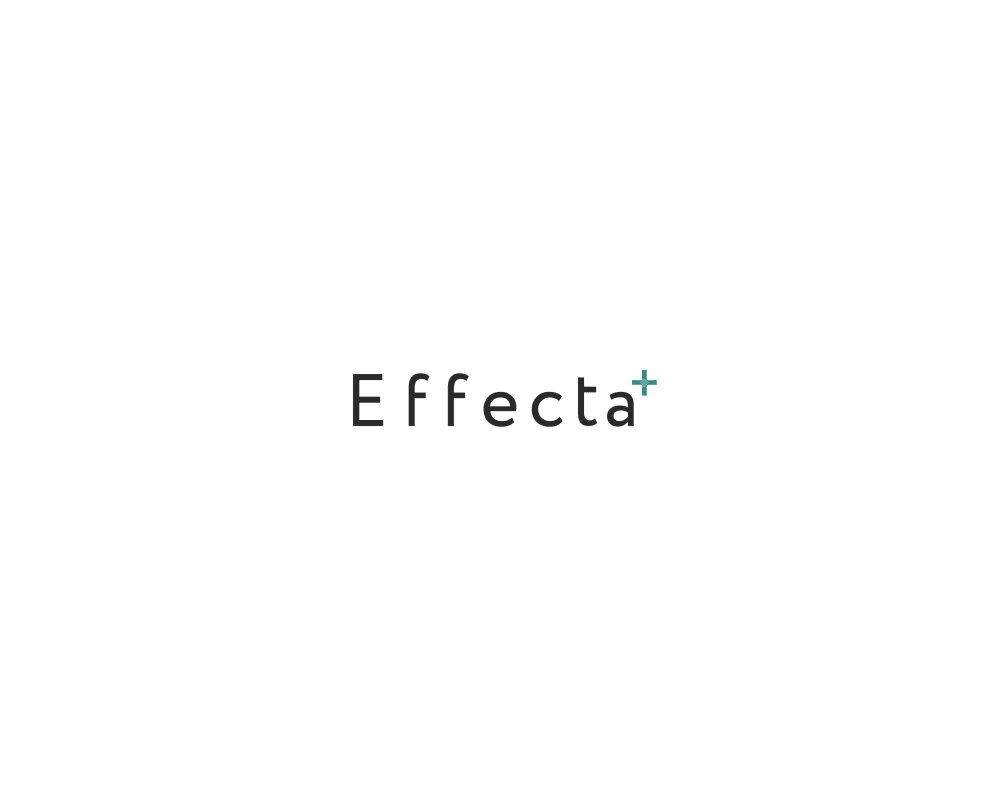
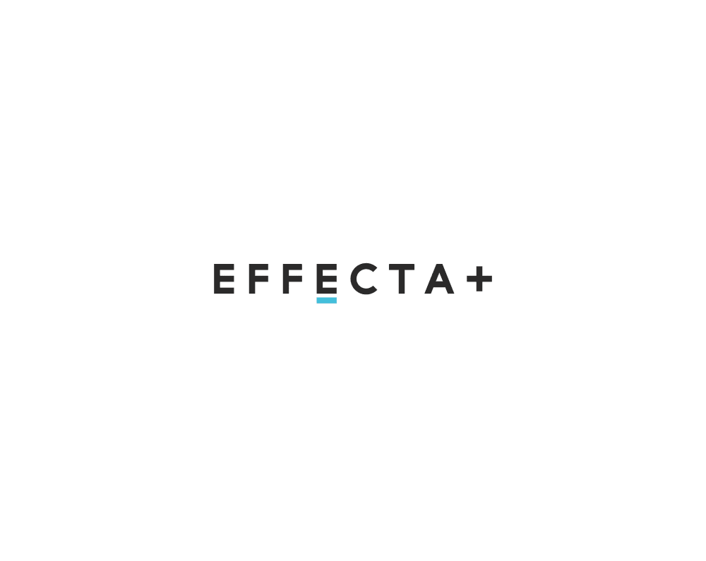
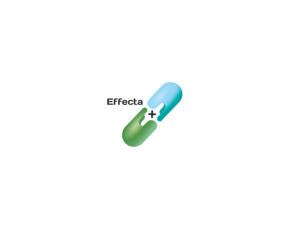
Which logo for supplements do you like more?
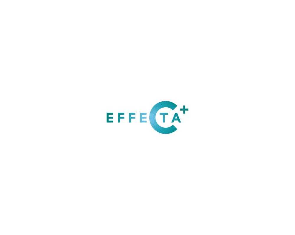
Option C won this Ranked poll with a final tally of 59 votes after 3 rounds of votes counting.
In a Ranked poll, respondents rank every option in order of preference. For example, when you test 6 options, each respondent orders their choices from first to sixth place.
PickFu requires a majority to win a Ranked poll. A majority winner differs from a plurality winner. A majority winner earns over 50% of the votes, whereas a plurality winner earns the most votes, regardless of winning percentage.
If an option does not earn a majority of votes, PickFu eliminates the option with the lowest number of votes. The votes from the eliminated option are reassigned based on each respondent’s next choice. This process continues in rounds until a majority winner emerges.
Scores reflect the percentage of total votes an option receives during the vote counting and indicate the relative preference of the respondents. If there is no majority winner, look to the scores to see how the options fared relative to one another.
| Option | Round 1 | Round 2 | Round 3 |
|---|---|---|---|
| C | 31% 31 votes | 34% 34 votes +3 | 59% 59 votes +25 |
| D | 34% 34 votes | 35% 35 votes +1 | 41% 41 votes +6 |
| B | 20% 20 votes | 31% 31 votes +11 | Eliminated 31 votes reassigned |
| A | 15% 15 votes | Eliminated 15 votes reassigned |
Age range
Amazon Prime member
Education level
Gender identity
Nutritional supplement use
Options
Personal income range
Racial or ethnic identity
15 Responses to Option A
I choose A first because I like the font, it looks very nice. C is my second choice because the color is nice. I don't know why the C would be highlighted though. D is my next choice because I like the color combination and the idea of a capsule. I last choice is B because there is nothing special about this and I don't know why the E is underlined.
A is a simple, easy to read logo. The plus sign at the end makes it easier to remember and adds some life to the logo. I like how clean and easy to read it is. B is similar but I can't determine why the E is underlined over any of the other letters. I like the pill logo but it makes the name harder to read. The C in C really throws me off as I don't know why it is emphasised so much.
The simple and clean look of option A is the one that gives me the most professional look and the greatest confidence that the product is something of high quality and value
I like that choice A is very simple and clean cut.
Option A is professional and slick, while the others options are all a bit messy, particularly Option D's floating medicine capsule.
I chose the logos for supplements that I felt were easier to process and comprehend.
I like the options where are can see the actual name the best. Option A you can see the name the best. option B it just looks strange with the E underlined. Option D the name is in very small lettering. I also do not like the big pill taking over the logo. I did not like option C at all with the large C. It looked very strange and I questioned how I was suppose to even say with product name.
I like the more minimalistic logos. Their easier to read really quickly
I think the more simple ones look way better. I think that if the logo gets to crazy that it might turn people off from buying the product.
I chose A as the best because it has the cleanest simple design, D looks like its trying too much thats why its ranked low for me.
I think this one is most eye catching. It has a nice and clean look.
Option A is basic and to the point. Option D is good as it shows the combination of items. Option B looks like an eye test.
I like the skinny font better. I don't like the big C in the logo at all.
The text for option A looks typical of a medical brand and is simple and easy to read, so that would be the first choice.
A because it has a pleasant effect with a blue plus sign next to it. B because it is bold and you can easily read it. C because i like the calming color but not the enlarged C. D last because it looks pharmaceutical.
20 Responses to Option B
I ranked these in order of how professional they look. While I think B is the best, I also think A and C are great. I really don’t like D though. It’s not very professional looking.
The pill shaped logo reminds me of a pharmaceutical company, which isn't really a good thing. I prefer to think of supplements as natural rather than artificial.
I definitely do not like the option that has the pill. It comes off as too pharmaceutical. In this case, I think a simple logo speak more. My first choice with the underlined E looks professional and elegant.
B and C are simply and have a large degree of focus on the label. D is way too cluttered and you can barely see what the label should be.
I really find the logo in all caps to be really visually appealing, and more modern than the other logos that are not in all caps. I also think that the logo with the pill is not very adaptable to different user interfaces and should not be used
B is my favorite. The logo and text are large and easy to read. It also looks more polished and high end.
A logo should be simple, minimal, and memorable. Choice D is none of the above. The large image takes away from the small product name. Option C is an improvement. However, I don’t see a reason for the large “C.” It just confuses me. Options B and A are both very good. I prefer B because it stands out more and it is more unique.
I like B the most because it is the boldest and easiest to read. I like the supplement in D, but the company name is so small I can barely make it out.
I like the simplicity of B and A. And I liked D because the pill seems kind of cool.
I do not like the Pill (D) at all. EFFECTA+ is the nicest of the designs. Choice C was close because I like the coloring, but I ended up questioning the C and what it was supposed to mean in the logo.
I think B reminds me of something simple and easy to understand, yet effective.
I prefer the ones that allow me to read the name easier - so I can identify it in the store or online. Colors would help as well.
When I heard the word supplements, I am thinking the name across the top of a vitamin bottle that it makes me think what is it I want to see. I really like choice B and I could see it written across the top of a vitamin bottle. It's classy with a little hint of something. While I like choice C, now that I look at it again, i don't like the big C. I would switch choice C and A and go with choice A second. I like the lower case letters and the plus sign at the end. What I don't like about choice D is the image of a supplement, it's a little too much. It's big and overwhelming, it might not take away from the products name.
I thought that B was very clean and attractive- it has the high quality of trademark brands. The others were not as such.
i like to see the full brand name clearly. the last 2 options either have the name too small or the enlarged C is confusing.
YES I LIKE THIS PRODUCT AND VERY NICE SUPPLEMENT
I like the pill least because I think "pills" have a bad connotation in our country. I like the logos that are clean and simple with just text so I picked those as 1 and 2.
based on how modern, scientific and minimalist the logos are
B - This logo is the most balanced and professional. The underlined the E and the bold, capital letters make this logo stand out. A - I feel this logo is balanced as well I feel the lowercase letters should be uppercase or bolder. C - I feel the C is too big. D - The pill is too big and the text very small.
To be honest, the first two options are super clean and really look good. I think the first option outweighs the rest.
31 Responses to Option C
I like Option C, it is unique enough that it stands out and looks professional and trustworthy too. Options A and B are both solid looking but a bit plain. Option D looks too much like medical or pharmaceutical related.
I'm very into the design that utilizes the C in the logo as part of the company name
I choose option C the logo is eye-catching. Option B it is unpleasant. Option D logo is boring. Option A it is not intriguing.
I like C the best because I like how the large C stands out and it part of the name. It looks unique and is something that stands out and people would remember. I like A and B alright but they're a bit dull and D to me looks odd and makes the product seem cheap.
To be honest the only one that I really loved was C. I love them look of it the way it pops off the page. It stands out it has nice color scheme and font. It screams high quality. A is okay nothing super spectacular there. B again is okay nothing spectacular I don't really like the underlined E in it. Option D just looks terrible. It looks cheap and cheesy it doesn't convey high quality so I would definitely not purchase that product with that design. So my overall pick would definitely be C. That is by far the best option out of the others.
option "C" has more classy look when compared to the other options
I chose C first because it eye catching and looks very professional.the colors are nice and the logo is creativeI chose D second because its imaginative and unique logo using a image of a pill capsule shows you what your company is sellingI chose B third because while its simple it looks professionalI chose A last because the letters are too thin and it kinda looks generic
C looks like an actual logo - this logo looks to be effective with and I like it. A - the blue + logo looks incredible - the font is okay but paired with the sign and it looks outstanding. D - i like the logo with the pill, and that it integrates the + sign logo properly. B - I wish the + sign was colored blue, not just the udnerline under the E - overall good logos
option C logo is really looking good and the other logos are also good
I like the nice design of C and the color used for the font. I also like the simplicity of A & B. I think those three choices look very professional. D looks horrible and should not be used as a logo.
C is really unique and interesting, I really like the design. B is simple yet very attractive. I don’t like option D as well as the other options
Option C is best and looking so good than other logos.The color and word is more attractive.
I had to really study these logos, because my first impression was that I didn't really like any of them. But now, I think "C" is definitely the most appealing with the shades of aqua, and the large C in the middle of the word. I assume this to be a vitamin C supplement. The capsule on "D" reminds me of prescription drugs, and that's kind of a negative connotation.
Option C is much more then looking good then compare to other options. Option B is looking more good then Compare option A and D . Option A is better then option D , Option D is slightly looking bad to compared to others.
Option C is the most attractive of them all. Option B is less attractive than C. Option D is less attractive than B and option A is the least attractive of them all.
C has a pretty unique design and log which I think will make it more memorable in my opinion. B and A are typical. logos but are a little too bland and don't stick out to me
the design looks the most relevant and interesting
I picked the logos that really caught my eye, mostly due to the color and font.
I like this logo because it stands out to me.
For me, C, A and B ranked first because I find the name of this company to be easy to read on these logos as opposed to with D. C is first because I love the fun colors that are present. A is next because it's simple and I feel like the slimmer font is quite attractive for a supplement. B works as well, but it's just not a favorite of mine.
Prefer the deign in C
I like C because I like the font and the blue color, then A because it is the most simple and to the point, then D I like because it looks like a pill and looks different, then B last because it does not stand out to me that much.
The large blue 'C' in my top choice catches the eye and looks unique. I don't like the pill in my last choice, because it's a bit gimmicky...
The C in the logo is really eye catching in choice C. I like B for a more traditional logo with a nice simple font but the accent on the E is a nice color addtion that could maybe use a blue + like in A.
I had absolutely no idea any of these were ads for supplements until I looked above the options for the product logos. After learning that, the one with the large C, (choice C), almost looks like it is promoting vitamin C.
I chose C as I like the combination of design, logo, and colors. I feel that the logo with the giant pill is just too much for a pharmaceutical company.
C - The circular logo with the + sign makes it look like something out of an SNES-era video game, where as you had cured your character of something effecting them. This is the most attractive logo due to that likenessB - The _ under the E with the bold text makes this the second most attractive. It is gold and memorable with a nice touch with the _A - The text is too small in this one. Also the All caps in B makes it stand out and deem more dominant than this option.D - The Effecta words are barely legible. It looks like a side comment and not the point of the logo. You need to have your name bigger. It doesnt look like a company that would use such a small-font logo
Option C, because the product name is clearly visible and colorful. Option D is also of interest to me because its design is striking, however, the name of the product is not clearly seen.
C works best in my opinion, it has a very catchy allure andthe design is also very unique, D comes next, it has an appealing image, the design is also very catchy, A comes next, it looks okay as well, B comes last, it looks the least appropriate of them all.
C stands out above the rest to me as the best logo.
Option C looks really cool and would get my attention before the others. Option B has a bold font which I like better than Option A. Option D is just too big and the letters are too small. It may represent a supplement pill well but it doesn't show the name as well as the others. If the graphic was horizontal below the name it might be better,
34 Responses to Option D
i like the brand of d
Very cool descriptive choices that brings a good eye appeal to everything.
I like the images with graphic images the best.
i think the choice of the product is good .
I like D the best because it’s the most colorful and the picture of the pill lets the consumer know that this is a medication. The text only options leave me wondering exactly what the product is.
i like the little pill logo. makes the name stand out
I like the logo and I use it very much
I like seeing the actual pill capsule at it helps me understand what the product is without doing a lot of research.
the last two are completely forgettable. the first two at least have some color and semblance.
i choose d1st because it gave you an idea of what the company does just by the logo c is 2nd because the bold c is really eye catching a is 3rd because it looks cleaner then the last option of b which is kind of confusing with the underlining of e
I like D with the capsule which encloses the plus. It indicates value and a positive aspect. C is good because of the attractive blue color. B has a blue underline which is interesting and causes you to wonder what that means...creating interest.
I like option D the best. Since it’s for supplements I like the little pill in the logo. He other three options could be for just about anything. I did choose option C second as I liked the C in the design. The other two options were sort of generic, bland.
I like that the logo in D says effecta and also has the pill included in the logo.
Supplements are general in capsule form, so I think it makes perfect sense to use a capsule in the logo.
D: I liked the two capsules with plus as Effecta.C: Not everybody could figure out EFFeCta+B: Under E in Effecta + looks good.A: Effecta+ simple and original i feel.
I like D the most because it includes a picture of a pill which just makes it stick out more than the others and makes it clear what the product is.
It is unique and memorable.
I like brands that include logos and not just the name of the company. D does this the best with a nice pill logo, but the company name needs to be spruced up. The rest are just the name of the company, but C does make it look like there is a logo with the "c" forming a pill. That is clever. The last two A and B are just the company name. Of the two, I like the accentuation of the plus sign rather than just the letter E being underlined as I have no idea why it is highlighted.
The picture of the pill is a good seller, it explains what the company does
I love Logo D since it is easier for me to tell what the it is about. It does not leave anything to imagination
i like the one with the pill best since it shows what it is and the one with the large font was boring so i ranked last
This is a pill type product, so D works well for me as a logo. C is colorful and eye-catching. A is rather bland, and B is not attractive to me at all.
The logo is easy to understand. It tells you immediately that it's a supplement
I like option D the most because it shows what the product is. I think the other options needs to provide more clarity about the product/brand.
I chose D as first choice, it stands out and represents a supplement. Option C also stands out and looks professional. B & A are similar, however the font is bold and bigger in B and stands out.
Option D has a logo which represent the supplement design with image.Option C is not better than Option D but has a design which is better than Option B and A.
I like the logo with the pill as it shows what the product is. I can't tell what the other logos represent.
different and unique design
I liked option D the most as it actually showed me a pill. It made me think of the supplements before anything else.
D shows a pill, which makes me associate it with supplements- none of the other 3 choices would lead me to think the product was supplements. I didn't really care for the other 3 options, but C at least incorporated colors and a logo, which is why it was ranked my second choice. B and A were both just boring black text, which I didn't care for at all. I made B my third choice because I feel like the font being in all caps was more eye catching than A. All in all D was the only option I really cared for.
D with the capsule is ok, but the name needs to be larger. C is visually appealing with the blended colors, but the giant C makes me think it is vitamin C. B is clean, all caps is not a good idea, and underlining the E is odd without knowing what this product is. A's font is too thin, and the kerning between the letters is odd and off putting.
I like the creativity of option D with the pill. It is cool and unique. Option C is interesting too with the large C. Option's B and A are too similiar and basic to other logos out there.
D - I liked the illustration. Makes it very clear this is a supplement C - clever design grabs the eye, both A &D are similar except thickness of the font. Both are uninteresting as well
Overall I'm drawn to the logo with the pill because it really ties into the product. However, I feel that the company name should be a bit larger.
Explore who answered your poll
Analyze your results with demographic reports.
Demographics
Sorry, AI highlights are currently only available for polls created after February 28th.
We're working hard to bring AI to more polls, please check back soon.

