Poll results
Save to favorites
Add this poll to your saved list for easy reference.
Which logo is more appealing?
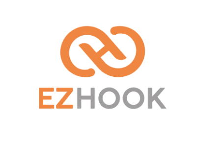
27 Responses to Option A
Option A is a bigger logo and looks better color wise.
This looks like an actual hook honestly.
This one is more appealing because the words stand out more and the graphic is smooth looking.
I really like the grey font
I like A better because the grey "hook" word is much easier to read. Also, I like the darker orange of the logo. For some reason, the lighter color on B hurts my eyes when I look at it, which makes it difficult to read clearly. And I don't like the dual color of the logo.
I think this one looks much better
Option A is bold, confident, and the colors also give me an indication of strength and professionalism. I also like the size of the logo, I would be able to notice or recognized the logo from a glance or from a distance. The gradient color of option B is appealing to look at but it doesnt look confident or professional. Option a has more thought behind it and I also think that Option A would be more recognizable than option B.
I chose A because it is larger and easier to read.
I prefer the one that is larger and easy to see
The logo in option A is large and more in charge looking. I prefer the size of the logo along with the colors. The colors have a contrast so that they are well noticed. The lettering and the colors in option B blend together too much and that makes the logo less noticeable and interesting looking. The actual logo is a better representation for the name of the company
The logo featured in option A is more appealing to me because the colors in the image as well as the size of the logo and lettering, make it more engaging and friendly.
I see how blended the logo is. The contrast is cute and professional
I chose A because the logo stands out better and the 2 color logo is more appealing to the than the monochrome image.
A has a cleaner look that doesn't hurt my eyes with the yellow. It is also smoother on the direct image in the middle, with the connections.
Simple design. Simple color scheme. B is just too much "extra" for what should be simple.
I like the logo in A better. The orange and gray make for a nice color contrast and the logo itself is very simple and clean. I'm not a fan of the logo in B as it's too "curvy", in my opinion.
I like choice a best since it makes it stand out to much orange is not a good thing you want to vary the font
It's nicer looking and seems more clear and legible
I liked A because the vibrant yellow on the white background is a bit hard to read. If it was on a black background I would prefer B.
The non gradient color is easier to ready, and I like the logo design more because of the way the edges are curved
The different color for the word Hook really makes it stand out...looks great!
A is a little bigger and that draws in your attention faster.
I like the graphic in option A more. I like the font and the hook itself seems cool. I would go with that slightly over choice B.
It's only honestly a little difficult to explain why Option A is better. First of all, the overall design feels cleaner and more profession. The grey on the word hook as opposed to the gradient coloring in Option B makes the company name stand out. Lastly, logo itself seems smoother and more elegant. Basically, it just "flows" better than logo B. Therefore, it looks better.
This logo is better because the color of the text has a clearer appearance and a good contrast.
I chose option A because I really like how the center of the design as an H.
Don't like the color combo in B. They arent compliments.
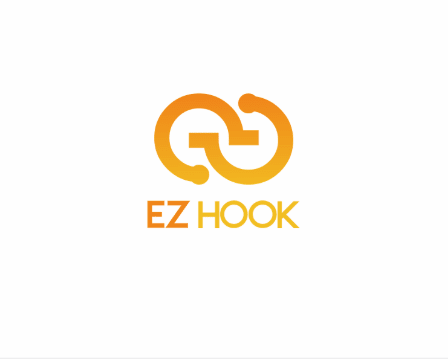
23 Responses to Option B
The nice color gradient helps.
Choice B just looks a lot more friendly and aesthetically pleasing than choice A does in my opinion. The brighter colors convey a happier tone overall, and I just really like the way the logo looks with the lines going opposite directions in the middle instead of kind of going parallel to each other. I much prefer the design of choice B.
This logo design has more personality and it could represent very well a brand or a product. I liked its design and the font colors.
I like option B as a logo much better because it's smaller but still very easily readable.
I like the color gradiation in the actual 'logo' part of this one a bit better.. I mean, its close, regardless, but this would win out for me slightly.
i like the logo of choice b
I like the look of this logo better.
Choice B is not too big and in your face and all the colors of the logo blend nicely together.
I like the way the colors blend together.
I chose B because the colors are more appealing and make it pop out more
Option B has a more modern shape. It's also more obvious that Option B is supposed to be hooks. I like that there's more colors on Option A though.
It looks more like a hook- represents the product better.
The bottom one is more futuristic looking. The other one looks more early 2010s time period.
The blend of orange and yellow is better.
It is more complex but swirly and good
The logo in B seems to be more of a hook shape and ties better to the product.
The colors on option B stand out more compared to option A.
I like the color scheme better. The gradient in the logo is eye-catching vs the bland orange/gray in the other logo.
I like the color combination better.
I like the color scheme of this one better.
less obtrusive
The color on the wording stands out a lot more. I feel like the grey is very common in logos today. I also like how it gradients up into the logo icon.
I like the multiple orange colors and the graphic is more creative.
Explore who answered your poll
Analyze your results with demographic reports.
Demographics
Sorry, AI highlights are currently only available for polls created after February 28th.
We're working hard to bring AI to more polls, please check back soon.

