Poll results
Save to favorites
Add this poll to your saved list for easy reference.
Which logo looks best as your FIRST REACTION (ie- your immediate preference)!


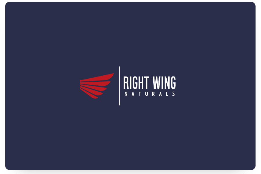
24 Responses to Option A
The wing facing the right feels the most natural for this logo type
I like Option A because the wings face the text, drawing me in.
My immediate preference here for this logo goes to Choice A. Primarily because it lines up better. Your name is 'right wing' and the wing design in Choice A actually is a wing on the right-hand side. B immediately bothers my OCD in that it's opposite of what it should be going off the name.
I prefer A because the wing is actually facing right.
A is better is because the art design of the right wing is literally what the name Right Wing embodies. It would not make sense if the wing was pointed left like in B.
I prefer the option A brand logo because the right wing is pointing to the right and direct the eye of the viewer toward the brand name in this option A logo.
the wing looks more natural on this logo
I like A better since it says right wing and the wing of the logo points to the right, in b the logo points to the left and away from right wing
A is more logical given the company name. Also, the wing pointed towards the right is more visually interesting.
B is more like a left wing
My first immediate reaction was to read the name and then to look at what direction the wing was facing. As option A is the option that is more consistent with the direction that the name indicates that is my preference, since the direction the other wing for Option B is facing is to the left and that is inconsistent with the name right next to the wing. Aesthetically option A looks better with that consistency. The contrast is also better. Thematically and symbolically option A appears to be a logo consistent with the name and so that's why I chose Option A. My first impression was also that I liked option A more because it looks nicer facing to the right instead of the left. So that's why I chose option A, because of the direction of the wing and because it looks nicer overall.
I like this one because of the angle of the red wings. I think it looks better and flows better with the words
This one is positioned accordingly. It is one the correct side.
It's actually the right wing.
at first glance, this logo provides all i was looking for and is very stylish.
It’s literally the RIGHT wing, it fits the title lol
A is actually a right wing. The one on B would be a left wing.
The name right wing implies I should be seeing a right wing as in choice A
The wing in B just doesn't seem right. I suppose because the wing in A is pointing to the viewers right. But oddly the wing pointing to the left in B made the image appear not centered on the screen.
I feel like A looks more natural for some reason I prefer the wing facing this way
I prefer choice A Because the wing is actually On what I consider to be the right side . an option B The wing is on the left side and that's kind of confusing because the logo is right wing Not left wing .
I like A better because it is the right wing in the image so it fits better.
I choose A because its graphic design looks more visually attractive and creative than B
The logo is elegant and ideal for marketing. I find the colors to be suitable and appropriate for such a product line. My reaction is a positive one.
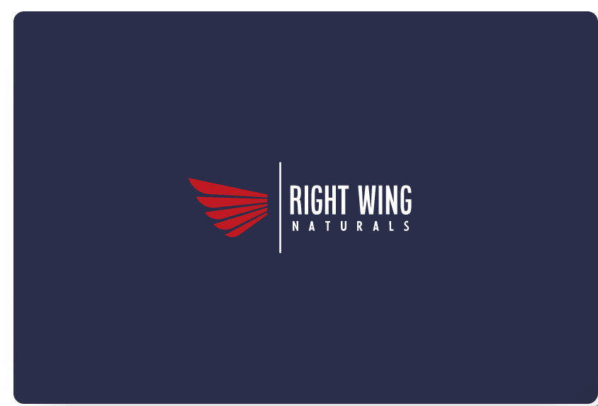
26 Responses to Option B
The wing looks like its in the correct orientation in option B
It looks more natural coming away from the text
B's logo flows a lot better with the wing on the left.
A doesn't seem like the right wing
The wing seems to go better with the text here overall
The wording literally is the right wing, smart logo
It feels connect to it, which makes it looks nicer. A makes it feel disjointed.
Option B grabs my attention first, it feels like it flows better with the wing facing that direction, and if you think of it as viewing the logo from the front, the wing is the right wing
This option felt bolder and more confident to me.
I like option B the best because I like that the wing logo is a right wing, which is perfect for the Right Wing Naturals name.
I chose B because the wing implies a movement to the right, which works with the name.
Wing towards left makes writing like the body.
I’m a lefty so seeing the wing this way really grabbed my attention right off the back.
I think option B is definitely the superior option. I like the positioning of the arrow much more in choice B than in choice A. It looks more natural to me.
I think that option B looks best. The way the wing is facing in option A does not look right to me. I think the color and font look nice in both images.
I like option B because it looks more natural with the 'wing' coming off of the text instead of facing away from it like in the other one.
B, simply because it is actually a right side wing.
better use of space
This one looks best. It is very natural.
This version makes it seem like the wing is coming out of the name. That fits and looks cool to me. It is also memorable.
I like the wing facing away from the text, but it should be on the right side of the text in my opinion.
I prefer option B because the orientation makes it look like a wing is attached to the name which suits the logo better.
I prefer the way the wing is facing on option B. It seems more natural.
The "wings" look more natural being lined up on that side, with the white line, but I think it should be flipped/mirrored completely. "Ring Wing Naturals" on the left, right side wings on the right.
Choice B just flows better overall going from left to right. I would choose choice A if the wings were on the right side of the logo.
I think it looks more "proper" with the wing going outward from the rest of the logo. It just feels right.
Explore who answered your poll
Analyze your results with demographic reports.
Demographics
Sorry, AI highlights are currently only available for polls created after February 28th.
We're working hard to bring AI to more polls, please check back soon.

