Poll results
Save to favorites
Add this poll to your saved list for easy reference.
Which logo set for a forestry luxury resort gives you the better feeling?
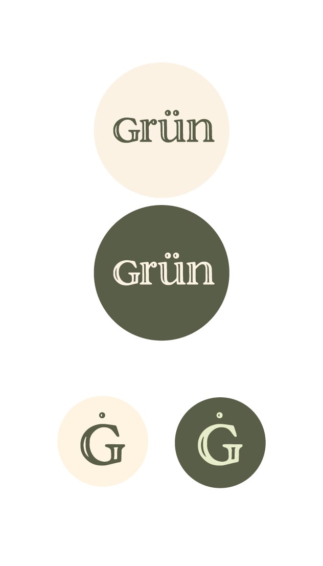
24 Responses to Option A
The two tone serif font in A imparts a chiseled and regal feel that is missing from the sans serif. I think this gives more of a luxury feeling.
I prefer option A because the shading gives it a more stylized, appealing look that makes the logo stand out.
I like a with the older looking text. Seems more authentic.
This one seems to have more texture and reminds me more of a tree
A has a more attractive color options of the icons and the logos which make it more attractive and easy to read for me.
The letter inscription is gorgeous and more appealing.
I had to think a little bit about this one, because they are both great logo sets. However, choice A would be my choice because of the font. Choice B's font seems a little too simple. Also, I love the "G" for the last row in Choice A, because of the marks above the G.
The font style looks more luxurious in option A
The fonts in A are little more sophisticated.
G looks more established, and the font gives it some character. B looks like essentially every single other brand and business in existence at this point, so it doesn't really stand out. I looks like a brand I'd find at a mall, or at a dollar store, or maybe as a luxury retailer, it could be any of those. With A, I'm confident it's not generic, and feel like it would be worth my time and money.
The lettering fits better with more luxury look It is more regal in appeal the other choice doesn't say high class
The other font is too plain. It does not look luxurious.
I prefer Option A because the font seems more "woodsy." Also, I dislike Option B because it looks like it was designed by a Green Bay Packers fan.
The font choice in option a is reminiscent of trees for me and makes me prefer it
The font in A definitely has more style than B, which helps catch my eye. More importantly, I think the dot over the G gives the impression of high quality
A has more style
I think A is nicer, the font definitely makes me think forest and it seems more upscale than B which is pretty plain.
I love the colors for option A, the green is so pretty. It's a really nice logo.
Both look good to me. I just think that A has a little more forest look. The idea of a forest luxury retreat should great to me, something you do not see that much and something I would like to try out.
The darker green look richer and more sophisticated
A looks higher end. B is kind of basic
I like both, but the text on A stands out. The smiley isn't as noticeable on this one though.
Option A is more visually appealing and grabs your attention more right off the bat. It has a more rugged and natural look to it that makes it feel more like it matches the idea behind the resort and what it would have to offer. It also looks more professional and unique, which gives you a better overall feel that the place would be high quality and a great place to stay. Option A would appeal to a wider audience of people and would make them more interested in learning about what it being offered.
I chose option A because the double font makes it look more professional.
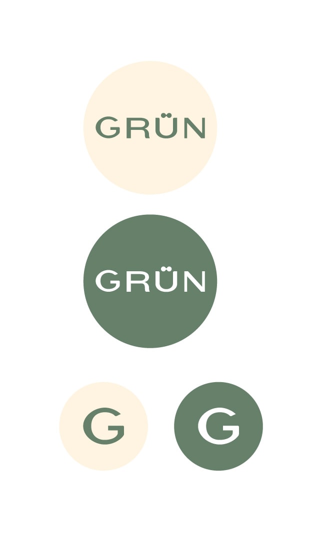
26 Responses to Option B
I like the design of B better. The green color of the logo is more consistent with the name and the forestry theme, and the logo looks cleaner than the logo in A since it has solid-colored lettering.
The text looks softer, more inviting.. something that draws you in. Other option looks rough and unfinished, somewhat lacking in drawing you in.
B feels cleaner, comfortable, and more modern to me.
I choose B because it looks more modern and clean. A looks more archaic and old.
Just the green color on the logo would tie it in better to the forest.
The sans serif font looks cleaner and more modern.
I like option B for it is easier to read. The outlines on option A for me at least make it harder to read.
I like this because it's simple and seems modern. The logo for A seems ancient and very low tech.
This one gives me a better feeling because it looks more modern and easier to look at.
I don't like the font of the other.
Looks more luxurious and I like the matte look to the background color that's being used
I like the cleaner font appearance of option B. It makes it seem more elegant.
the design of B is a bit more basic, but doesn't seem as if it is trying too hard which in turn speak volumes.
I just love the short, all uppercase, consistent font. It gives me a feeling of luxury and trust.
The font is more modern and sophisticated while A looks like it is selling a brand of cheese.
I like choice B because i feel that the logo looks natural and looks more homely and comfortable than choice A.
I think the shades of green used in B are a bit more cheery and less army-like, therefore I prefer it to A. I also find the font to be a bit cleaner and modern. A's font reminds me too much of 80s printing programs.
I think the font in B is much better than the one in A, I also like the lighter green in B better than the dark / olive green in A
Easier to read and looks cleaner and more professional.
I feel like the option I selected is simple, easy to read, and feels like it might tell you more about the product. I also think the colors are easier on the eyes. I just feel like the two options show a modern idea versus a retro idea.
I prefer choice B because the green shade and the font appear more luxurious due to their softer hue and solid lettering versus the darker olive green with a font look that is trying too hard. Simple = more prestigious these days.
I like option B the best. I like the name and font better. the block lettering is attractive
I like the simplicity of it. A lot of times i feel less is more and you also don't want some gaudy logo covering up the actual design.
I definitely prefer the clean lines and sans serif font of the B option, over the A option, which looks to me a bit more old-fashioned.
The font is much more relaxing and welcoming.
I like B better because it's not so fancy. A looks like it belongs in a bakery not on a forestry luxury resort. I think in this case less is more... it looks clean and sharp; easy to read.
Explore who answered your poll
Analyze your results with demographic reports.
Demographics
Sorry, AI highlights are currently only available for polls created after February 28th.
We're working hard to bring AI to more polls, please check back soon.

