Poll results
Save to favorites
Add this poll to your saved list for easy reference.
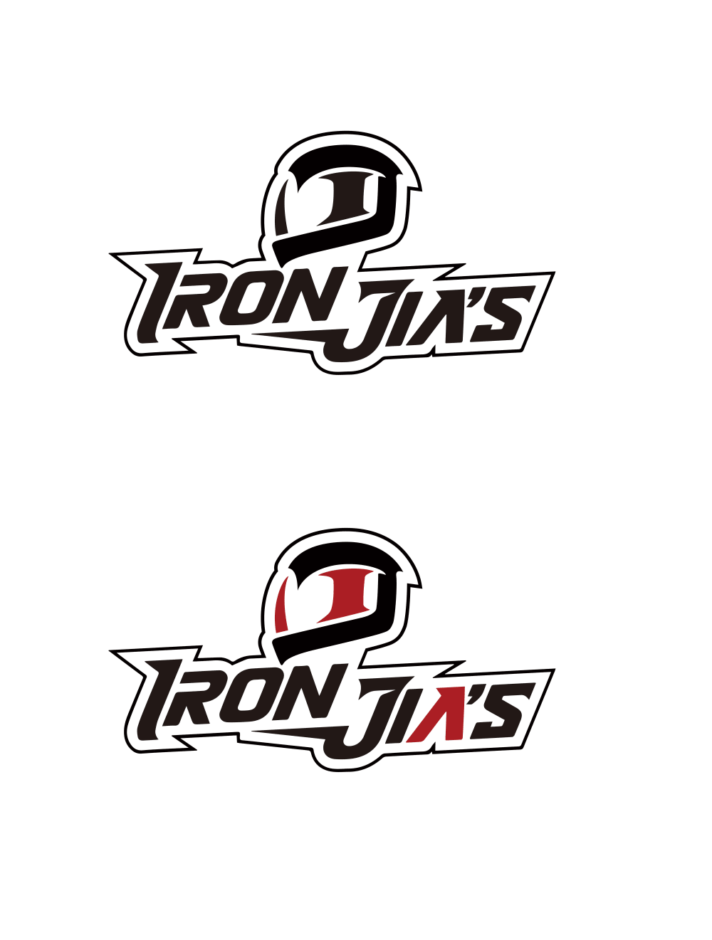
Which version of the following logo would you prefer as a trademark for motorcycle protective gear and clothing?
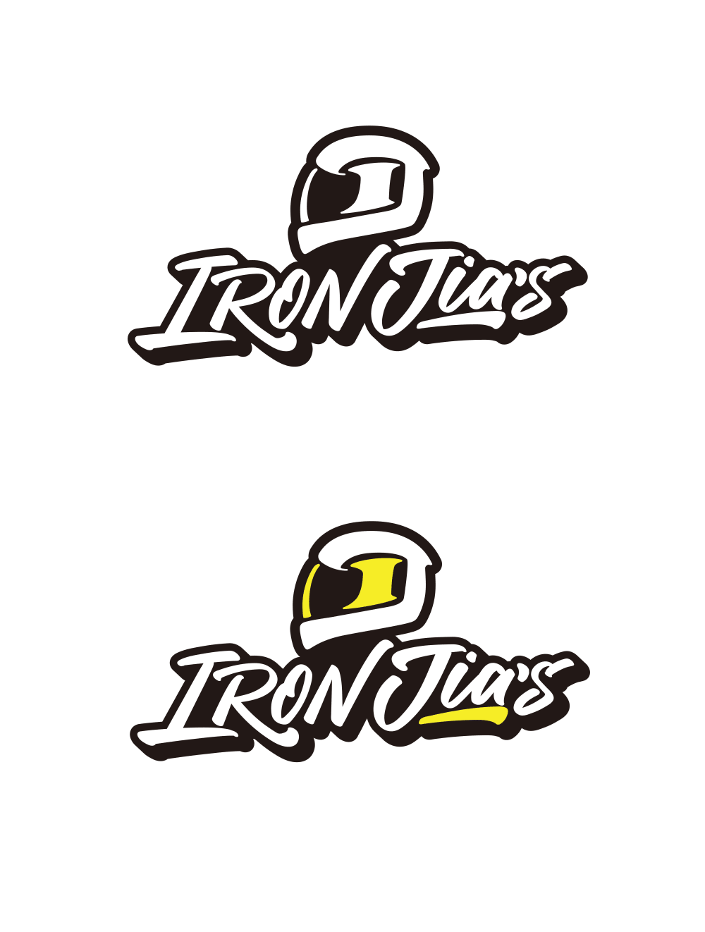
38 Responses to Option A
The font style of my top choice is superior and much easier to read from a distance
I prefer the opaque face shield and the font of choice A
I like the yellow I feel it pops more and stands out and has a unique look to it.
I like the helmet much better in A, but I think the font from B is superior. Since you are selling helmets, I'd go with the better helmet option.
This set of logos blend together better, the black in Option B takes over the design and is all I can focus on.
The logo In A looks cooler and more modern
It looks more bolded and dilled in.
The look of the item for the yellow helmet is a good match for this product
I think the yellow inside the logo really makes it stand out. I like that some of it is white also
This font stands out more and has a more sporty feel to it. It is way more impactful.
This looked more cool and edgy and less techy which the other logos looked like.
The yellow stands out in the logo but it is subtle enough that the logo looks professional.
I prefer the option A motorcycle logo because I like the yellow color and the more readable font used to state the brand name clearly on this logo and the smoother curves on the helmet look much more appealing.
I like the style of OPtion A. They look more interesting. It looks like a custom made high quality brand.
i think the set of logos in option A looks a lot more relevant to motorcycle protective gear
I chose A because I like this look best, especially the one with yellow and black. It's a good look to me.
I think because it's easier to read overall and the yellow makes it stand out more.
I picked option A because I dislike option B. Red color that reminds blood color shouldn't be used in a motorcycle protective gear and clothing, IMHO.
I like the more fun and modern feel it has to it
I love this option more because it has some yellow coloring to it making it better fit the vibe as well as making it more attractive.
I like the splash of color and think the layering of the color and black give the logo more depth and character.
The logo design looks more finished and complete. The overall appearance is solid and suitable for the company with a strong rugged component.
A grabs my eye as the design is unique and colorful
I picked A as my top choice as I love the yellow bold colors as it tells me that it's very fun.
Very cool design. I really like it. Such a cool looking logo. Reminds me (in a good way) of classic skateboarding art.
I thought the look of A seemed more coherent and easily visible, particularly the helmet.
The white and black shading on the top logo looks more official and properly colored. Also I think the yellow highlight will catch the attention of your prospects.
I think the yellow accents are more fun and inviting while also popping out to bring attention to the image.
I like the images in choice A a lot more than the images in choice B. I think that this one is more rounded, more smooth. I like the rounded font better
I like the design
The other logo looks a bit dated. The logo I picked is great for the younger demographic and has a trendy feel to it.
The yellow contrasts very nicely with the white, and the font used it easily read.
I choose option A because the font design looks better
A's design I feel flows and looks better.
I really don't like either, but choice A is easier to read, the fonts are better.
Option A is the best logo because the colors and design are simple and detailed
I like the font and colors used better.
I think the colors in A do a better job of defining the helmet, which doesn't look much like a helmet otherwise. I also prefer the yellow underline to the red A, since I'm not sure of the significance of the A.
62 Responses to Option B
I find B to more attractive. The crimson/red makes for a more formidable presentation for the brand.
I'm liking the font of the logo better
The black and red combination is more visually appealing in general and especially for this motorcycle company. The yellow feels out of place and would look better if there was another color besides black and white to balance out the brightness.
The sharper lines around the logo and font feel more "exciting" to me
The red is truly Iron like, as iron oxidizes red, it also appears more vibrant than the yellow.
The sharp lines gives the logo a strong look. Looks too much like a pizza place using the script.
I prefer the red in B over the yellow in A.
Between the font on the yellow color, image A sort of reminds me of a pizza company, NOT motorcycle gear. The plain red and black lettering is by far better,
In the logo about the trademark I choose the this option is valuable to choose for this title so I choose this option.
I like the design and the color scheme of these. They fit my style and personality better.
This logo has a more modern and extreme style which I think fits better with the brand
The font style is much more aggressive and fits in better with the IRON in the name.
This one is easier to read and it fits the product line better
i think this one is more on brand for motorcycles, it is tight and clean
I love the red and black as to me it is very stylish and something that I would enjoy to look at.
I like the font for B better than the cursive in A.
Option B is my top choice because it is bolder and would show up better when printed.
I would choose choice B because of the color red on the logo as compared to the yellow color in the logo of choice A. The red color makes the logo to look more appealing as compared to the yellow color.
I like the red and black colors. They look the coolest and it would be sweet to wear such stylish colors on a motorcycle.
I like font better and maroon and black as well
I prefer both the font and the color scheme in B. The cursive text in A does not scream "motorcycle" to me. I like how the black outline in B encompasses the logo and the name. B feels bolder and more noticeable to me. A, frankly, almost looks like a restaurant logo to me. I would strongly prefer to wear B if I was purchasing bike gear.
I really like the way the black on read looks in option B.
Choice B is the one that I prefer because I like the look of it better, especially the lettering style that it has. I like how it is more pointed and feel that it goes well with the black, red and white color scheme.
I prefer the outline design and the colors available.
The black and red options just looks better. The yellow in option A does not looking appealing at all.
I like option b better. It looks stronger and more masculine. The other one looks wimpy.
This one looks cooler to me . the other one comes off kind of soft . Option B looks like it protects you and looks good /good quality
I prefer this design in the red version.
I prefer the less embellished lettering in option B. I also think the red and black colors are strong and bold.
Red would be so much easier to see on a sticker and decal type thing
I prefer option B because I think it looks more intriguing and captivating to me. Option A does not feel quite as memorable.
I chose B because I think black as the main color for the logo is better than white. The white with black strokes makes it look more cartoonish than the reverse. I think for motorcycle gear, B is the more powerful logo you would want to associate with. I also prefer the red over the yellow.
I like the font and colors a lot more. It makes it seem more modern and strong.
I prefer the logo design for the motorcycle protective gear of option B more than option A.
I felt like option B looked more like a helmet and I enjoyed the letter type.
"B" looks rather ragged just like a biker is. It does not matter if it all black or has red coloring. Rugged is rugged no matter what.
The colors in this version better fit the product in my opinion. I also do not really care for the font used in the other version.
I chose option B. I really like the design of the logo and the colors used.
I like the bottom one with the red. I like the font in the logo and I think the red makes it stand out more compared to all black.
I don't care for the yellow accents in the other option.
B has more clean lines and I also like the red color in the logo.
this one catches my eye more with the red and looks cooler
I really like the way the letters look and the font in B the best. I think it matches the helmet better.
A logo should provide instant recognition . A brand logo plays an important role , as it provides the customer with instant recognition of your brand . Therefore the option B includes the all and had an unique look
Red accents are much nicer for motorcycle apparel as it exudes strength and class. I also prefer the text which is straighter and not as curved.
I think motorcycles and their equipment are great, so I think this option is more suited to that.
the color of the trade mark logo looks more bright and captivating to viewer.
The colors are great together and the font is really cool.
With the touch of Red in the logo, B really stands out. Yellow is just too wimpy of a color for a business such as this.
I like the colors better and its easier to read.
I prefer the color red over yellow which was used in A
I think the text's style in B looks better - sharper, more cool and suitable for motorcycle related products, whereas the font in A looks more like something for, say, a restaurant. I particularly like the second version with the red color. Red feels more suitable for motorcycles than yellow, to me.
With option B I like that the letters are shaded and also like the red used for 2 of the letters.
The red really stands out and makes the logo attractive.
Option B of red color creates a sense of excitement and dare devil like theme to it.
I liked B, A seemed more like a fast food logo
B seems more long lasting while a is cool but may become dated
The logos look a lot more masculine then the other ones do. The darker colors are better in this regard.
I like the red color ... shows intensity but also helps give shape and form to the helmet.
I prefer B because the font looks more metallic, like iron.
I chose B because the font and the color scheme appears tougher, which is consistent with how I view motorcycles.
I like the black with white logo, and the black with the red logo better. I know some people might associate red with blood or danger, but I feel it really gets your faster and looks better, too.
Explore who answered your poll
Analyze your results with demographic reports.
Demographics
Sorry, AI highlights are currently only available for polls created after February 28th.
We're working hard to bring AI to more polls, please check back soon.

