Poll results
Save to favorites
Add this poll to your saved list for easy reference.
Which is a better and more appealing design for a blockchain company website and why?
19 Responses to Option A
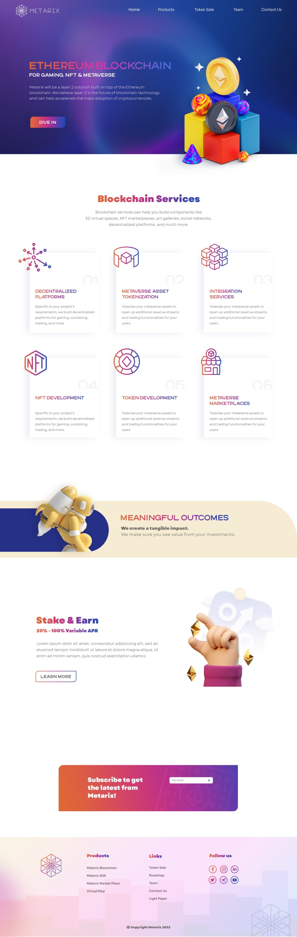
I chose A because it looks much more futuristic and fits a blockchain company website.
A I feel has a much better design that is more appealing and is able to draw my interest more to it.
I like the color in A, it makes the top of the page not seem so blinding. The text could be a bit different as it doesn't contrast enough on some parts with the blue background.
Not only are the design choices on option A better, but I also feel like it conveys the same information as B while not being as complicated.
This is definitely more appealing . The color scheme is so much better especially at the top. It really does a good job drawing in your attention and then it makes me want to read all of the information
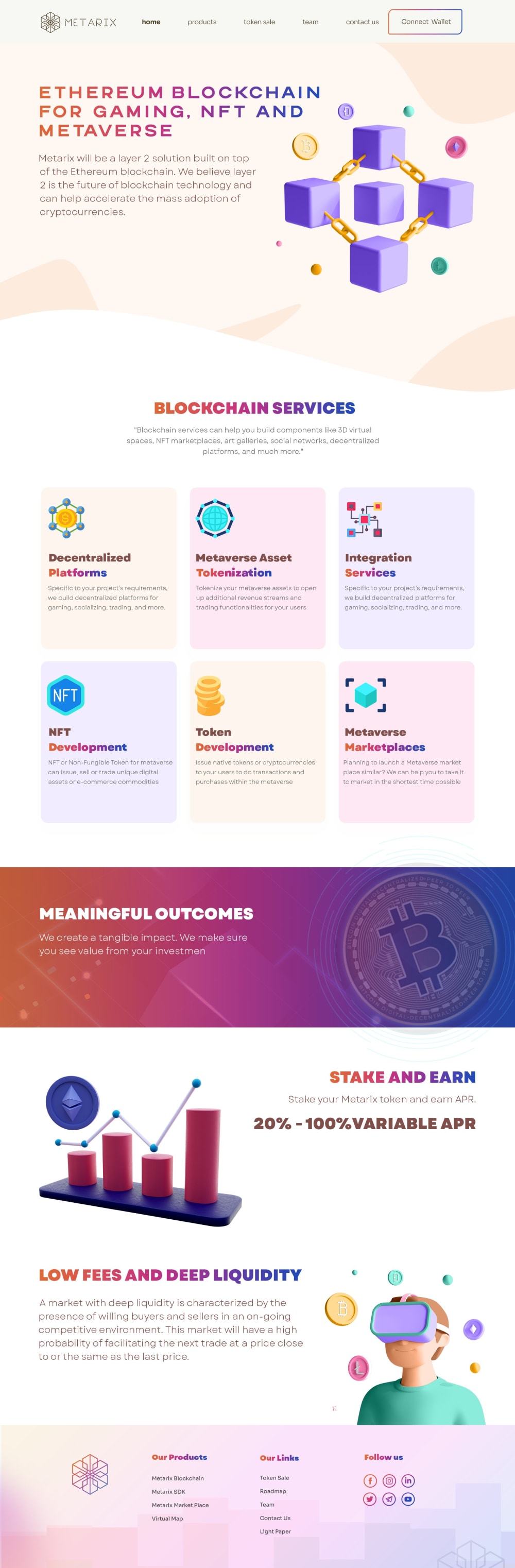
Option B would be a better advertisement for the services of a blockchain company, but the colors need to be deepened.
The images look fancier and more sophisticated in choice A. It just looks more professional crafted to me
The more vibrant colors, especially at the top of it, makes it more eye-catching and easier to read.
I felt the colors used were more eye-catching and the layout of the information made more sense to me. I liked the images used for this one better, because they seemed more cohesive with the topic of blockchains.
I prefer the icons and body of option A. I actually prefer the banner header of Option B, but Option A overall is better.
I picked A because the deep blue/purplish background has more of a tech look and feel.
I like the stacks showing the different coins in the main landing image and the overall design of A
I prefer to go for the option A. Because the option A's content was meaningful and the the multi model icons were attracts me to know more about it. I like the theme of that product image.
This stands out a little more and looks more fun and distinctive to me based on the top part of the page which is important since it's the first thing you see.
I prefer option A because it looks more unique and creative to me. Option B feels less desirable to me overall.
Looks more modern and professional to me. I like the darker colors at top and the block chain services part looks a lot better here
This option featured a rich and bold color.
I picked A as my top choice as I like the bolder colors.
This one has much more interesting designs and I really like how the colors look like in this option as well. The other options feels a bit more simple.
31 Responses to Option B
The colors are nicer and I like the pastel backgrounds on the blocks of text, it makes them easier to read than the white ones in A.
I like the color breakdown and sections of this one better. It’s easier to read by the way it’s laid out
option B seems way more informative and educational
B seems more appealing overall in terms of colors and aesthetics
I prefer B because I think the chain of blocks at the top is clever, and I think everything is easier to read and take in quickly.
The blocks fit with the name.
I feel like the graphics and font are easier to read
B felt a lot more appealing to read because of the colors
I prefer the colors, fonts and icons used in option b.
There's too much empty space on the other one and it doesn't look quite right. The other one has nice balance.
I prefer Option B because the design is more neutral with pops of color which is more eye-catching and draws your eye to the most important parts. I also think that the images/ diagrams are more related to the text in Option A and drive home the points better.
This one is better - the icons are easier to read and the text contrasts better with the background. The header part is more legible.
Option B is a lot easier to digest and seemingly gives more information. Also, the graphic design is much more creative and palatable.
The webpage layout is more authentic and legitimate
I like the blockchain graphics at the top and I think that one looks a little more creative.
I like that option B provides more information than option A, and there is more information to choose from.
I like the logos and emoticons in B more than I do in A
B seems easier to follow and digest to someone with limited knowledge of the blockchain process. B has print which is friendly to the eye and not stressful to read.
I think option B is easier to read and more eye catching which makes me more likely to visit the website and makes it more user friendly
The initial image is great here, actually showing chains connecting things gets things off right. The low fees, and details on pricing is also above average here. Use of graphing is also great in B. A avoids too many of these great elements.
I like choice B much better. It doesn't look like a magic toy advertisement.
I choose "B" because it is more into detail.
I makes more sense in the long run
Choice B actually shows boxes held together by chains. I think that is pretty neat.
B seems easier to read and understand. Looks sharp and designer paid attention to detail!
Option B is easier to read and has better visual style. A has purple text on purple background.
B is slightly better than A overall because it has a cleaner layout and better text which is easier to read. I especially love the way the 6 items are arranged.
Version B is more eye-catching and appealing to me. It grabs and holds my attention. I want to look through much more compared to A.
This layout has mostly suitable details and a nice arrangement of colorful graphics. I find this mostly appealing to the blockchain company and most connected groups.
B is a bit more attractive and I think the overall colors and design are more cohesive
I think they both look great, frankly. B gets a slight edge because I like the way the image looks on the lighter background.
Explore who answered your poll
Analyze your results with demographic reports.
Demographics
Sorry, AI highlights are currently only available for polls created after February 28th.
We're working hard to bring AI to more polls, please check back soon.

