Poll results
Save to favorites
Add this poll to your saved list for easy reference.
Which of these matchmaking onboarding designs do you prefer and why?
Age range
Amazon Prime member
Gender identity
Options
Recently purchased categories
Relationship status
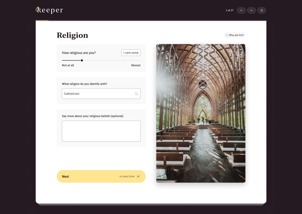
28 Responses to Option A
I prefer option A because I like the use of color and framing better. The black background is easier on the eyes.
I have mixed feelings as I like the bigger subject photo but I chose A as I love the color.
Prefer the addition of color in A. It is subtle but less depressing looking.
I chose A because it has a little color to it.
I like the full color photo better.
Option A, because the image has color on it, the template looks modern, and it is more visually appealing overall.
It looks more elite and laid out nicely. Simple and effective!
The page design looks modern and less intimidating when it has the large black border. Makes it seem like it's not too involved and wouldn't take too long.
I think the white background and color picture of Option A look much better. The eggshell background just looks dated to me. It looks like an old website. Option A looks clean and modern, while still being dignified and respectable because of the picture of the church. And the picture looks better with the white background because of its color. The black-and-white picture doesn't really complement the eggshell background of Option B.
The color scheme and layout looks better.
I feel the color in A is more appropriate; B looks more akin to a funeral.
The color is so vibrant and really catches your attention
This is more eye catching and striking visually to me so I prefer that option.
I prefer Option A because of the higher contrast. It's a really interesting page.
I like the overall design and that the image is in color. I find it more appealing .
I prefer option A because it looks more clean and simple to me. Option B does not really entice me as much in general!
I definitely prefer the full color church image as I think the other would tend to make people shy about their answers. The one with the full color makes religion look special I feel people would answer more sincerely and confidently.
I prefer A because I like the more contrasted color scheme; it makes it easier to read.
Option A is definitely better and feels more modern vs Option B. The picture in Option B feels out of place and just overall feel like it's an outdated design from early 2000's website.
A because the church image is more colorful and realistic looking than the church used in B.
Option A is the better option because of the black background and the color of the image of the church. The other option does not look as good because of the black and white image.
I think A is better because the dark background gives it some more contrast, and it makes it look more interesting.
The color scheme seems to be more consistent and welcoming in Option A.
Because it looks more professional, and I like the colored version of the picture.
I like the logo and the color scheme of A more than B. It makes the white part stand out more too.
black and white is outdated. i chose a because the image has color.
#A is much prettier with the color. The black and white image does practically nothing for me. I like the prompt in #A that's less specific than the one in #B.
A prefer white background looks better and what people usually expect on webpage.
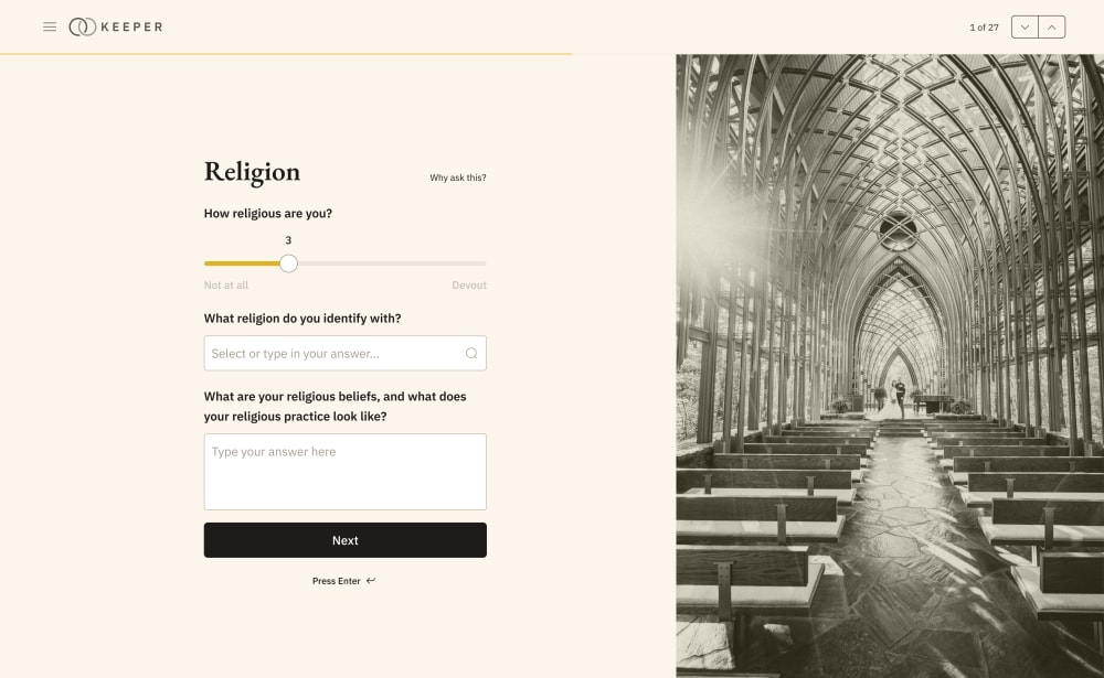
22 Responses to Option B
Black and white looks too uptight and almost funereal.
is less demanding and more gentle, encourages looking at the image a while more
I lied the design for option B slightly more. I liked the lighter color background and the black and white photo gives it a more classic look.
I prefer option B because I think that it is a more premium and visually appealing visually appealing webpage design. I mainly just do not like the plain black background of option A.
B's page layout I feel is able to flow a lot better and look more appealing.
The look of the beige stands out for the religion part of this background here.
I prefer the color scheme of the onboarding design in option B the most, so that is the one I would choose.
The lighter color and theme is more inviting, this image evokes positive emotion.
Option B's layout is cleaner but it's a bit harsh on the eyes due to the bright colors. Option A looks a little inconsistent with its color scheme. I think Option B but with darker colors would help with eye strain. Remember, people like using dark-mode for a reason: less eye strain and fatigue looking at darker colors compared to brighter colors.
The beige background is better in my opinion because the contrast is not as harsh
I prefer Option A over Option B because Option A's image of the church included color versus the colorless depiction in Option B. The color I feel provides a warmth and positive sentiment over the colorless and industrial look of the church in Option B.
I voted for this set because I loved the lighter background, even though I feel the photo in color, like in A would be much better, rather than the sepia it is currently. I think the cream/peach background with the black next button looks much better versus the yellow against the white background. I also like that the frame for answering the questions extends all the way out because I think the frame in A looks very dated.
theres a more fitting overall color scheme and it just looks so much better than having the black background
My first choice has a calm and relaxing look and feel.
i prefer the color scheme and the font used in option b.
I like the lighter, brighter color as the light goes better with God.
The color on B is softer and more easy on the eyes.
Just personal preference, but I'm a huge fan of black and white, so that'd be my choice in this case.
I like that the prompt for the final question in B is more detailed than in A. It provides more instruction for what should be included.
I prefer B, the look of the page has a more stylized theme to it that's cohesive throughout the design of the entire page. It gives it a more, distinct feel.
B because the image is more appealing and detailed than option A
Option B has a much warmer, much more soothing color palette. This may make the process of signing up for this service feels more welcoming.
Explore who answered your poll
Analyze your results with demographic reports.

