Poll results
Save to favorites
Add this poll to your saved list for easy reference.
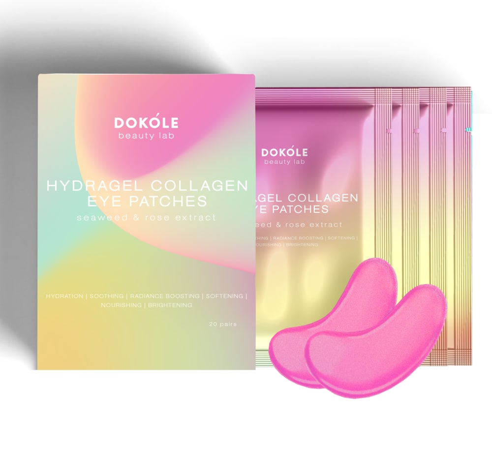
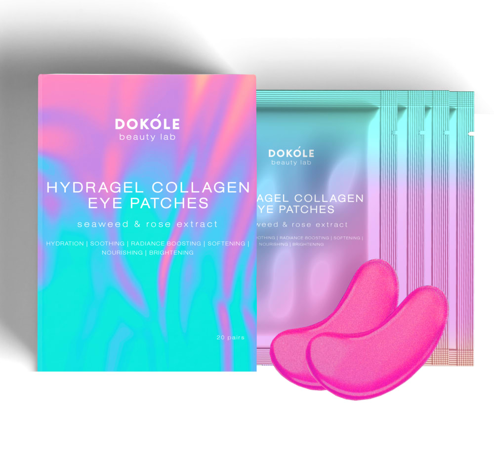
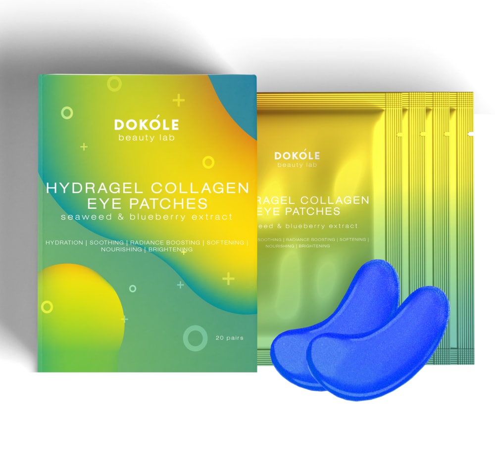
Based on the design, which eye patches(mask) would you rather buy?
Option B won this Ranked poll with a final tally of 28 votes after 2 rounds of votes counting.
In a Ranked poll, respondents rank every option in order of preference. For example, when you test 6 options, each respondent orders their choices from first to sixth place.
PickFu requires a majority to win a Ranked poll. A majority winner differs from a plurality winner. A majority winner earns over 50% of the votes, whereas a plurality winner earns the most votes, regardless of winning percentage.
If an option does not earn a majority of votes, PickFu eliminates the option with the lowest number of votes. The votes from the eliminated option are reassigned based on each respondent’s next choice. This process continues in rounds until a majority winner emerges.
Scores reflect the percentage of total votes an option receives during the vote counting and indicate the relative preference of the respondents. If there is no majority winner, look to the scores to see how the options fared relative to one another.
| Option | Round 1 | Round 2 |
|---|---|---|
| B | 36% 18 votes | 56% 28 votes +10 |
| A | 34% 17 votes | 44% 22 votes +5 |
| C | 30% 15 votes | Eliminated 15 votes reassigned |
17 Responses to Option A
A looks the most cohesive and stands out the most. B has nice colors but looks a bit off to me. C i do not like the colors
I like A because I like the muted soft color of the package. I think it looks the most attractive out of the three.
I like the gold and pink combination
I picked option A because I like its combination of lighter pastel colors.
Option A looks like it would be gentle. Option B and C might give me an adverse reaction to my skin.
I like the softness of the colors used in A. It has a soothing implication...it's relaxing. Option C is next - even though the colors are bit too bold, I kind of like that the color of the pads are totally different from the packaging. It makes it stand out. Option B is last - I don't like the neon iridescence in the design. It almost makes me dizzy.
I really like option A a lot better with the more pastel colors. I think option A is much nicer packaging.
A.. This was a hard choice for me because I really love all of them I went with option A because it's more of a lighter pastel And that helps the product that's on the right stand out better
A is my first choice because I think they would smell good together, it tells on the box what they will do for your eyes, and there is 20 in the package. B is my second choice because I believe these eye patches are the same as A, meaning the smell, what they do for your eyes and quantity. C is my third choice because I am not too sure of the seaweed and blueberry combination. but other than that they are the same as A and B as far as count, and what they do for your eyes.
I love A and B the most as the shade of pink in here feels a lot more caring and makes sense for a product like this I find. From there, I love A since the colors blend well and feel more gentle
I prefer this one just because the color of the packaging make it seem more calming and make it seem like it would help with destressing.
Based on the design I would like to buy option A eye mask which is very beautiful.
I chose option B because they appear the most relaxing over options A & C.
Light pink eye patch looks the best so i choose A. Blue does not suit well so option C is my last choice.
I prefer pink over blue, and prefer the pink and gold packaging over the pink and blue packaging.
option A cover looks attractive and light pink suits best for the product so its my top choice.
I like Option A the most. The color are vivid but also serene and very attractive. Option B is also quite nice and has a pleasing simplicity. The last option is perfectly fine but seem too loud and too over the top color wise.
18 Responses to Option B
The packaging color on B and the product color on B stand out the most to me. I really like them both and I also really like C as well.
these are ranked from the more unique to the least with option B being the more consistent option in theres of color theme
The pink and holographic packaging of B is fun and would stand out on the shelf. The pink adds a feminine touch. I would buy this just for the holographic packaging.
I am loving the colors of choice B that I am looking into these eye pads first.
The bright color is really stick out to me and make me want to choose that option
The colors and design is more eye catching and pleasing to see.
I prefer the color scheme of B the most. I feel that I can read the labeling easier. C and A I like equally as they are all nice colors.
The colors of this box makes the product look like it would feel cool and soothing.
I really love the packaging color in option B. The vivid teals and bright pinks are very nice. I also really like the bright pink color of the eye masks themselves. Option A's packaging has a nice peaceful vibe. I don't love it (too much yellow/green) but I like it better than option C. Option C's packaging is way too yellow/green and honestly gives a very negative feeling for me. I don't mind the bright blue eye mask color (and actually prefer the mask color over A) but the packaging is just off-putting.
I chose the option that was easiest to read. The text is difficult to read on option A.
These colors feel more modern and feminine.
Teal and pink look absolutely gorgeous and striking together!
Option B and A's colours are dark and mixture of glowing so it was more appealing than option A. Then within option B and C, option B's colour was gives pleasant feel so it was my first option.
Based on design I would rather buy option B as the best design for eye patches. I liked this colors mixture, looks very appealing and lovely. Bright design.
Design, color, and how effective they appear to be.
I like the two pink options most and their packaging is more interesting and grasping, B won by far though because of how unreal it looks.
I LOVE THE PACKAGING OF OPTION B AND A. THEY LOOK SOOTHING AND LIKE SOMETHING I WOULD USE OFTEN
Based on the design of the packaging and these three options. I would like and enjoy the most and would it have a high probability of buying options B followed by C the most. I like the color blend on these two options the most I would enjoy something like this for myself or to make a gift in a gift basket or stocking stuffer for someone I knew who also enjoyed these colors. Option A is my least favorite compared to the other two I don't find the packaging and colors as fun and exciting.
15 Responses to Option C
C was my first choice because the little bubbles made it look liquid and made me think of moisture. B was second because I liked the look. A was third because it wasn't quite as bright as the others. They were all very close though because I thought all looked good.
I just like those colors best and it gives the impression of fresh and new.
They all look the same to me but I'm not a pink person, so I chose the blue
I think that these are all goo, but Option C is the best because the blue and green colors seem very hydrating. Option A seems gentle and delicate. Option B seems a little too intense.
better colors. looks bold. not everything needs to be pink.
I really liked the green color because it felt more natural than the other colors. It was hard to see the font in A against the pink background.
I loathe pink. So, B and A are out.
C has the most vibrant package coloring, and the two colors go well together, B is next in line for vibrancy and option A is the dullest package. The vibrant packages will catch the eye.
I chose C because it is very calming to me. If I am just going by design that would be my number one choice.
Option C with the color of blue for the eye patch mask is my first choice because it is a darker color compared to the others
I think the bright colors of C and B are incredibly appealing, and very unique compared to what is on the market.
The blue coloring automatically makes it seem like they would be more hydrating.
Based on the colors, C and B are bright so I chose them in first two positions. The yellow with blue combination is visually attractive than pink and blue so I chose C first.
Option C was my first choice because it is visually more appealing with soothing colors that makes this product relaxing and enjoyable to use. B was my second choice as I liked how attractive the package look and how easy it was to read. I chose A last because the colors were too vibrant for this type of product.
I like the blue. That is my calming color.
Explore who answered your poll
Analyze your results with demographic reports.


