Poll results
Save to favorites
Add this poll to your saved list for easy reference.
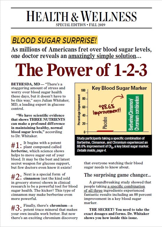
Which one of these mail pieces would you be most likely to open and read?
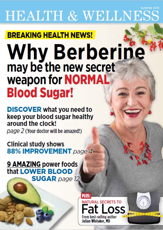
41 Responses to Option A
B has too much on it, it is overwhelming at first glance
A is easier and faster to read.
The pictures are more interesting.
A, the larger text makes it feel like a shorter more pleasurable read
A looks like a magazine layout, B looks like a something from the National Enquirer.
It's a much more inviting piece, seems less dry/technical. Presented more like the cover to a magazine instead of a piece of mail.
this one seemed to have more information and it has a nice image
This one seems more attractive and interesting. Seems like it would grab my attention right away.
Really grabs my attentioin and it appears to be giving a very positive spin on things which makes me want to read more
she looks so happy
the pic makes me want to read on
I liked that B listed a 123 approach, but I want to know more about the list of 9 foods. More pictures, less writing.
I would choose A. I like how the things are presented to me better than the one that has mainly an article.
Option A looks better
A is a more eye catching cover
I just love that 'Italian grandma' with the thumbs up. it's a pleasing, if not informative, image.
Option A does a great job of keeping it simple while highlighting the main points that will be discussed in the mail piece. Having a person on the cover also humanizes it, enabling one to relate more to the mailing. Option B is just too cluttered and it overwhelms the eye. I'd be concerned people would just glance at Option B and toss it without really looking at it. Option A catches the eye and engages the mind.
I love avocados so once I saw that on the cover I am intrigued to find out more about what kind of story they are being featured in.
The colors and the vibrancy allures more than the other. The other is too plain and has too many words.
I think A is better because it seems more legitimate, like a magazine article. B looks like a fake news article, and no one trusts those.
More inviting mail piece to open.
PREFER THE WAY A LOOKS
I chose A because the picture of the woman is inviting and engaging.
The picture of the elderly woman makes it seem more authentic.
Option A, I like because there is so many images on the cover.
This seems welcoming and willing to get one positive
I would most likely open up and read A because of the graphics. The pictures draw you in more then a bunch of text does.
I choose Option A because it looks more like a magazine article where option B just looks like an add trying to sell me something.
Too much reading on other choice to peak my interest
I think this option is more inspiring and exciting I would be more likely to try something with this type of advertising
The summarize facts placed in this product presentation makes me believe in the product and I would love to learn more. Option B has a lot of information but I have to spend more time on it.
I think the background picture and a photo of the woman stand out a lot more
A is slightly more appealing with the design and font
I like that you have the woman. It also show the avocado. The other is just words and is rather bland.
It's full of pictures. Looks very entertaining. The other one is really boring looking.
I think both of these seem a little ridiculous but I picked A because the photos of a person and food is more inviting than just plain black text.
stands out a lot more
These are both very obviously ads, but I appreciate the effort that went into option A making it look like a magazine.
the other ad looks boring
Choice A has better design implementation with images and words that invite me to open and read the mail piece. I find Choice B plain and boring compared to A.
"A" = clickbait/more attention-getting
9 Responses to Option B
I don't care of the giant picture of the lady, I rather have the info there to see for myself.
Both are bad but B looks a tiny bit more credible since it has more text
I like the information that is provided here that makes me want to read more.
Graphics are garish and distracting.
I like the bar graph.
Option B sounds like it is much more professional and fact-based.
This piece feels more reliable and informative.
Option A looks like it is marketed toward elderly people, and I am not an elderly person.
This one looks more like an almanac, which appeals to me.
Explore who answered your poll
Analyze your results with demographic reports.
Demographics
Sorry, AI highlights are currently only available for polls created after February 28th.
We're working hard to bring AI to more polls, please check back soon.


