Poll results
Save to favorites
Add this poll to your saved list for easy reference.
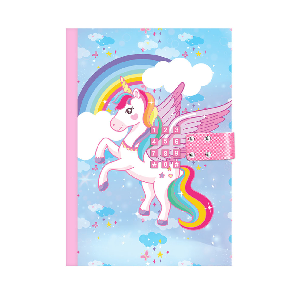
If you were shopping for an unicorn journal with lock, which would you buy?
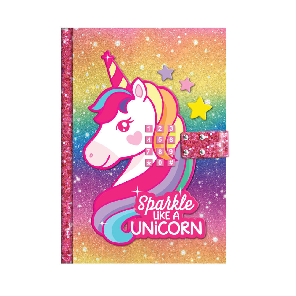
9 Responses to Option A
Option A probably looks more attractive and catchy than other option.
These colors are more vivid and modern feeling. They also don’t feel as childish which is more appropriate for a pre teen.
What I like about choice A is I didn't even realize the numbers on the cover that I would purchase this one for sure
A looks better in term of the art design on the cover it looks nice and aesthetic and the vibrant colors for the cover makes it even better.
I would pick A because it has more sparkle and I think my daughter would like that more.
A looks better in term of the horse drawing and the colors used very vibrant and aesthetic.
The sparkles are what do it for me. If I am going to have a unicorn journal, there had better be glitter and sparkles to go along with it. It just makes it stand out more and I like the rainbowish background on it as well.
My girls are really into unicorns and very bright colors.
This unicorn journal is very beautiful! I love the pink gem crystals that are aligned onto the sides of the journal. I love both of them, but this one is my favorite. The fuchsia color is very beautiful!
7 Responses to Option B
The colors are soft and moderate, they are mild and lively too. I like the more elaborate image of the unicorn, it is detailed and well crafted. The blue background makes the design brighter, more visible and very appealing. It stands out more vibrantly.
i think option B is more appealing to me as the unicorn in option A looks a bit angry
I selected option B because the design is easier to see. I can see the unicorn and the numbers on the journal clearly. The design is bright and beautiful.
I prefer seeing the whole unicorn versus just it's head. I like to see that the unicorns tail is rainbow colored as well. I also don't need the sparkle like a unicorn phrase on the front of it.
B is more traditional color and looks softer and better taste
I like option B better because it's more neutral and doesn't seem as childish as option A.
I honestly don’t like either option because the buttons are over top of the main design and it just looks awkward. But having to choose I would pick option B. This option at least the buttons aren’t on the unicorns face.
Explore who answered your poll
Analyze your results with demographic reports.

