Poll results
Save to favorites
Add this poll to your saved list for easy reference.
If you were shopping on Amazon for Bible verse cards, which design would you be more likely to purchase for yourself or as a gift?
Option B won this Ranked poll with a final tally of 16 votes after 2 rounds of votes counting.
In a Ranked poll, respondents rank every option in order of preference. For example, when you test 6 options, each respondent orders their choices from first to sixth place.
PickFu requires a majority to win a Ranked poll. A majority winner differs from a plurality winner. A majority winner earns over 50% of the votes, whereas a plurality winner earns the most votes, regardless of winning percentage.
If an option does not earn a majority of votes, PickFu eliminates the option with the lowest number of votes. The votes from the eliminated option are reassigned based on each respondent’s next choice. This process continues in rounds until a majority winner emerges.
Scores reflect the percentage of total votes an option receives during the vote counting and indicate the relative preference of the respondents. If there is no majority winner, look to the scores to see how the options fared relative to one another.
| Option | Round 1 | Round 2 |
|---|---|---|
| B | 36.67% 11 votes | 53.33% 16 votes +5 |
| A | 43.33% 13 votes | 46.67% 14 votes +1 |
| C | 20% 6 votes | Eliminated 6 votes reassigned |
Age range
Education level
Gender identity
Household income range
Options
Racial or ethnic identity
Religious affiliation
13 Responses to Option A
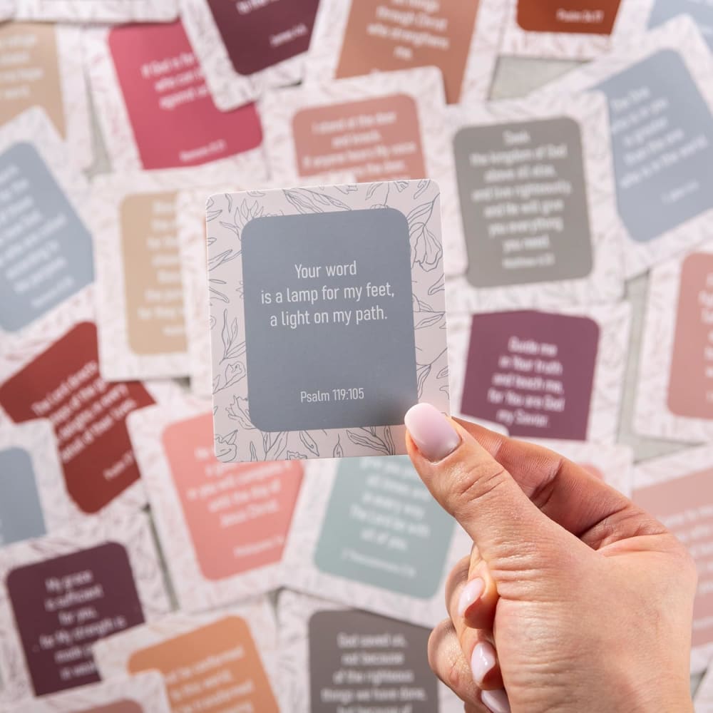
A looks to be the most soft and kind- reflecting a bible verse card
I would like to go for the option A at first as the look is very cute and sweet the white borders with minimal detailing are very pretty looking . Then i went with the other options as per their look .
i would purchase this one because it looks wholesome and caring
I love the pastel/muted colors used in option A- I think that this is the most aesthetically pleasing option.
A first because I like the fun, neutral and aesthetic like colors which makes it the most appealing C second because I like the bright and vibrant colors B last because the colors are a bit too dark which makes it the least appealing
I love how small A is, they are all easy to carry around but A really stands out with the size. I love the design on B a lot because of how simple it is as well.
I like the frame look of A the most. B is more simple but still looks nice. Not a fan of the wavy border of C.
It's the more interesting, more attractive design. Cleaner looking.
I picked option A because I like the more vertical orientation of these cards.
I preferred option A the most because of the more vertical orientation of the cards compared to the two other horizontal choices. I also thought that the color palate for option A was more in line for what I would expect bible cards to be. The colors in options C and B seem a bit too bright for my taste. That is why I would most likely choose option A for myself of as a gift.
Option a the lighter colors of the background on the cards make the words easier to see and read especially for older people
Option A cards a bit smaller and have an nicer boarder design on them. I like the color scheme and font of option C cards, they're a little bit bigger, but still a nice size.
While I am not a super religious person, I like the design of the cards of choice A that I would look into these first.
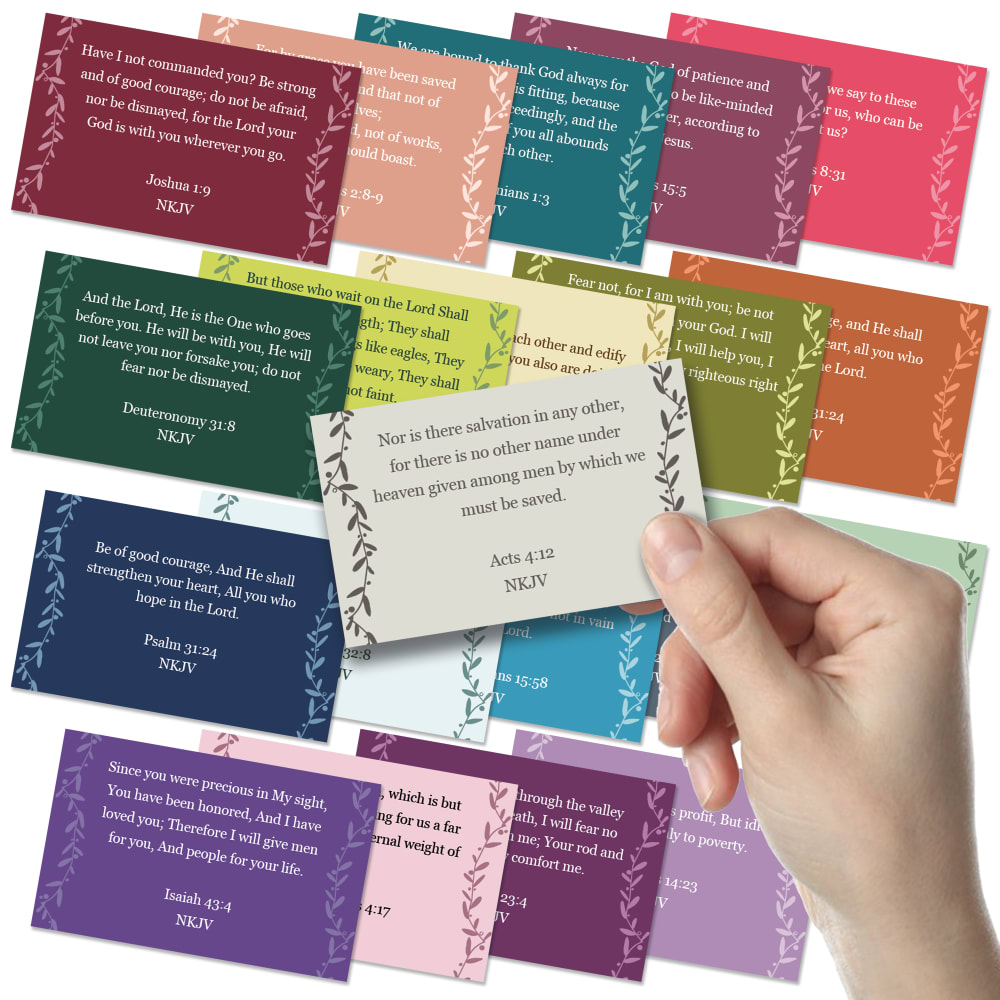
11 Responses to Option B
These cards look best in landscape orientation without any borders.
I like the design and font of these cards more over the two other designs
B is very classy and professionally done. I would keep them or give as a gift without feeling they look cheap.
I like this bible verse set's color scheme and art. This bible verse set has a more solid and eye-catching color. The leaf art on this bible verse set feels pleasant to look at. The other bible verse set has a light and less appealing design. I will click on this bible verse set on Amazon shopping to learn more about its designs and buy it.
Option B is in first place, because these are the cards I'd most likely choose for myself. They're bright and cheerful. Option A is second, because they're the choice I would pick as a gift. The colors are more subdued and elegant. Option C is last, because they're kind of unattractive. I would buy them if I had no other options to choose from.
The cards in B and C are colorful, the letters in B is black which is bold and easy to ready so I'll buy B.
b simple easy to read and to the point not to much unneeded things main thing is whats written on it
The letters in black font is bold and easy to read so I'll pick B. As the colors of the cards in C is bold, I ranked it second and dull A last.
I like the color which seem fun and that you get to pick from a random one which gives you a lot of variety and surprise
Option B of the floral design looks more elegant and would work well for mothers.
Option B of the floral design looks more elegant and would work well for mothers going through rough times.
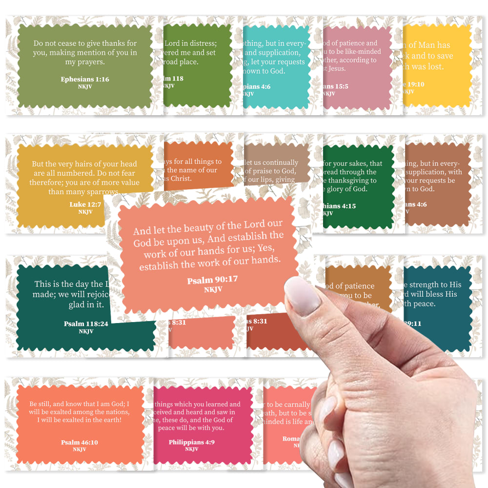
6 Responses to Option C
The colors used on these cards are bright, positive and fun.
I chose Option C for its color and overall design of the cards.
I like the color scheme and design on this set the best. I like that a darker color makes up the main portion of the card. It looks really nice having the white border and trim around the outside. It is easy to read and the border brightens everything up
The brighter colored background on the cards in both Options C & B do the best job of making the printed verses noticeable due to the enhanced color contrast between the text and background. That being said, I like the borders around the cards in Option C the best and think they help enhance the printed wording.
I like the color set of B. But I think C has a more impactful design with the nice borders.
The colors of these cards of C flow nicely. The first two choices are for the smaller rectangular shape. I also like the direction of the printing versus A.
Explore who answered your poll
Analyze your results with demographic reports.

