Poll results
Save to favorites
Add this poll to your saved list for easy reference.
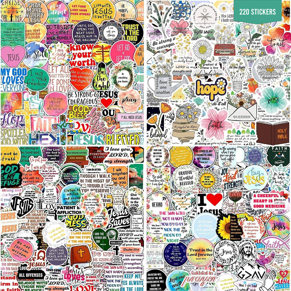
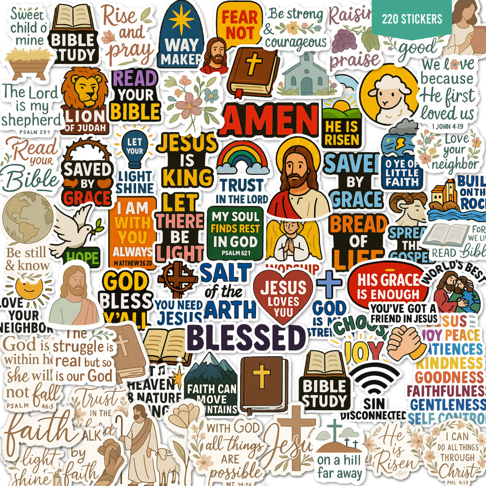
If you were shopping on Amazon, which Christian sticker design would stand out to you the most?

Option C won this Ranked poll with a final tally of 18 votes after 1 round of vote counting.
In a Ranked poll, respondents rank every option in order of preference. For example, when you test 6 options, each respondent orders their choices from first to sixth place.
PickFu requires a majority to win a Ranked poll. A majority winner differs from a plurality winner. A majority winner earns over 50% of the votes, whereas a plurality winner earns the most votes, regardless of winning percentage.
If an option does not earn a majority of votes, PickFu eliminates the option with the lowest number of votes. The votes from the eliminated option are reassigned based on each respondent’s next choice. This process continues in rounds until a majority winner emerges.
Scores reflect the percentage of total votes an option receives during the vote counting and indicate the relative preference of the respondents. If there is no majority winner, look to the scores to see how the options fared relative to one another.
| Option | Round 1 |
|---|---|
| C | 60% 18 votes |
| B | 33.33% 10 votes |
| A | 6.67% 2 votes |
Age range
Education level
Gender identity
Household income range
Options
Racial or ethnic identity
Religious affiliation
2 Responses to Option A
I like these the best I like how they sayings on them and how much more colorful they are
The nice tiled squares all look good. The squares are nicely chunked up also
10 Responses to Option B
These stickers feel more simple and more feminine.
Option B is absolutely beautiful! I would be glad to have some of these stickers. Option A is also acceptable. Option C is a little bit rough and cartoonish, but not bad at all.
I like the presentation of the stickers in optoin b, almost like a globe, round with no edges, optoin c i prefer over optoin a which is too cluttered
I really like the circle. It just adds a nice bit of detail to it. The other two are OK. I just prefer the shape of option B the best.
I would choose "B" because this one is beautiful and it is not so stuffed full. I can see God, Jesus, and the Lord all over it.
I feel like a round design I like that the it represents the circle of life.
I liked option B and the circular shape and I could see and I heart Jesus sticker, my favorite.
I like these cartoon designs the best of the different options
I like that there is a balance of bold colors and pastel colors. I also like that there aren't so many words but shapes and designs also.
Option B shows even balance of color and white space throughout.
18 Responses to Option C
I like the art styles of C and B a little more than A. A also doesn't to seem to have as many pictures and are mostly words.
I love the variation of stickers in C, there are colorful option and there are more aesthetic options that verses. I also love the look of B with the types of styles and A is also great because it's another variety pack. All of them are great, but I would get C.
I like option C because the text on the stickers is larger and easier to read.
I would choose item "C" and then "B" because of the Jesus stickers that are clearly present.
C really stands out and makes a statement
Choice C seems to have a greater variety of stickers. They aren't all text, which makes them more fun
I chose C because there are more than just text stickers and has a good variety.
This design has many of the darker colored font, which is easier to read, and I see a lot of the Christian themes
As a Catholic, I love these so much. I ranked in order of which pack seemed to have the most variety. Not just how different the stickers are with font and design, but I was also looking for color. I like a little fun in my stickers.
I like the bold, colorful choices that are in the middle. They stand out and draw the eye in.
Option C makes it the easiest for me to see what the various stickers say, so I prefer that.
C because to me it is balanced. I can see the big pictures and they attract attention and stand out, don't get lost in the crowd. B is next though much of it fades into the background. Then A is just too crowded. Like being in a crowd of people for me, I avoid that. So, I would avoid this example of stickers.
I highly prefer the image in option C because the stickers are displayed closer up with the phrases more easily readable.
The large AMEN, Jesus and rainbow in the center of option C stood out to me the most.
My first choice would stand out to me the most because it is very vivid and eye catching. This is the one that really draws my attention in the most.
Options C and B are designed so that many of the stickers "jump out" at me immediately. Also, the overall circular design in option B is unusual and catches my attention. The stickers in option A all blend together to me.
I really like that this set has really bright and bold colors and fonts. They stand out better that way.
I prefer C as there is more variation to the color and the words are more prominent.
Explore who answered your poll
Analyze your results with demographic reports.

