Poll results
Save to favorites
Add this poll to your saved list for easy reference.
If you were shopping on Amazon, which design for a Bible verse jar would you be most likely to purchase as a gift or for personal use?
Option A won this Ranked poll with a final tally of 20 votes after 1 round of vote counting.
In a Ranked poll, respondents rank every option in order of preference. For example, when you test 6 options, each respondent orders their choices from first to sixth place.
PickFu requires a majority to win a Ranked poll. A majority winner differs from a plurality winner. A majority winner earns over 50% of the votes, whereas a plurality winner earns the most votes, regardless of winning percentage.
If an option does not earn a majority of votes, PickFu eliminates the option with the lowest number of votes. The votes from the eliminated option are reassigned based on each respondent’s next choice. This process continues in rounds until a majority winner emerges.
Scores reflect the percentage of total votes an option receives during the vote counting and indicate the relative preference of the respondents. If there is no majority winner, look to the scores to see how the options fared relative to one another.
| Option | Round 1 |
|---|---|
| A | 66.67% 20 votes |
| B | 20% 6 votes |
| C | 13.33% 4 votes |
Age range
Education level
Gender identity
Household income range
Options
Racial or ethnic identity
Religious affiliation
20 Responses to Option A
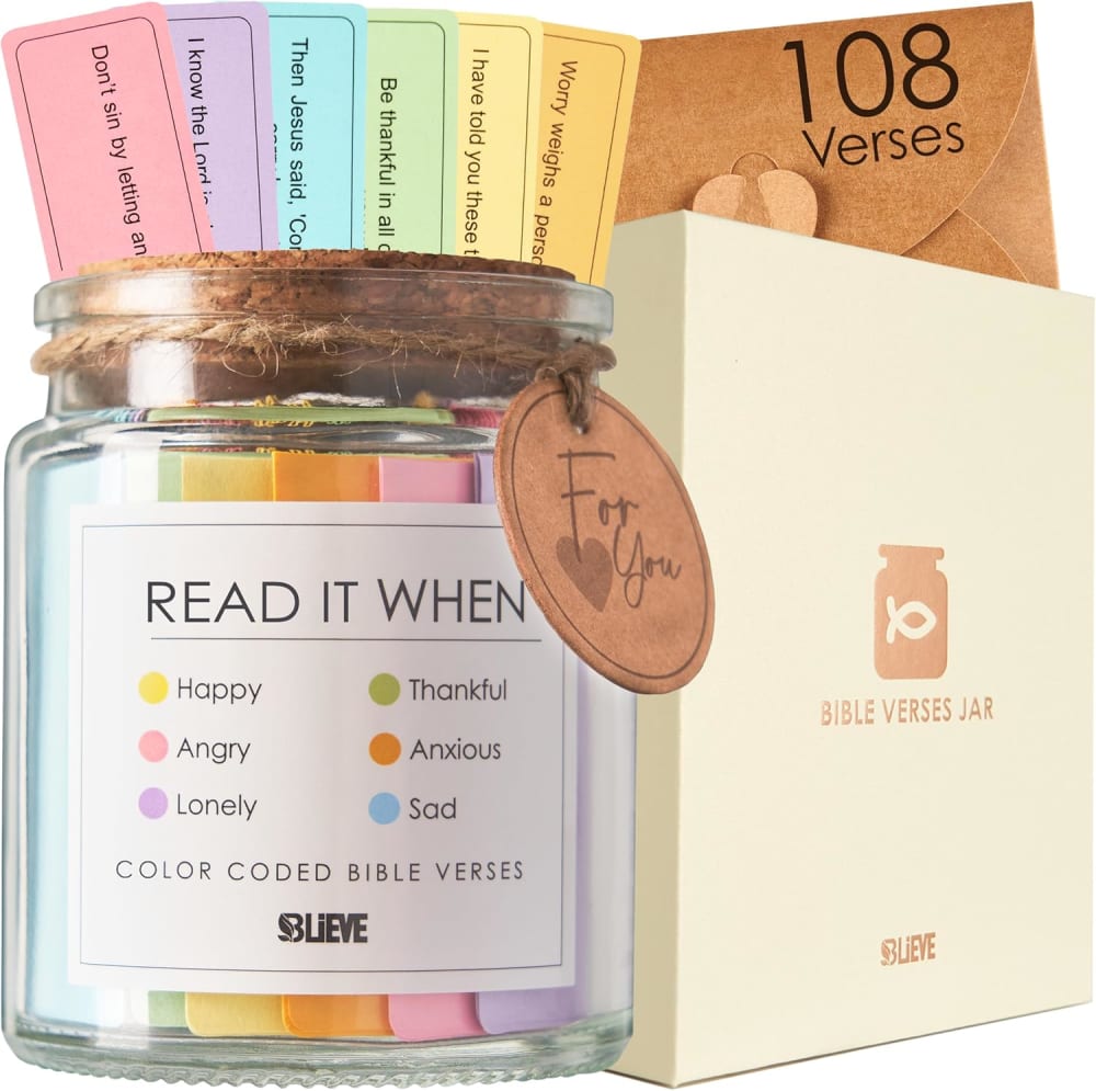
This text on the label is less cluttered, larger and easier to read.
I like the simpler, cleaner design of A. Really like that font. Looks clean and light, and easy to visually process.
I like the light colors of option a. They look more welcoming and peaceful.
I think all three of these look very nice. I chose option A because the lighter packaging, the leather looking nametag and the twine give the jar a handmade and rustic look. I would buy something like this to give to my mother, I know she would appreciate it.
A is my first choice because I prefer the white box rather than the black boxes in B and C. I also like the white label and the light colors used on the label and papers. I also like that it states how many Bible verses I get in the jar. B is my second favorite, I don't like the black box, but the label is pretty. C is my least favorite, I don't like the black box or the label.
I like the simple design of option A. I also like the wording "Read IT when" instead of "read ME when".
I like the information that the jar contains 108 verses.
I like option A the best, because the layout and closer view of the product are more compelling than the other option. The printing on the label is light and happy, and easy to read. Option C is okay, but seems darker and the printing on the label is not as attractive. Option B is also darker and the printing on the label is tougher to read at a glance. It also is an unattractive font.
I chose A because it is larger in the picture and it tells me how many Bible verses there are and it says, "read it when" and I like that better than "Read me when"
This is a cool idea. I like the lighter-colored verses of A and B and the extra space around the text.
I prefer choice A. I like that the image indicates how many bible verses are included & I like that the verses are boxed in on the paper. I think it looks better than the others.
I liked choice A since the product is organized in a way that makes it look more eye catching and appealing.
I like the softer blend of colors with the jar and box. Also, the fish logo is appealing.
Pretty interesting concept, I think A works the best with the easy to follow along with instructions and clear design.
The zoomed in photo gives off good detail of the choice well. Much better than choices B and C
I like the slips of paper the most in this verse set; I like the colors and I really like the thin lines that make the slips look more finished. The less heavy font is also easier to read; the others look too dark.
I like the fact that the jar is more zoomed in and larger in this image so I can see it in more detail . Ultimately , this is what matters in terms of the product placing .
These are all very nice , uh , for myself , I chose option A , um , I like to , I like the bubble verses I think they're fantastic . I like the text and the overall presentation uh of this one the best .
I think the color and design of the paper on Option A looks the best.
I prefer the package and muted colors of Option A. The colors of Option B are more appealing than Option C, which is too dark and bold.
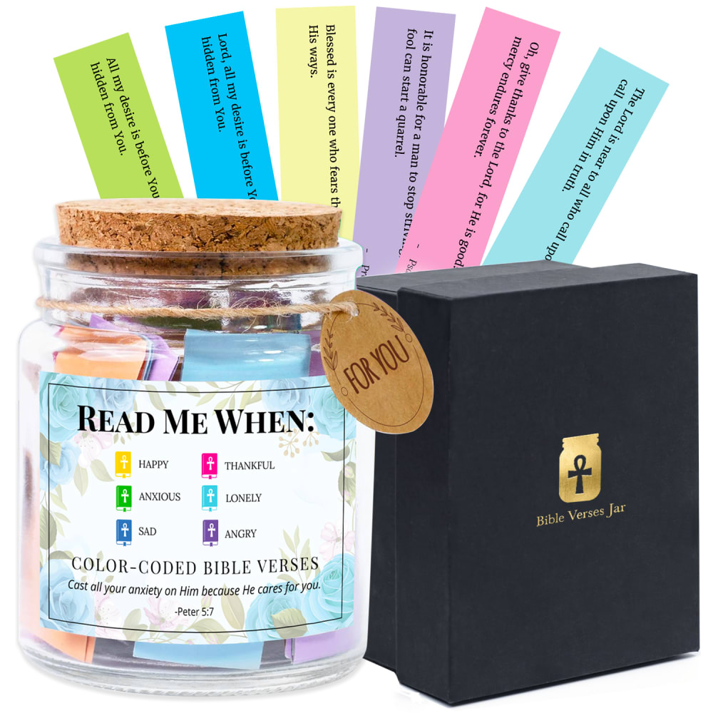
6 Responses to Option B
I like the color scheme on this one a lot. All of the blue around the border of the label is great. Light blue is my favorite color and this is a great shade. I like the bold font that it has on the top too
I prefer option B. I like the color of the paper slips and I like the font and length of verses. I like the color on the label.
I like options B and A almost equally. I really like the pastel floral label with the cross symbol on option B. But, I like the ivory box much better in option A. I also like the lettering/font and the square lines/border around the bible verses in option A. I wish there was a way you could combine both product designs.
B is more prominant as far as the letters and words.Brighter and more to my liking
First of all, I like the black and gold packaging boxes in Options B & C which make the set feel more premium quality. Option B appeals to me the most though due to the blue/white floral design on the label.
I really like the labeling on this jar better than the others. It is more appealing.
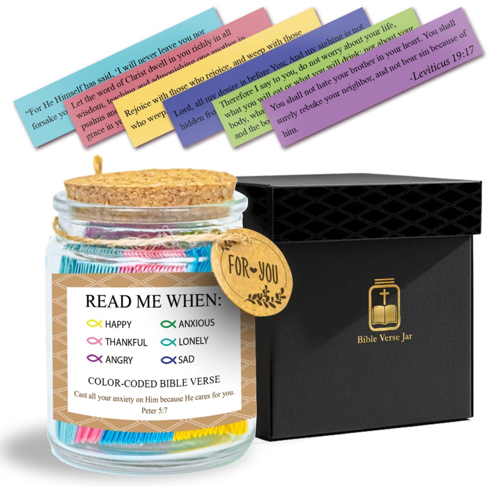
4 Responses to Option C
Does the best job of showing me the verses included
I like the fish logo as bullet point icons as my top choice. Has bible connections without coming across as corny
Option C was my top choice for a few reasons. First, I liked the black and gold box. Second, I preferred the logo on that box to the other options. Third, I liked the brown background which had a certain Middle Eastern feel to it. Option B had the coloring of the box I liked, but I didn't care as much for the logo. Option A was just bland with its color usage and even the jar was less interesting than the other two.
C. looks more like a complete set, easy to see how the verses look and overall is more eye pleasing.
Explore who answered your poll
Analyze your results with demographic reports.

