Poll results
Save to favorites
Add this poll to your saved list for easy reference.
If you were shopping on Amazon, which product would you click on?
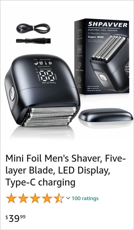
39 Responses to Option A
A seems more useful because of the charging number on the side
I think the screen on the side would be easier to see the information.
Five layer seems like you can get a more precise cut than four.
I would likely click on Option A over Option B. In my opinion, Option A's design looks a bit better than the other.
I prefer having less accessories because I almost never use the extra ones
The image is too crowded in Option B! I also like some helpful copy on the razor’s package.
The angle of the design in the pictures better. The other one makes it look like you're getting to razors too because the case is a little bit misleading
Option a has more blades for better closer shaving
I rolls prefer the added layer, so would choose Option A.
A has 5 blades, I’d want to click on it to know why it has that many.
The display is more prominent and makes this on initially appear more advanced.
I picked option A because it looks like the product has multiple more blades.
I like getting the extra layer for the same price as one less foil layer.
A, I like the digital display and it looks more ergonomic.
The position of the handle on A makes it less susceptible to accidentally pressing it while using it.
I like the sleek ergonomic design, I want to hold this one just to see what it feels like and try it out.
I like option A as you get a slightly better look at the product to make a better purchasing decision.
I would click on the shaver of choice A first to see how well it works and the benefits of this shaver.
I like to have a digital display for the readout, make it easer to see what setting I am using
The easy button for ON being on the side of the shaver is quite nice. This makes for easy access to shaving and operating the shaver
Option A of the LED screen is bigger and easier to read the digits better.
More simple and less clutter so I would click on that one
I chose option A because the packaging is more informational.
I like it with that digital face on it, looks great.
choice A seems like a more simplistic design which to me would be great, less to worry about and the fact the display is on the side rather than on the end of the shaver.
I like the fact that the screen is on the side because it appears that the screen is larger and can project more information
I like the layout better in the ad and I also like where the digital information is on the side of the shaver as well.
I like the digital display on the front of the razor and the sleek style of the razor.
The main reason I chose A is the digital display on the shaver with the numbers caught my attention right away and got me to look at everything else in the image. I also think the overall image looks more clean and visually appealing because it doesn't have as many things in it as B, I think B looks kind of cluttered because it has a lot of things in a small space. Also, I like that A has 5 blades instead of 4 because that will give me a cleaner shave and it's nice that the box has a lot of info on it so you can easily learn about the shaver without even having to check the listing.
Having the shaver stand alone makes it easier to see the size and the features. I like know how palm size it is.
I would click on Option A. I feel like Option A looks more organized, and I feel like I can see each of the separate components better. The shaver in Option A also looks more compact, and the whole package seems like it involves less stuff to have to carry around or deal with. The layout and look of Option B seems cluttered to me and like the shaver involves too many pieces and parts. I would click on Option A because it seems like the product I want, clearly visible, without too much other clutter.
1. A - If offers a five-layer blade, which may give a closer shave than four. 2. B - It looks bulkier and has on less blade, which could mean slower shaving.
A is a five layer blade compared to B's four layer.
Option A shows the main section of the product up front and clear. Option B has 2 different pieces up front so it makes the display look bulky and crowded.
While both images are quite complete, A looks a little cleaner and less busy.
I like A because it shows the LED display in action and lets you know what it will look like when you get it.
The product and packaging is overall a well better design. A compact display of what it offers.
I like where the display is on A; you can see it much more easily while using it than on the other one.
the other one has a duo tone design and it just seems weird, keep it all one color please
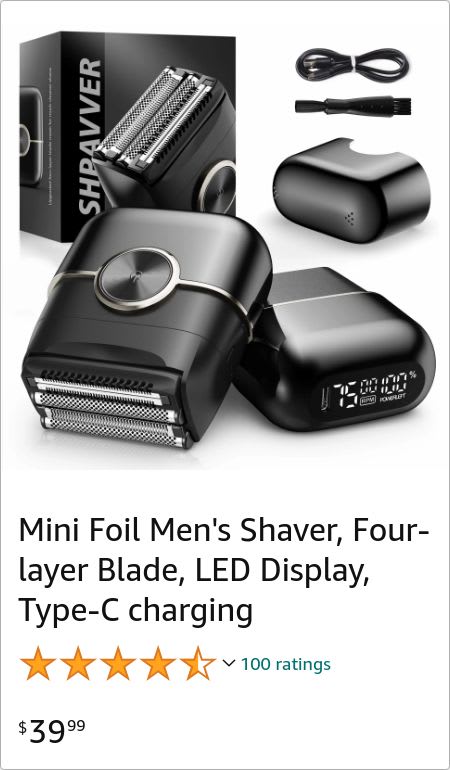
61 Responses to Option B
I think that Option B looks amazing. I think it would be easy to hold while going through the shaving process. I like how it is smooth and sleek overall!
I like b better as to me it looks better quality and the photo is laid is better. I like how the status screen is on the top than on the side. it is much easier to see the screen on the top
I prefer B. I like the shape and design more because it looks more comfortable to hold.
Option B has a thinner profile, making it more comfortable looking to hold, plus the cap is larger and looks easier to take on and off.
Assuming they're of equal quality, I just prefer the design on this one. I like the viewer being on the bottom and the front just having the power button. Just looks like a more sleek, nice design
I prefer the more elegant design of the electric shaver in option B. It looks easier to hold than the bulbous rounded shaver in option A.
I like the big button on the center of choice B. It looks easier to use
the more slight and monotone color shown for this one is more attractive
Option B appealed to me more because it has a better shape and color for the shaver.
If I was shopping on Amazon I would be more likely to click on option B because this option looks like it is more high tech.
The opposing option, A, just looks like it would slip out of your hands easily. It looks like you could fumble it and break it on the first try. Option B looks much easier to grip. It's all about being easy to use
B seems like it would be easier to hold and control.
I think that the size and design of this choice looks much more appealing and easier to grip than the other option.
I like B as it shows you more of the overall product.
I prefer B because it would be more comfortable in my hands since it looks more thin and easy to hold than A.
This option looks more ergonomic like I would have a better grip on it and more control of the direction of the shaver.
I prefer this one since it has a big button in the middle, which makes it seem like it will be easier to turn off and on, and I prefer the larger cap size, since that seems like it would stay attached more easily than the smaller one. The shaver blades on the other one are also skewed, which makes that one look like a render instead of an actual device.
I like the design and the components that come with the set
I would click on Option B because the shaver looks bigger than the one in Option A, which I think would make it easier to handle.
I like B, it looks like it is easier to use and has a better picture of the accessories included.
I like the position of the display in B and I think A has too much going on in the blades and looks like overkill.
The circular accent in this option looks classy and confident for sure!
A seems too fat, I think it wouldn't shave as well.
I like b. Looks like it is easier to hold and use. Comes with more to help the shaving experience.
this view makes it look like you get more parts and gadgets as part of it when they spread out like this
The two razors stacked on B looks more appleaing and aligns with the box a bit more.
I get a better view of it from different angles
I like the two color scheme and the overall design of my top choice. It fits my style and needs.
I believe the pick I made at least it shows a bit more than the other pick making sense why I rolled with this decision I made earlier
I like the full look of the razor and the organized accessories. It is easy to see and comprehend.
I prefer to have the digital readout at the bottom of the product. This makes it easier to see the levels while it's charging.
This style stands out more to me. More appealing visually.
Option B because the design is a lot more modern and minimalist
I like the shaver in B. It looks like a very compact option which is also ergonomic in the hand, which is important.
In option B I get more of a sense of the product design and a clearer understanding of the included accessories.
I liked choice B because the inage is more organized and easy to focus on the product and what is being offered in the kit.
I don't care about the digital read but like B's design better.
I would go with this one. The other one looks like it might be too small. This one would be more comfortable to use.
I like that close up look at the main piece with the big circle button and the display clearly visible on this option.
Looks a lot easier to hold onto without slipping in the hand.
The images shown in Option B look more eye-catching to me, particularly the two bottom parts, which show the device from two different angles.
Option B. I like the position of the analog clock being at the top of the shaver instead of the middle of it. By design choice, I think option B is more attracting and more professionally made.
I would choose option B because I like how it shows the shaver and all the accessories. It is far easier to understand the product compared to option A.
I like the design and position of the LCD screen . On this shaver . I also like the way the image is represented . It showcases The front and kind of the back and side , so you see all angles of the product . And also shows the product box . And other items that it comes with .
I prefer choice B because the image shows me the shaver from different angles and I think give me a better feel for the product.
The design on this choice looks more compact and looks easier to use.
I feel like the actual shavers look more modern and sleek in this one.
More detailed view of everything included in the product package
B. looks easier to charge, the small compact design looks easy to hold as well as it has less areas for hairs to get stuck.
B seems like it would be more ergonomic. It would be easier to hold and use.
This one has a more sturdy look to it
I prefer option B . I like the size of the shaver . It looks like it would be easier to hold in my hand than option A .
I don't know , the other one that just seems a bit crowded and a little bit bulky .
I prefer the on/off button on the main "face" of the razor and the display on top (option B). This arrangement works best for how I hold and manipulated a razor.
My question is how many blades are enough? Too many moving parts leads to an unnecessary breakdown.
B looks like a better design and easier to handle. It's slightly longer giving a better grip.
Item B presents more info in the cover display, specifically what you should expect to be included in the package.
I really like both of these electric shavers . I chose the one an option B . I like the size of it , it would be perfect for travel , and I would get a lot of use of it . The price is great as is the color.
I prefer "B" because it looks more sleek and easier to handle.
I like the look better. It has a nice color scheme with the silver and black. It has a better shape that looks easier to use. I like the button in the middle of it too
the large button interface makes it an easy one click solution to use for the shravver design with B
Explore who answered your poll
Analyze your results with demographic reports.

