Poll results
Save to favorites
Add this poll to your saved list for easy reference.
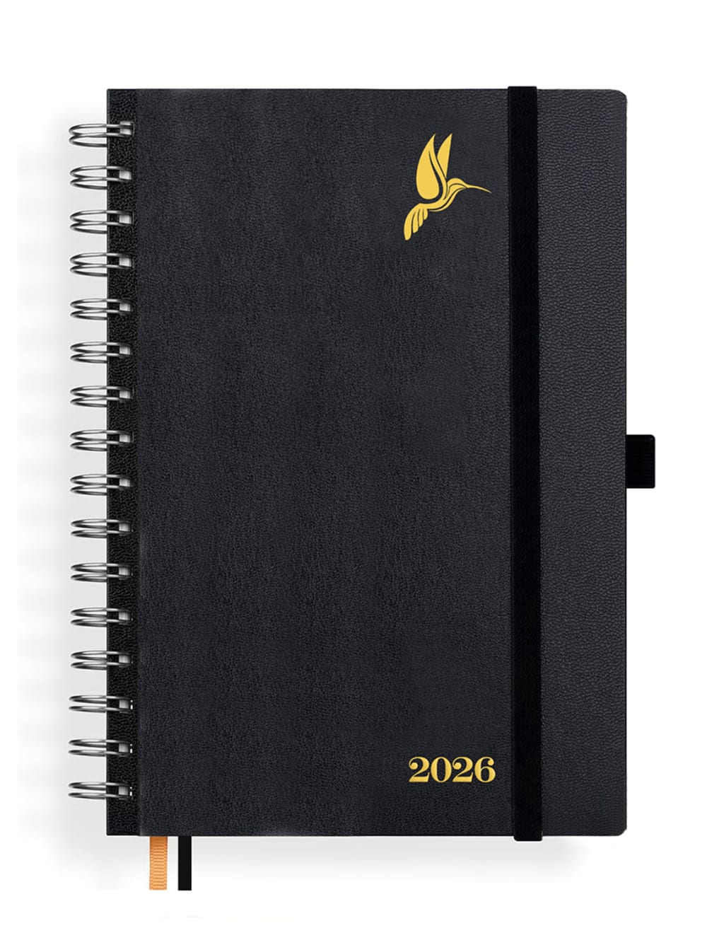
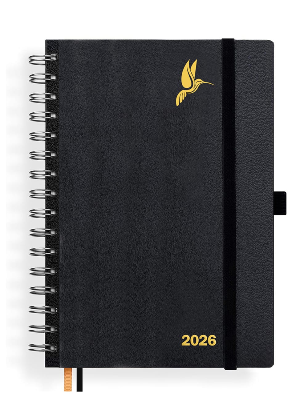
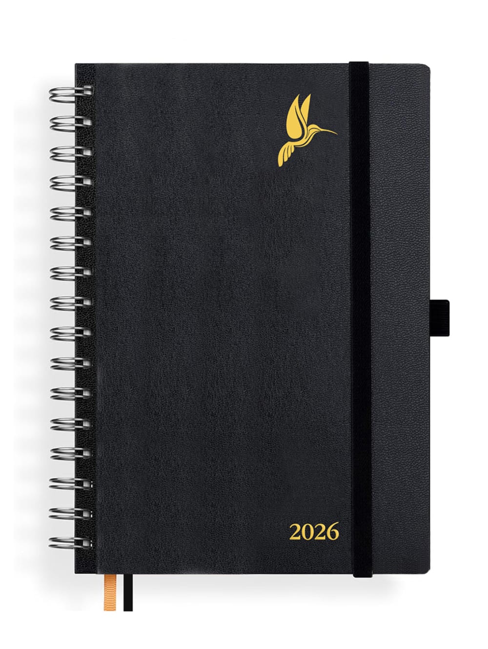
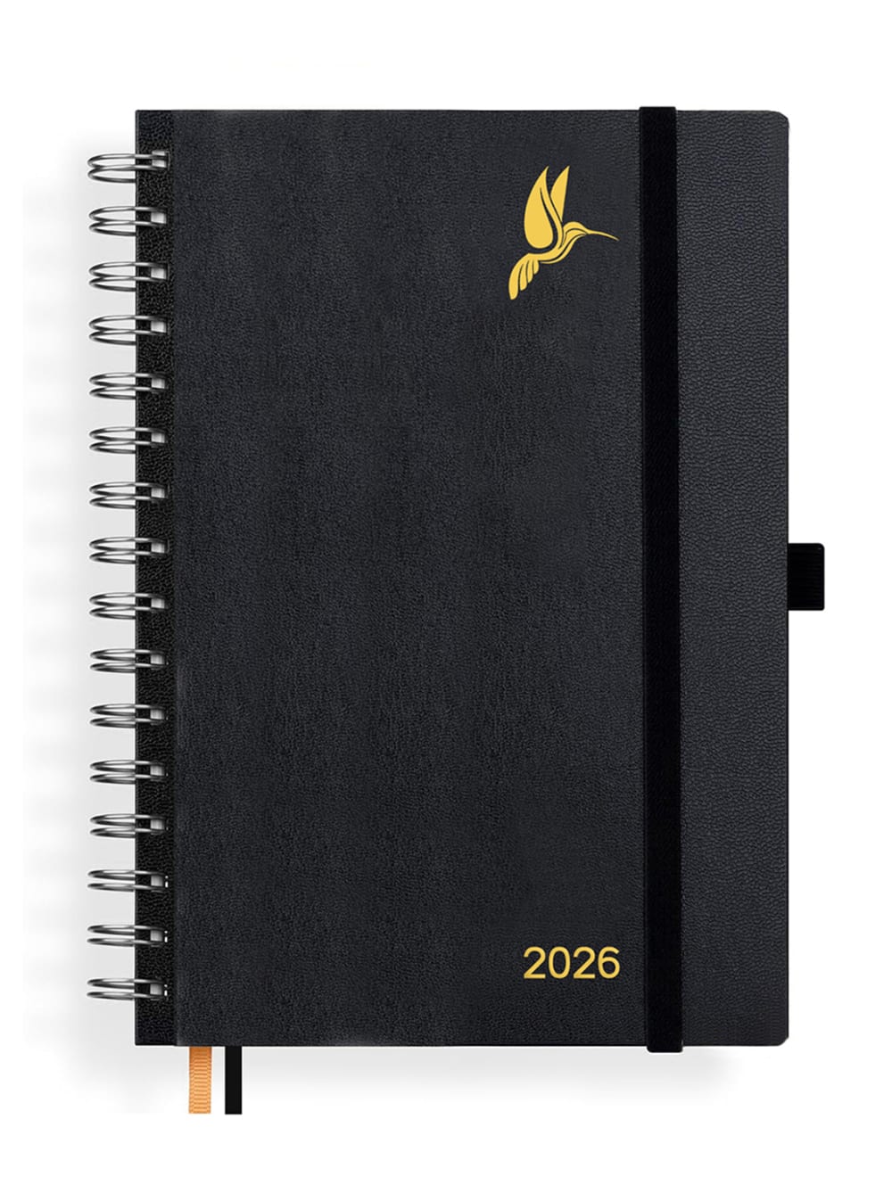
Please choose your favorite digital font design for the cover
Option F won this Ranked poll with a final tally of 29 votes after 5 rounds of votes counting.
In a Ranked poll, respondents rank every option in order of preference. For example, when you test 6 options, each respondent orders their choices from first to sixth place.
PickFu requires a majority to win a Ranked poll. A majority winner differs from a plurality winner. A majority winner earns over 50% of the votes, whereas a plurality winner earns the most votes, regardless of winning percentage.
If an option does not earn a majority of votes, PickFu eliminates the option with the lowest number of votes. The votes from the eliminated option are reassigned based on each respondent’s next choice. This process continues in rounds until a majority winner emerges.
Scores reflect the percentage of total votes an option receives during the vote counting and indicate the relative preference of the respondents. If there is no majority winner, look to the scores to see how the options fared relative to one another.
| Option | Round 1 | Round 2 | Round 3 | Round 4 | Round 5 |
|---|---|---|---|---|---|
| F | 32% 16 votes | 34% 17 votes +1 | 36% 18 votes +1 | 42% 21 votes +3 | 58% 29 votes +8 |
| B | 24% 12 votes | 24% 12 votes | 24% 12 votes | 32% 16 votes +4 | 42% 21 votes +5 |
| A | 14% 7 votes | 16% 8 votes +1 | 22% 11 votes +3 | 26% 13 votes +2 | Eliminated 13 votes reassigned |
| D | 12% 6 votes | 14% 7 votes +1 | 18% 9 votes +2 | Eliminated 9 votes reassigned | |
| E | 10% 5 votes | 12% 6 votes +1 | Eliminated 6 votes reassigned | ||
| C | 8% 4 votes | Eliminated 4 votes reassigned |
Show answers in:
7 Responses to Option A
I find Book A with the cursive script the most beautiful because it is more pleasant to the eye. It looks more elegant. While the others are similar and sans-serif. Answer A gives the book more elegance.
The number A is my preferred font design that I use in all my emails or letters when writing. It looks the best to me personally, and then all other fonts follow. They almost look similar.
I like the light ornate design of option a. Not too thick or too sterile and boring like option d. I have sorted the others in order of how much I like them.
The variant A stands out strongly. The script form is modern and future-oriented.
I find A the best because the font is extraordinary and looks beautiful. B, as well as all other products, are quite simple.
I find numbers with curves more beautiful and they look more natural.
In the first selection, I like the dark color of the cover best. Also, the length of the ribbons is appropriate.
12 Responses to Option B
I like version B the best, apart from the fluttering hummingbird, the font design of the year is clear and factual, just as I imagine it for a cover.
B is very good here, as it is bold and clearly recognizable. A is very bad, as you simply cannot recognize it well, there is not really a difference in between.
Because the year stands out the most. The cover is best structured.
I chose this because you can see the year most clearly there, otherwise I find all calendars very similar but good. But it could also be available in different colors.
Is best to read and is easily recognizable, that's why I chose option b.
Option B looks the most stylish. The rest of the calendars look normal except for answer E. There, 2026 is definitely too blurry and printed too small for me. In general, however, I am not a fan of monochrome surfaces on pocket calendars.
Sorted by: Large enough to be easily recognized and because it is "unadorned". Whereas the latter is exactly the opposite of optimal.
The chosen font cover is simple, straightforward, and very readable. It fully serves its purpose.
I prefer the straightforward font. The year should not be depicted too small either.
I sorted my priorities first by readability and then by beauty. On the smartphone, everything was quite small.
The clarity of the writing is clearly recognizable in 2026. And that's why this order. It is extremely important to quickly grasp 2026 and also clearly.
I like the larger and thicker font best. It's just better and easier to recognize.
4 Responses to Option C
I prefer thinner numbers more than thick squashed numbers. The C, that is the first place, has thin but not too thin numbers; moreover, they are larger and better visible at a glance.
There are almost no differences, only minimal details, but I like the order best this way. In C, I like that the font is not too thin and not too bold.
I would choose option C. I think the yellow lettering stands out best there. The black is plain and simple. Good ring binder.
I think the cover is better because the voglel is more recognizable there. And the jar comes out better
6 Responses to Option D
The font I chose is simple and oriented towards objectivity, without frills and not too bold. It is a font used by high-quality brands such as Apple.
Everything is great and nice, not too big or small, the color matches my needs. Simple and appealing.
What should I elaborate on, I like the numbers in D better because they are thicker. I don't like this filigree so much.
Lettering D is modern and timeless. Lettering C is modern and almost timeless. Number F is extremely clean. Font B is almost too intrusive due to its thickness. Number E is too old-fashioned and no longer contemporary. Lastly, there is Lettering A: it is too thick and outdated.
The font I chose is factual and modern, without frills, and is also used by large companies such as Apple. It is therefore ideally suited for a calendar.
All variants are readable. However, the most preferred variant stands out the most and is clearer to read and recognize. Therefore, I would prefer Cover D. I like the others slightly less.
5 Responses to Option E
Hello, I find everyone very great and the font is different in each booklet but great, I would definitely buy it because I always like to use something like this for private things. I chose number 1 because I liked it best.
I find the ranking best and most individual this way because it appears so eccentric and stands out.
What I like about the first one is that there is no offset edge visible on the left. The font looks optimistic, you can look forward to the new year.
I made my choice based on the font. The font design on Cover E is curved yet simple. In my last selection, the font design was too plain for me.
I find the calendar very simple. Therefore, I also prefer an unexciting and simple font.
16 Responses to Option F
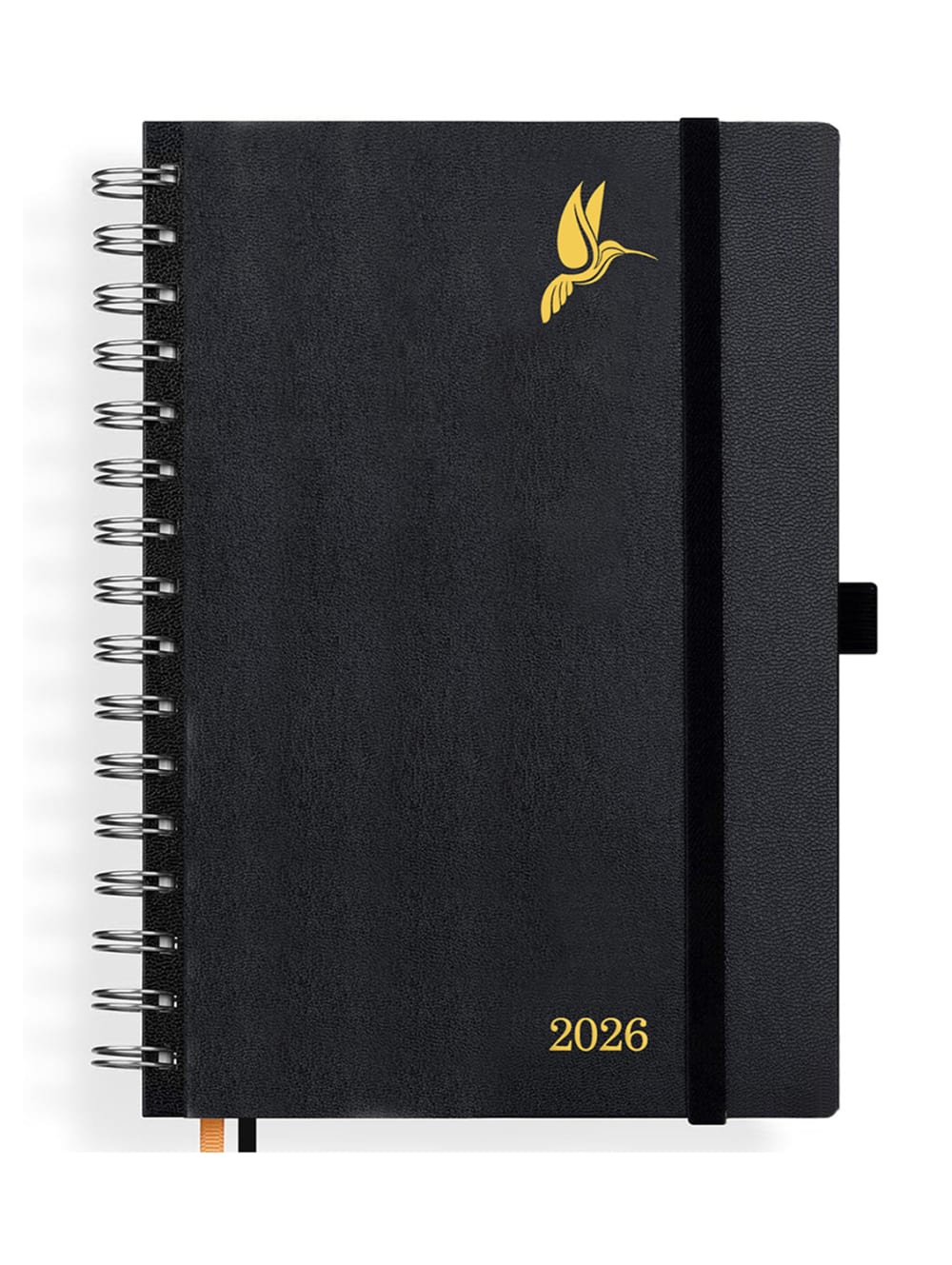
Option F is written in large, clear letters, making the year easy to read. E and A have a stylish font, but not quite as legible as F. B, D, and C are also easy to read, but I find the years a bit too small.
I would buy this font design because it looks very high-quality and elegant. The year is nice and large and clearly visible. The golden bird on the black design stands out particularly.
Gut feeling decided on the type and font selection. F was the most convincing in terms of form and font.
I like the font better because it is easy to read and recognizable. The appearance is very good.
This is now my personal choice. I find variant F the most beautiful and it also fits best with me and my preferences, especially with the wonderful color black.
I find the font in option F to be the most legible and also the most appealing. The further selection was made based on these criteria.
I find the font for "2026" here the best because the number appears large and is slightly thicker, so you can read and see the year well. The very thick or very thin written years would also be okay, but it depends on my preference; I would choose a planner where the font thickness is medium-sized.
abb. on F is my number 1 because this form has a nice design, simple but still looks somewhat high-quality.
I decided this way because I find these designs are not so intrusive and nicely subtle.
I find the number at number 1 very pleasant, I like a clear number.
The date is easy to read. The reading threads are long enough. The hummingbird goes very well with everything.
I decided based on the clarity and legibility of the writing. Without zooming in, which is easiest to read.
I have decided on option F. The reason is that I like the quality of digital font design best.
I find that with this option, the font of the year number is the most readable and recognizable. With the other options, it gets worse and worse.
In my selection, the 2026 is the largest where it matters to me, otherwise they all look good. It's hard to decide. I like the font of the F best individually.
You find the design F the most appealing. It doesn't stand out significantly from the others, but it looks very good. I would be interested in the price and material and can certainly imagine that this product is very high quality and feels very valuable.
Explore who answered your poll
Analyze your results with demographic reports.

