Poll results
Save to favorites
Add this poll to your saved list for easy reference.
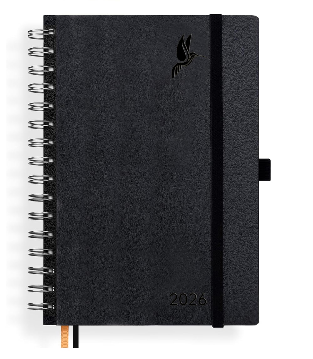
Please choose your favorite notebook cover design
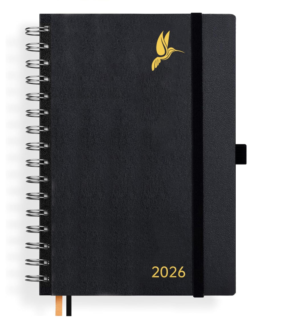
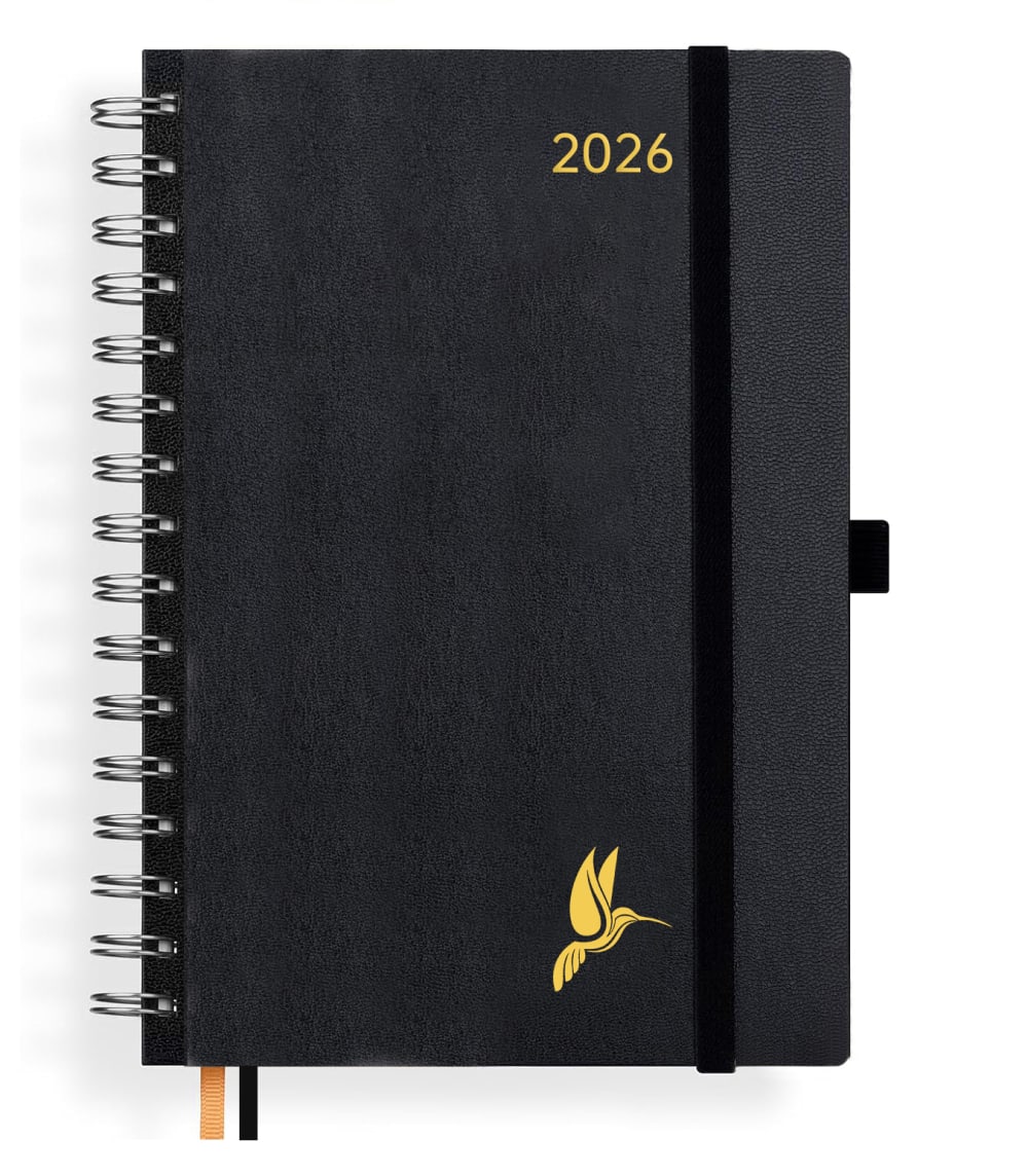
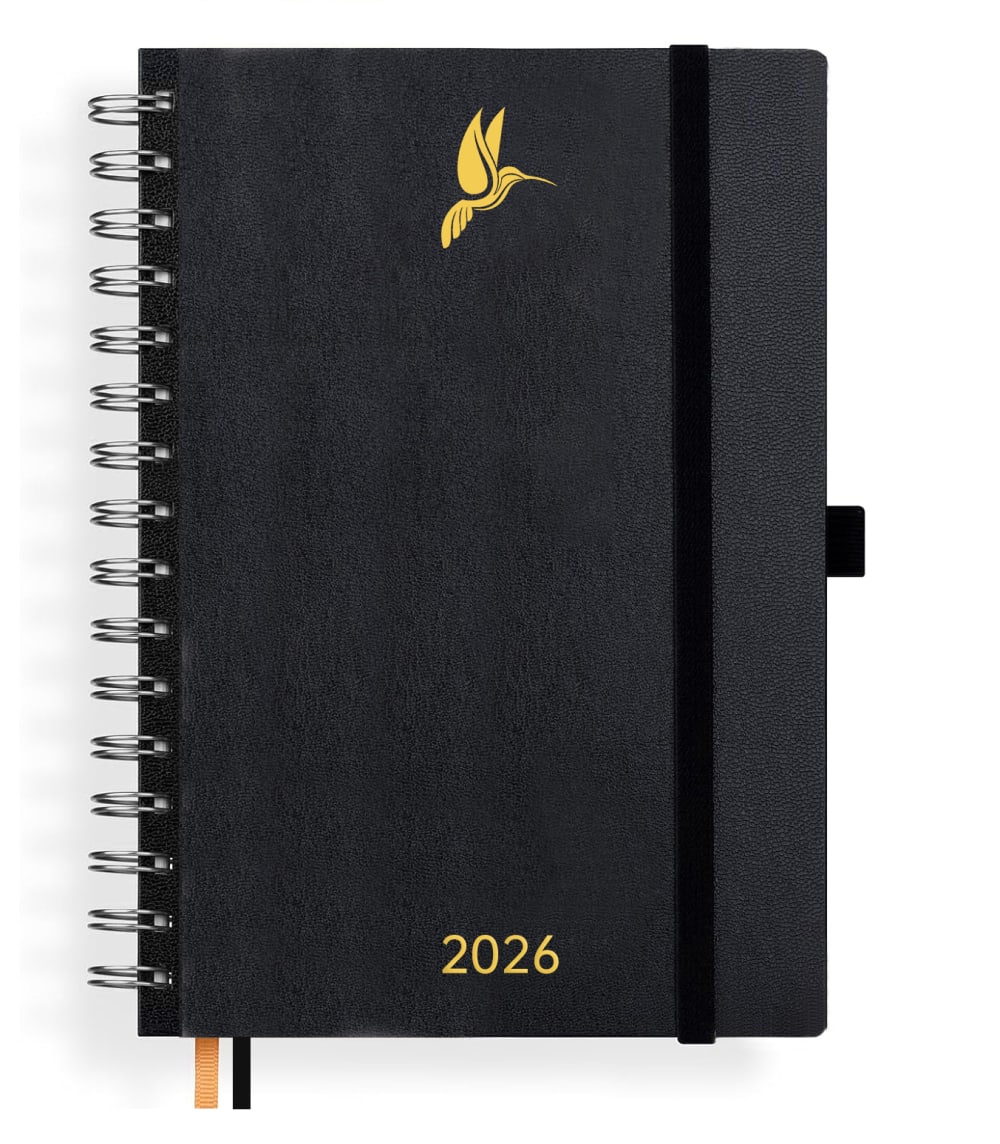
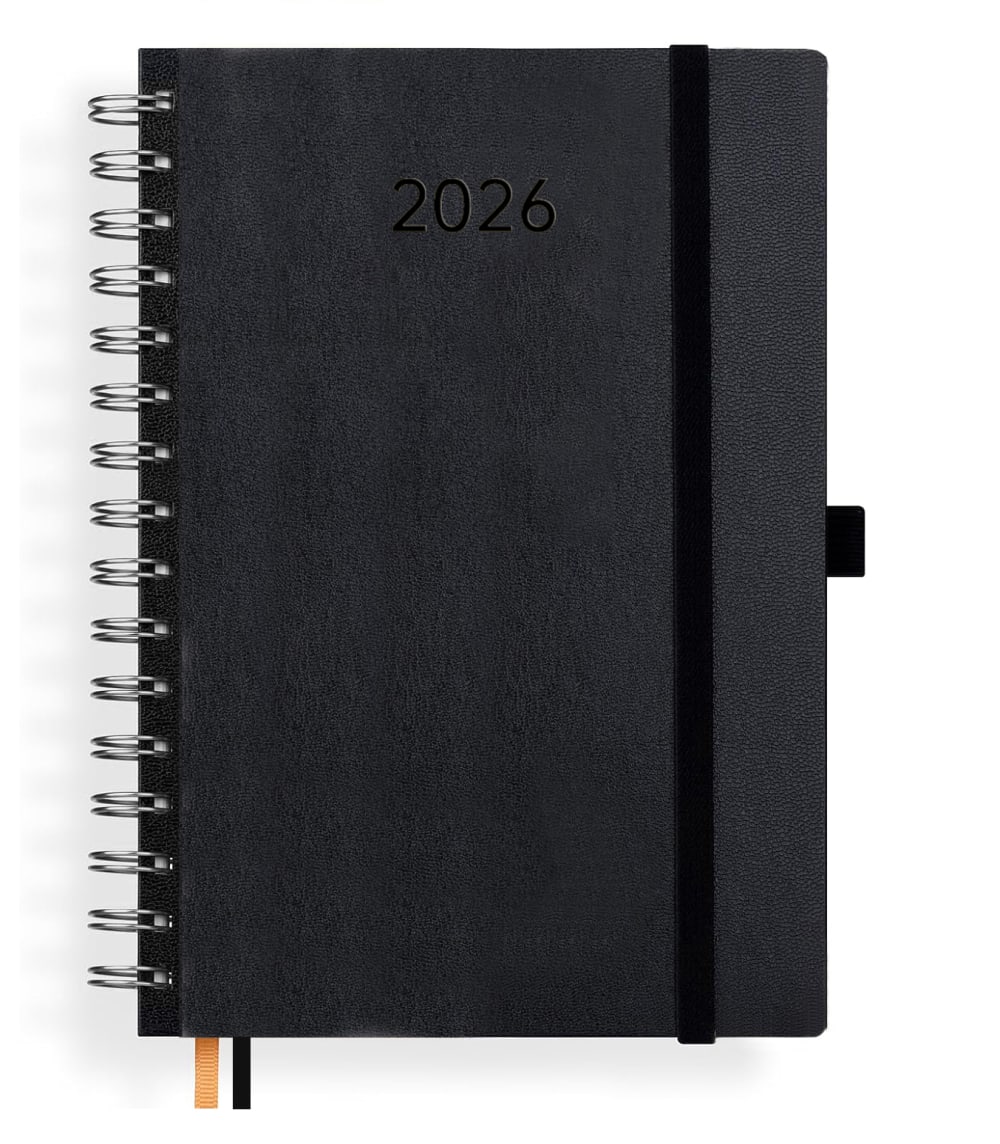
Option B won this Ranked poll with a final tally of 31 votes after 5 rounds of votes counting.
In a Ranked poll, respondents rank every option in order of preference. For example, when you test 6 options, each respondent orders their choices from first to sixth place.
PickFu requires a majority to win a Ranked poll. A majority winner differs from a plurality winner. A majority winner earns over 50% of the votes, whereas a plurality winner earns the most votes, regardless of winning percentage.
If an option does not earn a majority of votes, PickFu eliminates the option with the lowest number of votes. The votes from the eliminated option are reassigned based on each respondent’s next choice. This process continues in rounds until a majority winner emerges.
Scores reflect the percentage of total votes an option receives during the vote counting and indicate the relative preference of the respondents. If there is no majority winner, look to the scores to see how the options fared relative to one another.
| Option | Round 1 | Round 2 | Round 3 | Round 4 | Round 5 |
|---|---|---|---|---|---|
| B | 32% 16 votes | 32% 16 votes | 32% 16 votes | 40% 20 votes +4 | 62% 31 votes +11 |
| C | 26% 13 votes | 26% 13 votes | 36% 18 votes +5 | 36% 18 votes | 38% 19 votes +1 |
| E | 16% 8 votes | 16% 8 votes | 18% 9 votes +1 | 24% 12 votes +3 | Eliminated 12 votes reassigned |
| A | 14% 7 votes | 14% 7 votes | 14% 7 votes | Eliminated 7 votes reassigned | |
| F | 8% 4 votes | 12% 6 votes +2 | Eliminated 6 votes reassigned | ||
| D | 4% 2 votes | Eliminated 2 votes reassigned |
Show answers in:
7 Responses to Option A
I would choose option A. They all have the color black, nice and simple. I think the yellow goes very well with it. I would choose the bird on top and the number at the bottom and find it looks best right-aligned.
I choose the answer because it is nicer and also comes across better with the year specification.
I chose variant 6 because I like the font design better than the others.
I like the design with the bird and the year in gold/yellow best.
A1st: Product logo and year immediately visible and recognizable. E2nd: Product logo and year visible and recognizable. B3rd: Product logo and year on the right side right side clearly recognizable. C4th:Only the year is recognizable. D5th and E6th: Unlabeled and no or black logo, recognizable from which product brand or year.
I chose the answer because I really like the combination of black and gold. I like birds and the illustration looks high quality. In principle, I probably wouldn't choose a paper calendar, but if the
I just looked at all 6 notebook covers, and I have to say respect, 1a comes across the best for me. It looks super high-quality thanks to the golden effect and looks super high-quality and modern. The bird looks awesome; it appears sustainable and very upscale, simply top-notch. A lot of effort was put into it, and I would buy it right away.
16 Responses to Option B
My favorite cover design is Option B. Option B is the most visually appealing. I would prefer this design.
I find the cover better because the year is at the top. And with the bird at the bottom, it stands out better.
I prefer the year directly at the top, a small decorative emblem always looks pretty. Without print, black always seems a bit dull. However, with this item, it also depends on the internal layout.
I like embellishments on the cover and I like details and contrasts
I like the first one best because it has the year and a picture on it. The other two are still okay. The others are boring. Also, you don't know if it's a calendar or a notepad.
F and D, you can hardly see anything, so the font color doesn't work. I like B the best, with the year at the top and the decoration at the bottom, both in gold, very nice.
The version a looks much more serious than the other variants. I like the hummingbird, all other versions are not appealing.
I like the options with the little birds best because they have something refreshingly cheerful about them
I find this ranking the most individual because it seems the most innovative and is presented in the best way.
The labeling is best with this option. You can recognize the symbol best, which is why I like it more.
I find B the best because the year and the logo are kept subtle. It looks the most elegant. F is too plain for me. You can't tell which brand it is from and which year the book is supposed to describe.
I chose this design because I like it when designs stand out from each other and are a bit more eye-catching. Then you know exactly what it is.
I have organized the calendar to the best of my ability and have chosen the best pattern. The color and appearance were very important to me.
On one hand, it is very simple with the color, on the other hand, the golden bird stands out positively.
I like B the best because the bird is at the bottom and the year is at the top. Options A and E are practically identical to me. At least D still has a bird. Option C at least still has the calendar year. And F has nothing at all.
The contrast of yellow to black is naturally significant. The embossed year in black is hard to read. Without the year, it's impractical if I use this as an annual notebook. Hence, rank 6. I'm not entirely satisfied with the central representation, but that's more of a personal feeling. The position on the right side with the year and symbol appears successful and subtle.
13 Responses to Option C
The year is clearly visible at the top, the emblem is not needed. It is important to see the year immediately.
I prefer simple calendars that are slightly color-coded. I personally like the light font in C very much, so it's in 1st place. The order results from calmness and simplicity.
I like it best because the design is appealing and universal without any print.
I prefer a design where the year is at the top because it is easy to find among notebooks in years afterwards.
The first one is very simple with the small golden year in the corner, which I find very beautiful.
Looks the most high-quality and innovative of all to me.
The books are similar, but I only prefer the date on the cover. That's completely sufficient.
I like the design with only the year best because it is nice and simple.
I find C and F the best. The placement is good there and they are simple. I don't like the positioning of the other options.
On the one hand, it is important to immediately recognize the year 2026, which is why it should be in gold and not black. I don't need the bird, and if so, only at the bottom because the year is more important.
Beautiful discreet design, I like the contrast of black and gold.
The simplicity and the disturbing arrangement of the writing determined the order for me.
With the notebook, it's immediately apparent which year it is about, right on the cover. I don't need any more frills around it. You can see that it's a ring binder, a pocket calendar notebook for 2026. Whether there's an emblem on it or not is relatively unimportant to me, but the simpler, the better.
2 Responses to Option D
D looks the most elegant because it is black and minimalist. However, gold looks a bit cheap.
Less is better. Preferably no paintings, and if so, very inconspicuous ones.
8 Responses to Option E
In E/A/B/C, I like the golden color on a black background. I prefer the date at the bottom and the logo at the top. Black on a black background like in D and F I don't find nice. Small note: in silver or rose gold, writing and logo would also fit well.
I chose the house because the quality and color are nice.
Optical reasons that led to the decision. The composition of the elements and the colors used.
Definitely option E. The little hummingbird is a very beautiful eye-catcher.
I like the symmetry of Option 1, further selections are subordinated to Selection 1
I like that the logo is above and the year is below. Without a logo, the book is boring.
I chose E because I find the depiction with the bird on the top side of the book to be the most beautiful!
The bird is minimalist yet striking at the same time. On the other books, it was too asymmetrical. I like this little gold detail of a bird on a black background. The others without gold are hard to see on the screen.
4 Responses to Option F
I like it simple and unobtrusive, without frills. The arrangement of the motifs is another criterion.
Prefers it to be rather inconspicuous in terms of design. Answer F is the best, followed by C, E, B, A and finally D.
I like it simple and classic, preferably without any print. I also find gold very feminine, which is why I rated all the gold designs lower, the more gold the better
The design and layout of the notebook are simple and straightforward. That's why No.1 is my personal favorite. All the others are ranked in descending order.
Explore who answered your poll
Analyze your results with demographic reports.

