Poll results
Save to favorites
Add this poll to your saved list for easy reference.
Which book cover do you prefer, and why?
Age range
Favorite book genres
Gender identity
Options
Reading frequency
Relationship status
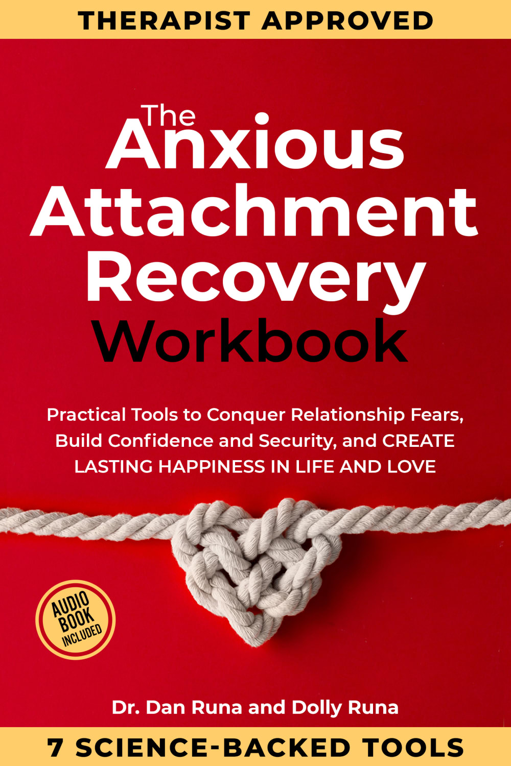
12 Responses to Option A
I like that the font is easier to read because the information isn’t too large and busy.
I like this one more because it's easier for my eyes to read and follow and the cover itself also makes me feel calmer which is a big plus
This looks a lot less buzz-wordy, like it is it simply a book and not trying to sell me on some scam concept
I think the other cover of the book is too busy.
I liked A because I was able to absorb the information on the cover better. B felt very aggressive, too close, too in my face. A had more "white space" that made the text easier to process and didn't make me feel overwhelmed like I did with B.
The book cover i choose was option A. It looked the best out of the 2. It seems more legit and interesting to have on my book collection. It seems like a great buy from barnes & noble. The title and wording looks the best.
Definitely Option A because it looks real, legitimate, and not fake scam awful advertising like in my opinion. Thanks.
I don’t think either cover is a good choice for a book on anxiety. They are both cluttered, in your face, and overwhelming. Simplicty would be better. I chose the one I did because it slightly less overwhelming when using the smaller font.
I prefer A because it's less in your face with the text and gives some breathing room in between.
I think that the book cover with the smaller text is better because it is not as bold and in your face. I understand that the bigger text may stand out more to the reader but I think that it is even too much in this option whereas in my preferred option, you can still read the text just fine and it is not huge or overwhelming.
I like the smaller wording on this cover and think it makes it look less crowded.
the smaller texts make the book simpler and not messier, it's more harmonious
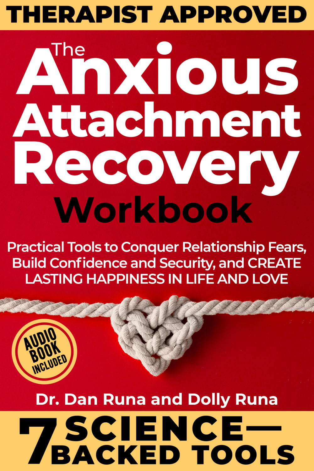
3 Responses to Option B
I like the larger and bold text. It's easier to read and understand and is a nice pop on the page.
The words are bigger which makes it easier to read. The words “therapist approved” really stood out to me.
I chose B because the text stands out more and is easier to read.
Explore who answered your poll
Analyze your results with demographic reports.

