Poll results
Save to favorites
Add this poll to your saved list for easy reference.
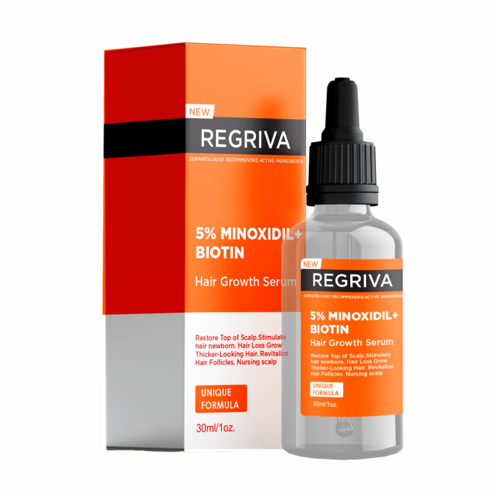
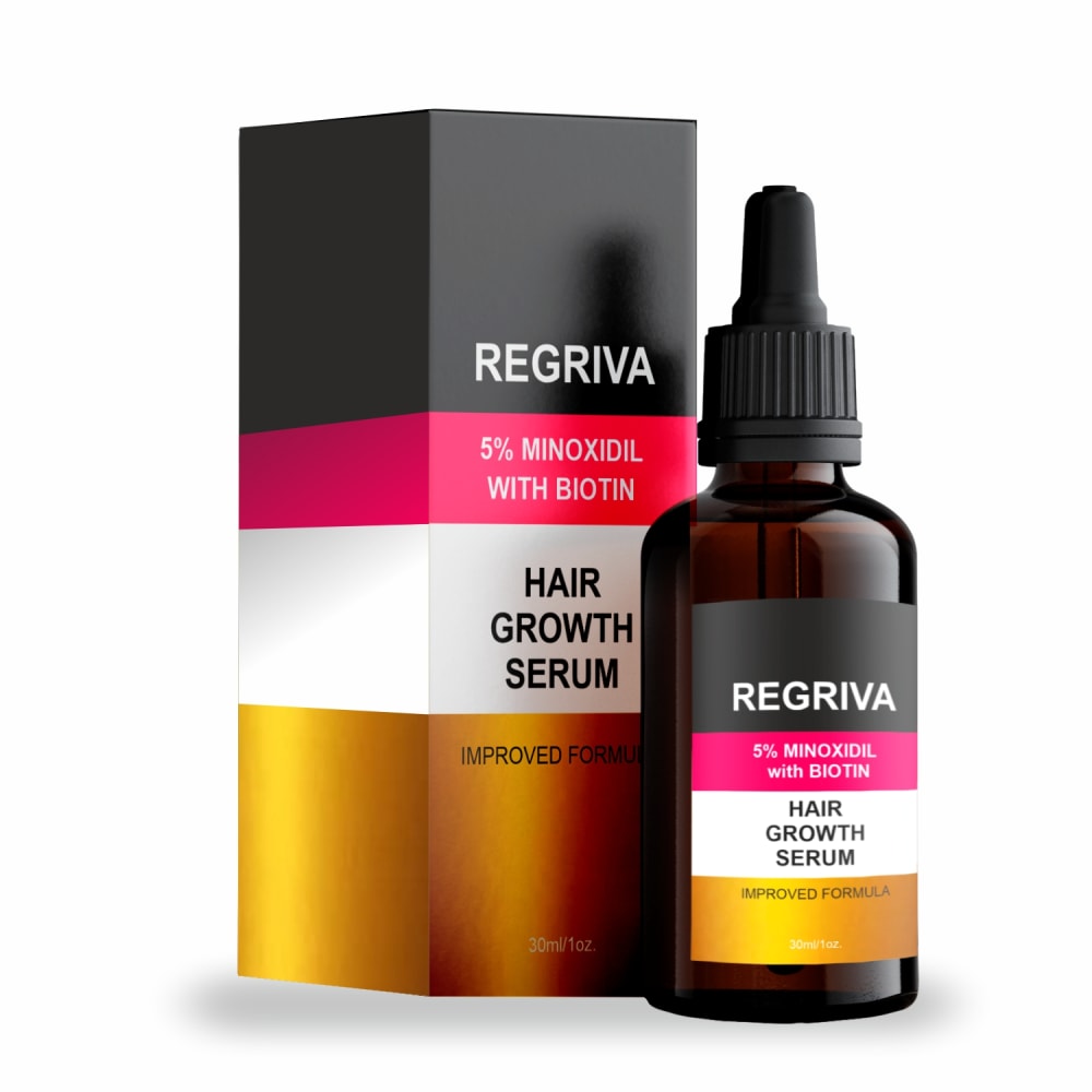
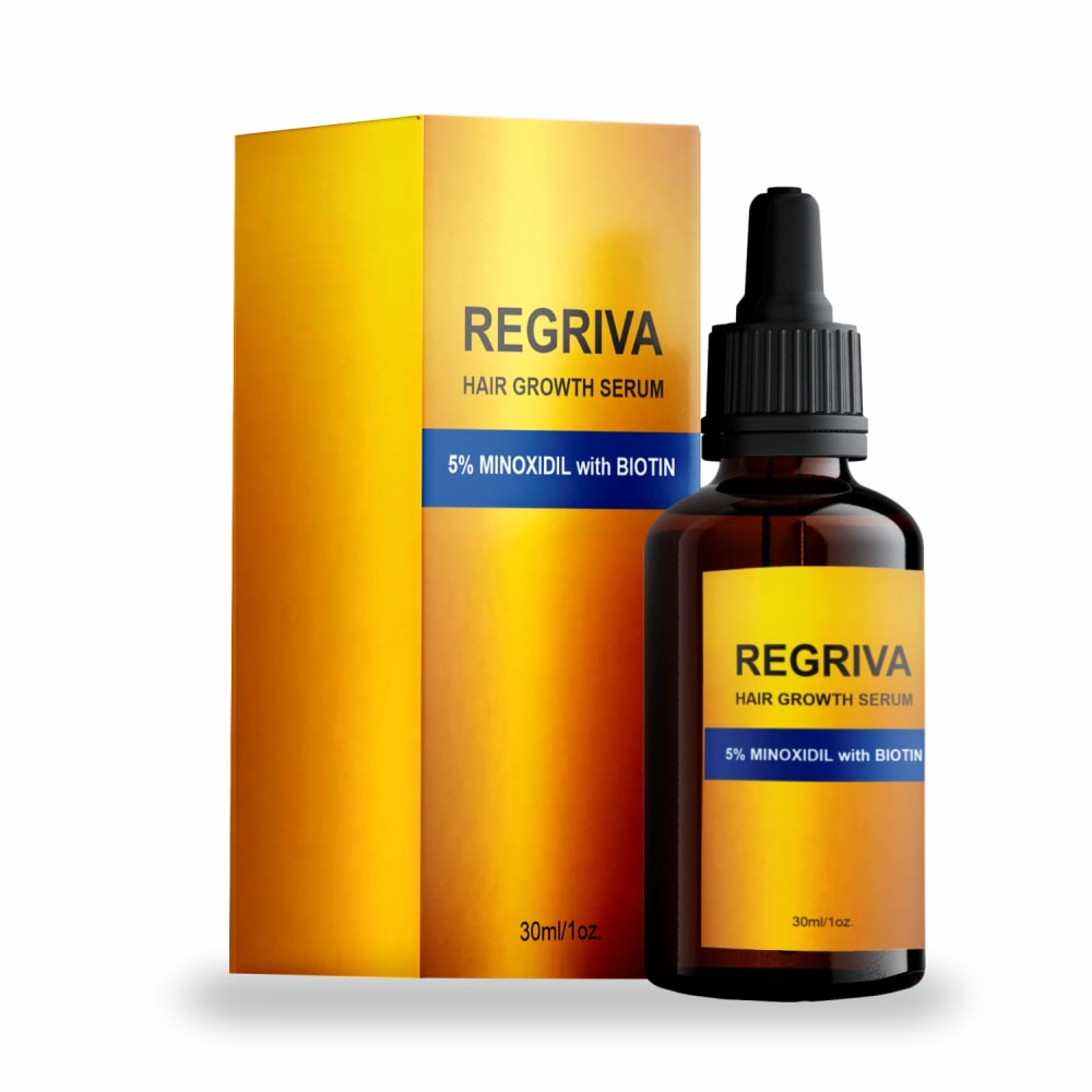
Which HAIR GROWTH SERUM packaging design to you prefer? Why?

Option A won this Ranked poll with a final tally of 9 votes after 2 rounds of votes counting.
In a Ranked poll, respondents rank every option in order of preference. For example, when you test 6 options, each respondent orders their choices from first to sixth place.
PickFu requires a majority to win a Ranked poll. A majority winner differs from a plurality winner. A majority winner earns over 50% of the votes, whereas a plurality winner earns the most votes, regardless of winning percentage.
If an option does not earn a majority of votes, PickFu eliminates the option with the lowest number of votes. The votes from the eliminated option are reassigned based on each respondent’s next choice. This process continues in rounds until a majority winner emerges.
Scores reflect the percentage of total votes an option receives during the vote counting and indicate the relative preference of the respondents. If there is no majority winner, look to the scores to see how the options fared relative to one another.
| Option | Round 1 | Round 2 |
|---|---|---|
| A | 46.67% 7 votes | 60% 9 votes +2 |
| C | 40% 6 votes | 40% 6 votes |
| B | 13.33% 2 votes | Eliminated 2 votes reassigned |
7 Responses to Option A
option A is the only one that looks professionally designed to me.
Option A because the product package looks a lot more professional and also the text is provides more useful information
I think the orange looks the best followed by the gold. I think the gold is too gold and theres alot of blank space that could be used. The multicolored one comes last because it just looks dumb, the pink doesnt fit.
Option A is the only one I like, I think how the colors and text are arranged meet my expectations of what hair growth packaging should look like.
The packaging has a very modern look which I find appealing. Has a strong look overall. The only downside is the bottle not being dark like the other options. But I still like it more than the others.
I think the orange and white label works best. Looks the most medicinal and professional.
I like the color orange on these health and hair products as it pops out to me along with the shiny gold label in A
2 Responses to Option B
I like the multi color bottle and label, it stands out more.
B box color, label, design made it stand out. A caught my eyes second noticeC last to uniform a color to stand out least.
6 Responses to Option C
Gold packaging tells me this is the gold standard, no need to look elsewhere.
The gold label and color makes it look more like a premium product and more appealing
The gold/yellow looks nice with the brown bottle.
I like the color of this one a lot. I like the brightness. I like the shine. It feels like the gold standard with the colors
it looks simple but nice and mysterious enough to attract buyers
I like the look and design of the label on the bottle in option C, so that is the supplement I would choose.
Explore who answered your poll
Analyze your results with demographic reports.

