Poll results
Save to favorites
Add this poll to your saved list for easy reference.
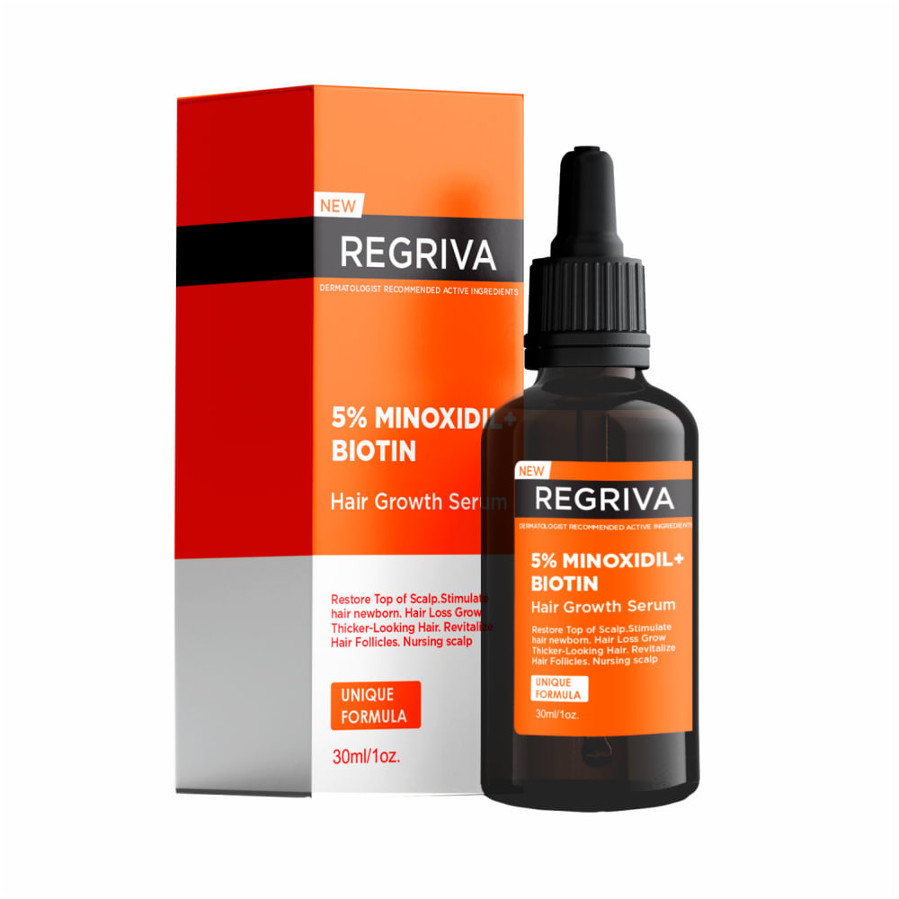
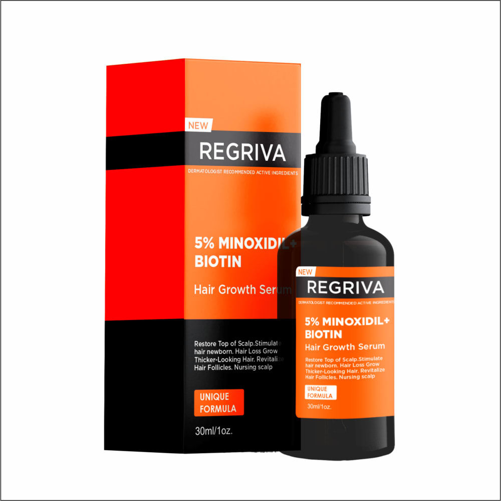
Which HAIR GROWTH SERUM packaging design to you prefer? Why?
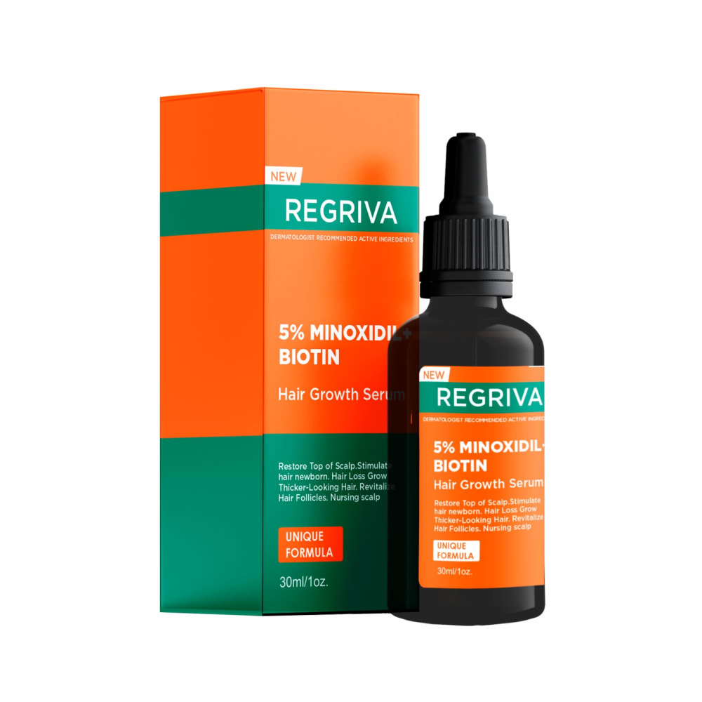
Option C won this Ranked poll with a final tally of 8 votes after 2 rounds of votes counting.
In a Ranked poll, respondents rank every option in order of preference. For example, when you test 6 options, each respondent orders their choices from first to sixth place.
PickFu requires a majority to win a Ranked poll. A majority winner differs from a plurality winner. A majority winner earns over 50% of the votes, whereas a plurality winner earns the most votes, regardless of winning percentage.
If an option does not earn a majority of votes, PickFu eliminates the option with the lowest number of votes. The votes from the eliminated option are reassigned based on each respondent’s next choice. This process continues in rounds until a majority winner emerges.
Scores reflect the percentage of total votes an option receives during the vote counting and indicate the relative preference of the respondents. If there is no majority winner, look to the scores to see how the options fared relative to one another.
| Option | Round 1 | Round 2 |
|---|---|---|
| C | 40% 6 votes | 53.33% 8 votes +2 |
| B | 33.33% 5 votes | 46.67% 7 votes +2 |
| A | 26.67% 4 votes | Eliminated 4 votes reassigned |
4 Responses to Option A
I would buy Option A because of the bright white portion of the box.
The option with white on the packaging looked the most modern to me.
Based on color theme of the package design, my first choice is A.
I choose option "A" as my first choice; I like the less bright orange with the black strap on the label and the white bottom describing the details. I think it's a balanced color combination. I find the product description and details against the white bottom stand out more to me.
5 Responses to Option B
I would like to prefer the packing design of option B as my first choice for its black and orange color combination .My second choice is option C for its orange and green color combination .My third choice is option A for its orange ,white and black color combination .
Black and orange is most eye-catching. The orange and green is pleasant and the orange and white is kind of boring for me.
I like option B the best because the bottle matches the box quite well and I think that looks very different from what a product typically looks like. I think that option C is the next best option because the green is very different and makes me think that this product is made with natural ingredients. The white on the bottom is very been here done that before.
b the orange and black stands out the most it is bright and easy tp spot
I love the design for B very aesthetic, the colors blends well to give the product a colorful taste and virtual appeal needed for a product package. The product labels are also very visible on the package.
6 Responses to Option C
I chose C first because the green banner was easy to see. I chose B second because I liked the black and orange packaging. I liked the white and black accents the least.
Option C HAIR GROWTH SERUM packaging design, which I prefer because it restores the top of the scalp. Stimulate the hair of newborns.
The color contrast on Option C is bold and dynamic. Option B had a good blend of colors. Option A wasn't bold enough.
I like option c the best because I like the color scheme of the packaging and how it includes the teal color with the orange. I put option b next because I like the orange and the black together. I put option a last because I think putting the white on the box really makes the packaging look more dull.
I would like to prefer option C packaging design. Because the color combination of the blue and orange is enhance the look of this packaging design.
I chose C because the colors stand out the most over black and white. I chose A next because the white draws more attention than B's black background. B's black box blends into the black bottle.
Explore who answered your poll
Analyze your results with demographic reports.

