Poll results
Save to favorites
Add this poll to your saved list for easy reference.
Which layout of weekly view PREGNANCY JOURNAL do you like most?

Age range
Education level
Gender identity
Household income range
Number of kids
Options
Personal income range
Racial or ethnic identity
12 Responses to Option A
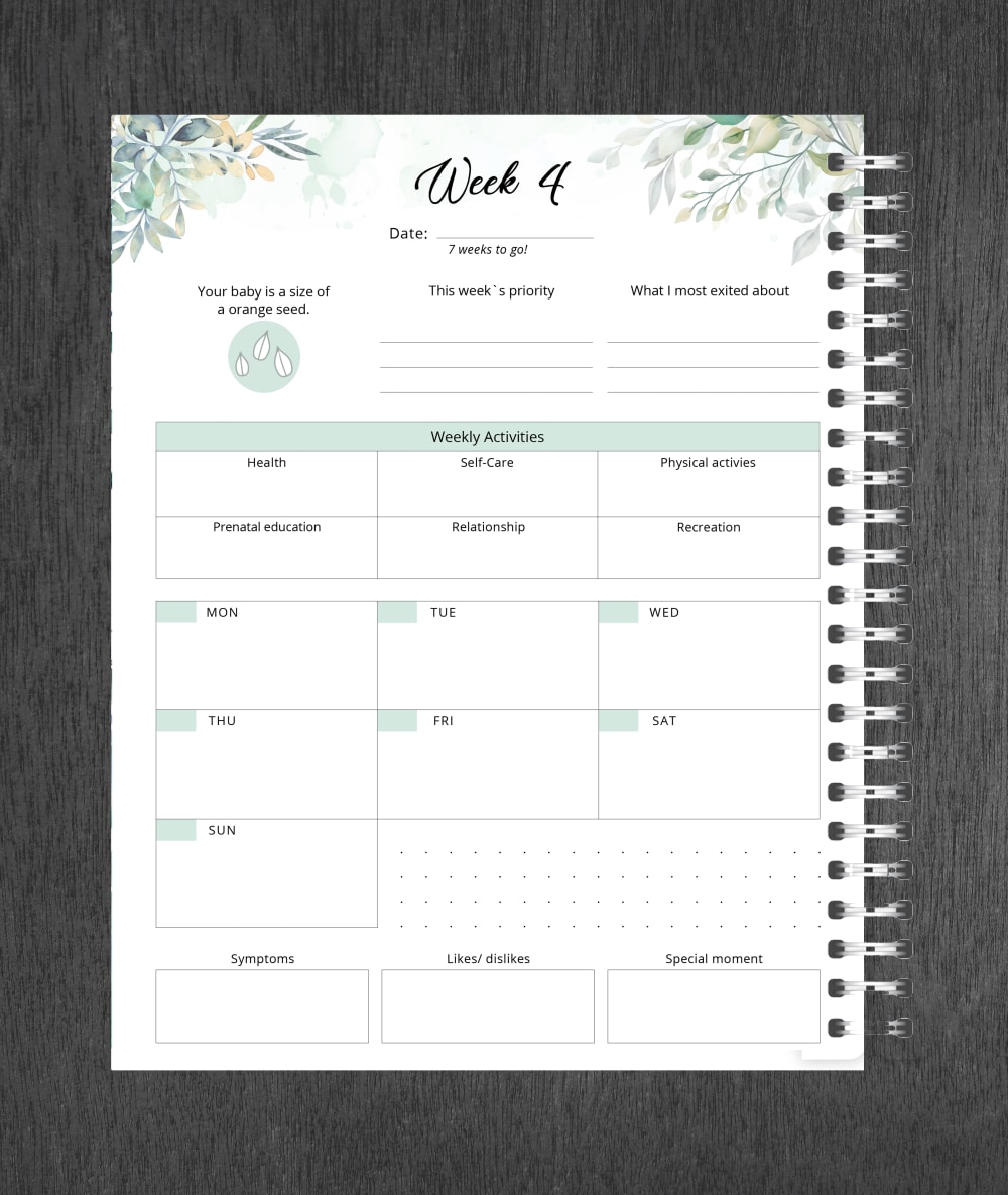
I like the lay out of this one it meets the needs that I have
A I like this journal because, it tells you something about the week that you are in and about your baby. I also like the payout of where I enter the information that I want to add to the journal.
I think that Option B wastes too much space with illustrations. I would rather have more room to use for planning purposes.
I like that A is more colorful around the edge of the paper. There is more design to it.
I like the inclusion of detailed information on the baby's development at this stage.
Option A because it shows the embryo's development
this design looks more clean and less cluttered.
This on looks to have more space to write more details in.
They're BOTH rife with errors! Misspelled words, terrible grammar.... I would hope these are not final versions! The errors made it difficult to like either one, but A won by a millimeter.
I like the flower border around the entire page.
I prefer option 'A' as I enjoy the layout compared to the other option. I also like the green highlights on the font on top.
I like A better because of the to do list because it seems like it would help with tracking appointments, purchases to be made, cribs to assemble, etc.
9 Responses to Option B
looks pleasant in a simple way. the details are clear with no mess
I like B because I like the layout better and I like it without the border.
I chose B because I feel I like the simple page design over the one with the heavy border.
The layout o the option B is more classical where A is more contradiction which reduces the attractiveness of layout, so B layout is much prefered.
I like the simplicity of Option B, and I think the layout is better. I like the floral design on the top more than it being a border like in Option A.
I like that there is more space for my thoughts to be written down as opposed to random facts posted towards the top
I feel that choice B gives me the most space to add information.
Option B is my choice for the layout of weekly view PREGNANCY JOURNAL because it is much simpler and easier to comprehend.
I picked b because the design was less cluttered and presented well.
Explore who answered your poll
Analyze your results with demographic reports.

