Poll results
Save to favorites
Add this poll to your saved list for easy reference.
Which packaging design do you prefer?
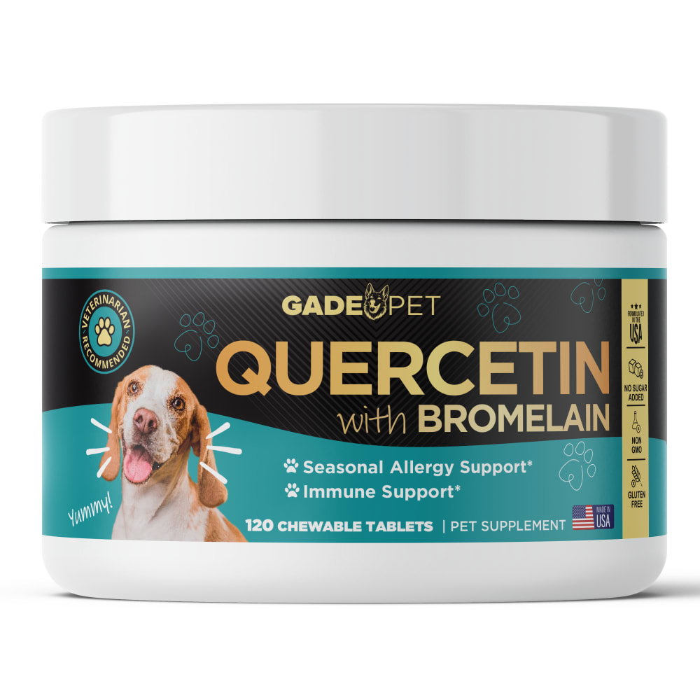
Option B won this Ranked poll with a final tally of 8 votes after 1 round of vote counting.
In a Ranked poll, respondents rank every option in order of preference. For example, when you test 6 options, each respondent orders their choices from first to sixth place.
PickFu requires a majority to win a Ranked poll. A majority winner differs from a plurality winner. A majority winner earns over 50% of the votes, whereas a plurality winner earns the most votes, regardless of winning percentage.
If an option does not earn a majority of votes, PickFu eliminates the option with the lowest number of votes. The votes from the eliminated option are reassigned based on each respondent’s next choice. This process continues in rounds until a majority winner emerges.
Scores reflect the percentage of total votes an option receives during the vote counting and indicate the relative preference of the respondents. If there is no majority winner, look to the scores to see how the options fared relative to one another.
| Option | Round 1 |
|---|---|
| B | 53.33% 8 votes |
| D | 26.67% 4 votes |
| A | 13.33% 2 votes |
| C | 6.67% 1 votes |
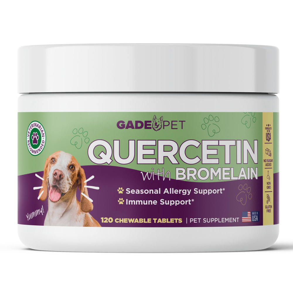
2 Responses to Option A
I think the color use is appealing/meshes well in this order. Perhaps darker plastic for the darker and more bold color schemes would be good to consider.
I personally love all of these designs . I think they all have very good color combinations . My favorites are options A , B , and D , I will be most likely and most considerate to buying these products . They have the best quality in my opinion , and I really like the designs .
8 Responses to Option B
While I would likely be content with either Options B or D for this particular packaging of the product, I do think the former is slightly more visually appealing the brighter colors allows the text to be a bit more legible.
I like that this is an American made product and the gold text makes it feel more official.
I would be most drawn to the look and design of my first choice. I really like the color choice here too.
I think the colors and text looks the best in D and B.
I liked choice B because the color scheme of the label looks the most appealing and eye catching.
I like the color combinations of B the most. I think it looks higher quality and I like the contrast between the gold and black.
I actually used this product for my pet , and I generally go by the brand and the reviews and things like that , but I chose , uh , option B because of the appearance of it , it just has a professional look like they took the time to make a quality product and they the shows in the label .
I like the light blue and the black on this one so much.
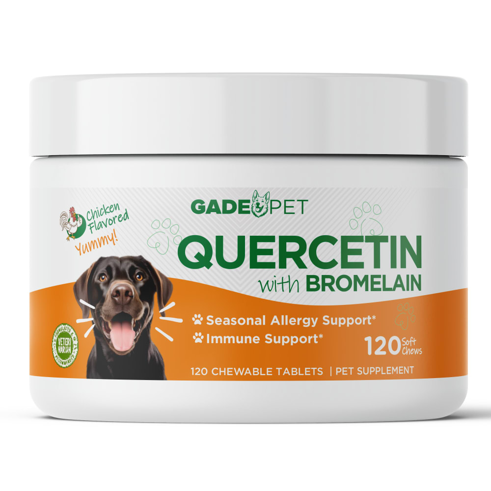
1 Responses to Option C
The more color the better to stand out on the shelf, but that being said, the colors in A really clash with one another.
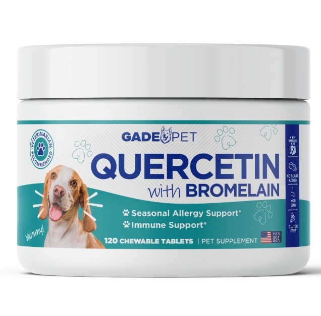
4 Responses to Option D
I like the color scheme and design of Option D the best.
I would be more inclined to click on the pet supplement in option D because the label is clear and easy to read.
D I feel has the best color and design to its label that makes it most appealing to me.
the teal color with white background supports the pet product the best giving it a wellness brand look and contrasts blue label text well for a pet product with D
Explore who answered your poll
Analyze your results with demographic reports.

