Poll results
Save to favorites
Add this poll to your saved list for easy reference.
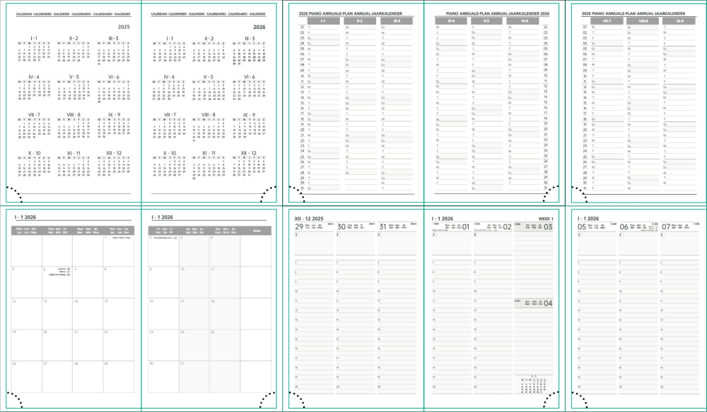
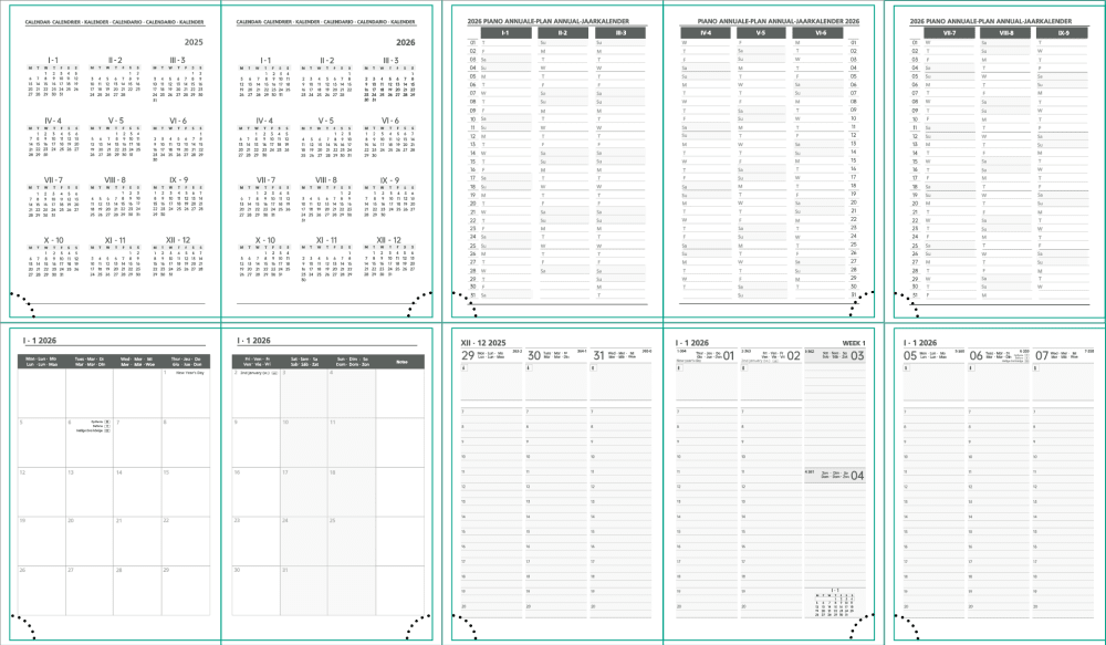
Which page design do you prefer, the dark color block scheme or the light color block scheme?
Show answers in:
13 Responses to Option A
Hmm, I have to admit that on a phone there really isn't much of a difference to see. In principle, however, I find dark block schemes better than light ones.
I chose A because it comes closest to my visual impression and provides a better overview.
I like the dark color block scheme much better, the contrasts are easier to recognize, making everything appear much clearer and tidier.
I prefer the light theme because I can read everything better and the dark theme is simply too gloomy and irritates my eyes. Additionally, in the dark theme, certain questions are displayed so dark that you can no longer recognize the writing.
The dark is worse for seeing and the light also seems more sympathetic and friendly. Otherwise, pure gut feeling.
I chose it because of the good clarity, you can see everything well, but neither is bad.
The frame and the coloring are clearer and stronger, and I like it better visually.
The brighter design is simply more visually appealing to me and seems friendlier.
I like nr.A because you can orient yourself faster and it is better to write the notes.
I chose option A because in option B the background is too dark at the top.
Definitely the light color scheme, it is clearer to read and brings more order. The eye is not distracted by unimportant things.
For me, it's clearer that the light one is more subtle. I find the darker one too extreme.
Option A is the best page design for me because it is very clearly structured. Additionally, I can work more easily with "Copy and Paste" here, which gives me great time advantages.
17 Responses to Option B
I have clearly decided for option B. Because the color block scheme with dark design is more visible than the color block scheme on option A.
With the dark color scheme, you can see better, I have poor vision
The dark scheme, here I just need a higher contrast and that is better given with B, easier to read
The dark one looks more appealing as it is on a certain basis. The design is unique and promising and has great graphics.
I prefer darker designs because I can read them better.
Option B. Looks best in my opinion. Has a nice and structured overview.
I prefer the dark color block scheme because I find it clearer and more practical. Even when looking for entries afterwards.
I prefer the right color block scheme, I find it is more structured, you can recognize everything better and it would be fun for me to do my daily work with it. It is more pleasant for the eyes.
Dark has better contrast. More contrast is always better. Looks nicer.
I like it better visually, and therefore in my eyes everything is easy to read and understand.
I prefer the darker one. It's easier to recognize, especially from a distance.
I find the dark color block scheme better because it stands out more.
I find the darker one is much easier to read, it stands out better on the white paper.
The dark color block scheme stands out better. It looks more organized.
It is more readable and therefore clearer
I find b much clearer and easier to recognize, I would prefer to choose b, I think.
Due to the contrast, it is easier for me to read. It's just clearer.
Explore who answered your poll
Analyze your results with demographic reports.

