Poll results
Save to favorites
Add this poll to your saved list for easy reference.
Which Pie Pan Would You Buy?
Option A won this Ranked poll with a final tally of 9 votes after 3 rounds of votes counting.
In a Ranked poll, respondents rank every option in order of preference. For example, when you test 6 options, each respondent orders their choices from first to sixth place.
PickFu requires a majority to win a Ranked poll. A majority winner differs from a plurality winner. A majority winner earns over 50% of the votes, whereas a plurality winner earns the most votes, regardless of winning percentage.
If an option does not earn a majority of votes, PickFu eliminates the option with the lowest number of votes. The votes from the eliminated option are reassigned based on each respondent’s next choice. This process continues in rounds until a majority winner emerges.
Scores reflect the percentage of total votes an option receives during the vote counting and indicate the relative preference of the respondents. If there is no majority winner, look to the scores to see how the options fared relative to one another.
| Option | Round 1 | Round 2 | Round 3 |
|---|---|---|---|
| A | 33.33% 5 votes | 40% 6 votes +1 | 60% 9 votes +3 |
| E | 40% 6 votes | 40% 6 votes | 40% 6 votes |
| B | 13.33% 2 votes | 20% 3 votes +1 | Eliminated 3 votes reassigned |
| C | 13.33% 2 votes | Eliminated 2 votes reassigned | |
| D |
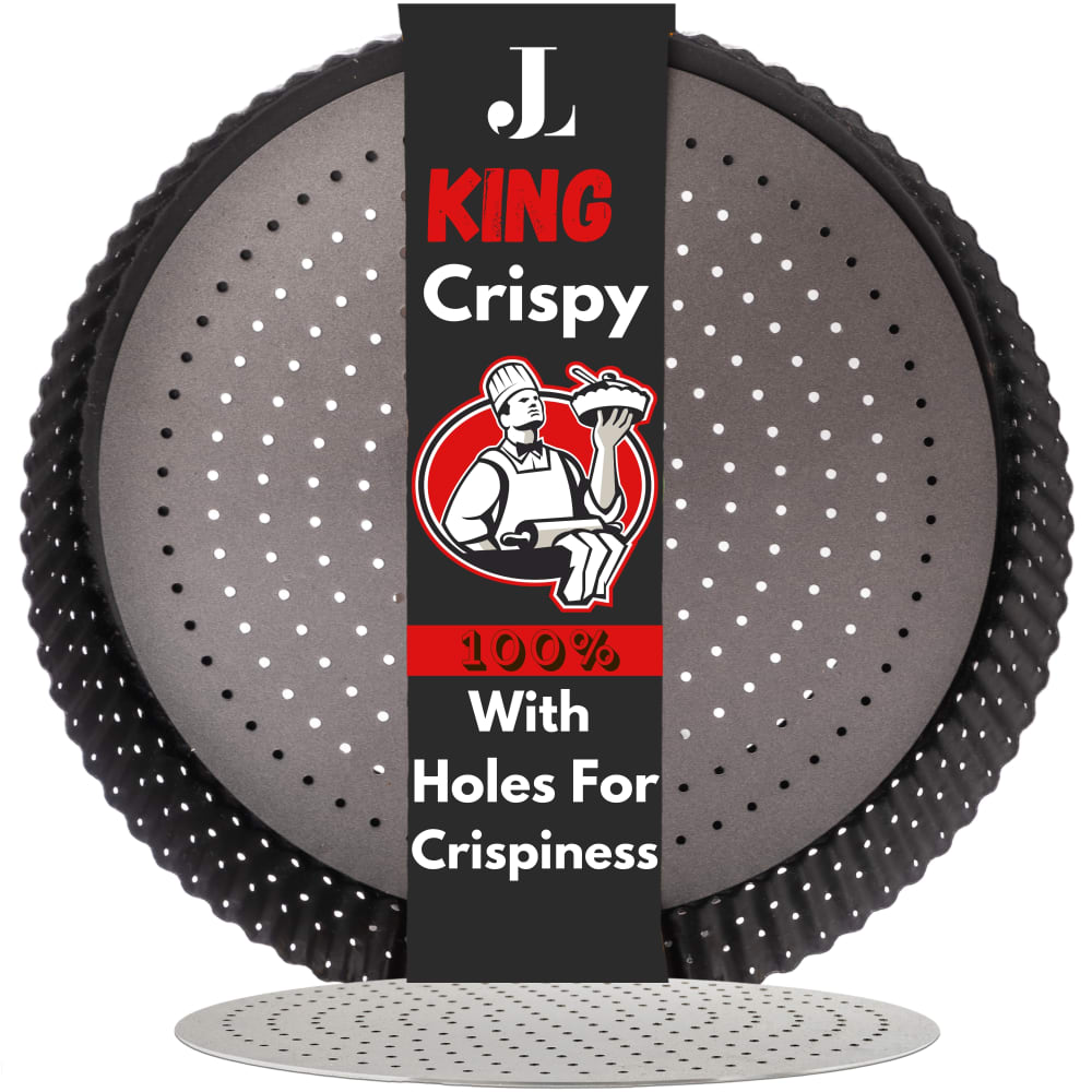
5 Responses to Option A
The red colors make me think of fresh fruits and vegetables.
Red color is more appealing than other options.
Red grabs my attention first because it is so bright and contrasted with the black.
I chose option A. I bake a lot and I use different pans. I like the packaging in panel A. The red band showcases the pans very well.
The top choices have color schemes that stand out the most.
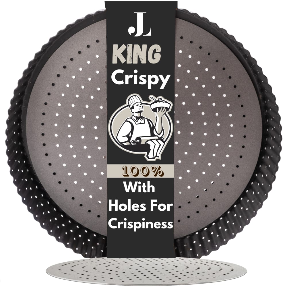
2 Responses to Option B
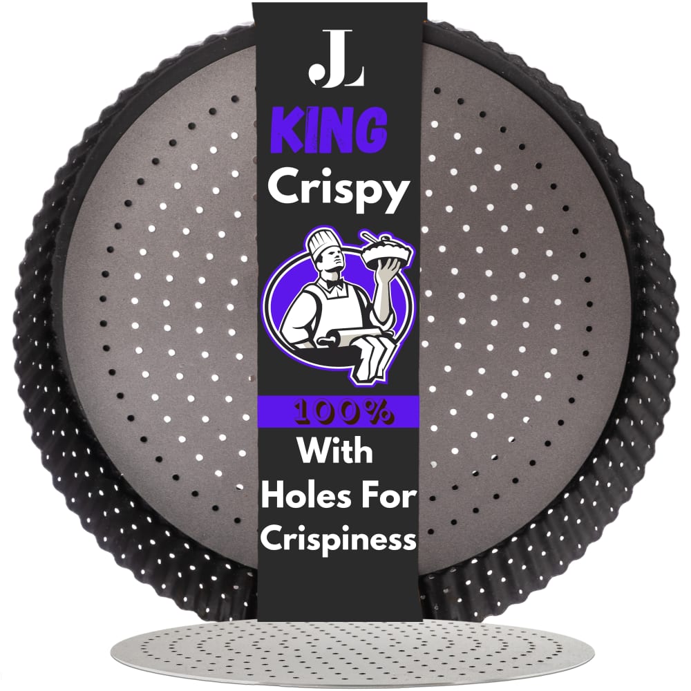
I most prefer the option B pan product design because I like the black and gray color design label the most because it looks most classic and cool. I chose options A, E, C and D in this order because the red color stands out more than the orange and light blue and darker blue colors here.
I prefer the darker colors. I think they look better and are more in tune with what the product is trying to sell.
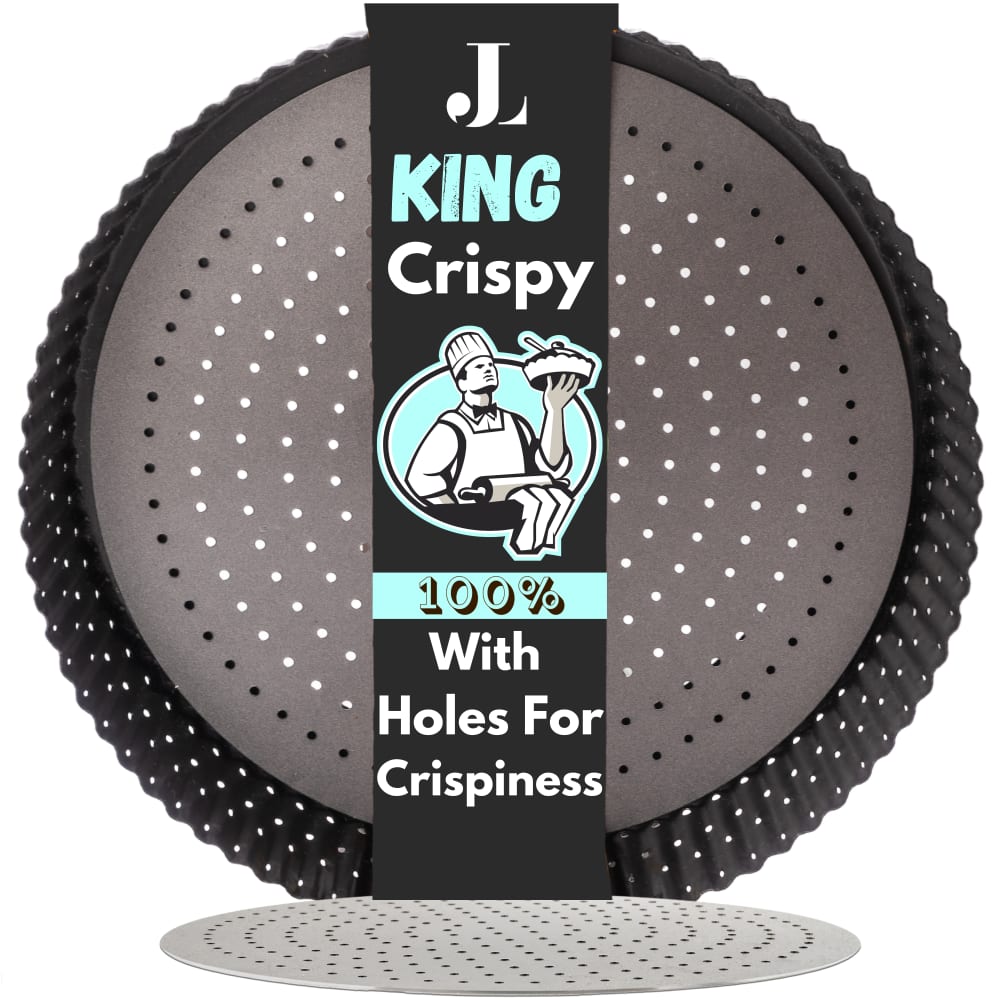
2 Responses to Option C
I like C the best because blue is my favorite color and here it was super nice and relaxing/calm and easy to read.I chose B next because I think this was the easiest to read overall color-wise although a little bland.I chose A next because the red is attractive but a bit harder to read.I chose E 4th because it wasn't an interesting color to me. I thought D was the worst here because purple made all of the elements really hard to read.
I ordered my choices in terms of which colors caught my eye more. Blue seemed the most modern and fun, followed by red. Gray was the most boring.
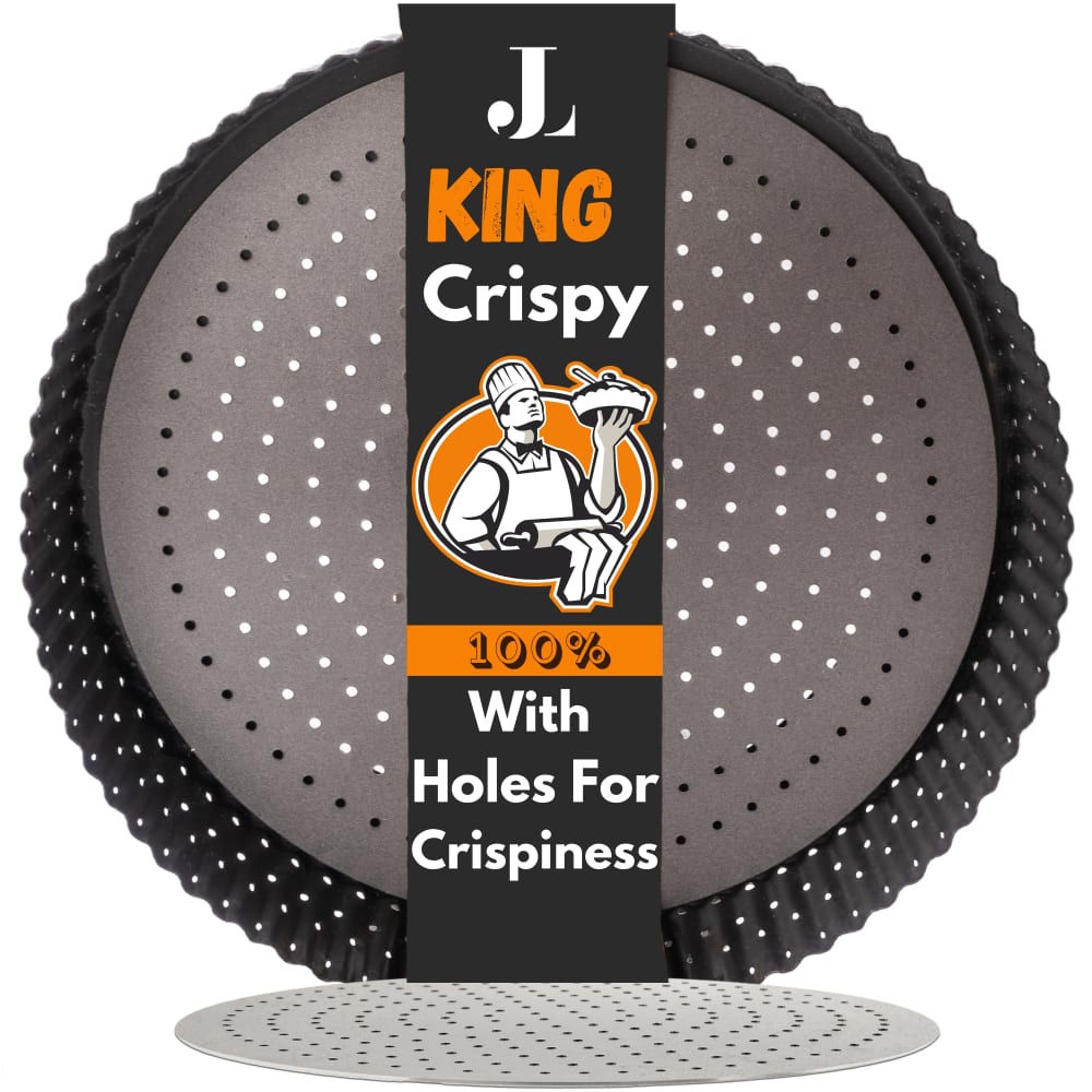
6 Responses to Option E
closest to the color of baked pizza dough
I usually don't care for orange, but option E stands out from the rest here and somehow makes the information stand out too.
I prefer the orange label in option E, so that is the pie pan I would choose.
Out of the five available options, I would highly recommend option E as it features a unique pie pan shape and design that is very appealing. Additionally, the packaging style of this option eye-catching and adds to the overall presentation. The pie pan also comes with holes tat ais in achieving a crispy crust, making it an excellent choice for all your baking needs.
I like the visibility of the colors in E, A, and D. I could easily picture the color in option E with the product.
The orange color reminds me of pie crust. It also stands out nicely when the rest of the packaging is very dark.
Explore who answered your poll
Analyze your results with demographic reports.

