Poll results
Save to favorites
Add this poll to your saved list for easy reference.
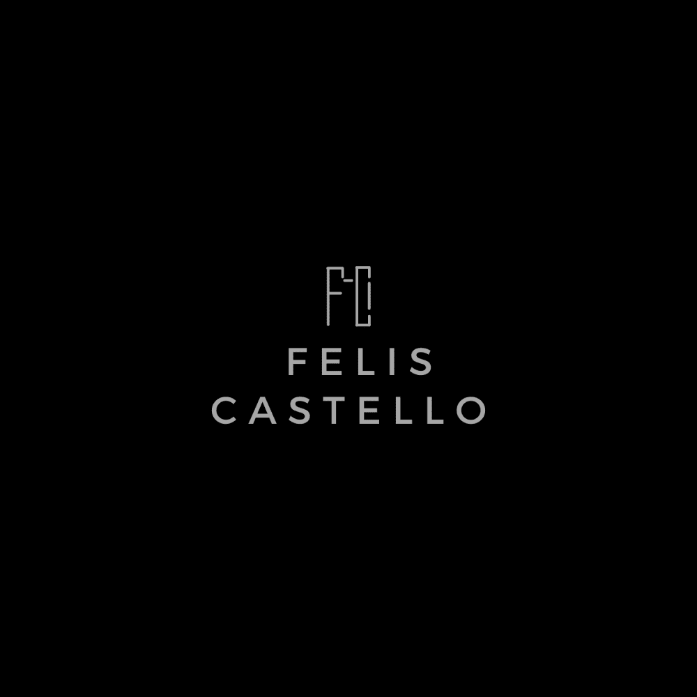
Please choose your favorite logo design. I would love to know why you choose the design and what kind of company/product you would expect to have this kind of logo.

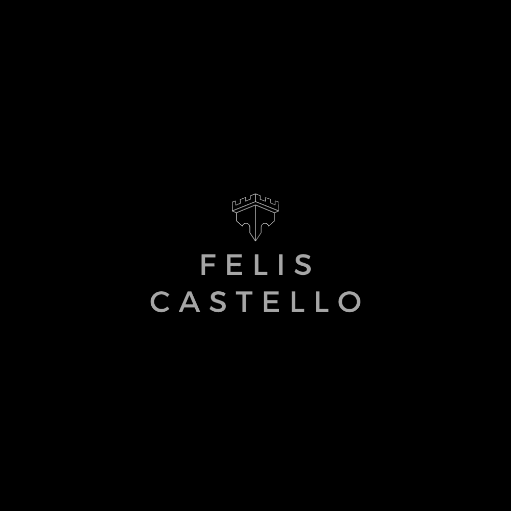
Option C won this Ranked poll with a final tally of 29 votes after 1 round of vote counting.
In a Ranked poll, respondents rank every option in order of preference. For example, when you test 6 options, each respondent orders their choices from first to sixth place.
PickFu requires a majority to win a Ranked poll. A majority winner differs from a plurality winner. A majority winner earns over 50% of the votes, whereas a plurality winner earns the most votes, regardless of winning percentage.
If an option does not earn a majority of votes, PickFu eliminates the option with the lowest number of votes. The votes from the eliminated option are reassigned based on each respondent’s next choice. This process continues in rounds until a majority winner emerges.
Scores reflect the percentage of total votes an option receives during the vote counting and indicate the relative preference of the respondents. If there is no majority winner, look to the scores to see how the options fared relative to one another.
| Option | Round 1 |
|---|---|
| C | 58% 29 votes |
| A | 28% 14 votes |
| B | 14% 7 votes |
Age range
Cat owner
Dog owner
Education level
Gender identity
Options
Personal income range
Racial or ethnic identity
14 Responses to Option A
My top choices of A/B/C are based on which logo design has more minimalism and a contemporary vibe. I think A is the best when it comes to this type of presentation. I feel like this type of logo would work well for a real estate firm in a city such as New York. Specifically, luxury real estate for the discerning client.
I really have no idea but felis makes me think of feliz in spanish so I am thinking something pleasant like the word happy, but I am guessing this is actually someone's name the company is branded after. Since the symbol is so dang small, I would not make it complicated in design. I think option C has too many elements in the tiny design so it makes it look like the transformer logo. I like option A because it seems like a sand castle or like a turret from a castle. If I had to guess it would be a real estate company or engineering or something related to that field. Design of some type.
I like A because the logo looks like a skyline. I assume you're an architect or in construction
I like the little castle looking logos the best and for option A, I liked the simplicity of it and I think it makes it look more professional than the alternatives.
Choice A would fit well on luxury brand.
I liked choice A since the design of the logo reminds me of a castle top which reminds of your last name and fits well together. I would expect a video editing company for what services you offer.
A is perfect, simple and elegant , I would see this being high end accessories like glasses, wallets , purses, things like that. C is also okay and comes off more old fashioned which can be good. B I dislike it comes off sort of abstract and modern and just does not feel right
this one looks the best overall to me. I think it would be some kind of artist or some kind of entrepreneur
A is the most discernable. The logo on C is too light. It looks like a logo for a real estate company.
Looks like the difference seems to be the graphic above the words. I strongly prefer the more simple graphics of the first place choice. It mostly looks like a stylized "M" which I am not sure how fits but its still looks good. I would expect this to be selling something in the male fashion or accessories category, it would make a lot of sense as a sunglasses brand.
I prefer Option A because I like simple logo designs since they are more impactful and memorable and classic.
I really like option A because the logo looks much more simplistic and easy to read. I would expect a product like cologne.
A is my top choice because it looks strong, like a castle which also consequently looks elegant. C looks visually interesting but the bottom part of the iconography looks a little awkward. I understand the concept of B, but I think it is a weak statement given the thin lines and therefore my last choice.
I chose option A because the symbol on top reminds me of a castle and the word castello in the name makes me think castle. When I think of this name and the symbol it makes me think of a wine company.
7 Responses to Option B
The first one stands out to me because the little design is bigger and then the next one stands out because I can see the design good too the c option is not good because the icon thing is dark
B Looks elegant, classy, and artistic. To me it looks like a luxury brand of clothing
I like choice B the best as I feel that the logo looks more modern and is a good reflection on the logo in itself.
I really like the straight lines of B and A the most, B looks really cool. C is not bad but I just want something simple and it doesn't do that for me. I would expect this logo on a high end fashion line product.
B has the frost letters in the company's name. They rest are too generic. My guess is this company is a high end something company
This would be an hotel logo, as its a really good design
i like that you're able to see the logo above the letters. it makes the name stand out
29 Responses to Option C
I chose C because it looks the most symmetrical and sleek. I would think this is some sort of graphic design site.
Seems the most high quality and looks a little bit regal
choice c because the upper graphic felt more high class.
I like the regal look of this one most. Seems like a luxury brand for men's clothing.
I think C is the most unique and elegant. I also liked A because it's simple and straightforward, but B is too unnecessarily complicated. I'm guessing this company makes cat houses, since its name is a mix of Latin and Spanish for "cat castle".
C is my favorite because of the symbol. It looks very elegant and regal. These logos remind me of a high end wine label. A is my second favorite because of the symbol. I didn’t like B much because the symbol doesn’t seem to be anything recognizable.
I would expect something classy for sure, perhaps watches? or some type of designer accessories
C seems regal, not sure the angle of the brand name but the other two look like buildings
I chose it because it looks the most regal, and stands out the best. I think this is for some real estate type company.
The logo looks high class and regal. I imagine a internet security company.
I prefer the option C logo because I like the corner illustration with the complex corner guard shown in this logo image illustration the most. I chose option A second because I like the simple corner illustration shown in this logo a lot. I chose option B last because I like the complex corner illustration shown here in this logo.
I love Choice C. I love the wordplay on Castello and it's a picture of a castle. I love the minimalist imagery. The second one is A because I am reminded of a castle again but it wasn't as detailed as C. Choice B is just confusing. I am not sure what that is supposed to be a drawing of.
I prefer option C because the logo give it an almost regal feel. Like it is a brand fit for royalty. I feel like this brand would sell some sort of luxury good
I honestly have no idea what sort of company it might be, but it does inspire confidence that it is "high-class" and quality. I like C's castle/crown looking logo the best. A/B's logo is odd, A almost looks like a razor blade at first glance.
Option C would be my first choice. The crown and castle merge brings across royalty and a classical feeling. Makes me think this brand is expensive and of good quality. Option B would be my second choice. I like the play on the F and C within the castle in the logo but wish the actual name was in the same font style or incorporated into the logo itself. Option A would be my last choice. The logo works but it feels too generic.
The castle looks the best out of all the logos, because it is the most recognizable. I think the "F C" monogram looks better than the vague castle design in A. This might be a jewelry company because the logo looks exquisite.
I like the symmetry of the shield like design and I imagine it is an architectural company.
I really like the subtlety in choice C. I think the others, I have to sit and think about which is not good. It looks like a wine company selling fancy wines.
I like C, I thought it had a cool design but I think it would look better if the lines were bolder looking.
Option C looks memorable and unique; it gives the brand a sense of prestige and professionalism that the other designs lack. Options A and B are much too bland in comparison, and they don't stand out nearly as well.
Option C had a more ornate and professional looking logo. I would expect it to belong to a security company, because the logo looks a bit like a shield. Option A was good and implied security and protection. Option B was the least appealing, because the logo looks incomplete and makes me feel like the company isn't effectual.
The logo from option C draws in the most attention, its unique, and well designed. It fits with the rest of the advertisement, and has a natural blend look, while maintaining its artistic vibe.
These remind me of a perfume brand. But I would choose C because it looks the most formal and high class.
The 1st one you have to look at a little bit longer to have it makes sense but I really like it. The 3rd 1 is a little bit confusing. The 2nd 1 is OK but I'm not as big a fan
I like C. I thought the little image looks unique and interesting. A is too simple and B is too abstract. I assume this is a high end fashion brand
I'm not sure what any of those logos are meant to be, so it is difficult to relate it to a product or service. I would guess they remodel homes.
I LIKE THE CROWN STYLE IN C THE MOST, I THINK THE LOGO IN THE OTHER TWO LOOKS TOO MUCH LIKE A RAZOR BLADE
Option C is the best because the logo and font is well designed and simple to understand.
c looks the most high end
Explore who answered your poll
Analyze your results with demographic reports.
Demographics
Sorry, AI highlights are currently only available for polls created after February 28th.
We're working hard to bring AI to more polls, please check back soon.


