Poll results
Save to favorites
Add this poll to your saved list for easy reference.
Which logo for a boutique resort do you like best?
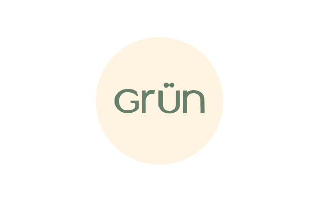
Option A won this Ranked poll with a final tally of 28 votes after 2 rounds of votes counting.
In a Ranked poll, respondents rank every option in order of preference. For example, when you test 6 options, each respondent orders their choices from first to sixth place.
PickFu requires a majority to win a Ranked poll. A majority winner differs from a plurality winner. A majority winner earns over 50% of the votes, whereas a plurality winner earns the most votes, regardless of winning percentage.
If an option does not earn a majority of votes, PickFu eliminates the option with the lowest number of votes. The votes from the eliminated option are reassigned based on each respondent’s next choice. This process continues in rounds until a majority winner emerges.
Scores reflect the percentage of total votes an option receives during the vote counting and indicate the relative preference of the respondents. If there is no majority winner, look to the scores to see how the options fared relative to one another.
| Option | Round 1 | Round 2 |
|---|---|---|
| A | 36% 18 votes | 56% 28 votes +10 |
| C | 34% 17 votes | 44% 22 votes +5 |
| B | 30% 15 votes | Eliminated 15 votes reassigned |
18 Responses to Option A
I love the cont in A; the lower case, the rounded letters draw me in and it looks modern and upper class to me.
Clean, simple, and modern. I go back and forth between A and C, but I think A looks more modern.
I ranked my choices based on which logo seemed the most elegant based on the font.
I think Option A stood out to me as a good choice for a logo for a boutique resort. I think the logo would fit a fancy place. I really can’t explain why except that it just seems to fit.
A is modern and sophisticated without looking boring. B looks like a cheese/sausage factory label.
I go back and forth between A and C. The more simple A stands out. It feels a bit stronger, paired down.
Really prefer A over the other ones. I think it fits the business better.
All the options look nice. However, option A looks more professional. Also, in option A, the u with the dots looks like a smiling face, this would make me think the resort is a good place and there to serve their customers.
A looks the most balanced, elegant, and modern. I think C looks too squished like someone made a mistake or is trying too hard. B looks like a dated font from an 80s printing program.
I like the small curvy lower case font! It looks soft and comforting. The others are a little more harsh.
Option A looks the most inviting to me.
I like the cleaner look. Easier to read.
I picked A because it seemed like the most subtle of the three which I thought was appropriate for a high end boutique
The font is easier to read. I think it's more pleasant.
I chose A because I think the rounded font goes well with the sound of the resort's name. I ranked B last because I think the negative space in the letters doesn't look as good as just having solid letters.
Options A and C fit a little bit better with the idea of a resort than does Option B.
Option A - simple, elegant font that's easy to read. Option C - Nice, a little crunched/condensed. Option B - looks like it's trying too hard to be upscale.
I really like the simplicity of option A. The font gives an inviting and warm feeling. Option B was similar to Option A for me, but the thicker font and the hollowness of the interior of the letters felt more like the title of a high school science fair project than the name of a resort. The emptiness in the center of the font, in my opinion, detracts from the logo. Finally, Option C felt too rigid. I was not drawn to this option at all.
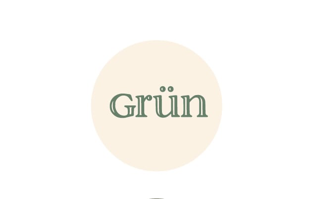
15 Responses to Option B
Love the unusual open font in option b
I LIKE THE FANCIER CIRCLES IN OPTION B BETTER THAN THE OTHER TWO OPTIONS
I Think Option B is the only one that looks fancy/elegant. The font looks royal to me: very proper and very sophisticated. Option C is okay, but I dislike Option A. Option A looks like pre-school lettering.
This font is the fanciest and looks like it would be great for a boutique exclusive resort.
The extra styling in B makes it look more elite and botique. C with the tall letters looks too casual so I put it last.
Option B has a more up class look to it.
I think this has a bit of a sophisticated look to it.
I chose option B because I like the double font, it makes it look more professional.
I find option B to be the most appealing and eye catching logo. Option C is alright but not as good as option B. Option A looks very generic.
This font looks more exclusive with the outline/shadow around it.
I think that B looks the most clean and professional.
I would expect a very stylish design for a boutique resort and I think that the font in B is more unique than the other two options.
I picked the font that seems most like a font that would have umlauts.
I definitely like the white and green the best. It looks the highest end and gives me a good feeling. I do think all the fonts looked high end and would not have a major problem with any.
B looks like the better logo because the letters have some depth and texture to them. They look like the more premium product
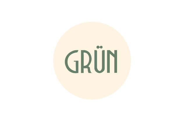
17 Responses to Option C
I like c. Catches the eye and looks unique.
I love the font used in option C. It is a fun and interesting font that would catch my eye right away. I also like the font in option A, however, it's a bit smaller and not quite as noticeable as option C. Option B is not bad, just not as fun as the other two options.
I like C's look, the subtle serifs make it feel like a style from the past that's still appealing. A looks modern, but a little generic. B's look looks very old and dated, I'm not sure what to expect from it.
C looks more modern and premiun. It is also the most unique.
I like the lettering in option C. It is rather large and easy to read.
I prefer the elegance of the art deco style of the font in C.
Option C reminds me a lot of the 40s with a modern touch which seems very fancy to me, that's why it would be my first option.My second option is A, because of its simplicity, which makes it modern and minimalist.Option B is a bit common
The text style of the letters in C is very refined because it is an elongated style. It conveys good taste and minimalist but modern style. It is also playful at the same time because of how letter U has two dots on top. It is a good use of space with just enough empty space of the circular yellow background.
i like choice C cause i like the boldness and i feel like it is the easiest to read. i like the simplicity yet boldness of it.
The size of the font and the design of the letters best works in option C. It looks classy and memorable.
I like the larger font so i go with C. then b and then a.
Option C is the most visually appealing and grabs your attention more right off the bat. The font is better and easier to read and makes it stand out more to the reader. It also has a more professional and advanced look to it that would give people a higher first impression of the resort itself. It also matches up better with the idea behind the resort and would give people and better feeling just from the logo alone. Option C would appeal to more people and would make them more likely to check deeper into what it has to offer.
I like Option C the best because it's the easiest to read and it stands out the most. Option B is ranked last because the text is too thin.
I like C; it looks elegant. A is ok. B is dull
I like the ones that are easier to read - larger letters.
I like option C the best. I really like the solid block lettering the best
I like C and A almost the same. I like how the font in C takes up more space in the circle, so that's my first choice. I don't like the double-lined font on B. It's hard to read.
Explore who answered your poll
Analyze your results with demographic reports.
Demographics
Sorry, AI highlights are currently only available for polls created after February 28th.
We're working hard to bring AI to more polls, please check back soon.


