Poll results
Save to favorites
Add this poll to your saved list for easy reference.
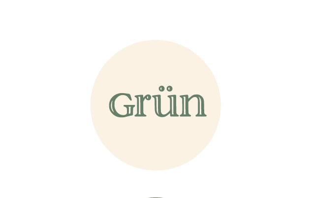
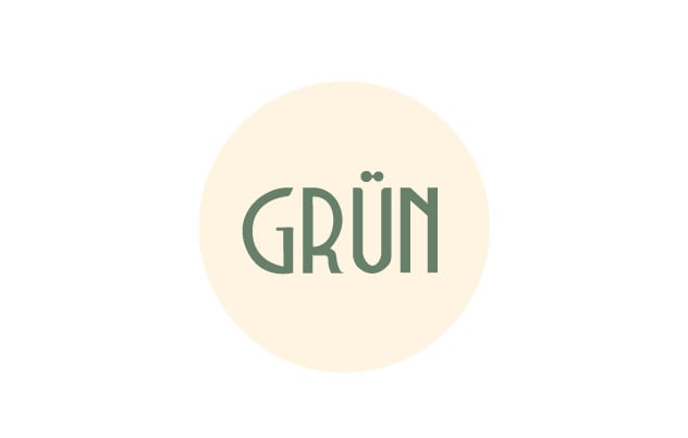
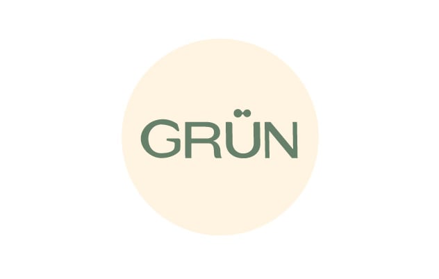
Which text logo for a boutique hotel do you like best?
There was no majority winner of this Ranked poll after 2 rounds of vote counting. However, Option A and Option B had the most votes (25).
In a Ranked poll, respondents rank every option in order of preference. For example, when you test 6 options, each respondent orders their choices from first to sixth place.
PickFu requires a majority to win a Ranked poll. A majority winner differs from a plurality winner. A majority winner earns over 50% of the votes, whereas a plurality winner earns the most votes, regardless of winning percentage.
If an option does not earn a majority of votes, PickFu eliminates the option with the lowest number of votes. The votes from the eliminated option are reassigned based on each respondent’s next choice. This process continues in rounds until a majority winner emerges.
Scores reflect the percentage of total votes an option receives during the vote counting and indicate the relative preference of the respondents. If there is no majority winner, look to the scores to see how the options fared relative to one another.
| Option | Round 1 | Round 2 |
|---|---|---|
| A | 38% 19 votes | 50% 25 votes +6 |
| B | 36% 18 votes | 50% 25 votes +7 |
| C | 26% 13 votes | Eliminated 13 votes reassigned |
19 Responses to Option A
I would choose choices A and C first because it has a nice font and it is easy to read as compared to choice B.
The open faced font is unusual and memorable
I ranked A highest because I thought it looked simple but elegant and quite readable--so appropriate for a boutique hotel. Option C was plain but inoffensive. I didn't like B's narrow fonts. It may have been intended to look modern, but it seemed cramped and unappealing.
This has a bit of a sophisticated look to it.
After carefully studying and comparing all three images of text logos for a boutique hotel displayed above, I selected Option A as my first preference and the one that stands out above the others. I felt that this logo image just jumped right out at me as having the most eye catching appeal based on its design. Option C was my second choice followed finally by Option B with all three rankings based on my own personal opinion of the relative attractiveness of each logo image.
A looks the highest end
I think is a little overused these days. Really like the soft and classic look of C.
This font is the fanciest and makes the hotel look like a more discreet location.
For this locality I really like the smaller and more decorated verson. It would stand out on a street sign....and I like the use of the lowercase letters after the capital G. It would also stand out in their marketing designs. The other two ; C and B seem clumsy and big...almost too rough to be a boutique hotel.
I chose Option A because I think that the text has the most "character."
Option A is the most professional looking. Option C is nice as well. Option B seems the most informal. Option A is easiest to read and nice to look at
I like option A because it has an upscale simplistic feel It looks upscale and interesting. I would expect a hotel with this logo to offer some things other hotels do not so very much a boutique name.
Option A because it was clear and easy to read, while standing out more than the others
I like A with the white and green, it seems high end and the font looks really nice. The others look good as well, I just think with only one color they aren’t as high class.
I like the texture of this font the best, it looks premium and like more thought actually went into it
I like A better than the others because I like the design. for me, it stands out and is appealing as well for a logo in my opinon
I think A looks more novel.
The inscription looks more attractive and appealing to me
Option A was selected for the way that the word is outlined makes it look more up scale.
18 Responses to Option B
I like B the best; the lettering looks the most elegant. A is ok. I don't like C
Easier to read and looks higher end.
I picked B because I think it looks clean while also looking unique. I ranked C next because I think it looks clean, but is a bit more generic. I ranked A last because I don’t think the negative space inside the letters looks as good as just solid letters.
B looks more modern and European. It's a cleaner looking logo.
I prefer the font in B the most as it looks modern but not so canned as C. A looks terrible and dated.
I think the font in Option B is the most appealing (the boldness of it) followed by C and A. I don't like the lightness of A.
The font gives it that very chic high-end euro look to it so I would most want to purchase that
I like b best for a hotel. C has like a makeup font and a looks like a beer font.
The gong on B is unique and just fancy enough without looking as if it’s trying to be fancy.
Options B and C seem a little bit more professional and fit better with the idea of a boutique hotel as compared to Option A.
I like the Art Deco font in B.
The font makes it seem full of old-world European charm.
B&C look more professional than A, which looks like someone randomly chose a fancy font from Word.
I like the font and solid green lettering in the option I chose. My least favorite has a drop shadow making it harder to read - especially in dark light or from a distance.
B's style has a little bit of character and doesn't make me concerned or worried about what to expect. It's easy to read. C looks sort of generic, like every other logo out there these days. A's font looks very dated, it makes me unsure what to expect, if the experience will be too dated or something.
i really like how choice B is both bold and different in its writing. i think that it looks nice and is easier to read at the same time.
I think the font in Option A looks different/creative/unique. This makes me think they paid for a special font, which made me think they are upscale. Both A and C seem to use more commonplace fonts, but I think that C is even more basic than A.
B would appear to be the most unique font of the 3. Fitting for a boutique anything.
13 Responses to Option C
The font in C is timeless and classy. B is ok, but a bit too rigid. A looks to much like a cartoon and I don't take it seriously.
I prefer option C because it is clear and is the easiest to read.
Option C is the most visually appealing and grabs your attention more right off the bat. It has the most unique and professional look to it that makes you think the hotel would be more interesting. It makes you think quality and that the product would match that ideal. It just has a more memorable look to it as well and makes you want to know more about it. Option C would appeal to a wider audience of people and would make them more interested in learning more about what it has to offer.
Option C seems the most sophisticated of the logos to me. Option B I put last because it feels a little childish to me. I put Option A in second because I didn't love it or dislike it.
Option C seems the classiest and cleanest. Nice sized font. Option A I like the text effect. Option B the letters are too tall and skinny.
The letters don't look bad. They are easier to read.
C is the runaway winner. The simple font is nice and is the only one not dated. I don't love the art deco on B but it looks less dated than the font on A so it's a bit ahead.
Do not like the font of B, especially the N. C is better than A because the letters are solid, A has no fill
I like option C by far the most. It is the most clean and modern looking and looks very classy. The other two look antiquated.
I ranked them with a preference for the designs that conveyed the most comfort to me.
I like option C the best. I really like the block lettering the best
I chose option C because I like this font the best. To me it looks the most high end and would go with a boutique hotel.
My first choice looked upscale and stood out. The second choice stood out more than the third choice (with hollow letters font face)
Explore who answered your poll
Analyze your results with demographic reports.
Demographics
Sorry, AI highlights are currently only available for polls created after February 28th.
We're working hard to bring AI to more polls, please check back soon.

