Learn more
How it works
Audience panel
Case studies
Testimonials
Industries
Amazon
E-commerce
Gaming
Marketing
Publishing
Enterprise
Products
All features
Surveys
Done-For-You services
AI tools
Pricing
Resources
Blog
Events
Help center
Templates
Poll examples
Amazon main image guide
Log in
Sign up for free
English
Chinese
Russian
Spanish
Go to dashboard
Language
English
Chinese
Russian
Spanish
Settings
Log out
Search examples
Industry
Apps and games
Business
E-commerce
Publishing
Poll type
5 Second Test
Click Test
Emoji Reaction
Head-To-Head
Multi Select
Open-Ended
Ranked
Single Select
Star Rating
Survey
Clear filters
Thank you! Your submission has been received!
Oops! Something went wrong while submitting the form.
Browse our examples library
Explore our collection of poll and survey examples to spark ideas for your next PickFu test.
Showing
0
examples
Van Westendorp price sensitivity: portable outdoor coffee maker
See how 15 U.S. campers and RVers set price expectations for a portable outdoor coffee maker across all 4 Van Westendorp questions.
E-commerce
This is some text inside of a div block.
Price sensitivity testing, Van Westendorp, product pricing
This is some text inside of a div block.
Survey
Product pricing, Van Westendorp, outdoor products
Design
Campers and RVers
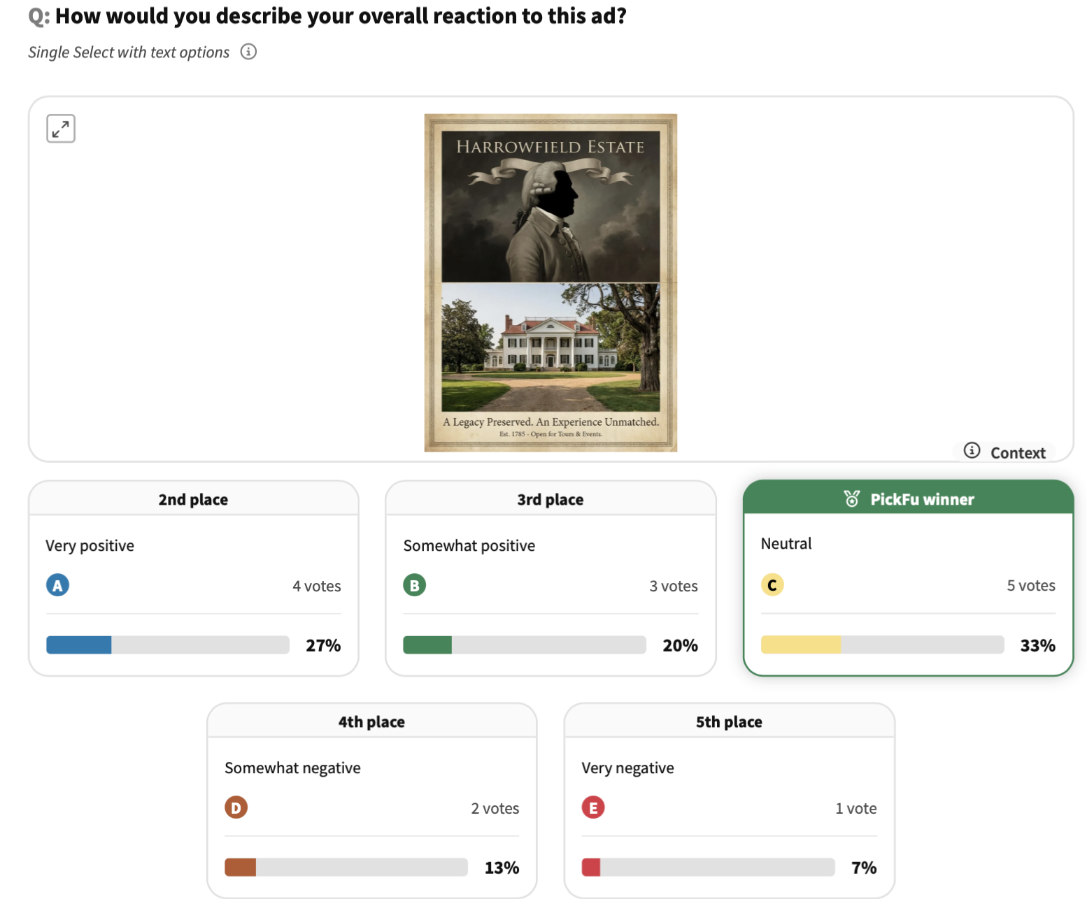
Historic estate ad creative: 5-question survey
See how 15 U.S. travelers and museum-goers reacted to a historic estate ad — testing sentiment, visit intent, prior awareness, and suggestions for improvement.
Business
This is some text inside of a div block.
Ad creative testing, awareness research, visitor intent
This is some text inside of a div block.
Survey
Ad creative, brand awareness, visitor intent
Distribution
Travelers and museum-goers
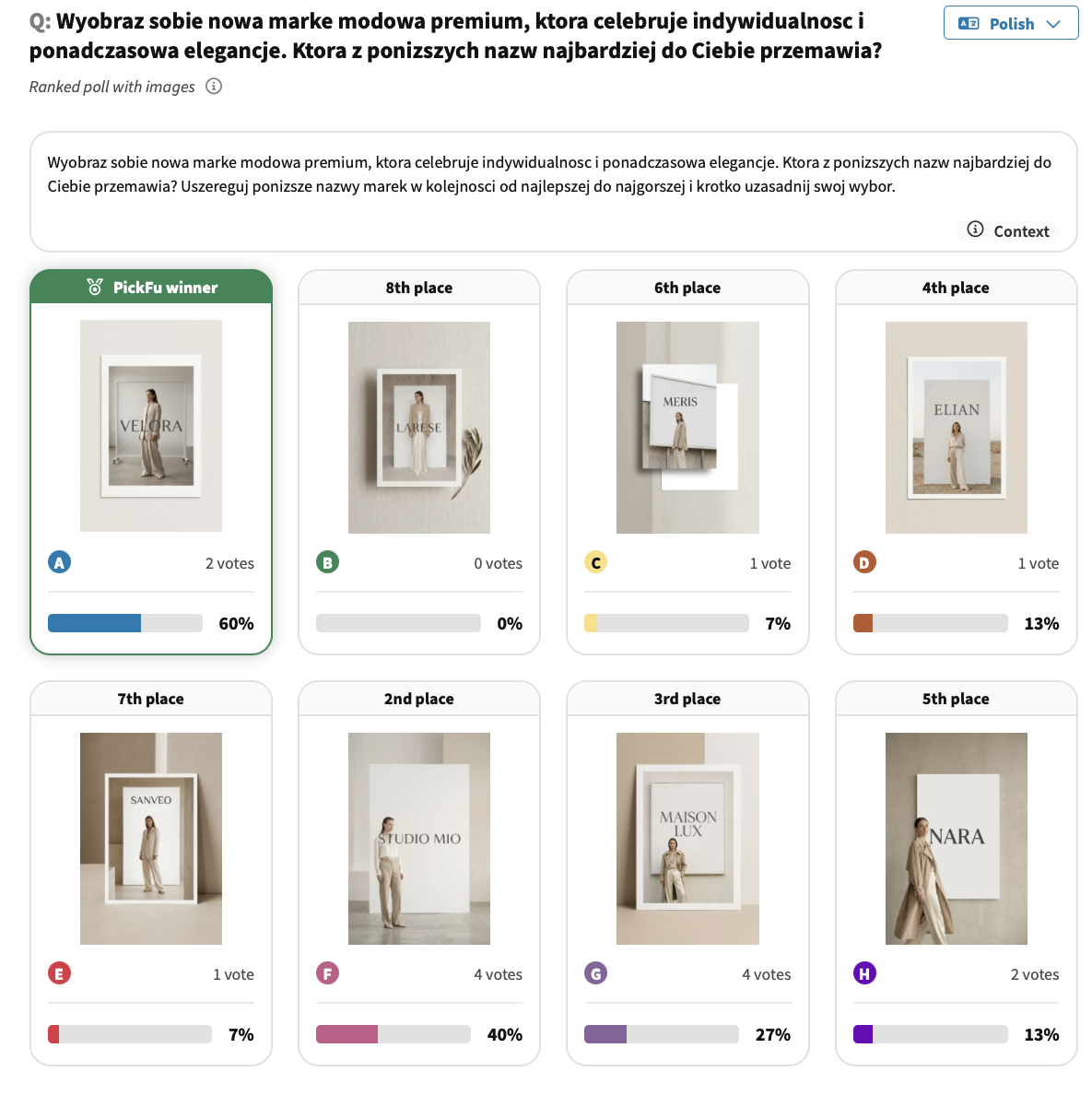
Brand name ranking test: Premium women's fashion (Poland)
See how 15 Polish women aged 35–44 ranked 8 brand name concepts for a new premium fashion label — and what drove their choices.
E-commerce
This is some text inside of a div block.
Brand name testing, market research, international audience research
This is some text inside of a div block.
Ranked
Brand name, international audience
Branding
Women aged 35–44
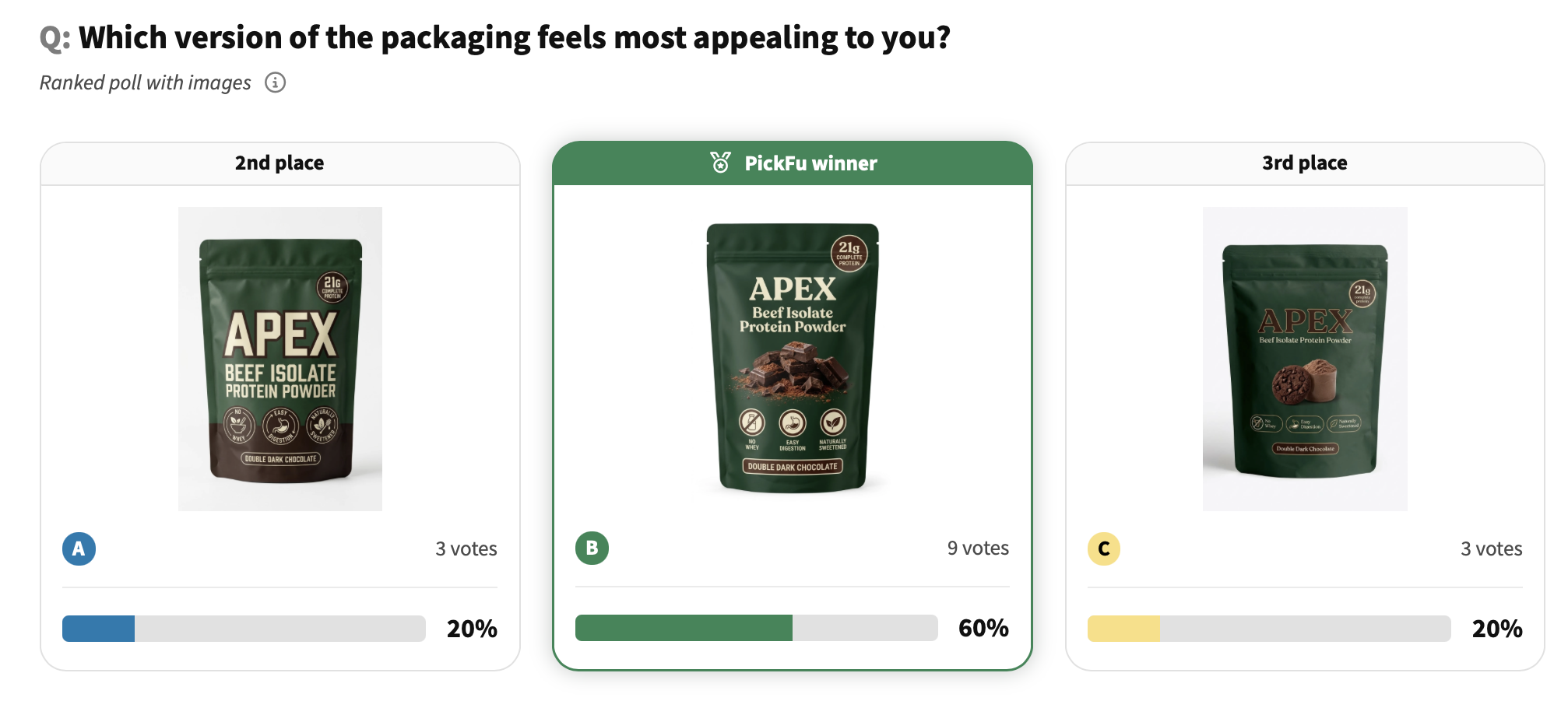
Packaging survey: Beef isolate protein powder (16 questions)
See how 15 U.S. female supplement users evaluate every angle of a protein powder's packaging — from first impressions to price expectations.
E-commerce
This is some text inside of a div block.
Packaging research, claim testing, audience research, price sensitivity
This is some text inside of a div block.
Survey
Female supplement users (occasional and daily)
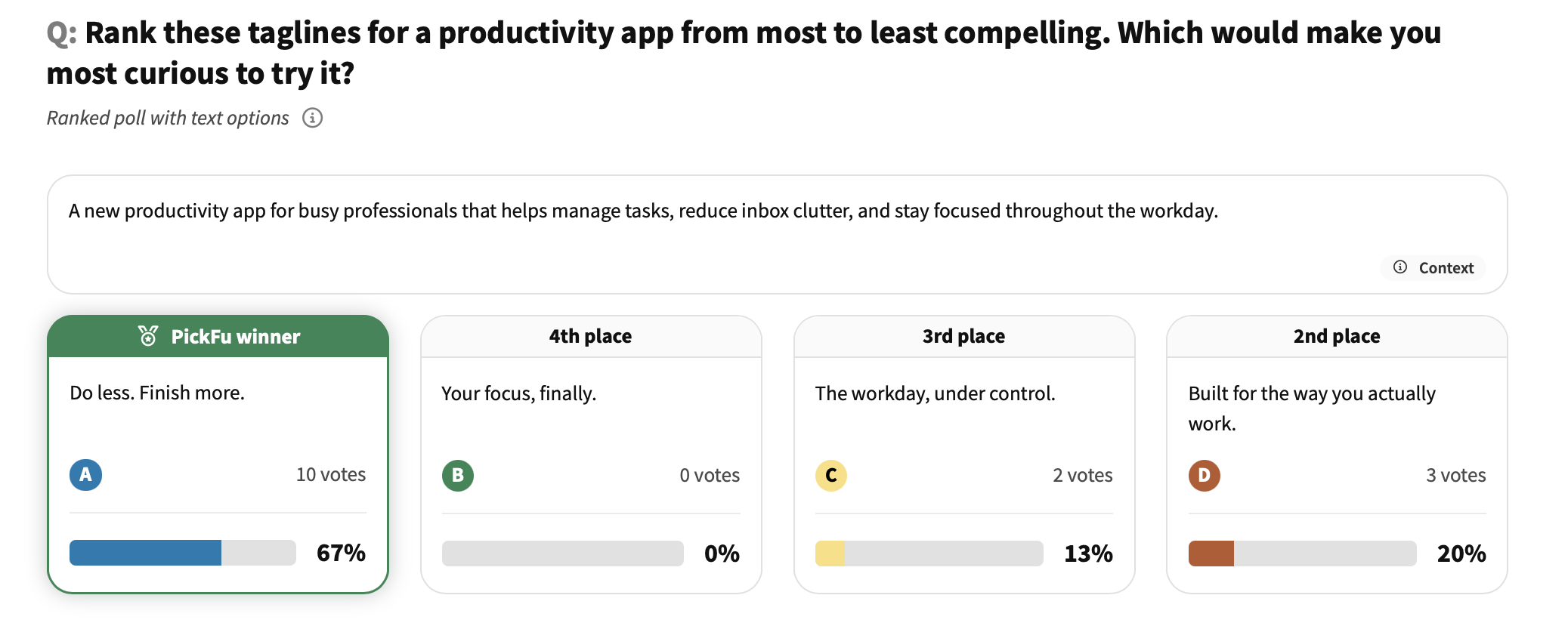
App tagline ranking: productivity app
See which productivity app tagline resonates most with 15 U.S. consumers — and what copy angles fall flat.
Business
This is some text inside of a div block.
Message testing, tagline testing, SaaS copy optimization
This is some text inside of a div block.
Ranked
General population
DTC purchase decision: skincare brand website
See which trust signals most influence first-time buyers on a skincare brand's website — real multi-select feedback from 15 U.S. consumers.
E-commerce
This is some text inside of a div block.
DTC website optimization, purchase decision research, trust signal testing
This is some text inside of a div block.
Multi Select
General population
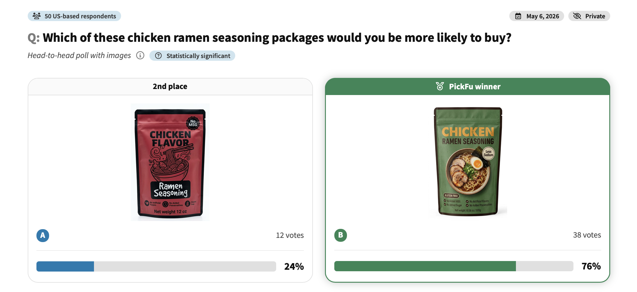
Packaging design comparison: chicken ramen seasoning
See which chicken ramen seasoning package 50 shoppers preferred — and what drove them to choose.
E-commerce
This is some text inside of a div block.
Packaging design testing, food product branding, color psychology
This is some text inside of a div block.
Head-To-Head
General population
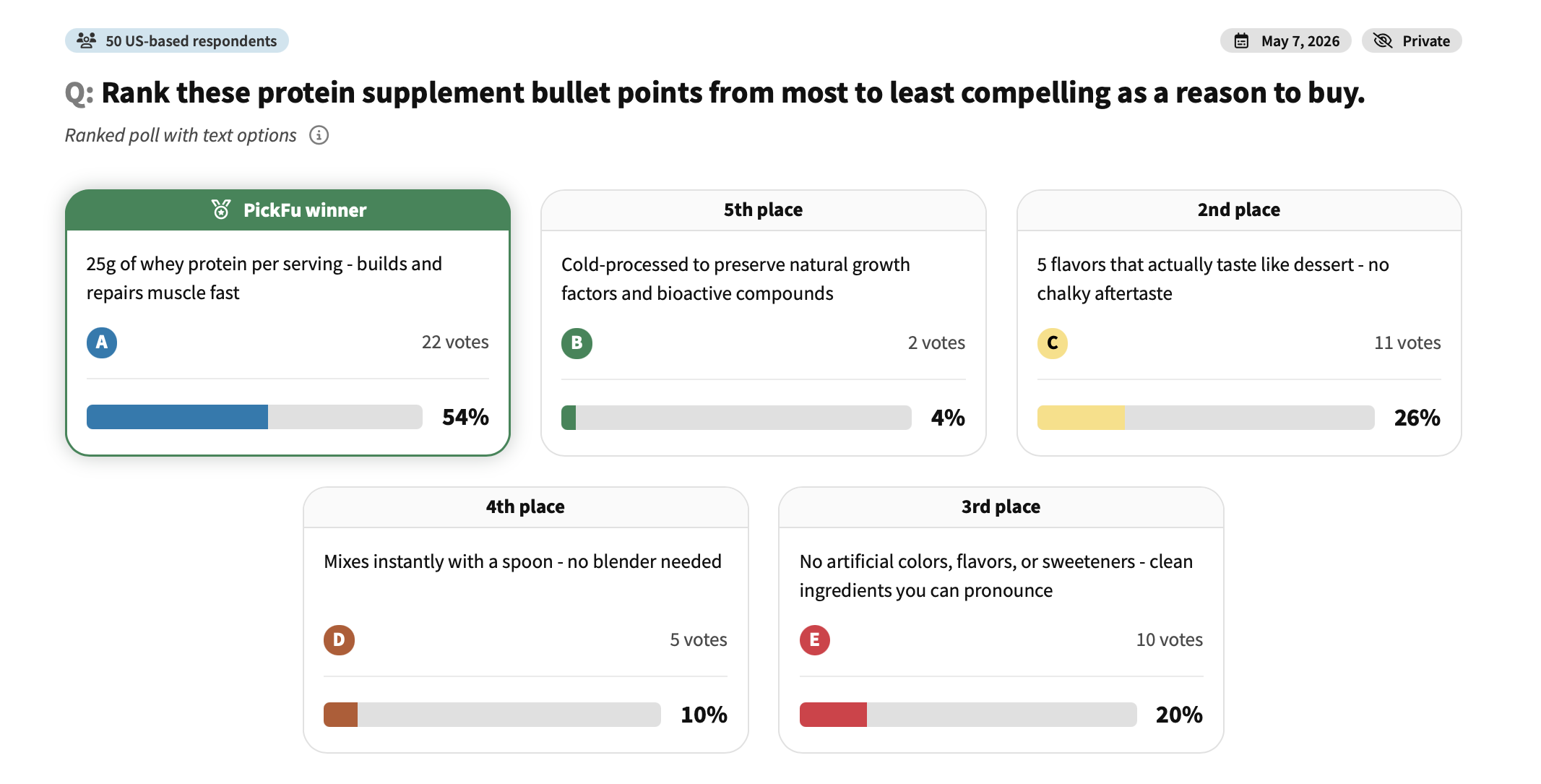
Amazon bullet point test: protein supplement
See which protein supplement bullet points 50 shoppers find most compelling — and which claims fall flat.
E-commerce
This is some text inside of a div block.
Amazon bullet point optimization, listing copy testing
This is some text inside of a div block.
Ranked
General population
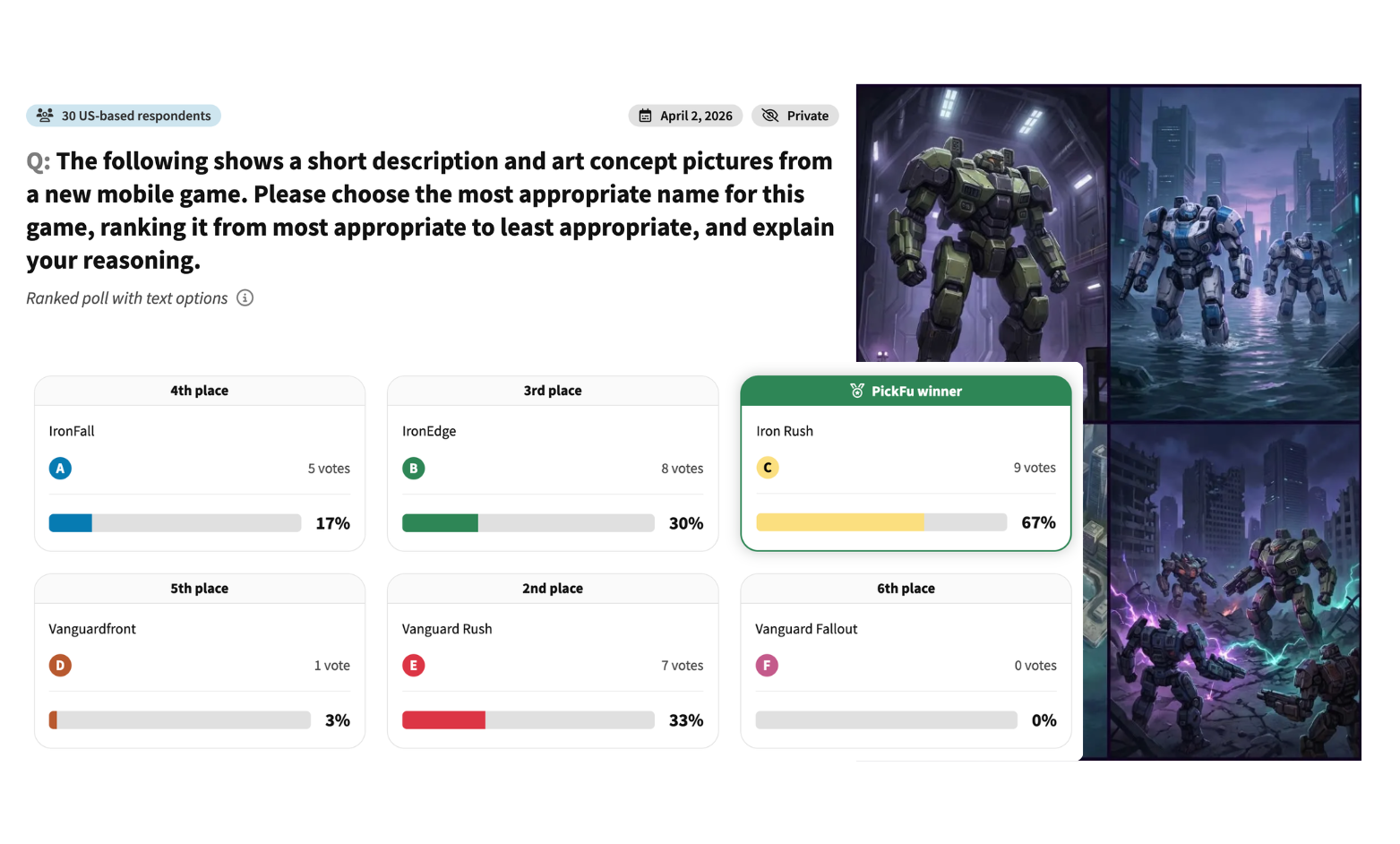
Game title test: mobile sci-fi mech game
See how 50 U.S. consumers rank 6 potential names for a sci-fi mobile game – and what makes a game title feel epic.
Apps and games
This is some text inside of a div block.
Game title testing
This is some text inside of a div block.
Ranked
General population
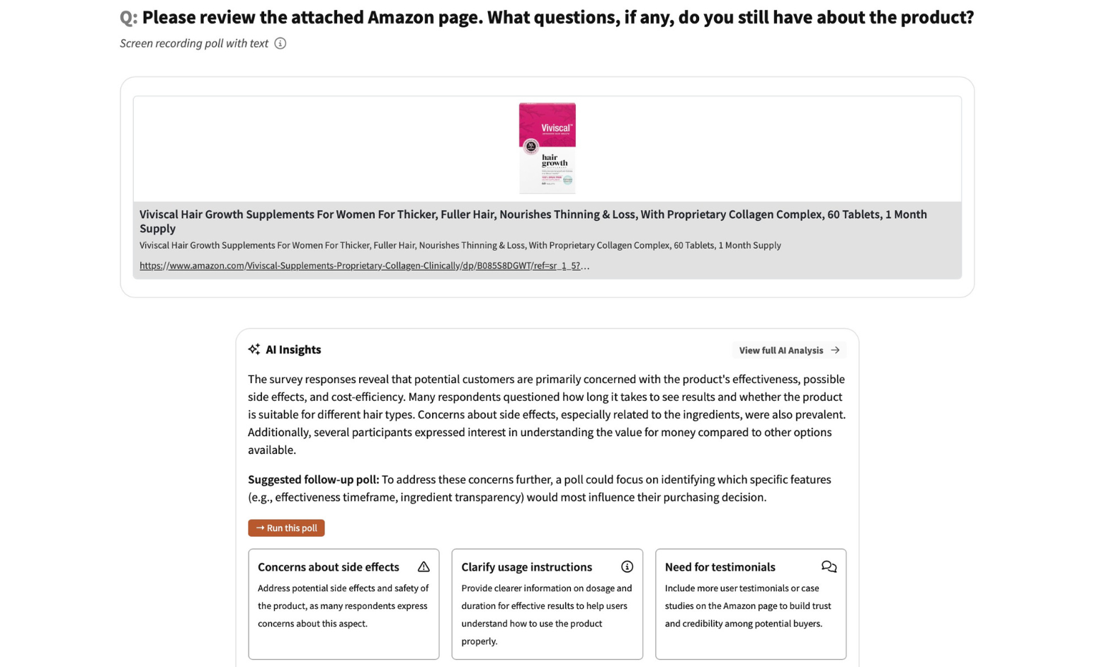
Amazon listing review: hair growth supplement
See what questions 15 U.S. consumers still have after viewing a hair growth supplement's Amazon page.
E-commerce
This is some text inside of a div block.
Amazon listing optimization
This is some text inside of a div block.
Open-Ended
General population
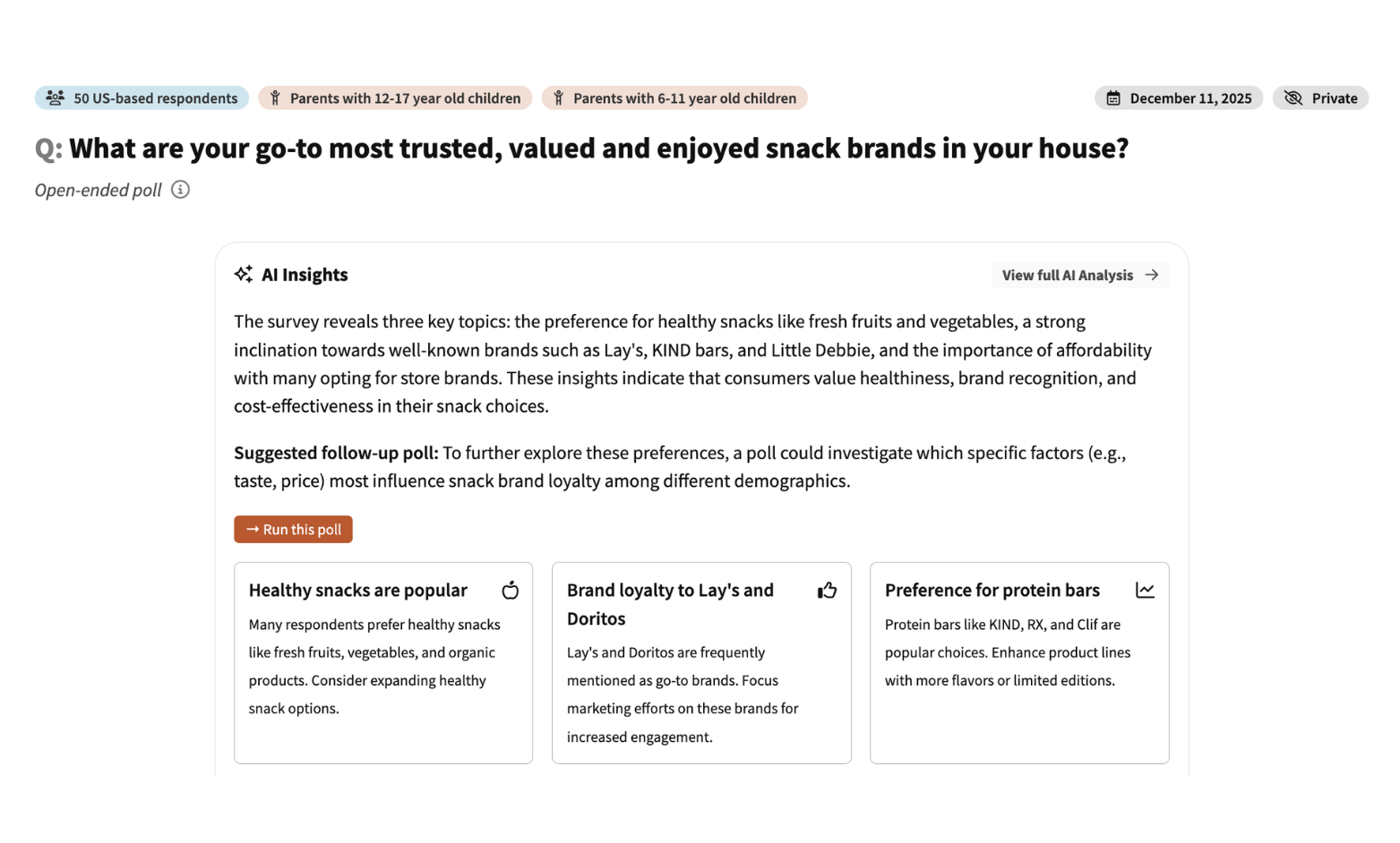
Healthy snack ranking: kids snack options
See how 50 U.S. parents rank six kids snacks by healthiness — and what trusted brands they already buy.
E-commerce
This is some text inside of a div block.
Idea validation
This is some text inside of a div block.
Survey
Parents of middle schoolers and teens
Product preference test: tearable dog toys
See how 30 U.S. dog owners choose between two tearable plush toys — and what features tip the decision.
E-commerce
This is some text inside of a div block.
Audience research
This is some text inside of a div block.
Head-To-Head
Dog owners
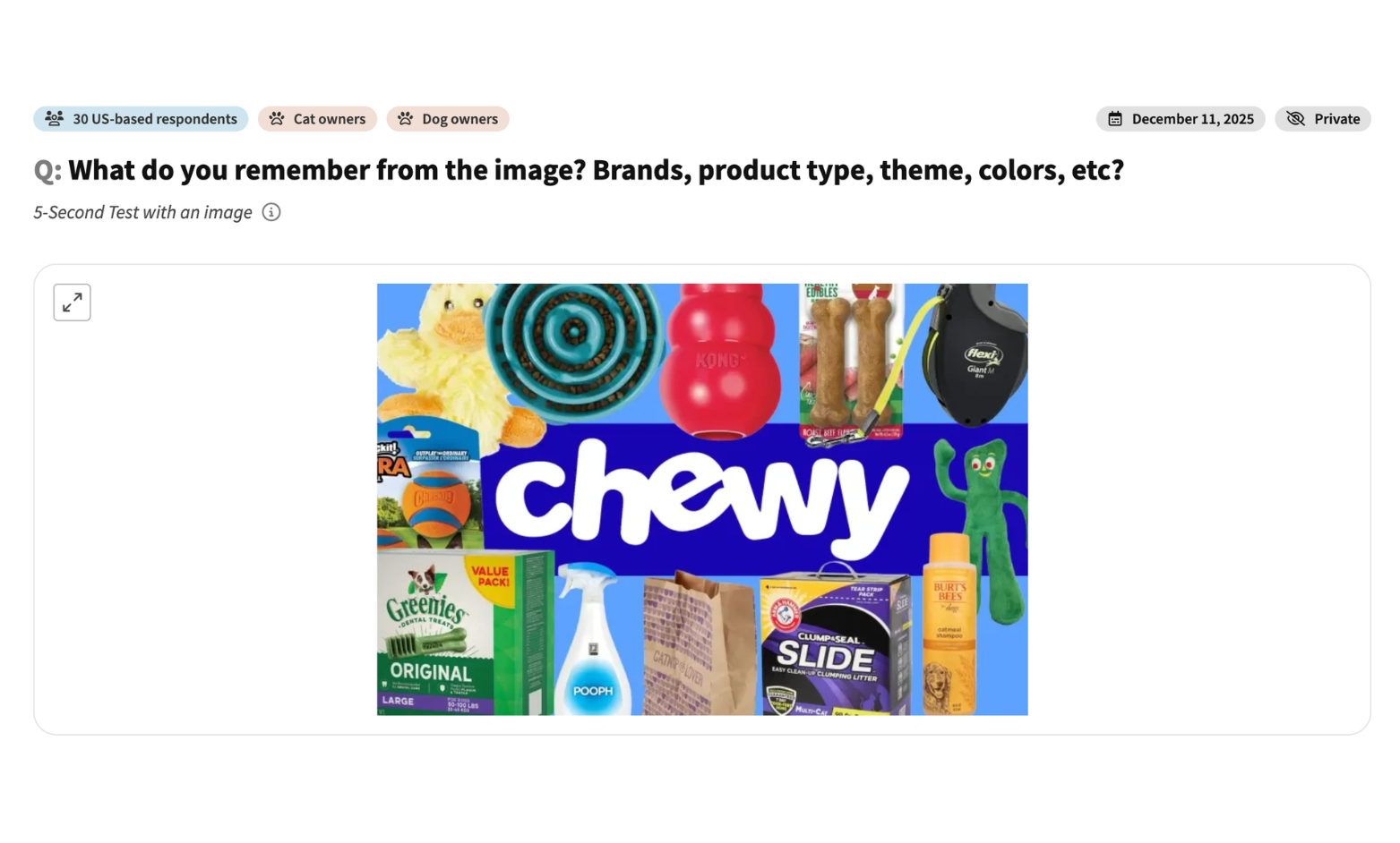
Brand recall test: pet retailer ad image
See what 30 U.S. pet owners remember after a brief exposure to a pet retailer ad — and what got lost in the clutter.
E-commerce
This is some text inside of a div block.
Marketing, ad campaign, brand recognition/recall
This is some text inside of a div block.
5 Second Test
Dog and cat owners
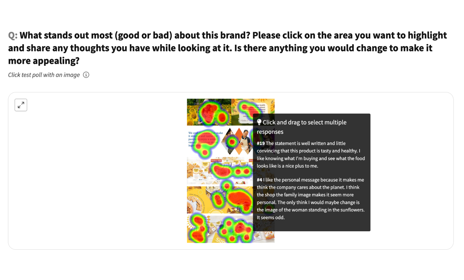
A+ content click test: healthy food brand
See where 30 U.S. consumers click on a healthy snack brand's A+ content — what draws attention and what falls flat.
E-commerce
This is some text inside of a div block.
A+ content design, brand appeal
This is some text inside of a div block.
Click Test
General population
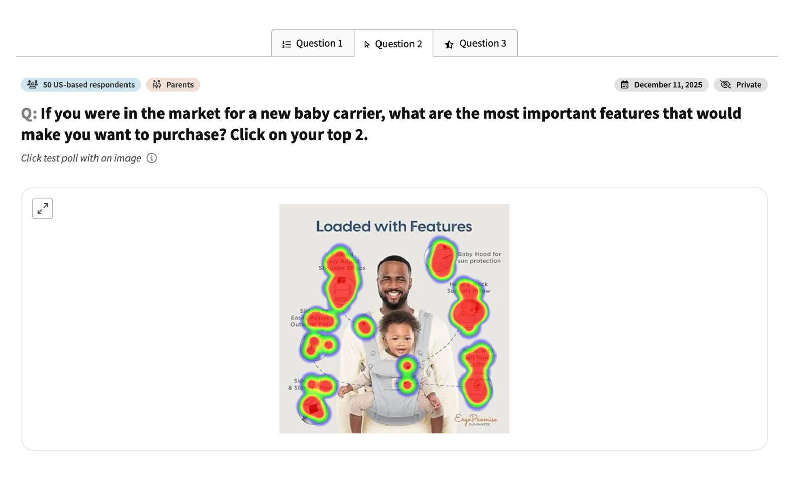
Competitor comparison: baby carriers
See how 50 U.S. parents rank four baby carriers and rate Ergobaby brand trust. Real feedback on price, comfort, and safety.
E-commerce
This is some text inside of a div block.
Competitor comparison, buying intent
This is some text inside of a div block.
Survey
Parents
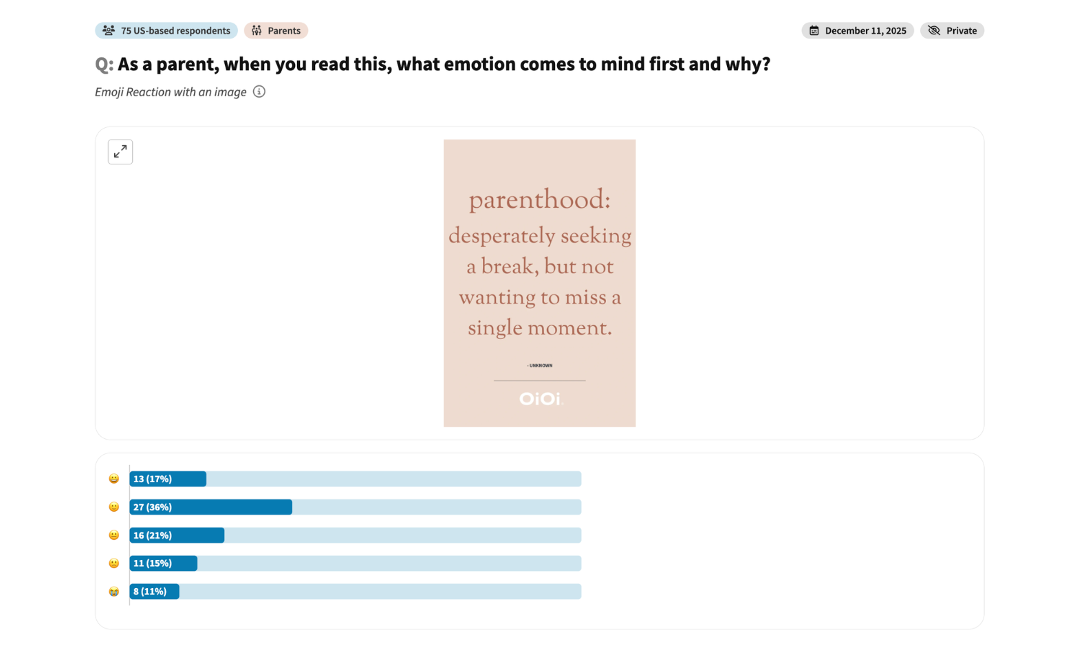
Marketing message test: parenting brand tagline
See how 75 U.S. parents emotionally respond to a parenting brand tagline — warmth, humor, and mixed reactions included.
E-commerce
This is some text inside of a div block.
Marketing message testing
This is some text inside of a div block.
Emoji Reaction
Parents
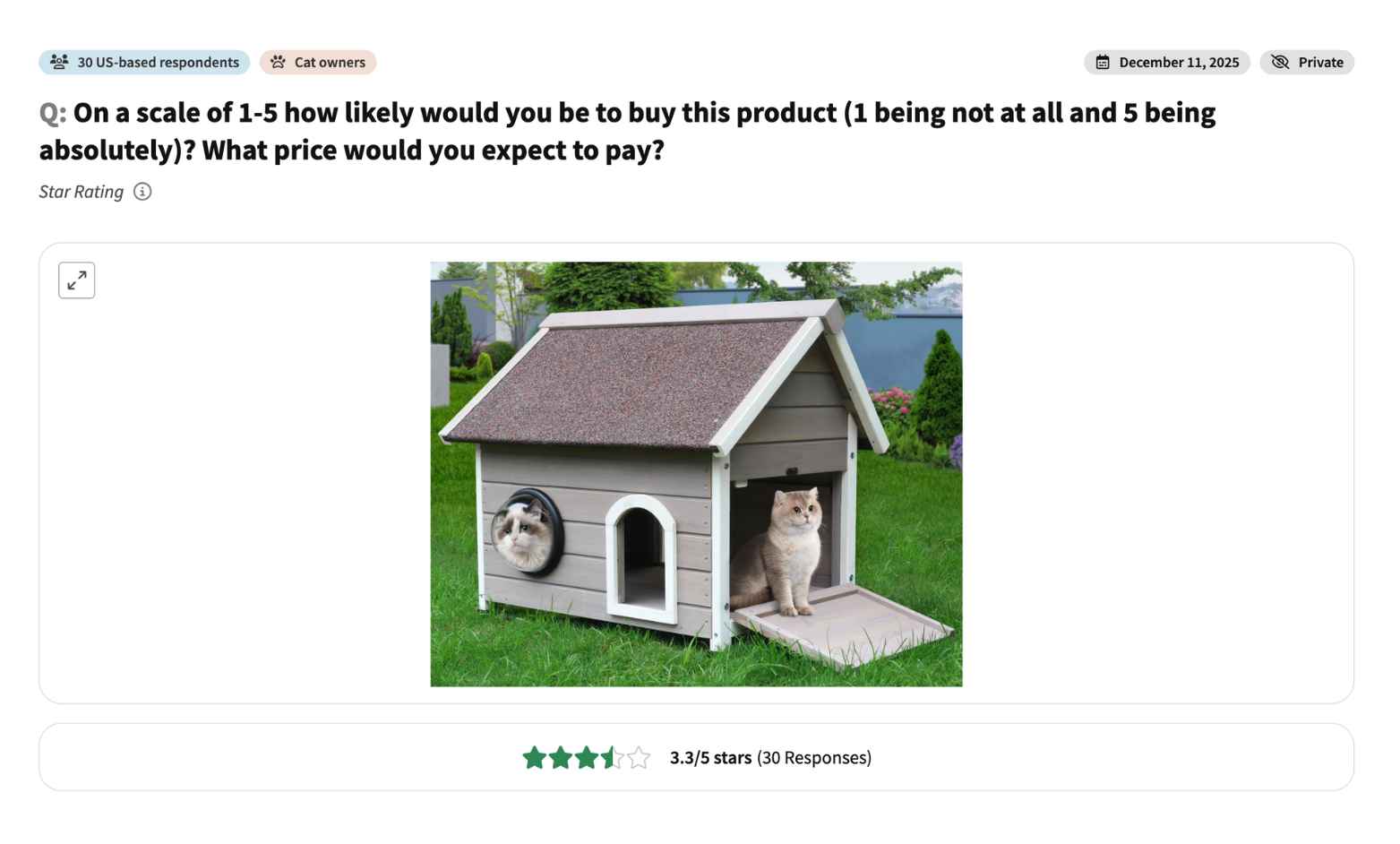
Product concept test: outdoor cat house
See how 30 U.S. cat owners rate purchase intent and expected pricing for an outdoor cat house design.
E-commerce
This is some text inside of a div block.
Product design and price testing
This is some text inside of a div block.
Star Rating
Cat owners
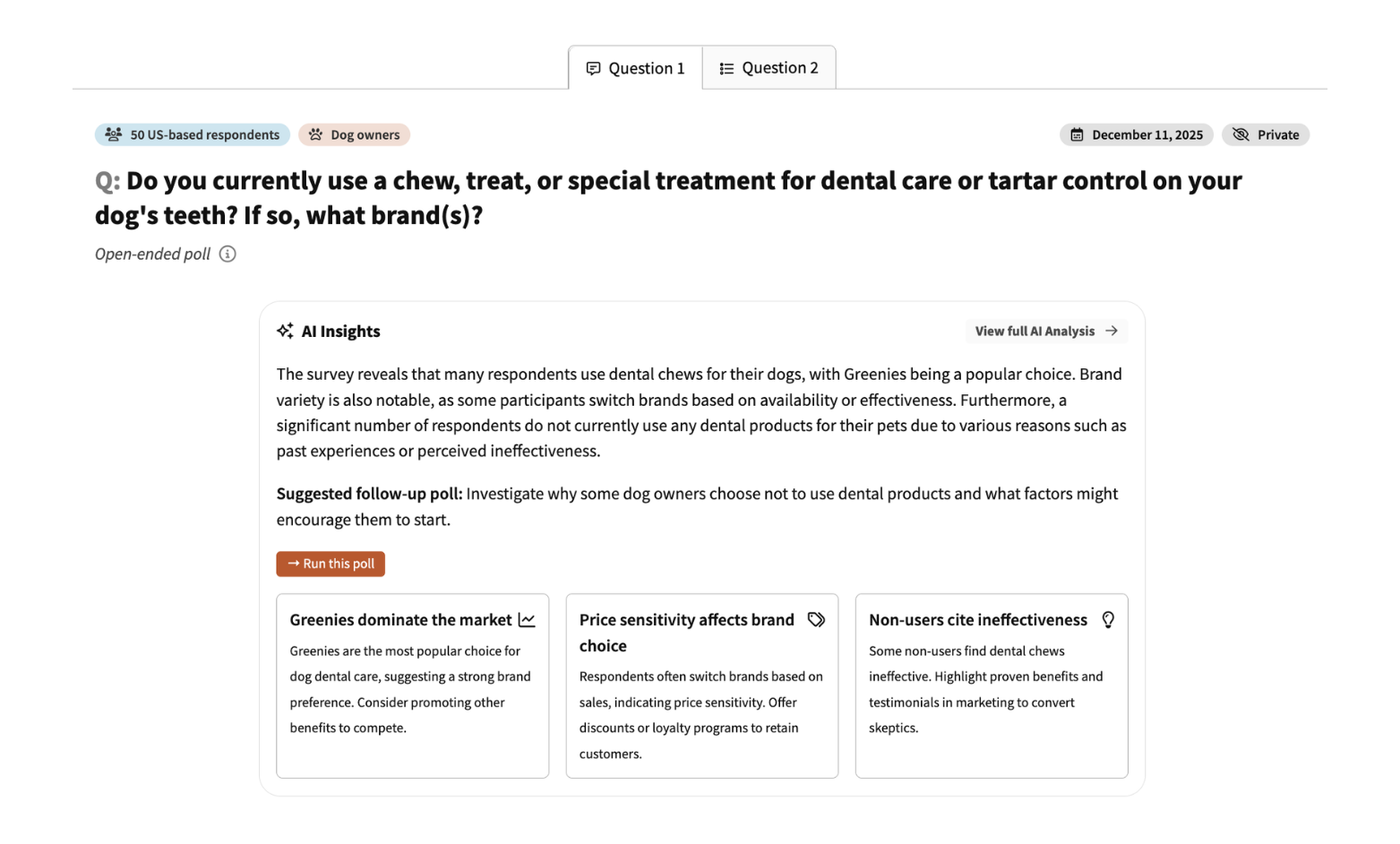
Brand loyalty survey: dog dental care products
See how 50 U.S. dog owners respond to a pet dental chew brand — what they already buy and whether they'd switch.
E-commerce
This is some text inside of a div block.
Brand loyalty research
This is some text inside of a div block.
Survey
Dog owners
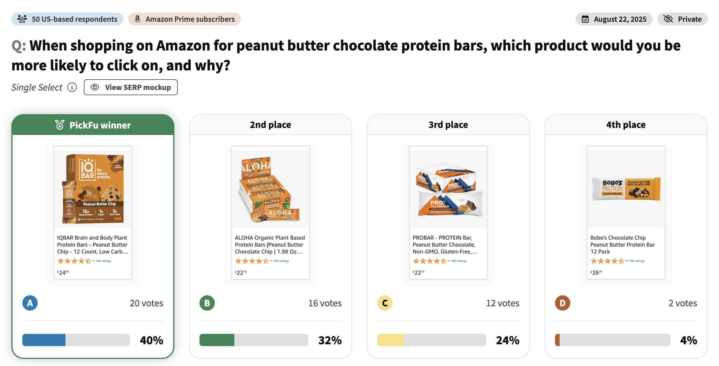
Amazon competitor comparison: protein bars
See how 50 Amazon Prime shoppers compared 4 protein bar listings. Real feedback on packaging, nutrition claims, and what drives clicks on Amazon.
E-commerce
This is some text inside of a div block.
Amazon listing optimization
This is some text inside of a div block.
Single Select
Amazon Prime subscribers
Packaging design feedback: instant noodles
See how consumers identify confusing elements on instant noodle packaging. Real click-test feedback on design complexity and readability.
E-commerce
This is some text inside of a div block.
Packaging simplification
This is some text inside of a div block.
Click Test
Product packaging
Development
General population
Product label color test: cleaning product
See which label color wins for a cleaning product bottle. Real consumer feedback on readability, contrast, and shelf appeal.
E-commerce
This is some text inside of a div block.
Product packaging design
This is some text inside of a div block.
Ranked
Product packaging
Design
General population
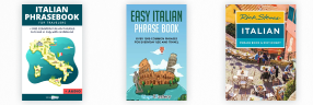
Book cover comparison: Italian phrasebook
See which Italian phrasebook cover stands out to language learners. Real feedback on design appeal and feature importance.
Publishing
This is some text inside of a div block.
Book cover design
This is some text inside of a div block.
Ranked
Book cover
Design
General population
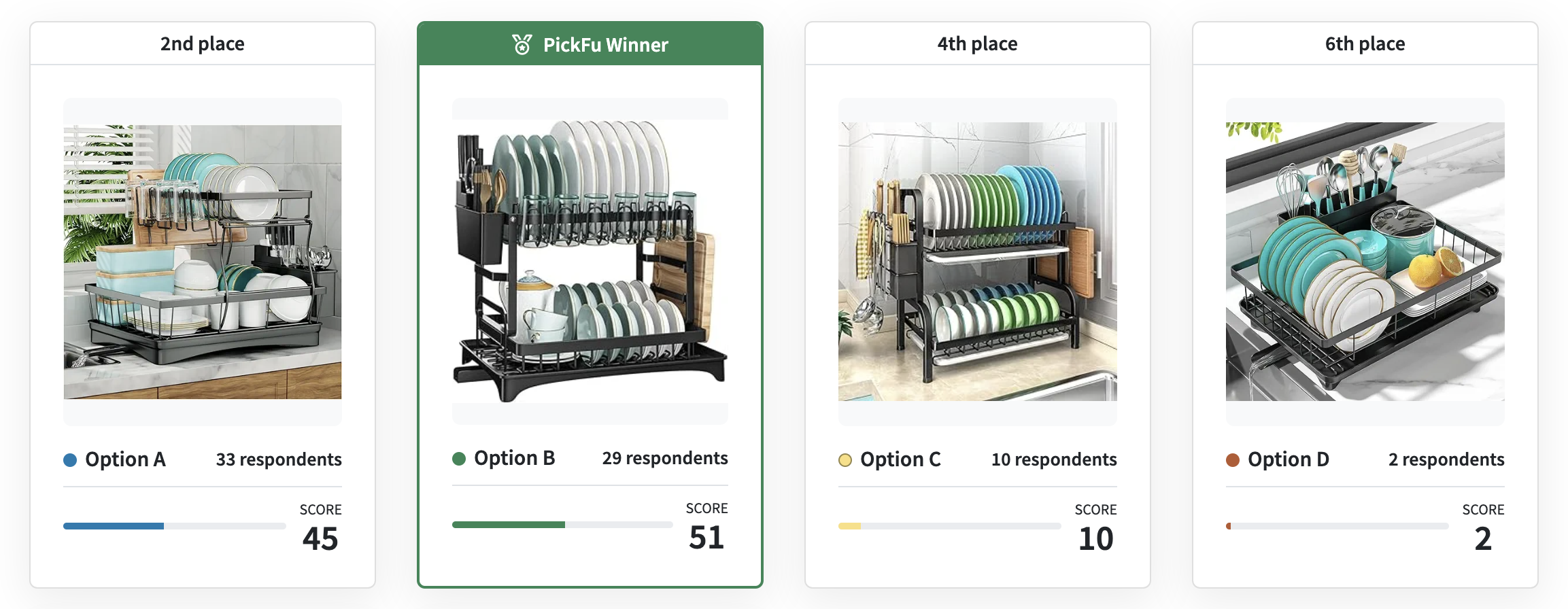
Amazon product comparison: kitchen dish racks (Mexico)
See which kitchen dish rack design Amazon shoppers in Mexico prefer. Real feedback on space efficiency and functionality.
E-commerce
This is some text inside of a div block.
International product testing
This is some text inside of a div block.
Ranked
Product design
Distribution
Mexico-based Amazon shoppers
Book cover design test: Christian self-help book
See where Christian readers' eyes go on a self-help book cover. This Click Test reveals most eye-catching design elements.
Publishing
This is some text inside of a div block.
Cover design optimization
This is some text inside of a div block.
Click Test
Book cover
Design
Christian audience
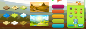
Game theme comparison: mobile puzzle game
See which puzzle game theme wins with mobile gamers. Round Robin comparison of character designs and visual styles.
Apps and games
This is some text inside of a div block.
Game theme selection
This is some text inside of a div block.
Round Robin
Character concept, App store screenshot
Design
Mobile gamers
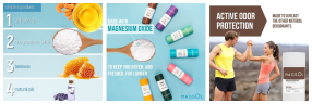
Amazon secondary images test: natural deodorant
See which secondary images grab attention first on Amazon. Click test of a 3x3 infographic grid for natural deodorant.
E-commerce
This is some text inside of a div block.
Image hierarchy testing
This is some text inside of a div block.
Click Test
Infographics or secondary images
Distribution
General population
App concept feedback: hiking trail guide
See how consumers rate a hiking trail guide app concept. Star ratings and feedback on features, usefulness, and connectivity concerns.
Business
This is some text inside of a div block.
App concept validation
This is some text inside of a div block.
Star Rating
Video
Design
General population
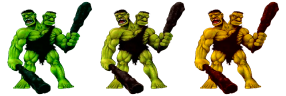
Game character rating: monster design feedback
See gamer feedback on a two-headed ogre character design. Star rating poll on proportions, colors, and overall appeal.
Apps and games
This is some text inside of a div block.
Character design feedback
This is some text inside of a div block.
Star Rating
Character concept
Design
Male gamers who like action, adventure, and RPG games
Game character feedback: Viking character designs
See which Viking character design wins with strategy gamers. Ranked comparison of three character concepts.
Apps and games
This is some text inside of a div block.
Character design selection
This is some text inside of a div block.
Ranked
Character concept
Design
Strategy mobile gamers
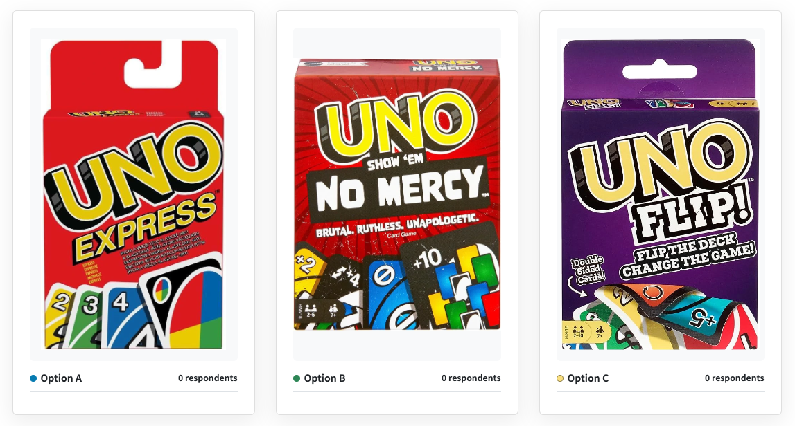
Product comparison: UNO game versions
See which UNO game version Mexican consumers prefer. Ranked comparison of classic vs. themed editions.
E-commerce
This is some text inside of a div block.
Product variant testing
This is some text inside of a div block.
Ranked
Product packaging
Distribution
Mexico-based consumers
Color scheme feedback: sheet music app
See which sheet music app color scheme readers prefer. Head-to-Head test of blue vs. green for extended reading.
Apps and games
This is some text inside of a div block.
App design optimization
This is some text inside of a div block.
Head-To-Head
App icon, App store screenshot
Design
General population
Product packaging test: honey bottle designs
See which honey bottle design consumers prefer. Head-to-head comparison of label colors and bottle shapes.
E-commerce
This is some text inside of a div block.
Packaging design
This is some text inside of a div block.
Head-To-Head
Product packaging
Design
General population
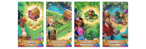
App Store screenshot Click Test: mobile farming game
See which mobile game screenshot grabs attention first. This Click Test reveals the most engaging elements in a farming-themed game.
Apps and games
This is some text inside of a div block.
Screenshot optimization
This is some text inside of a div block.
Click Test
Character concept, App store screenshot
Distribution
Mobile gamers
Sorry, we couldn't find any templates that matched your search or filters.
Try adjusting your search terms or removing filters.


.png)