Poll results
Save to favorites
Add this poll to your saved list for easy reference.
Which logo do you prefer for a high-end home decor product?
Option E won this Ranked poll with a final tally of 27 votes after 4 rounds of votes counting.
In a Ranked poll, respondents rank every option in order of preference. For example, when you test 6 options, each respondent orders their choices from first to sixth place.
PickFu requires a majority to win a Ranked poll. A majority winner differs from a plurality winner. A majority winner earns over 50% of the votes, whereas a plurality winner earns the most votes, regardless of winning percentage.
If an option does not earn a majority of votes, PickFu eliminates the option with the lowest number of votes. The votes from the eliminated option are reassigned based on each respondent’s next choice. This process continues in rounds until a majority winner emerges.
Scores reflect the percentage of total votes an option receives during the vote counting and indicate the relative preference of the respondents. If there is no majority winner, look to the scores to see how the options fared relative to one another.
| Option | Round 1 | Round 2 | Round 3 | Round 4 |
|---|---|---|---|---|
| E | 38% 19 votes | 38% 19 votes | 44% 22 votes +3 | 54% 27 votes +5 |
| C | 16% 8 votes | 24% 12 votes +4 | 32% 16 votes +4 | 46% 23 votes +7 |
| A | 16% 8 votes | 20% 10 votes +2 | 24% 12 votes +2 | Eliminated 12 votes reassigned |
| D | 16% 8 votes | 18% 9 votes +1 | Eliminated 9 votes reassigned | |
| B | 14% 7 votes | Eliminated 7 votes reassigned |
8 Responses to Option A
I like keeping it small and simple, less is more, and it can also be seen as a more luxurious type of brand, which I assume it what you're going for with the black and gold.
Keep the logo simple as a reflection of the name . change the white part of the logo of option 3
Option A appears to be the most prestigious logo.
This logo really has a timeless elegance to it. Looks luxurious and high class. You also get the natural element with the floral looking border.
OPTION A I love this logo it's really classy and in my opinion it suits exactly what the description is saying. And option B is my second choice for the same reason I can imagine that description when I look at the logo
I thought A had the most elegant look of all the logos
Artistic without being overbearing best in this order.
I think that the design of A is the most high end and posh looking of the logos
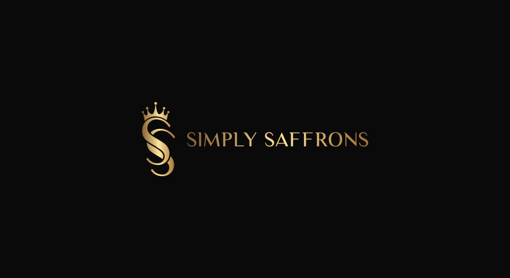
7 Responses to Option B
I strongly dislike the logo in D. ALso, I find the name of the company almost impossible to read in both A & D.B has the best logo and colors, I think, as well as the best font, so it's a distant first.
i prefer the logo in option B because of the gold gilded appearance and contrast
I found the 5 logos excellent.And they also stand out with the innate qualities that quality products have, black background and golden letters.If for me they are all excellent, there is an extraordinary one : B
B appears to be the most unique and elegant logo
I like Option B. It's very easy to read. I like the simple style. It's very pretty.
I would choose "B" because it is more creative and classy.
I like the size of the text, I can actually read it. I also like the intertwined logo design, I like the crown on top of the S, it makes me feel that it is fancy.
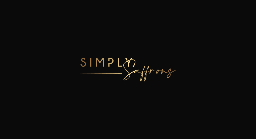
8 Responses to Option C
I like C the most. I always associate cursive as being sophisticated.
i liked option C the best b/c i like the font of the text and the way it's arranged on the page. my choices went in order of those things from my favorite to my least
I prefer C for the simplicity and elegance but I think I am confused on if this is spices or home decor
I ranked in the order that I feel the logos are high class and sophisticated.
I think option C is best, it remains elegant but is approachable as well.
I feel like this has everything that you need when it comes to elegance and the things you think about it.
I really like the simplicity of C, just the two words in the name stylized. I found it by far the most attractive option and best suited to a high end product.
I like C a lot because it is simple and beautiful. It has a blending of styles and is unique. E is very nice and straightforward. A, D, and B remind me of something else, like a logo for a law firm, mattress store, or real estate. I don't think they capture the right message. They seem out of place.
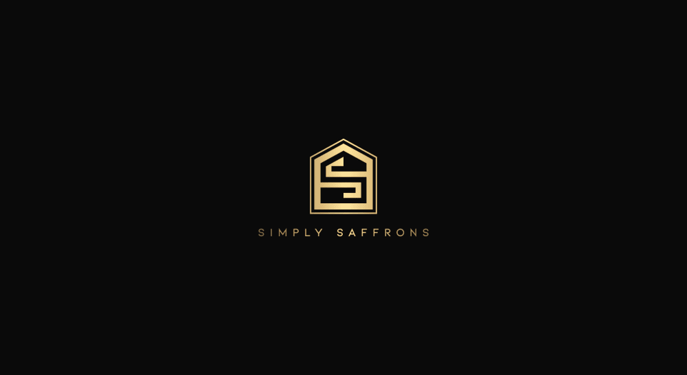
8 Responses to Option D
I like d the best. Nice and original.
I chose by options I find most unique and that get my attention.
E doesn't say anything high end so it gets last place.The crown in B makes it look rich so I went with that second.I like D the best. It speaks high end and minimalistic. I think high end logos need to be minimalistic.I like the fading on the words in A so that put it third.That leaves thr fourth spot for C. I don't dislike C. It is miles better than E.
I feel like the logo on D would be more recognizable
I would choose D it goes well with the theme and looks very professional
I prefer Option D because it looks like it is the most high end and the most modern and sophisticated without being fussy.
I picked D, E and B as my top choices as I like how the designs look like they are the boldest for the company.
I prefer option D. This logo represents the home. It is delicate and sophisticated looking. I would like this one.
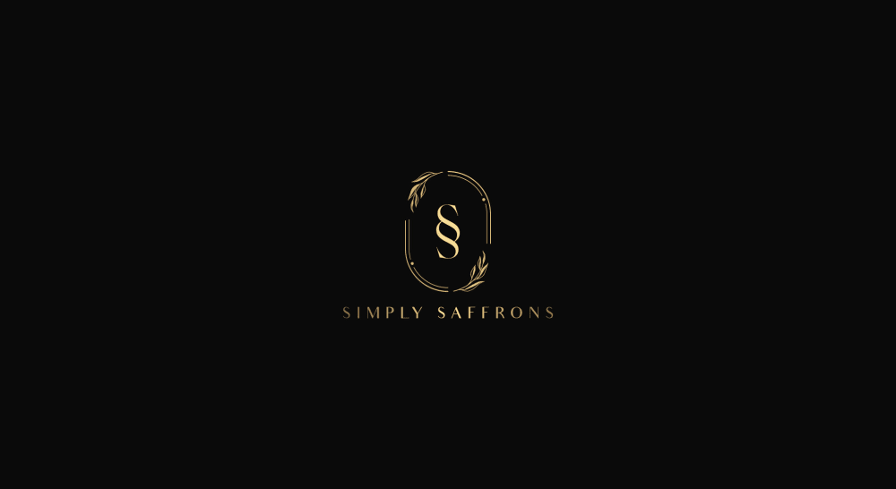
19 Responses to Option E
I went with my gut feeling and chose the ones most appealing to me
The brighter gold color and the all around design make Option E the very best logo.
Option E, I liked the logo design the most. Option C, looked simple but I liked the sleek font style. Option B and A, looked okay. Option D, I thought the logo design looked ugly which is why I ranked it last.
E stands out by far with the layout and the bold size, it really catches one's attention right off the bat.
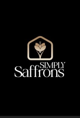
The depiction of the saffron seen in choice E seems adequate for most uses I believe.
Option E was large, easy to read, and had a good design. Option B was satisfactory and the design looked professional. Option C was acceptable, but a little plain. Options D and A were too small and difficult to read.
I prefer Option E as my first choice. It's legible, attractive and has style. Compared with the other very small logos it much more present and interesting. Options B & C are also quite nice and has a simplicity that's pleasing.
E is the best logo because it stands out and has a classy look but also helps to represent the brand and the meaning
I like the white mixed in with the gold color in E. Not a fan of the logo in A
This option is the most appealing to me because it has the most elegant design, and looks the most professional.
I think you need a memorable logo that immediately evokes the concept of home, so I would go with E since it ties in Saffron as well, followed by D because it is visually interesting. A and B remind more of logos for hotels or something like that, while C is just too generic and could be for anything as far as I'm concerned (chocolate is what my first reaction is).
My first several choices were those featuring elegance and intricate design into the logo. I am fond of elements that nicely flow into the space and the dark background showcases the golden elements that make these logo selections so appropriate.
I would choose choices E, B and C first because they have a more clear and easy to read logo which is more pleasing to me as compared to choices D and A which has a small font making it a bit to read the details of the logo.
I like this option the best because the design is simple, and the font of the text looks the most unique and in relation to the product being sold.
I picked option E because I feel it is the most elegant logo design. This elegance fits a high end home decor brand better than the other options.
The font is attractive and easy to read. The graphic is appealing.
The inscription is easy to read and the logo that comes with it is classy and very appealing
I think E is the best because it's a very simple, but very complex-thought provoking image. Like the simplicity and depth of a lotus.
The font in option E is very high class and looks great, so that is the one that I would choose.
Explore who answered your poll
Analyze your results with demographic reports.
Demographics
Sorry, AI highlights are currently only available for polls created after February 28th.
We're working hard to bring AI to more polls, please check back soon.

