Poll results
Save to favorites
Add this poll to your saved list for easy reference.
Which logo do you prefer for a product that is meant to convey luxury and why?

31 Responses to Option A
I like the color of this logo better and think it makes it seem more luxury based
I think that the font style and brighter logo image is more easily associated with a luxury product.
I like the bright orange and blue colors featured in this option, which are fun and energetic for sure!
I like the coloring better and it looks really pretty.
It's not just the colors, but the use of the specific flower in A that makes it seem more luxurious to me.
I prefer A, this colorful flower looks more luxurious and elegant.
The orange designs for the flowers stand out to me with A here, I like the design philosophy of the logo with a natural flower.
A. The color stands out more, makes it more beautiful and better matches the name.
I think the flower in the other one looks too much like the traditional Hawaii (I think?) flower. It seems much more relaxed and like something you'd find on a pair of swim shorts. The flowing flower and colors look very luxurious. The font of beauty makes it look elegant and provides some balance to the first part of the text. It's balanced very well. The other one is too wide and too tall. It would not brand well at all on any item.
A looks prettier. I love the colored flower logo.
I like the colors in A. B feels a little flat with no color.
I really like the colors present in this logo and there's so much more interesting than the black and white but even if they were both grayscale I would still prefer this because it's an intricate design and the Elegance of this really does convey a message of luxury to me
I prefer choice A with the two different font styles and the added color in the image. The added color gives it that little bit more of Luxury over just having one solid color.
I prefer Option A as my first choice. The graphics, font and especially the bird of paradise looks exotic and rich. Its subtle and has a pleasing simplicity. Option B is perfectly fine but not as eye catching , mostly because it's in black and white.
I think the bird of paradise flower is more colorful and elegant than the plain black flower, so seems more luxurious. I also like "beauty" in script.
I love the cold colors transitioning to warm callers it just pops. The other one is just to plain and does not stand out at all.
Because it has a birds of paradise photo witch to me means tropical and the italics font
I prefer option A. I like the one that looks like a water lily. They are rare around here and beautiful and elegant.
I chose Option A because of the color scheme.
A is more luxurious to me because it has a more unique and distinctive style.
A is admirable and more conspicuous which makes it more aesthetic. The mix of colors is unique and looks fancy. The design is lively and the patterns are highly creative.
I like the colors in choice A because it makes the logo more unique compared to choice B.
I like the vibrant colors, it makes it looked nicer.
I choose A because I like its colorful creative and visually appealing design
I like the logo design for A looks simple, classy, professional and versatile. The logo is also very relevant to the brand's reputation which is to provide luxurious services.
I thought A seemed less commonplace and more fancy. It looked high quality and engaging.
a is more distinctive. in terms of the flower and the way it is designed. in the other image, the flower seems "common". when i think of luxury i don't think common. i think of having to go or do a little bit more in terms of having it.
The flower and color for option A is nicer. That looks great and think it is a better overall look. Nice design for the logo and use of the font there with cursive on the bottom.
I prefer the colorful design of A and feels that it conveys luxury better.
A is more visually appealing.
This logo is more colorful and has a style that gets immediate attention. The flower design is graceful and gives a connotations of high quality.
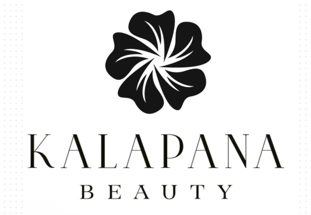
19 Responses to Option B
I think that option B has a modern and luxurious design that seems classy and professional.
The font of this option looks more structured, modern, and upscale.
I like B more because black and white feels more luxurious and the font is easier to read
I like how B is a little more understated and simple for a luxury product. I like the font better.
I would prefer option B's logo design as it looks elegant and modern.
B does convey his level of a product to me because of the flower design of the logo
Font and design of the name looks more modern and stylish. I would choose Option B.
Option B is more suitable for conveying luxury due to its elegant and simple design. Option A is colorful but lacks the sophistication of Option B.
B is simple and has a minimalist design which makes it more classy. The design is more professional and uses a neutral color which makes it more universal and visually impressive.
Black and white and somewhat art deco conveys luxury more than does the orange flower.
I love this one more because it is black in color, making it look much more luxurious.
I like the straightforward simplicity of B. Keeping it all one colour is much easier to take in. The large, central flower looks great.
The whole design of this is stunning, the black adds the class against the white, along with the flower design and the font used.
I think the font and black and white design look more luxurious.
The non colored version of the logo puts off more of a sense of luxury compared to the colorized option. The black and white seems to be high class, where the other option feels more fun and family friendly.
The black and white seems to convey more luxury to me. It's simple and sleek.
i like the intricacy of the black/white logo , classier than the blue/orange of A
I tend to think luxury brands have somewhat understated logos. I personally prefer A myself, but I think B fits better overall for the luxury market. A is a bit colorful and looks more of a general market logo to me. The more muted black and white looks more like something I would expect to see on a higher end product.
I like how the text and logo is one black color in optiom B and how the logo is centered.
Explore who answered your poll
Analyze your results with demographic reports.

