Poll results
Save to favorites
Add this poll to your saved list for easy reference.
Which design do you like most and why?
Option C won this Ranked poll with a final tally of 27 votes after 1 round of vote counting.
In a Ranked poll, respondents rank every option in order of preference. For example, when you test 6 options, each respondent orders their choices from first to sixth place.
PickFu requires a majority to win a Ranked poll. A majority winner differs from a plurality winner. A majority winner earns over 50% of the votes, whereas a plurality winner earns the most votes, regardless of winning percentage.
If an option does not earn a majority of votes, PickFu eliminates the option with the lowest number of votes. The votes from the eliminated option are reassigned based on each respondent’s next choice. This process continues in rounds until a majority winner emerges.
Scores reflect the percentage of total votes an option receives during the vote counting and indicate the relative preference of the respondents. If there is no majority winner, look to the scores to see how the options fared relative to one another.
| Option | Round 1 |
|---|---|
| C | 54% 27 votes |
| B | 26% 13 votes |
| A | 20% 10 votes |
Age range
Amazon Prime member
Education level
Gender identity
Options
Personal income range
Racial or ethnic identity
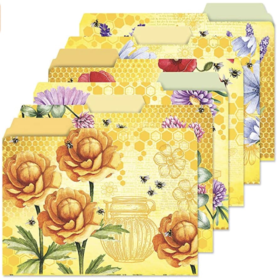
10 Responses to Option A
Option A has a pleasant theme through out and is unified by the closeness of all the pages. It reminds me of summer and I enjoy how well it all looks together.
Option A is the most visually stunning and I believe it would be liked by the most amount of people due to its use of every day items like flowers and honey. While options A and B are very pretty, the designs are very complex and I prefer something more simple and less busy. I picked option B last because it's by far the "busiest" of all 3 designs. Option B is nice, but the pattern reminds me a bit of generic wrapping paper. I would be happy with either Option A or B, but A is my preference due to the color scheme and items used in the design.
Colour-wise, I like A. The soothing yellow theme is easy on the eye. Pattern-wise, I like C. The geometric mandala shapes are interesting.
I think Option A brings about a brightness that promotes a positive mood. Also, it is more open and free-flowing than the standard designs of the other options and provides more variety (not just flowers).
Option A I really like this bright flowered design it's so pretty and it's so 3-D like as well,. it looks so realistic.
I like option A the best, they all have a nice bright yellow design and I like the flowers and bees. Option C has a unique design. Option B has pretty flowers but I like a design with less flowers like option A.
my eyes were drawn towards A as soon as the job opened. It is a very pretty color of yellow.
I like the brightness of A and B but dislike C because its too much design for me personally
I like Opt A the most, because it's a happy, joyful design and color, and I like bright, colorful flowers. Opt B is nice, because it reminds me of fields of wildflowers, cheerful and also joyful colors. Opt C was last due to the fact that there were some darker colors as well as only a single floral design, not many, as the others.
This was an easy choice for me. I ranked A first because yellow is a favorite color of mine. And a design that incorporates a yellow background and lots of beautiful flowers is a natural draw for me. The designs of B and C are nice, but they did not even come close to how much I really like A.
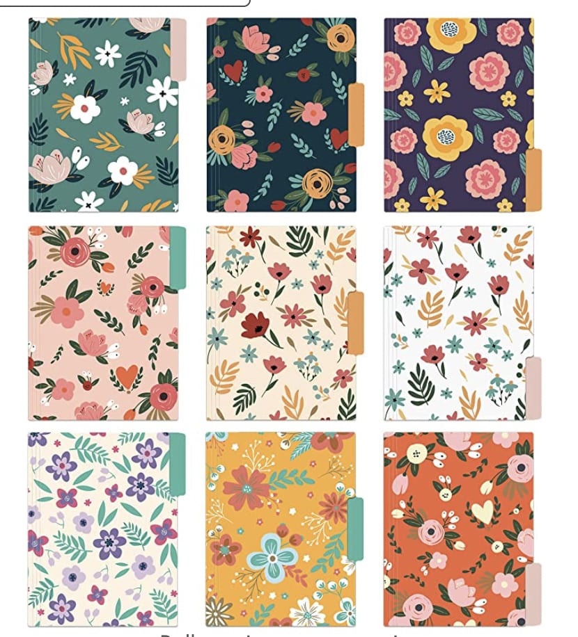
13 Responses to Option B
Option B has a wonderful variety of colorful floral patterns on the folders.
The many floral patterns are pleasing. They make me think of spring.
I like the colorfulness but the calmer pattern of Option B
I like the floral patterns a lot. The seem light and dainty. C and A look a bit old and messy.
I like choice B with the wide variety of colors and designs, help to better label and figure out which folder belongs to which things you are putting in those folder. Choice C is a close second since it's a wide variety of colors. Choice A is way too much yellow I am passing.
I chose option B because I like the floral desings on these folders. I think they look the nicest and are not too busy like the other options.
I like the clean and stylish design of Option B. The simple 3-4 color palette is very pleasing to look at, and it feels very trendy to me. I can see myself using these. While I don't personally like yellow all that much, I think Option A is a cute idea, and bees are a very popular motif right now. It has kind of a vintage/antique look to it. Option C looks too much like the designs found in an adult coloring book, and I don't find the color choices very attractive.
I like the variety in B and the design of C, but A is too monochromatic and boring.
I like the floral designs of A and B more than the geometric patterns of C. I like B more than A because it is just flowers and leaves, no bees or honeycomb.
I love the flowers and I love on option B how they all obviously go together but aren't so matchy matchy they blend together.
I like the difference in colors and patterns presented in option B the most, the color choice for option A isn't horrible but I prefer the variety of color options and patterns presented in B more.
Option A is too yellowy, Option C is too druggie, but I think Option B's flowers are quite pretty!
I love the variety of flowers but I also like the mandalas. A is too yellow and I don't like it.
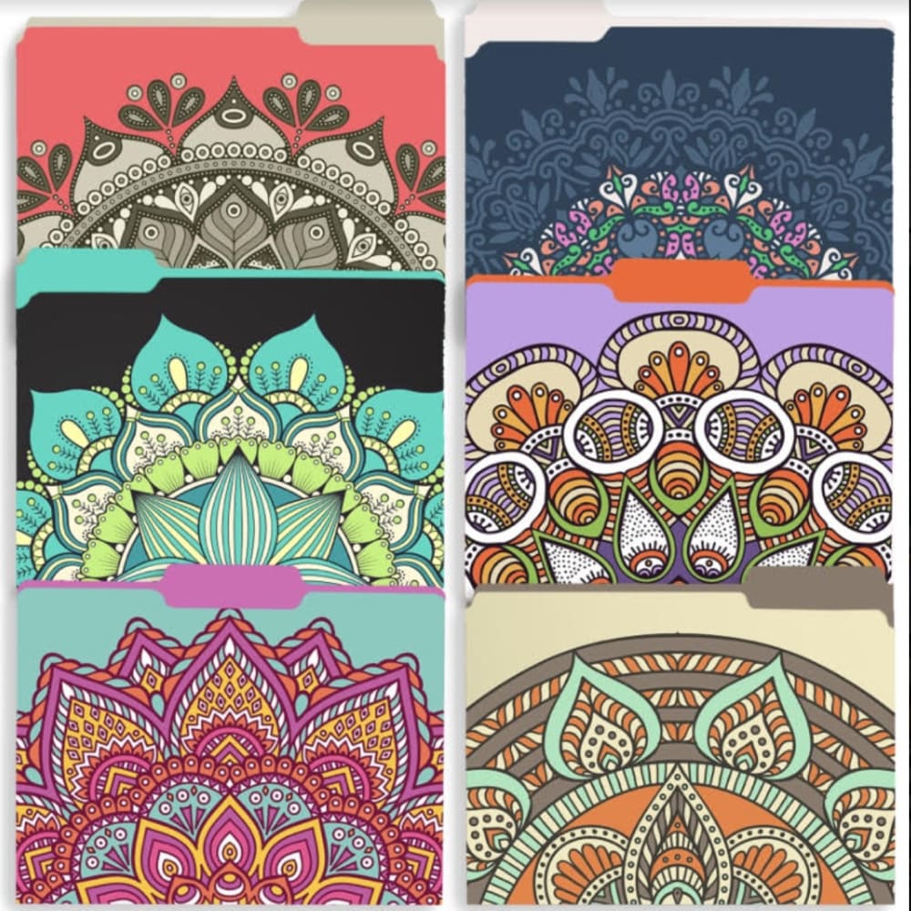
27 Responses to Option C
The warm colors and the unique patterns of Option C made it the most interesting and appealing one to me.
I'm really digging the colorful geometric patterns in option C. Option B is nice, a little boring, but better than option A.
C I feel has the most pleasing design that draws my interest to it. It is able to stand out to me.
I liked C the best because I liked the geometric design.
THE BRIGHTER PATTERNS STAND OUT BETTER AND MAKE IT MORE FUN
These are very colorful and an interesting design.
I like Option C because I think the design is adorable.
option C has the best design as the designs look southwestern!
I prefer option C. I think I like the variety of designs. It is the prettiest and most unusual.
The psych art shown off in choice C makes it stand out among the rest for me. I love the look of it.
C is the most vibrant and intricate. B follows with a lot of color. A is rather dull.
Option C is the best as it has the prettiest and most unique looking designs.
I like yellow a lot, but I prefer the folders that have a wide variety of colors. I think #C is especially cool with one part of one colorful image showing above the bottom. It reminds me of Spirograph designs and adult coloring books.
I like the patterns of C the most, the theme and distinct designs are interesting. B is also interesting and fairly distinct. I don't like A's graphic style.
I like the color scheme and patterns on this one. I like the variety of colors. The blue shade looks really nice. I like the solid colors
C because I like the designs of mandalas and themes that have to do with Eastern religions and mysticism.
I voted for option C due to having a mandella design and the design is detailed with the 6 tabs with 2 on the left, middle, and right side.Next is Option B with the large variety of colors of plants with them all being different color folders to help catalog different types. I voted for Option A last with the design of yellow background with different flower types with the tabs also in different spots. The pure brightness of yellow makes it hard to sort for me.
I like the colorful designs and patterns of c best.
It feels like option C has distinctive borders, which makes it stand out from the other two. Mandalas are also very meditative and therefore, this is my top choice. Option B seems dainty and I like it more than the Option A, which seems a bit too bright.
Because the design offers the most variety and color.
Option C choices are very easy on the eye and also the most interesting of the choices.
I prefer that design and the color that comes along with them as to me they match very well.
I like option C designs the most, they remind me of bandana patterns.
I find C the most interesting and beautiful. I find B the most boring.
I am attracted to the top two designs that I selected not only because of the color used but because of the complex textures involved. The patterns are eye-catching and quite beautiful overall.
I most prefer the version in Choice C. I like the greater variety and depth of color it has over C, and the stronger delineation of shapes over B. Which is to say that the thicker boarders make it all pop out a lot more than in that version, making it look all around more attractive.
C has much more interesting designs. B has the correct layout but has ugly flowers. B folders are awful.
Explore who answered your poll
Analyze your results with demographic reports.
Demographics
Sorry, AI highlights are currently only available for polls created after February 28th.
We're working hard to bring AI to more polls, please check back soon.


