Poll results
Save to favorites
Add this poll to your saved list for easy reference.
Which design do you like the most and why?
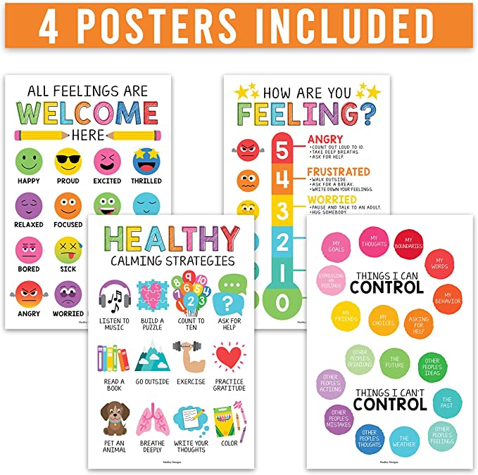
Option A won this Ranked poll with a final tally of 26 votes after 2 rounds of votes counting.
In a Ranked poll, respondents rank every option in order of preference. For example, when you test 6 options, each respondent orders their choices from first to sixth place.
PickFu requires a majority to win a Ranked poll. A majority winner differs from a plurality winner. A majority winner earns over 50% of the votes, whereas a plurality winner earns the most votes, regardless of winning percentage.
If an option does not earn a majority of votes, PickFu eliminates the option with the lowest number of votes. The votes from the eliminated option are reassigned based on each respondent’s next choice. This process continues in rounds until a majority winner emerges.
Scores reflect the percentage of total votes an option receives during the vote counting and indicate the relative preference of the respondents. If there is no majority winner, look to the scores to see how the options fared relative to one another.
| Option | Round 1 | Round 2 |
|---|---|---|
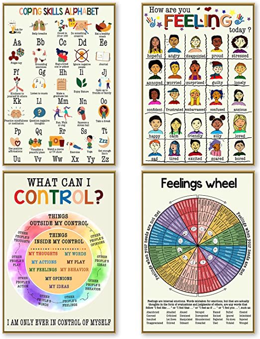
| A | 34% 17 votes | 53.06% 26 votes +9 |
| B | 36% 18 votes | 46.94% 23 votes +5 |
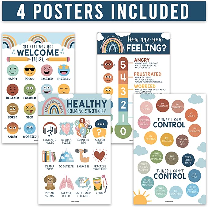
| C | 30% 15 votes | Eliminated 15 votes reassigned |
17 Responses to Option A
I like how colorful A is. I think it makes the posters seem more fun and they are also easier to look at and read
The colors for the control and can't control sections of choice A are appealing for a healthy guide.
It's posters for children so you don't want it to be overly complicated so I picked the simplest yet most effective design with the least amount of words and lots of color.
A chose C first because I liked the brightness of the colors, it had good visibility. I chose B last because it had too much going on with it, if I am stressed I don't want to be hunting the poster to find what I need. I chose C second because it was more simple, like A.
A is easier to understand and be useful, and the colors pop. B I chose last because it is way too cluttered.
I liked choice A since the image looks more informative and age relevant to the people using this. Choice B looks too serious and intense which isn't as appealing or eye catching.
I like the overall styles of A and C. They look like they are simple and clear to understand. Especially with pictographs like smiley faces which can be understood by most people/children easily. B is too detailed and probably provides an excess amount of information a child would have a hard time understanding. I like A over C because the colors are brighter and more interesting to me.
I like the colors that are used in Option A and C the most, but Option A is my top choice because I find the colors to be very vibrant.
I chose A because I love the rainbow primary type colors used and how they are clear and easy to see. C was next just liked the colors less on these not as vibrant but like the added rainbows. B seemed to chaotic and gaudy and overwhelming. Good info but needs a better presentation.
A I definitely like this one better
I picked option A because of the bolder, bright colors and larger shapes, which are great for children.
I like A because I think the posters are the most informative and the info is presented clearly. It's better than the other two.
I like option A because it is more vibrant and easy to understand. Option B seems a little bit more complex, but the design is rather intriguing. Option B's muted tone makes it kind of boring.
I like the colorful version used here in option A. This is a good look and I would go with that as the best choice. Think that poster looks best for the kids to relate to. Option B is nice and love the different designs between each. Option C is a nice color and font used too. All very good but I'll go with option A as the top choice.
I chose based on appealing colors and the overall design of the posters.
This looks like it is for kids and not knowing the age group would go with the brighter colors less noisy version first.
I prefer the simple design, clean layout, and most of all the color palette featured in Option A. I'd be most apt to purchase this one if I was in the market for this.
18 Responses to Option B
I like B the best because it seems like it would be great for kids and easy for them to understand the info.
I like how simple and straight to the point B is.
B is just more colorful and has more options on it. It is the first one that comes to my attention.
I picked B because it had the most picture options, was more visually appealing, and detailed with everything from the wheel to the charts and graphs with faces. I picked A next because the headers and the colors pop out more so than C. I picked C last based on the color options and because it wasn't as dynamic as the other choices.
i like the design in option B the most because it is easy to read and detailed
The wheel at the bottom of the poster in image 'B" helps the poster really stand out...it gets the top rank. Out of the other two, though, I like the design with brighter colors better.
Option B allows me to see the entire poster. I prefer the muted colors as opposed to bright pastels.
The artwork and the colors on option B are amazingly done and also extremely unique.
I would choose B first...it is a more colorful design.
I love that this option has a detailed color wheel. I feel that this could be fun and educational.
I like them all actually, each for different reasons. I chose B first, because the "how are you feeling" poster has the most emotions and I like the other posters as well. But, there's so much info that it might be overwhelming and information overload for young kids. A was my second choice. I like the material presented and the colors are nice and bright. B - those were my favorite colors, but I think kids might be more drawn to the brighter colors of A.
I chose option B because I like the breakdown in each of the posters and I think the synchronization of the colors is great. Also, the addition of the feelings wheel I think to me; is a plus. I'll stick with option B.
B/ i like how it breaks everything down and the feelings wheel has a lot to compare to. A/ Very colorful and the emojis add some humor. C/ Also like the pictures on each card and how it breaks it down also.
Option B is less intrusive in color and looks funner to read. Option B looks as though it is focused on mental health, verses the other two options that look very simple and I would rather print them out rather than pay for a full poster. I would pay for Option B, but not the other two
B has much more information than the other two options and that makes it the best option. A and C are very similar, but A has the better color scheme
Each poster is different, which is more interesting for a reader and grabs his/her attention more.
I like B the most. I think that it is good to be able to see a close up of each of the 4 posters so this one is the obvious choice for me
I like option B the best because the circle graph stands out the most and grabs my attention.
15 Responses to Option C
I felt that A was just too busy and distracting. I like the layout of B, it's more visually appealing and easier to look at but I like the design of the actual charts in C so that's why I picked it as number one.
I prefer option C because I think that it is the most interesting and visually appealing poster design out of the three options above. Option B just looks too cluttered and busy for my tastes.
I ranked the posters based on my preference for the color profiles that were the most appealing to me.
C has a bright style that is also calm looking and easy to read
I like the less over bright colors in C though A may be a bit neater, B is too busy to catch my eyes.
I like the color scheme of option C. Its what appealed to me the most. I feel as if it could be gender neutral. I like option B as well too. Its a close second.
I prefer option C, it isn't too bright in color.
Option A is too rainbow cutesy, Option B is too esoteric, but Option C is captivating, just right.
I like the color scheme of this one. I like all of the blue. I like the symbols that are on it too
I like the design and the colors used for my top choice. This one fits my personality and style more.
C has the nicest colors. The thing I really like about B - How am I feeling and the faces. I think that it's easier for kids to express emotions by pointing to a face. I am assuming this is marketed for the classroom? The feelings wheel seems too complex.
the colors in option C are most appealing to me. while option A is somewhat childish and option B is not fun at all.
I don't connect with Option B as well as the others. I like the blue colors in Option C more than the orange brighter ones in Option A.
I like C because of the beautiful blue colors and the other cool colors used in the actual product images. It's just my type of color scheme.
I like option C the most because I like the presentation of each poster. It's nicely spaced out and easy to read. I picked option C over option A because I like the colors more. Option B seems too cluttered.
Explore who answered your poll
Analyze your results with demographic reports.
Demographics
Sorry, AI highlights are currently only available for polls created after February 28th.
We're working hard to bring AI to more polls, please check back soon.


