Poll results
Save to favorites
Add this poll to your saved list for easy reference.
which desing do you like the most and why?
Option C won this Ranked poll with a final tally of 27 votes after 2 rounds of votes counting.
In a Ranked poll, respondents rank every option in order of preference. For example, when you test 6 options, each respondent orders their choices from first to sixth place.
PickFu requires a majority to win a Ranked poll. A majority winner differs from a plurality winner. A majority winner earns over 50% of the votes, whereas a plurality winner earns the most votes, regardless of winning percentage.
If an option does not earn a majority of votes, PickFu eliminates the option with the lowest number of votes. The votes from the eliminated option are reassigned based on each respondent’s next choice. This process continues in rounds until a majority winner emerges.
Scores reflect the percentage of total votes an option receives during the vote counting and indicate the relative preference of the respondents. If there is no majority winner, look to the scores to see how the options fared relative to one another.
| Option | Round 1 | Round 2 |
|---|---|---|
| C | 40% 20 votes | 55.1% 27 votes +7 |
| A | 32% 16 votes | 44.9% 22 votes +6 |
| B | 28% 14 votes | Eliminated 14 votes reassigned |
16 Responses to Option A
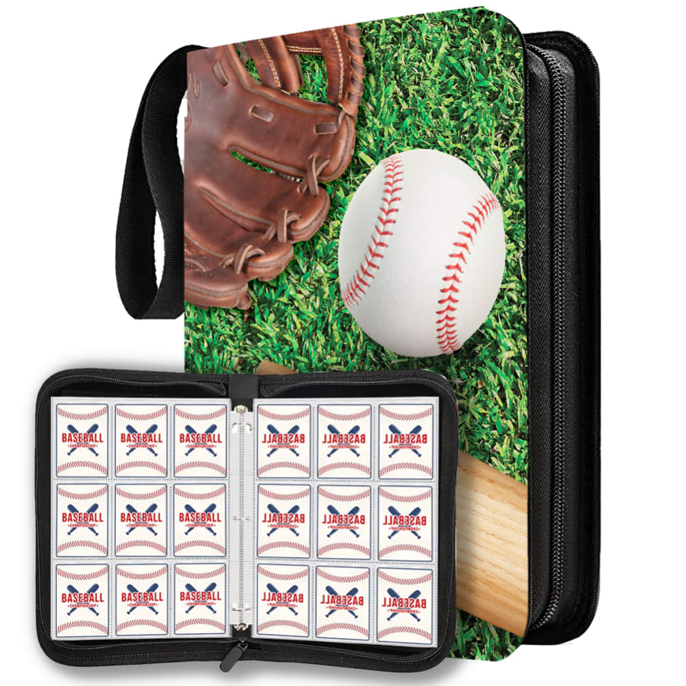
Option A is my choice because it is the most colorful and interesting design.
I chose A because of the simple baseball graphic.
I like the cover design with the really bright and vibrant colors..the green on the grass, the red of the baseball's stitches, the soft tan of the bat.
I like the design in option A because to me it looks the most charming and vintage. Option B and C feel less desirable to me overall.
I chose option A because the ball and glove laying on the grass looks fun and laid back. It makes card-collecting seem more fun to me.
I don't like the white design, but I do like the more colorful design of A rather than the dark black of B.
I like option A because I like that design has no words and just a picture of the 3 of the most important things in baseball. Option C and B are okay and I would still purchase it if A wasn't available.
I prefer this option. I liked that this has a ball, bat and glove without any writing on the cover. I think the no writing on the cover sold me.
I love the design of the binder of choice A. It screams baseball that I just love it. Choice A is a close second with the baseball. I don't like seeing the baseball player of choice C which is why this binder is last on my list.
I like this design best because of the simplistic baseball art on the front, I like that it doesn’t contain any text.
I like option A the best because I like the colorful color that features the glove, ball and bat. Looking at the image makes me think of how much fun I had playing baseball as a youth and would spark my interest in collecting baseball cards.
The realistic baseball scenery in option A made it the perfect overall baseball design for me.
I like option A the best because I like the grass and the glove. I think it stands out and really looks amazing.
Glove, ball, and baseball are all classic images.
I love the grass design on this option. It is the most appealing to me. That is why I would choose this option.
The glove, ball, and grass in my top choice add a sense of energy and excitement to the presentation, which is appealing. Very nice for sure!
14 Responses to Option B
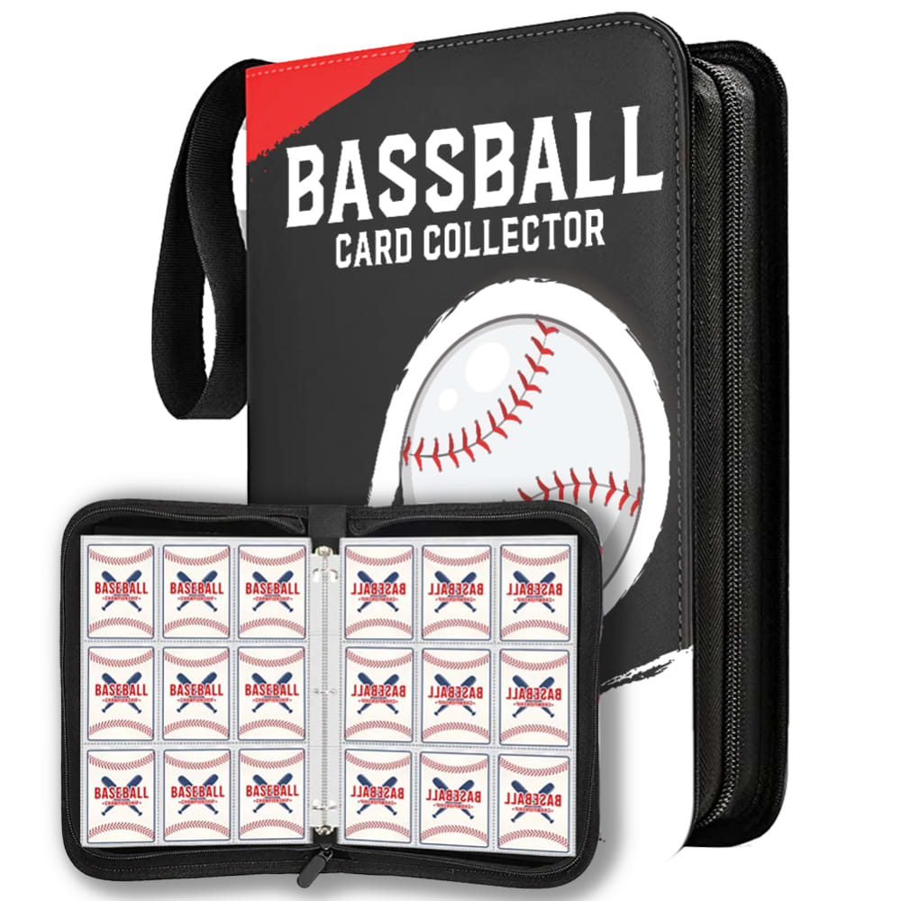
I like Option B because of the high contrast design.
I like my top pick because it explains exactly what it is, and I like the black coloring.
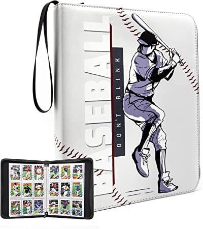
I really like all three designs, but I know I’d buy the one with the big baseball and CARD COLLECTOR on the cover.
I like the minimalist style of option B. All of my binders were either solid black or midnight blue, to differentiate between baseball cards and comic book cards, respectively. I like the style of option A as well, but I would worry about a full bleed print getting cracks and wear. Option C looks like clipart, not a fan of that style.
I picked option B because it looks stylish and simple at the same time. It also states what this product is for and is equally suitable for men and women. I also like combination of black and white.
choices b & a have a more flashier and modern design
B - looks like a professional collection and storage case
With a large number of cards, I might have multiple books, so I like the simple text across the top (I am assuming this is a typo in the image as it says BASSBALL instead of BASEBALL?) and the image of the baseball so I know at a glance what it is. The other options DO offer something similar but the "Dont Blink" tagline doesn't really mean much to me, and the picture on the front of C is a little silly to me. I just really like the sleek simple design of choice B.
I like the solid backgrounds in B and C more than the grass, and I like black more than grey.
The option that I like the most is B because it is the most youthful, with a modern design, the background color is more fancy.My second option would be C, because the design is very youthful, although I would like it to have more colors.And finally option A because it seems a bit childish to me
Option B is the best option because of the black background color on the cover. I also like the design of the baseball. The other options do not look as good.
The words baseball card collection makes it clear what the product is about.
B looks more high end, professional. C has good imagery but a bad logo. A is for kids just starting out with collecting.
B looks really sleek and classy. C has an cool drawn design but I'm not feeling the white. A is a bit bland in comparison.
20 Responses to Option C
I don't like the green grass in the image because it doesn't look right. I like the simple baseball player with the grey background from C. The one with the ball is just fine, but a little generic
Option C is the best as it is the most simply and elegant looking version
I chose C because I like this pitcher of the left-handed hitter. It looks good.
B spelled baseball wrong. A is just ugly. C looks decent and is by far the best option
I picked C because it's the most dynamic with the player on the cover and the baseball stitches. The insides show exactly how it looks in the binder rather than a generic inside holder. I pick A because the cover design has grass and really appeals to baseball fans and sports fans alike. I pick B last because it's not as appealing as the other designs or stands out as much.
I love the color to go along with the image of the baseball player on it.
I liked the movement of C so I chose it first. I liked the colors of A. B was plain to me, and baseball was misspelled.
I prefer this option the most because of the image on the cover.
Option C has a very straightforward design with a baseball player on the cover. Option B is not appealing because Baseball is misspelled as "BASSBALL"
I like Option C the most. The black and white graphics are attractive and have a timeless style to them that's very appealing. The remaining options are perfectly fine but not as eye catching and seems to be a little ordinary.
I like the style of option C more. It looks fitting for a baseball card collection.
I like the muted color scheme for choice C, as well as the focus on the player (which mirrors the design of the cards within). A is fine but pretty nondescript, and B has a misspelled word that is distracting.
I like the graphic on C. It looks stylish and complete. B seems rather generic, but I like it more than A due to the words (even though they're misspelled). A seems generic.
The illustration of this cover really sets it apart as a high quality item for me
Option C has the coolest looking design. I like how it looks like the person is on a baseball. The design in option C will most likely look best in person too. Option A is vibrant but I don't think it would look as good in person and it's not unique looking either. I would have really liked design B more if baseball was spelled correctly.
The stance that is used with choice C is neat wit the person in motion of swinging.
I really like the art style of the baseball player image in option C.
C is far away and the most modern and unique design of them all A and B are both a little tacky for me, and feel like they're very outdated
The creative design in option C is amazing. It has a anime like drawing which is way better than the other two. Option A is just a generic glove and ball and option B is just the worst.
I like option C a lot better. The white design is different and I think brings a cool look to the baseball collection. B and A nothing is special about them. lso, baseball is spelled incorrect in option B so I would not get that one. The best is option C by far.
Explore who answered your poll
Analyze your results with demographic reports.
Demographics
Sorry, AI highlights are currently only available for polls created after February 28th.
We're working hard to bring AI to more polls, please check back soon.


