Poll results
Save to favorites
Add this poll to your saved list for easy reference.
Which printing design do you prefer on the product listed below, and why?
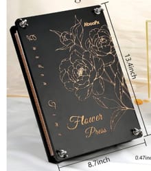
Option A won this Ranked poll with a final tally of 26 votes after 2 rounds of votes counting.
In a Ranked poll, respondents rank every option in order of preference. For example, when you test 6 options, each respondent orders their choices from first to sixth place.
PickFu requires a majority to win a Ranked poll. A majority winner differs from a plurality winner. A majority winner earns over 50% of the votes, whereas a plurality winner earns the most votes, regardless of winning percentage.
If an option does not earn a majority of votes, PickFu eliminates the option with the lowest number of votes. The votes from the eliminated option are reassigned based on each respondent’s next choice. This process continues in rounds until a majority winner emerges.
Scores reflect the percentage of total votes an option receives during the vote counting and indicate the relative preference of the respondents. If there is no majority winner, look to the scores to see how the options fared relative to one another.
| Option | Round 1 | Round 2 |
|---|---|---|
| A | 32% 16 votes | 52% 26 votes +10 |
| B | 38% 19 votes | 48% 24 votes +5 |
| C | 30% 15 votes | Eliminated 15 votes reassigned |
16 Responses to Option A
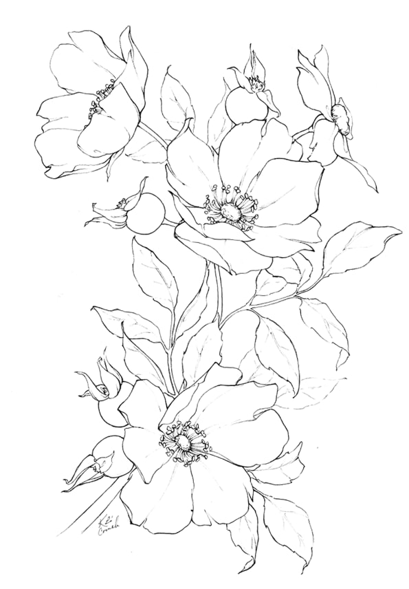
A I feel has the best design as it is very pleasing and able to draw my interest the most.
I prefer Option A even though it's a little light. Option C looks strange with the circle with nothing in it. B is too blatant.
I like option a best it is a beautiful and simple design but conveys the meaning and would look great across the front cover in color
I like the simplicity of the design for A. I really dislike the words on Option B.
I picked option A because the flowers are in a more natural position.
I ranked in the order that I find them the most attractive and would want to look at it repeatedly.
It looks more natural with just the flowers and not words.
I like A's simplicity without feeling too generic or simple. B feels a little too childish to me.
without an event penciled in the most benign version is appreciated.
I like the simple thin flowers and just plain. I like the more simplistic clean look.
I would prefer the simple design of option A because to me its the nicest
Option A seems most suitable for the dimensions of the book cover. The other options don't seem to fit the dimensions as well.
I like option A because I like the design of the flowers. I don’t think you need the circle design like in options B and C. I think the simple flower look without the ring is much better.
option A looks the most custom so it automatically is the most thoughtful, i wonder how much it is
Option A because it was the most attractive
The illustration featured in Option A is beautiful and eye-catching. It is a delicate and sophisticated illustration. It is the most distinctive option. Option B is not as eye-catching, but I like the way the flowers look. Option B looks too cluttered compared to the other options.
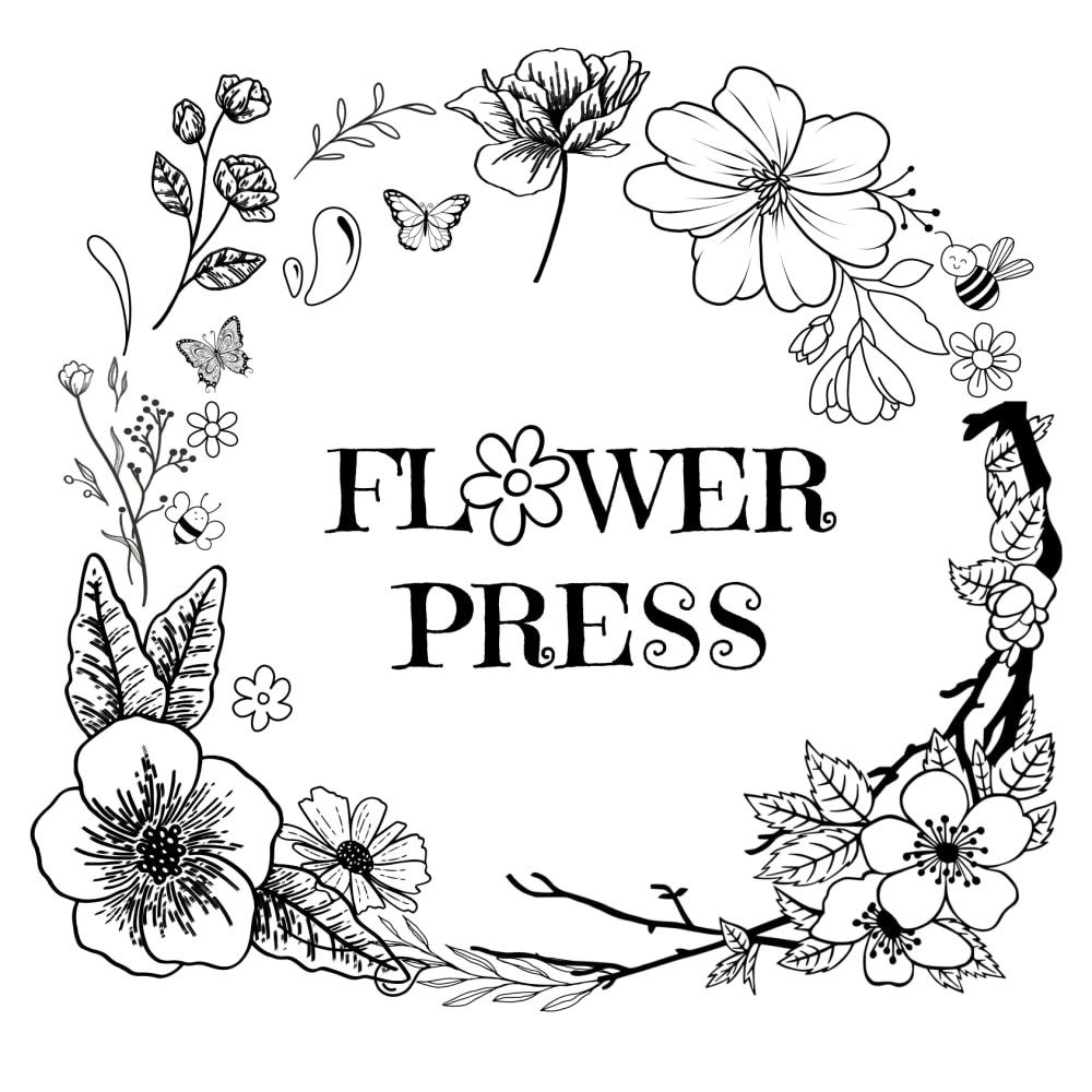
19 Responses to Option B
Might as well be straightforward and call the flower press a flower press.
I like Option B because it has the words which helps make clear exactly what this product is.
B looks the best overall. C looks the second best. A feels very basic looking.
B and C are more visually pleasing to me and the flowers are well designed as compared to choice A.
I love the bold flower wreaths shown in both options B and C. I do think the typeface in option B could be a little less cartoonish, but it's not terrible.
B stands out with text and design plus use of black and white.C the flower part stood outA very plain and no shading depth to it or text. This is way below the other two in quality don't use.
I like the text in option B, so that is the one that I would choose.
The darker contrast is nice
The most intricate designs tend to be the most traditional options that are available. I like the fancy artwork on display that seems mostly complete and well-rounded from a practicality standpoint.
Although I do not like the stylized flower in place of the "O" in option B, I much prefer having a title on the book cover over just having an image. A is in second place, because the floral design at least fits with the concept of the book, while C is in last place because it leaves a wide open space where a title should be, and leaves me wondering why it was made that way.
The flowers that are used for the flower press logo is unique and intricate looking in B
I chose B because I like that it states what it is.
Bs design is the best but the words dont look that great. C has nice solid design. A is nice but i think it doesnt hold up to the other two.
"B" is my favorite by a very large margin. in fact i don't care for "A" and "C" at all. "A" has too much to look at and "C" is the opposite...too much empty space. go with "B" on this one
I prefer option B because I think that it is the most interesting and visually appealing design out of the three options above.
I like B the best, it's really cute
Option B design fits much better for a picture provided - rank 1.Option C has worse design but deserves rank 2.Option A has the worst boring design - rank 3.
I like the text in the logo so I know what the book will be without having to open up the cover.
B The name is in the logo and the design is attractiveA the flowers are not overpowering. They are subtleC too plain and simple looking
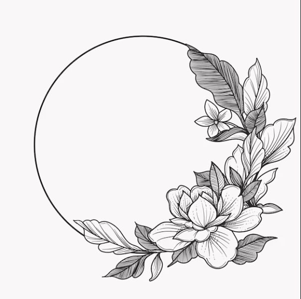
15 Responses to Option C
I like C best by far, I think it is clearly the most attractive option for the cover.
I think this looks the prettiest. I like the way the flowers look. I like that they are going around the outside of the circle. A little color on it would be nice
I like both the images without the text best. But i like the half circle looks of the flowers more than the free flowing design
C is the coolest, A is also nice with a retro feel. B is not very unique and a bit tacky.
This design has the right amount of customization and simplicity to me. I like the circle and the brevity of some part of it covered by flowers but not the whole bit.
I prefer simplicity so Option C is my first choice. I like how simplistic the design looks.
Option C is my first choice because I love the dimension with the shaded hue in the displaySecond is option A because I love the arrangement which is beautifulThird is option B which is nice
I like the more minimalist designs, and C especially looks very sharp. I like the idea that you could maybe insert something into the circle area, too.
Based on the shape of the product I would like option C printed on the product, it also has a very nostalgic presence for me it looks like something my grandmother would like.
I prefer something more minimalist and Option C is thus my obvious choice.
B's font just doesn't fit with the cover design, it's too casual of a font while the cover looks more serious and distinguished. C's circle fit well and makes it feel chronologically consistent. A also works, though not as well as C; it might work, but it may be too light on such a dark background.
I like it because it would have space in the center for a customized text or picture.
I don't really like floral designs, but if I do I prefer a more simple one such as option C. I find option B to be too busy.
I love the more minimal designs, especially the one with the rings. It just looks really clean. Then I like the flower branch with no text after that.
i find the moon with flowers to be beautiful
Explore who answered your poll
Analyze your results with demographic reports.


