Poll results
Save to favorites
Add this poll to your saved list for easy reference.
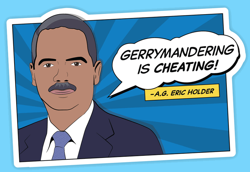
Which sticker design do you prefer for the National Democratic Redistricting Committee?
Option B won this Ranked poll with a final tally of 71 votes after 1 round of vote counting.
In a Ranked poll, respondents rank every option in order of preference. For example, when you test 6 options, each respondent orders their choices from first to sixth place.
PickFu requires a majority to win a Ranked poll. A majority winner differs from a plurality winner. A majority winner earns over 50% of the votes, whereas a plurality winner earns the most votes, regardless of winning percentage.
If an option does not earn a majority of votes, PickFu eliminates the option with the lowest number of votes. The votes from the eliminated option are reassigned based on each respondent’s next choice. This process continues in rounds until a majority winner emerges.
Scores reflect the percentage of total votes an option receives during the vote counting and indicate the relative preference of the respondents. If there is no majority winner, look to the scores to see how the options fared relative to one another.
| Option | Round 1 |
|---|---|
| B | 71% 71 votes |
| A | 17% 17 votes |
| C | 12% 12 votes |
Age range
Education level
Gender identity
Household income range
Options
Personal income range
Political affiliation
Racial or ethnic identity
17 Responses to Option A
Option A makes the most sense to the average viewer and looks the best. Option B makes little sense, so I selected it last.
it was more eye catching and was easier to read
I ranked based on how relatable and interesting each sticker seems to me.
I would prefer choice A as a sticker because it has a person saying the words and its convincing.
Choice A - I love the graphic of the manChoice C - I like the contrast of font colorsChoice B - The red is too glaring to look at
It shows support for the fact that he could possibly be cheating by having a figure and backed up support.
I the design with Eric Holder as my first choice because I feel the personalization of the design with his picture is much more appealing than just the wording without his picture. In fact, that was my feelings in how I ranked the other two designs. I believe that the more outstanding design in red letters out did the planner design without the red fonts.
Option A is ranked #1 because it provides more context on who is claiming that "Gerrymandering is Cheating". It tells you who that line came from and how they look. Option B provides a clear message, with easy to read font, but if you're not aware of what it's about, it does not provide any value for the viewer. Option C is hard to read so I don't feel the message is clear.
I like the design of A and I think that it looks good
Option A is my preferred choice. I think a quote from a specific person would make a better sticker than the other options.
Bold white text is eye catching for me
I do not tolerate gerrymandering or the redrawing of district boundaries. That message needs to be said loud and clear and what better way than with an image of a person saying that. B and C were interchangeable to me.
I ranked the sticker design based on the clear visibility and easily understanding. In the sticker design I chose it is clearly mentioned that it is about the political conversation. In other design it is not that much clearly designed.
I like my first choice because it uses an actual person and it's in the form of a cartoon. I like the second choice more than the last one because of the colors.
It grabs the attention of viewers
I thought that choice A was the best of the three since gerrymandering disproportionately affects the African American in a patently negative way, and having an African American man (Eric Holder) speaking out about the message is particularly apropos. I thought that B was the next best choice since it was essentially a pictorial representation of what gerrymandering actually is, i.e., unfair redistricting for political motivations. That left C as my last choice since there was nothing particularly notable or meaningful about it.
I think it feels more important to read if it is showing a drawing of who it is quoting.
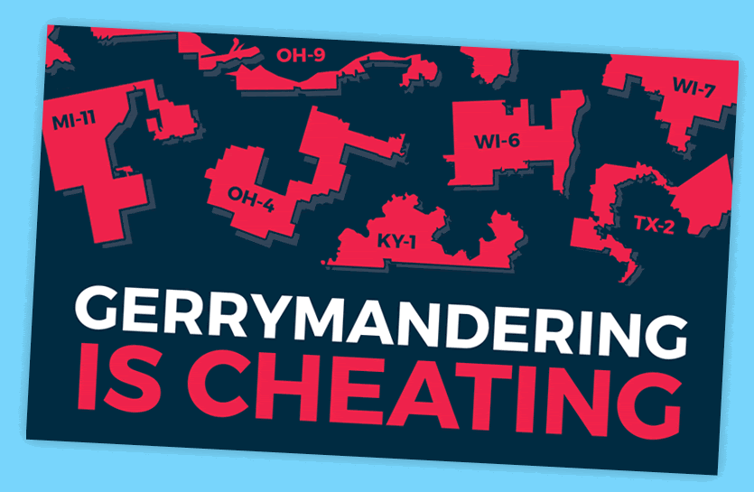
71 Responses to Option B
It attracts my eye the most. I don't like the cartoon guy very much. But I like the red one.
Having maps that show examples of gerrymandering is helpful
I think the first one is the best because it is big and bold. The colors are simple and it is easy to see the gerrymandered districts. The second one also does a good job at that though it is a little less obvious. I don't mind the third one but I don't know why the focus is on Eric Holder and not the districts themselves. I think that would get lost in translation with this one.
The lack of expression on the man's face in A makes it not good to me. B seems best.
SAY IT BIG AND BOLD. Don't be shy. Don't be scared. Just say it in the biggest font you can find, in the loudest colors you can find.
seeing the puzzle pieces for the counties show just how screwed up the current process is. this is more impactful.
I went with what was the most fitting with the message. For A I do not know who that man is and how it reflects Gerrymandering.
The red color is eye catching, and the cartoon man stands out as well.
I liked Option B the best for the awesome visuals of the puzzle pieces and it just grabbed my attention best. Option C was a distant second just for the simple design, while I didnt like option A much simply because of the use of the former AG. I have no issues whatsoever with him and personally like him, but I cant say that would be universal within the party. Overall just not as strong for the other two.
I really like B because the snaked-salamandered districts is very visible. it would also be very clear to cars behind me, which Option C has a little difficulty with. And personally I would not buy Option A, as even though I liked Eric Holder as Attorney General, it wouldn't do anything to make people think about the issue. Option B is best at that.
A cartoon isn't serious enough for a political logo. The red map makes the gerrymandered districts stand out a lot more, which helps drive across the point that gerrymandering is very arbitrary. The color red on a blue background is also more striking and reminiscent of an alert or an error
I chose B first because its interesting and creative its also catches your eye with all the redI chose C second because Its too the point and fun to look atI chose A last because its not as good as the other two the character portrayed is badly drawn
I like Option B the best because the red district colors and the simple text makes it stand out more how awfully wrong gerrymandering is. Option C is my #2 choice because I like the message, but it doesn't really display what gerrymandering is in case the viewer isn't aware. Option A just look like a comic book panel and I don't think AG Eric Holder is a big enough name to be the face of the fight on gerrymandering.
I like B because the image fits the subject best by showing the different districts and how oddly they're shaped. I also think the black and white get your attention also. C is okay, but I don't think the person on A really adds anything.
I picked B first as the colors are what the youth would like and it displays the urgency of the situationI picked option C as the second choice because the design seems not offensiveI picked option A last because I am not sure weather the figure present is a devisive figure amongst the democratic party so I cant evaluate his popularity.
Eric Holder is not the best spokesman. B is better C
Option B is the best visual indicator of what gerrymandering actually is and how it affects districts. I think it is tonedeaf to include Eric Holder's name and image since he was a brutal prosecutor (except against the people who precipitated the housing crisis and banking bubble) and there is currently a mass movement against the police.
The district shapes feel most clear to me and the red shows that it is a serious issue.
Option B looks professional and gets the idea across. The graphics do a good job showing ridiculous districts, getting the point it is trying to get across clearly. Option C is confusing with the letters superimposed over the districts, making it hard to comprehend or understand. Option A is unclear on who the person is right away.
Option B shows states and districts to reiterate what is being accused as cheating. Using red helps the sign to stand out and get your attention. I picked C as my next choice for similar reasons. I like that the districts are on the sign and red is used for the word "cheating". They get your attention. I don't know how serious I would take A, because it's a cartoon.
I ranked it based on how much the sticker design stands out so other people would see it and be more likely to read it.
Some people dislike Eric Holder because of Fast and Furious and B's graphics are clearer than C.
I picked the choices that had states names, because its important to realize this is a problem in many states.
The shapes in Option B make a good point; I like that one best, followed by option C.
I prefer the image that clearly states in bold and red font that gerrymandering is cheating, as it clearly presents the key idea of the image, and a general idea of what gerrymandering is.
I chose option B as # 1 because not only does it state the message, it also gives a very good depiction of district boundaries that would give everyone a good idea of what the message means (I only say this because I don't feel that everyone who will vote necessarily understands the term gerrymandering and what it means). You will reach a broader audience as more folks understand it.I chose Option C as # 2 because it's quite eye catching, and has subtle district boundaries. I chose Option A last, again, because this may miss the folks who are not familiar with gerrymandering, and/or who Eric Holder is. Not everyone who votes is super well versed in politics and the folks who held past positions beyond the Pres and the VP.
None of these are very good to be honest. Why is there a man on one of them? I guess I like seeing the states on the signs because that's relevant to gerrymandering.
Artistic design that is less harsh on the eyes, in terms of colors
I like Option B the best because I feel the colors stand out the most and grab my attention the best.
I think Option B is the closest to actually illustrating the problem that the Democrats envision is happening by showing the fractured districts front and center. Option C tries to show them, but it gets lost in the background of the text. Option A makes no sense at all for this kind of design and doesn't relate to the topic at hand.
I prefer B because it illustrates the results of gerrymandering, providing evidence to support its claim. (Not terribly clear evidence unless you already know something about the subject, but maybe as good as you could get in three words.) Option A is a distant second place for me, because it doesn't offer evidence, just an appeal to authority. Option C offers neither one (the illustration of the gerrymandered districts is present, but it's not clear at all).
I chose B first because it illustrates the strange way districts have been divided. The red and black colors attract attention and the white font for Gerrymandering makes it stand out. I chose C next because it also shows how strangely districts have been divided. I chose A last because I don't understand the reference and would have to look up who Eric Holder is.
A doesn't resonate because most people won't recognize who he is. B is easier to see than C.
B is the more eye-catching and "propogandic" poster which I think would resonate better. C is just plain. A is just weird because I don't think even the regular democrat likes Eric Holder.
I felt Option B was more detailed because it gave a list of states that were caught for gerrymandering votes.
Showing the bolder colored map of various states and districts is most effectively related to and conveying the issue of gerrymandering, followed by the fainter color scheme of district boundaries, and lastly by the image and quote from Holder.
I prefer the designs with text and districts. I think they look better and the sticker with the caricature just seems cartoony and not as serious/meaningful.
B is the most pressing and aggressive one, C is mediocre, A is plain and boring.
Choice b stands out more.
I chose option B the best because of the red lettering/red state tie in.
Picture B shows exact what gerrymandering is. Picture C does that too but it gets concealed by the words. Picture A looks more like a meme.
The images of all the weirdly drawn congressional districts really help get the point across. Very helpful for sure!
I think options B and C look pretty good and professional enough whereas option A kind of looks unprofessional and not official and as a result I thought option B and C were better.
I think the bright red of B stands out the most. C is second because the overall idea is the same. I don't find Eric Holder as compelling so I ranked A last.
I like option B the best because it gives examples of regions that have been gerrymandered and how outrageous they look on a map.
It’s hard to read Option C. Option B is the most eye catching.
I prefer the colors of choice B because it really catches my attention. I chose A on the last because I dont know who that person is.
I prefer Option B because it shows more clearly what a gerrymandered district looks like. Option C is clever in the way it shows the gerrymandered districts in the shape of letters, and I like the softer coloring of Option C better than Option B, but I think Option B is more visually arresting and gets the point across more quickly. Option A is actually my favorite in terms of overall design, but I'm not sure it has the same impact as the others. It's interesting to show who is being quoted in the slogan, but I think showing the shape of a gerrymandered district is more important than showing Eric Holder.
Option B has a striking color scheme and it plainly shows gerrymandered districts. Option C is good although more difficult to read. I think the issue with Option A is that many won't know who Eric Holder is and the fact that he's a Democrat will pose this as a partisan issue when it really *should* be a bi-partisan issue.
i don't have a preference, but maybe the red one is more noticeable
B is the best, dark background and bright letters pop out more and get your attention, makes it easier to read.
I think option B best illustrates what gerrymandering actually looks like.
I like the one with the states because it illustrates the point the best, it is simple yet effective at communicating the message. The message is clear and you can see each of the states whereas in Option C you can't really see the states very clearly. Option B is okay but if you are unfamiliar with the man in the image you might miss the point.
I like choice B is probably the most impactful out of the three. The colors red and black makes it look more intimidating and stern.
I chose the ones that visually depicted gerrymandering first.
I prefer the sticker design in option B the most. I then like the sticker design in option C and finally the sticker design in option A.
B is my first choice. I think it shows what gerrymandering is very well and why it's a problem. C is my second choice. I think it illustrates the issue of gerrymandering somewhat well, but not quite as well as B. A doesn't really feel relevant to me at all.
I like option B the best because I feel that it is the most eyecatching, and it's the easiest to read.
I like C because it shows you examples of gerrymandered districts.
The odd shapes of the districts stand out nicely in B. It makes the statement by itself. I like the colors better in C but I didn't recognize the maps right away because the blue is too subtle. The letters overtop also take away from the maps. And A is just wrong.
I like the use of the bright red in my first choice, it stands out more from the background
I like B because of the color scheme and the graphic of the different districts then C for the graphics as well, and A last because it seems like a comic.
I think Option B stands out the best and is visually descriptive as well. Option A is good as well if people are familiar with who that person is.
I think B is most representative of the concept with C a close second. I don't understand that much about it. They all seem negative.
I think that option B is the best because it shows different states and how many people represent that area in the state. I also like that the states are the same color as is cheating is. I think that C is also good because it includes the state information. I think as nice as it is to show a cartoon version of Eric Holder saying that gerrymandering is cheating it's better to get the full picture by seeing the different states.
I prefer Option B because it has the best graphic. Option C is my second choice, but it is not as striking because of the color scheme. Option A is not as appealing because younger voters may not know Eric Holder.
The first graphic makes clearer what gerrymandering means, with all of the crazily bordered districts. A lot of people don't really understand what gerrymandering is, but they are used to seeing their odd-shaped districts. On the second choice, the word, "cheating" obscures the crazy districts, so it's more unclear. My third choice is a nice rendition of Former Attorney General Holder, but if a voter doesn't understand what gerrymandering is this picture does not clear that up.
I like Eric Holder, but I think having images of the horrendously partitioned districts really drives the point home more.
The colorful poster is both the most eye catching which is good for a political poster and the most visually appealing. The version with the human character is pretty boring.
like the simpler design of B. Option A doesn't look serious.
I prefer the image that appears to show examples of actual districts that have been affected by the practice. I think this helps substantially visualize what can be more of a nebulous issue for some voters. The black and red contrast is a subtle jab at the Republican colors who seem to make the most news on the subject as well. The #2 item has similar visuals but they are shrouded by lettering which lessens their impact. The last choice is a quote from a reputable person but doesn't provide any context like my top choice.
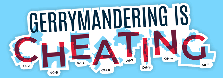
12 Responses to Option C
I put them in order of the ones that got my attention to the most
I really like options C & B and how they use districts that have been Gerrymandered.
My #1 choice is the only one I really like. Simple, catches the eye and doesn't look comical.
I think the design C is very unique. I don't like too much red color for the design B. and there's nothing wrong and nothing special about A
C had the best design and message. I like Eric Holder but I liked C's design more. B's design looks a bit scary so chose that last.
I like C because it has a bright pleasant look to it. B is very bold and it has an evil sort of look to it so maybe that could be better but just visually I prefer C.
Gerrymandering is clearly cheating, option C has a better design, option A has a quote attached to it from an attorney general which adds legitimacy, and option B is very dark and not appealing to look at.
With Option C, I think the generic aspect without the face as in Option A would be more beneficial for getting the message out. This also goes for Option B except I'm not fond of the states in the background. I do not like the face in the image in Option A.
Option C, I thought best showed how Gerrymandering looks like over the other options. Option B, is a close second but option C displayed/showed it better. Option A, didn't really seem all that great in the design and lack uniqueness.
It states in plain bold graphics and the message jumps off the page.
I like the font in choice c. I like the man shown in choice a.
Image C is my perferred choice because the focus is on the cheating that will take place.
Explore who answered your poll
Analyze your results with demographic reports.
Demographics
Sorry, AI highlights are currently only available for polls created after February 28th.
We're working hard to bring AI to more polls, please check back soon.

