Poll results
Save to favorites
Add this poll to your saved list for easy reference.
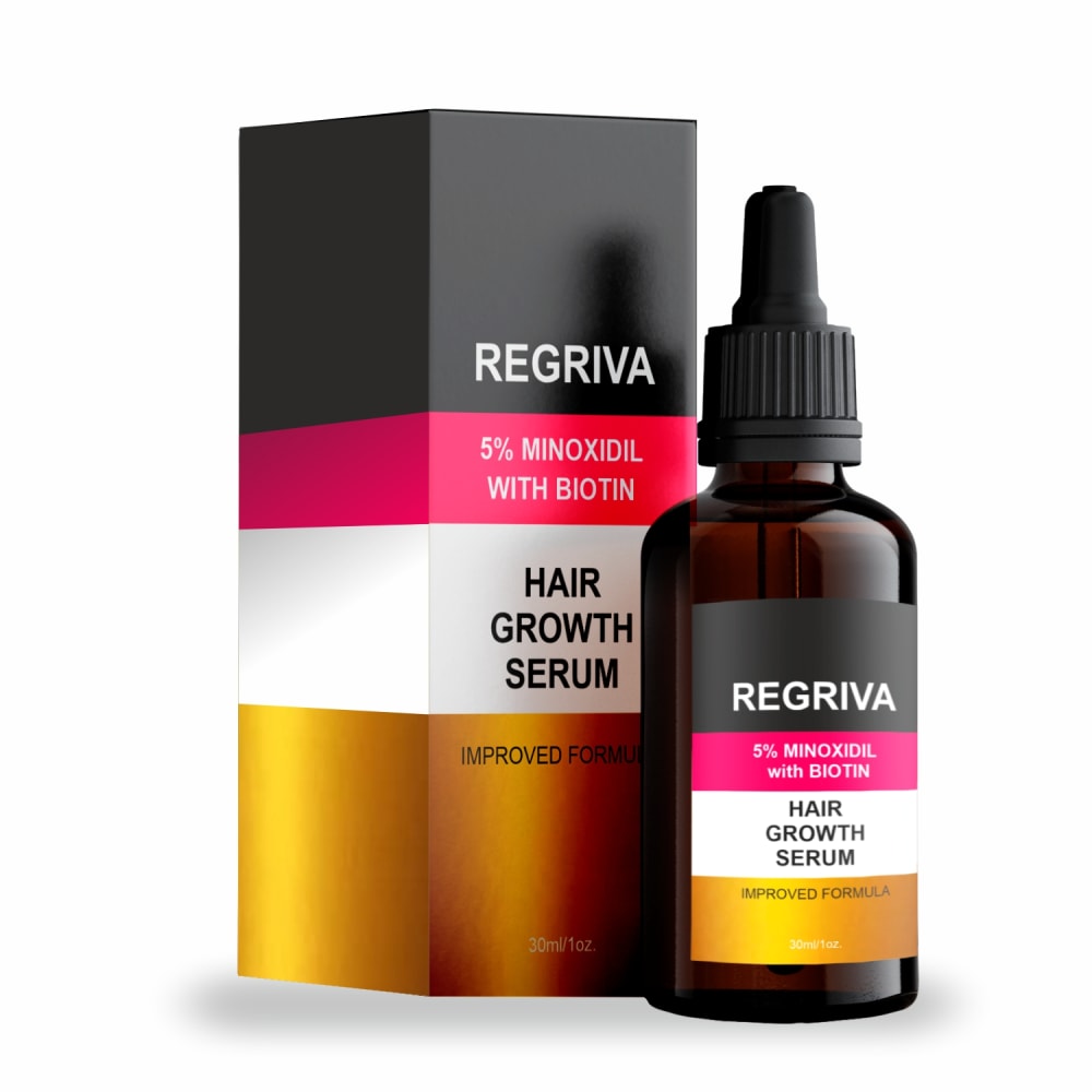
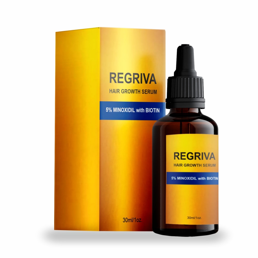
Which HAIR GROWTH SERUM packaging design to you prefer? Why?
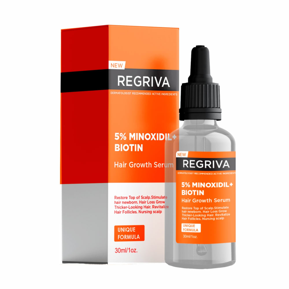
Option A won this Ranked poll with a final tally of 10 votes after 1 round of vote counting.
In a Ranked poll, respondents rank every option in order of preference. For example, when you test 6 options, each respondent orders their choices from first to sixth place.
PickFu requires a majority to win a Ranked poll. A majority winner differs from a plurality winner. A majority winner earns over 50% of the votes, whereas a plurality winner earns the most votes, regardless of winning percentage.
If an option does not earn a majority of votes, PickFu eliminates the option with the lowest number of votes. The votes from the eliminated option are reassigned based on each respondent’s next choice. This process continues in rounds until a majority winner emerges.
Scores reflect the percentage of total votes an option receives during the vote counting and indicate the relative preference of the respondents. If there is no majority winner, look to the scores to see how the options fared relative to one another.
| Option | Round 1 |
|---|---|
| A | 66.67% 10 votes |
| B | 20% 3 votes |
| C | 13.33% 2 votes |
10 Responses to Option A
I loved the citrusy orange color on A's packaging.
I like this one the best it tells me more about the product I liek how it looks and how it sraws my attention to it
I prefer Option A because of how much information is on the two labels. I feel as though I can trust it the most.
I think the orange is the most engaging and provides the best information about the product.
This bottle and packaging are really clear and easy to read. The gold on the other designs just looks overdone and gaudy.
I prefer the look of A. It's still professional looking even though it is multicolored. C is too bland and B is too busy.
A The packaging is alright. C I don't like all the gold or the tone of the gold. B I don't like the pink and the gold. The colors are too boxy and do nothing for the packaging especially the box.
I like the bright colors in A and C, though I think C is a little overdone with the gold. The large black sections of the packaging make it seem heavier and more medicinal.
I liked A more because there is more information on the packaging in A. Makes me think they have less to hide and gives me a chance to know what is all in it and what it is used for without digging.
A looks premium and more effective. The package has desirable colors and is more visible and legible. I like how the information is displayed on the package in a detailed and useful manner.
3 Responses to Option B
The three colors are very masculine and strong and stand out against the dark colored bottle.
The black, white, and hot pink colors of the label and box are the most appealing.
B's colorful design stands out to me.
2 Responses to Option C
I like the darker bottles in Options C & B the best with a preference for the gold colored label and box which provides a striking color combination with the dark text. Next, I think that the packaging design in Option B is more appealing than in Option A and I'm not as fond of the clear bottle in Option A.
C is stylish, a is sleek and b has a professional look.
Explore who answered your poll
Analyze your results with demographic reports.

