Poll results
Save to favorites
Add this poll to your saved list for easy reference.
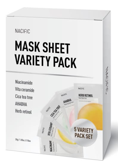
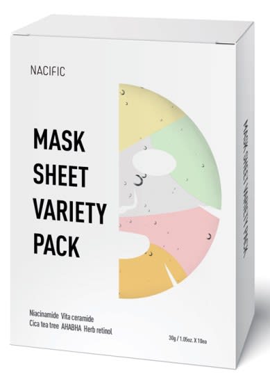
Based on the image, which product would you rather buy?
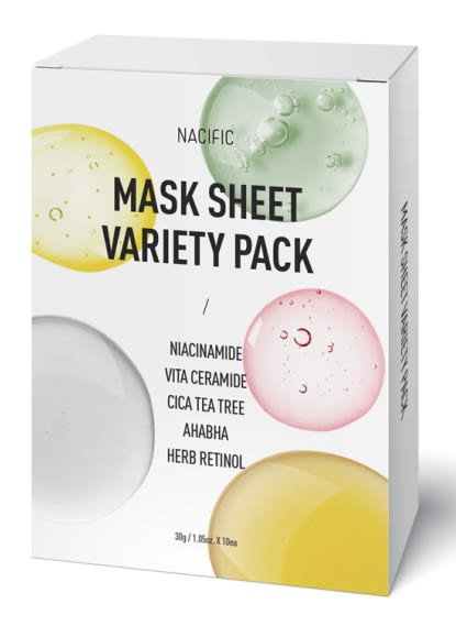
Option C won this Ranked poll with a final tally of 31 votes after 2 rounds of votes counting.
In a Ranked poll, respondents rank every option in order of preference. For example, when you test 6 options, each respondent orders their choices from first to sixth place.
PickFu requires a majority to win a Ranked poll. A majority winner differs from a plurality winner. A majority winner earns over 50% of the votes, whereas a plurality winner earns the most votes, regardless of winning percentage.
If an option does not earn a majority of votes, PickFu eliminates the option with the lowest number of votes. The votes from the eliminated option are reassigned based on each respondent’s next choice. This process continues in rounds until a majority winner emerges.
Scores reflect the percentage of total votes an option receives during the vote counting and indicate the relative preference of the respondents. If there is no majority winner, look to the scores to see how the options fared relative to one another.
| Option | Round 1 | Round 2 |
|---|---|---|
| C | 38% 19 votes | 62% 31 votes +12 |
| B | 32% 16 votes | 38% 19 votes +3 |
| A | 30% 15 votes | Eliminated 15 votes reassigned |
15 Responses to Option A
A is the best overall because it is the only option that tells you how many masks it has. B has the most unique design
I only really like options A and C, option B feels a little too plain. The image on A's packaging works best.
I like that A is the most clear in communicating that there's a variety of products in the pack and also clearly lists what they are.
I like that i see a picture of the foil packets the masks come in
A is best as it lists and shows the different packs. B alludes to the fact that these are masks. C's package is not as clear as the other two.
I like the way that A shows the different mask types and it looks the most balanced. B is both a little weird but fun in how it shows the actual mask. C is much too generic compared to the others.
I chose A because I like that it says "5 Variety Pack Set" and shows how the packaging I should expect once I open the box.
I like that the different varieties are listed nice and large on the box.
A because you can actually see what the 5 variety pack looks like. I do like the design of C the best though.
A is the most detailed, insightful, informative and professional. It is the most clear about the contents. C and B are colorful, but lack the detail of A.
i ranked these from the most modern design to the least
A is my first choice because it shows the different varieties included. I also like how it shows what the pouches look like. C is second because it also shows what varieties are included in the box. B is last because the face mask looks somewhat creepy on the box and it does not tell what varieties are included.
I chose option A first because the color combinations for the design aren't much thus, making it very easy to read the inscription on the product. The font also is a plus. I'll stick with option A.
I chose A first because the box states that it is a 5 variety pack set with each type listed individually on a picture of each single packet and on the side. Visually I like to know whats in the box and how its packaged. I chose C second because the variety pack statement is in the middle and below is what each of the 5 masks are. B last because the 5 types is in small letters on the bottom of the box.
A has the most consistency and is the least "all over the place". B is kind of weird with the face on the packaging; it's off-putting.
16 Responses to Option B
B looks pretty and I like the way the colors mix. C is okay but it lacks the dynamic look of B. A is just boring.
A's colors felt too dull and sterile whereas B was the most vibrant.
Having the sheets look like a face catches my attention pretty readily, and does a good job!
I liked the design for option B the most. It does a good job at showing off the variety. Option C, I liked the front packaging design more than option A. It just looked more appealing.
I like the design of the smiling face and more simplistic look of this package in B compared to the other two.
I prefer Option B above the rest because it displays the full variety of colors while also using the most mask-like picture presentation; I feel like I know what it is supposed to convey without even reading the words on the box. Option C does a good job of displaying the colors, but the product itself isn’t immediately recognizable. Option A is the most basic, and while it looks professional, it does not stand out.
I choose option B because it seems to me that it is the most graphic, you can see what the product is like in its different varieties.My second option would be A, because you can see the small packages of the varieties that the product contains.And finally option C, it is not very graphic although the colors attract me
I think B is the most creative presentation.
The text is very easy to read. The photo used on the front is very striking. Really stands out.
I like option B the best because the position of the text stands out the most to me and grabs my attention.
Option B is the best option because of the text in the middle of the box. The text is bigger than the other options, it makes it easier to read. I also like the color on the cover. The other options looked confusing.
I like the creative way the packaging displays the variety pack, and what each mask does differently. I think that's pretty clever.
i would buy the product in option B because it looks the most effective to me
I like option B the most. The mask and its colors stand out really well and drive the idea of the product home. Of the other two I think Option C does a better job of attracting attention with the colors.
Choice B is my first choice because it shows the actual mask on the product box. Choice C is second because it looks nice and colorful, still a good design. Choice A is my least favorite because it just shows the packaging versus something that will grab my attention.
Option B's packaging design is very clear yet appealing. Option C isn't clear but the image is appealing. Option A isn't appealing but at least informative.
19 Responses to Option C
I do like the face made out of it but would rather it full than half thats why i ranked it 2nd. C looks very professional and well put together. A is boring compared to the others.
The look of choice C for the mask sheet with the color variants is the choice I would go with here.
I would rather buy option C because I think that it has the most interesting, eye-catching, and visually appealing packaging design out of the three options above.
Option C had the most unique, colorful, and professionally done overall design.
I definitely like all of the options that have colors on them. I like seeing the variety of colors and they look good on the white background. I prefer C because it looks nice having the colors in a circle almost looking like bubbles
I would rather buy option C because it is most colorful!
I think, for a variety pack, the different varieties should be listed on the front of the box. Options C and A do this, but option C has a more compelling design.
option C is indeed the most interesting design, its quite attractive and very beautiful
Through the use of color, C and B make the variety pack concept more clear. I find A is a bit easier to red with the content centered. A looks overly plain though it is highly legible.
the big colors in c. b looks attractive and c looks plain
I picked option C because I like the many different colored bubbles (masks).
The colors help and they're best displayed individually, as in Option C, then they are together, as in Option B.
This would be my choice order as both C, and A, seem to show more information but C, catches my eye more
This kind of shows what is inside them
I like C the best because it lists the ingredients clearly in the front of the box and I like the design of the globs of product of each ingredient. A is next because even though the design is very simple and doesn't have a pretty design as C, it does list the ingredients of what the masks contain. I don't like B because it doesn't clearly list the ingredients or the benefits in a easy manner. The writing is so small on the bottom of the box.
I think the design of the first box is the most visually appealing, and I think the design on the option A is confusing.
C and A are more clear about the variety of options offered. B is a little creepy.
I like more colors on the box, like in C. It is eye catching and pretty. However I do like how the text is arranged on A and B the best. It looks better to be to one side and not in the middle. If C and A could be combined with those elements would be best.
Choice C is the one that I like the most because I like the color it has to it and how each of the circle is supposed to represent a different variety of mask sheet that is mentioned. Choice B is second because it has nice colors as well and they seem nicer combined but the face on the mask of it creeps me out a little bit. Choice A is last because it was kind of a boring design just showing the packs on the cover.
Explore who answered your poll
Analyze your results with demographic reports.
Demographics
Sorry, AI highlights are currently only available for polls created after February 28th.
We're working hard to bring AI to more polls, please check back soon.


