Poll results
Save to favorites
Add this poll to your saved list for easy reference.
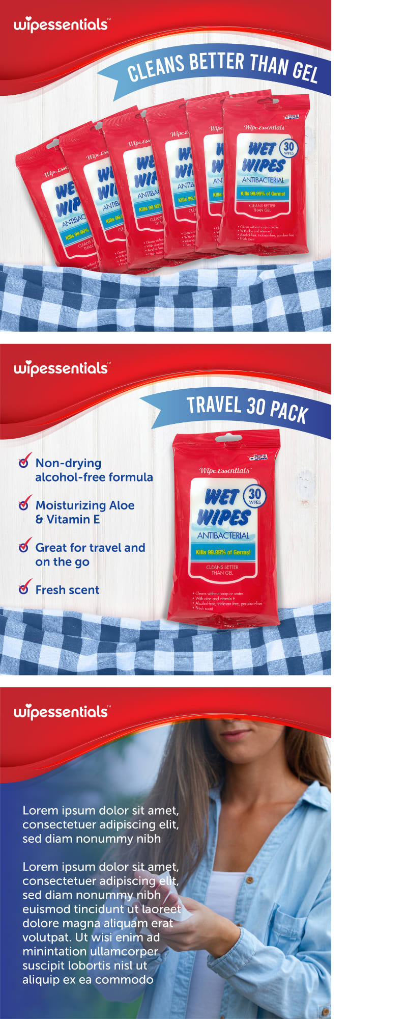
If you were shopping on Amazon, which product would you rather buy?
Age range
Education level
Gender identity
Household income range
Number of kids
Options
Personal income range
Racial or ethnic identity
26 Responses to Option A
Option A is better as the images look more cohesive and consistent.
I would rather purchase option A because I think that it has a more interesting, eye-catching, and visually appealing product image set.
The blue plaid draws my attention.
they just look nicer, especially the second and third photos. they go better together and i like the colors and the fonts.
The name of the product is all over the advertisements. The colors are fresher and more segregated looking.
I would buy Option A. I like the extra framing in these images. It feels well balanced and helps me focus on the product well.
I think the set up makes this much easier to read and evaluate.
I prefer A because I like the wording on the left side of the second page more.
Checked cloth in 2 panels provides a link to both sections
I enjoy the graphics for A because they have a wavy shape. They seem to fill the space in a pleasing way due to how the composition of the image flows. The colors of red and dark blue are also pleasing. I enjoy the checkered cloth in A.
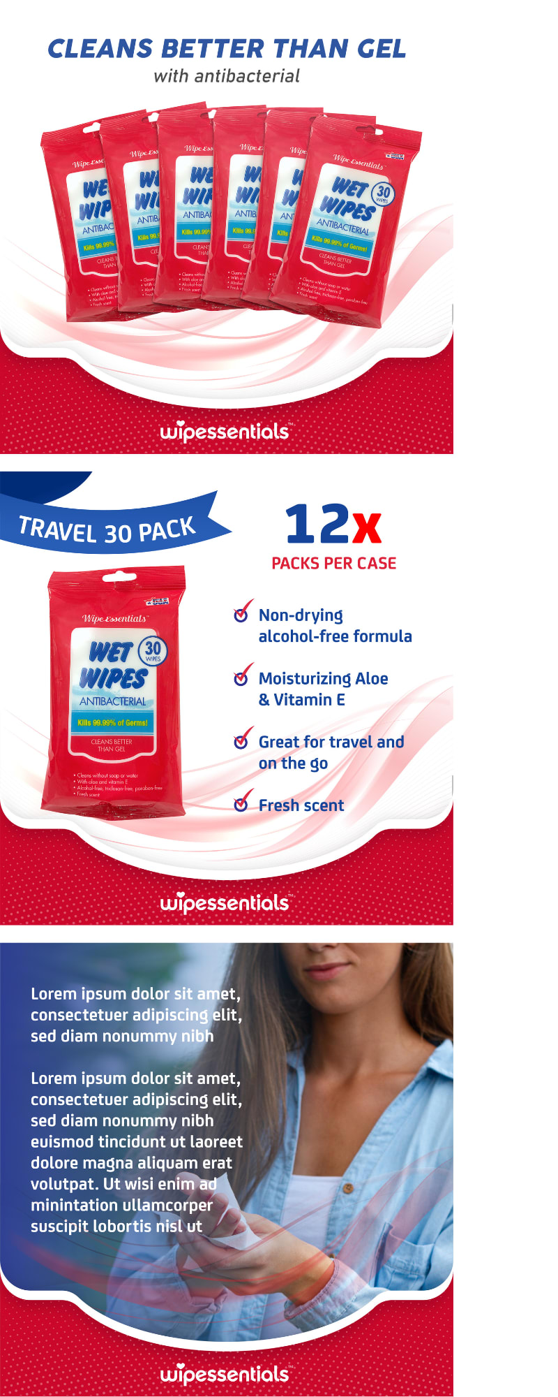
The overvall format seems more professionally designed. Plus wording in B was vague "12x" - 12 times what??
I like the design and color scheme of this one. I like how it is presented and find it visually appealing.
I actually really like both of these displays and honestly it's tough to say which display would be more encouraging me for buying the product because both of them work very well in this sense but since I have to pick one I really do like the Red Wave to appear at the top because I feel like it creates a natural header for the product and then I see the brand name at the top and everything that kind of lives below that in this display is more pleasant and calm in colors and that red really kind of anchors the wet wipes color to the rest of the display
The plaid design for the advertisement seen in choice A is neat to me.
The text is easier to read and the overall graphic presentation looks more appealing.
The blue checkered design is more visually appealing
This advertisement is much better presented and put together.
They're not all that different but the language about "cases" in B confused me, so A is the selection.
The graphic has larger images and I really like the addition of the checkered cloth.
I chose option A as the choice that I would rather buy because I think that the information about the product is presented more clearly and is easier to understand.
I prefer the clip art layout for A more than B.
A is less crowded looking. The text is easier to read based on the backgrounds and where it is located. I prefer the soft blue checkers too as they are not distracting like the red is to my eyes.
I dont know, this is a toss up but I think maybe the design looks a bit cleaner and less busy on the left overall i choose A. However i would NEVER use ANY of these wet wipes as i discovered they are BAD FOR THE ENVIRONMENT!! (clog the sewer system) and i use toilet paper just fine for all sorts of things, cleaning, wiping, absorbing, applying, blowing nose, etc.
I like A better because I think the images look a little better with the added blue part because it compliments the red. It also makes me think about being on a picnic since it kind of looks like a tablecloth or blanket you might lay on for a picnic, and then that makes me think about needing to make sure my hands are clean before eating on the go, so these wipes would come in handy. I like that the banners on the two parts showcase that this product cleans better than gel and that it's a travel pack of 30 wipes, because those are very important parts of information when comparing between this item and one that might be similar. I don't think B's part about it being "12X packs per case" is necessary for the photos because then you can't use the images if only one or two packs of 30 wipes are being sold in a listing, you could only use if when selling them in bulk. So A makes much more sense.
A the visual and graphic design of this one looks more interesting and i like the way it displays and presents information on the product more
It has more of a 'down home' kind of feel that is more comforting.
24 Responses to Option B
this one is highlighted better and the less distractions make it easier to see the product, particularly true in the top of the image, this one just has less distractors.
I chose B because I like how it prioritizes the information in the layout over the branding by putting the branding on the bottom of each section.
B because it lets me know much are in each case which is an important piece of information when deciding to buy this type of product.
B is better because A doesn't tell you how many packs there are per case.
The simple red background is cleaner whereas the patterned background makes everything feel busier.
This is the better option because there's more focus on the product itself. No need for the flannel cloth. Distracts from the product.
The tablecloth at the bottom of option A just looks out of place to me.
B's image design flows better with B, which makes it stand out more.
I like the first two panels of this and how they are simpler and don't have colored borders which match the product too closely and overwhelm the rest of the information. I also prefer the third panel because I'd rather see the text before the logo.
The text in B is easier to read because of the lighter background.
I like B because it was simple and the color theme matched better.
i like that choice b tells me how many i would be getting and labels titles very clearly. its eye catching.
Hhhmmm, I feel like B is the better for me as a consumer. The design and color scheme is less oppressive than the other option. It's definitely easier to process visually.
they are the same product. i would not care how they are advertised as long as it works.
Also tells how many packs per case, which is important.
I like how B says how many packs per case, I don't see that information on A. I assume this means it's being sold by the case. I feel like in B, the wipes are more the "star" of the page right in the center with nothing else to draw attention away. I don't mind the table cloth material in the design in A, but I like B better.
The colors and fonts used in option B are easier to read and more eye catching.
I would choose option B. The 12x packs per case is what would sell me, more value for your dollar.
I think the colors in this one flow better and are less distracting than the other one. They are complimentary rather than jarring
I prefer the pink and white swoosh to the blue and white checkers. The swoosh makes me think of wiping something
B is much easier to read and the graphics on A are very distracting.
I would choose B for the 12 X per case label because I wouldn't have thought it came with 12 packs without the label.
I voted for B in the long run purely for the fact in Option A the upward banner looks very offputting cutting off and overlapping the lady's face on the 3rd picture. The speckled effect in the lower banner in Option B looks good as well. you could use that speckled effect in A too, but overall Option B is my choice.
i hate the table cover in A. I think the graphic in b is much more sleek.
Explore who answered your poll
Analyze your results with demographic reports.
Demographics
Sorry, AI highlights are currently only available for polls created after February 28th.
We're working hard to bring AI to more polls, please check back soon.


