Poll results
Save to favorites
Add this poll to your saved list for easy reference.
Please rank in order of preference from highest to lowest
Option F won this Ranked poll with a final tally of 26 votes after 7 rounds of votes counting.
In a Ranked poll, respondents rank every option in order of preference. For example, when you test 6 options, each respondent orders their choices from first to sixth place.
PickFu requires a majority to win a Ranked poll. A majority winner differs from a plurality winner. A majority winner earns over 50% of the votes, whereas a plurality winner earns the most votes, regardless of winning percentage.
If an option does not earn a majority of votes, PickFu eliminates the option with the lowest number of votes. The votes from the eliminated option are reassigned based on each respondent’s next choice. This process continues in rounds until a majority winner emerges.
Scores reflect the percentage of total votes an option receives during the vote counting and indicate the relative preference of the respondents. If there is no majority winner, look to the scores to see how the options fared relative to one another.
| Option | Round 1 | Round 2 | Round 3 | Round 4 | Round 5 | Round 6 | Round 7 |
|---|---|---|---|---|---|---|---|
| F | 24% 12 votes | 24% 12 votes | 24% 12 votes | 28% 14 votes +2 | 28% 14 votes | 40% 20 votes +6 | 52% 26 votes +6 |
| A | 14% 7 votes | 14% 7 votes | 14% 7 votes | 18% 9 votes +2 | 22% 11 votes +2 | 32% 16 votes +5 | 48% 24 votes +8 |
| B | 12% 6 votes | 12% 6 votes | 16% 8 votes +2 | 18% 9 votes +1 | 28% 14 votes +5 | 28% 14 votes | Eliminated 14 votes reassigned |
| H | 20% 10 votes | 20% 10 votes | 20% 10 votes | 22% 11 votes +1 | 22% 11 votes | Eliminated 11 votes reassigned | |
| C | 10% 5 votes | 12% 6 votes +1 | 14% 7 votes +1 | 14% 7 votes | Eliminated 7 votes reassigned | ||
| G | 10% 5 votes | 10% 5 votes | 12% 6 votes +1 | Eliminated 6 votes reassigned | |||
| E | 8% 4 votes | 8% 4 votes | Eliminated 4 votes reassigned | ||||
| D | 2% 1 votes | Eliminated 1 vote reassigned |
Age range
Education level
Exercise frequency
Gender identity
Nutritional supplement use
Options
Personal income range
Racial or ethnic identity
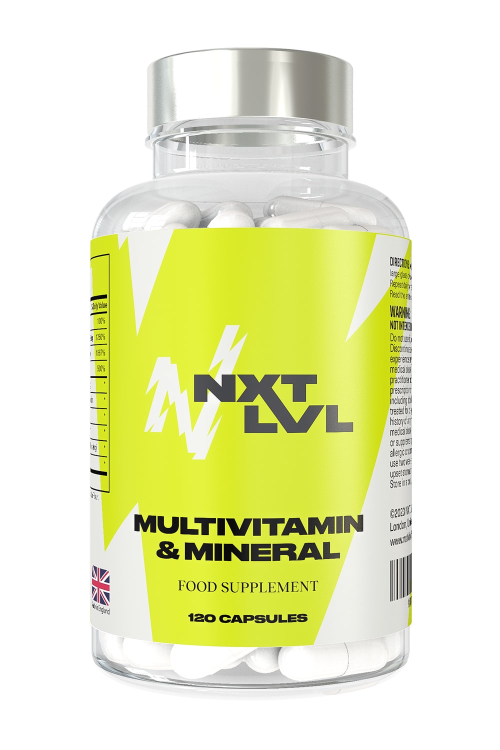
7 Responses to Option A
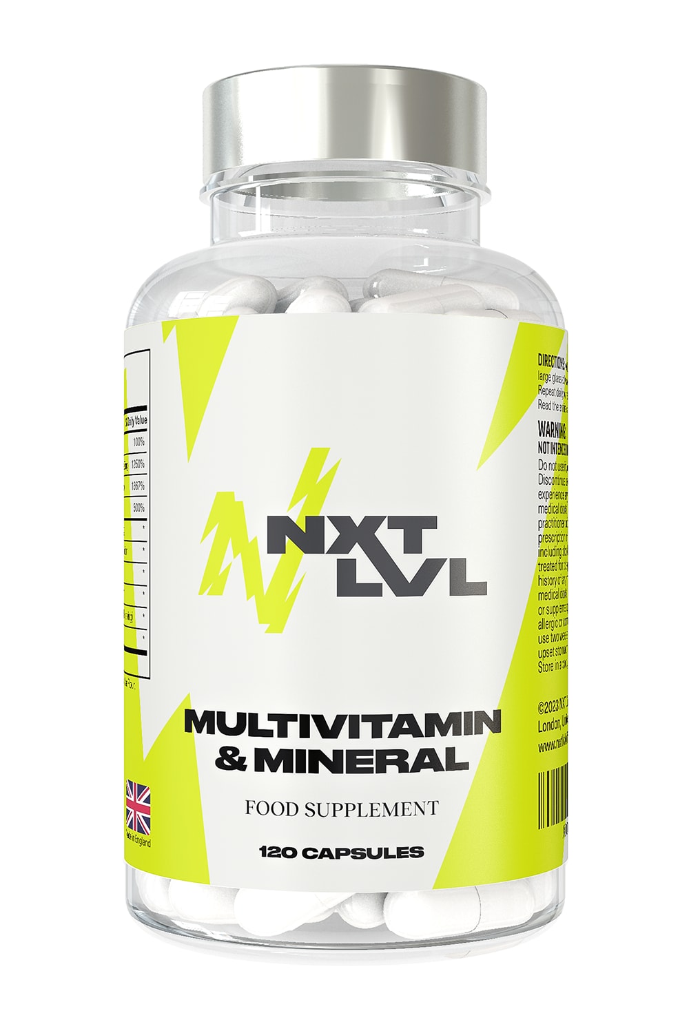
I would prefer having the brand name at the middle of the bottle . Mixture of yellow and white on the bottle is also appealing
I liked choice A and how the color scheme looks more eye catching and not too bland or too yellow.
Love the dominance of the yellow color
Having more yellow on the label draws more attention to it
The design looks more elegant and appealing.
A healthy dose of that neon color, plus the lower placement of the brand name makes the label stand out and look more balanced.
I like the designs with more yellow/black in them best, and the ones that have the best balance between the color/blank space/writing. A is the only one in color that feels completely balanced, so that's my favorite. E and B have pretty good balance, but lack color, and H and F have a lot of color but lack a bit of balance.
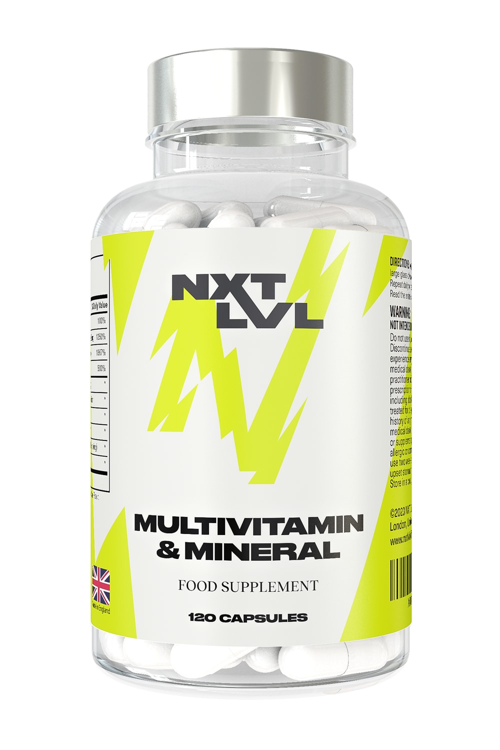
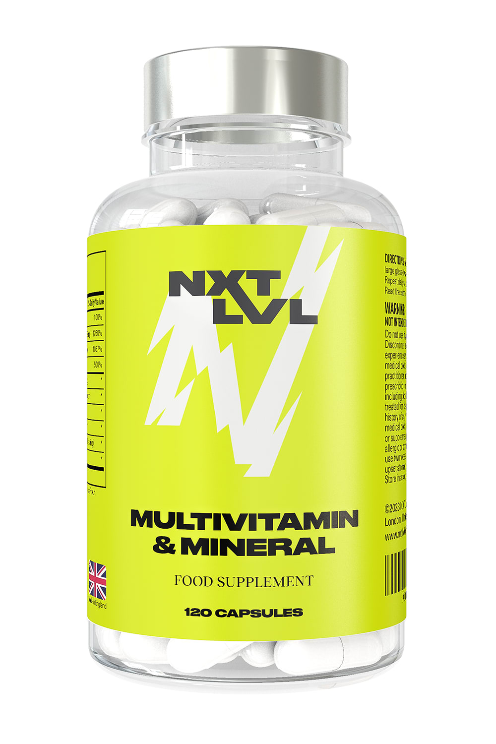
6 Responses to Option B
I chose this order because I prefer the whiter label over the yellow labels. The yellow labels are harder to read.
Colors are combines in a sleek way B and E.
My first choice is B, based on product design, graphics, and the label is a darker yellow which is easier to read, and more eye catching.
B has correct ration of white and yellow background and looks more appealing so ranked it first. In D, F, E and C either yellow or white is more highlighted which makes it less attractive so ranked them at bottom positions.
I like a mostly white background for the container. Easier to look at.
option b is the most balanced with color and white space, option g, d and h are all eye catching, option f, and e are okay, option a and c are my least favorite
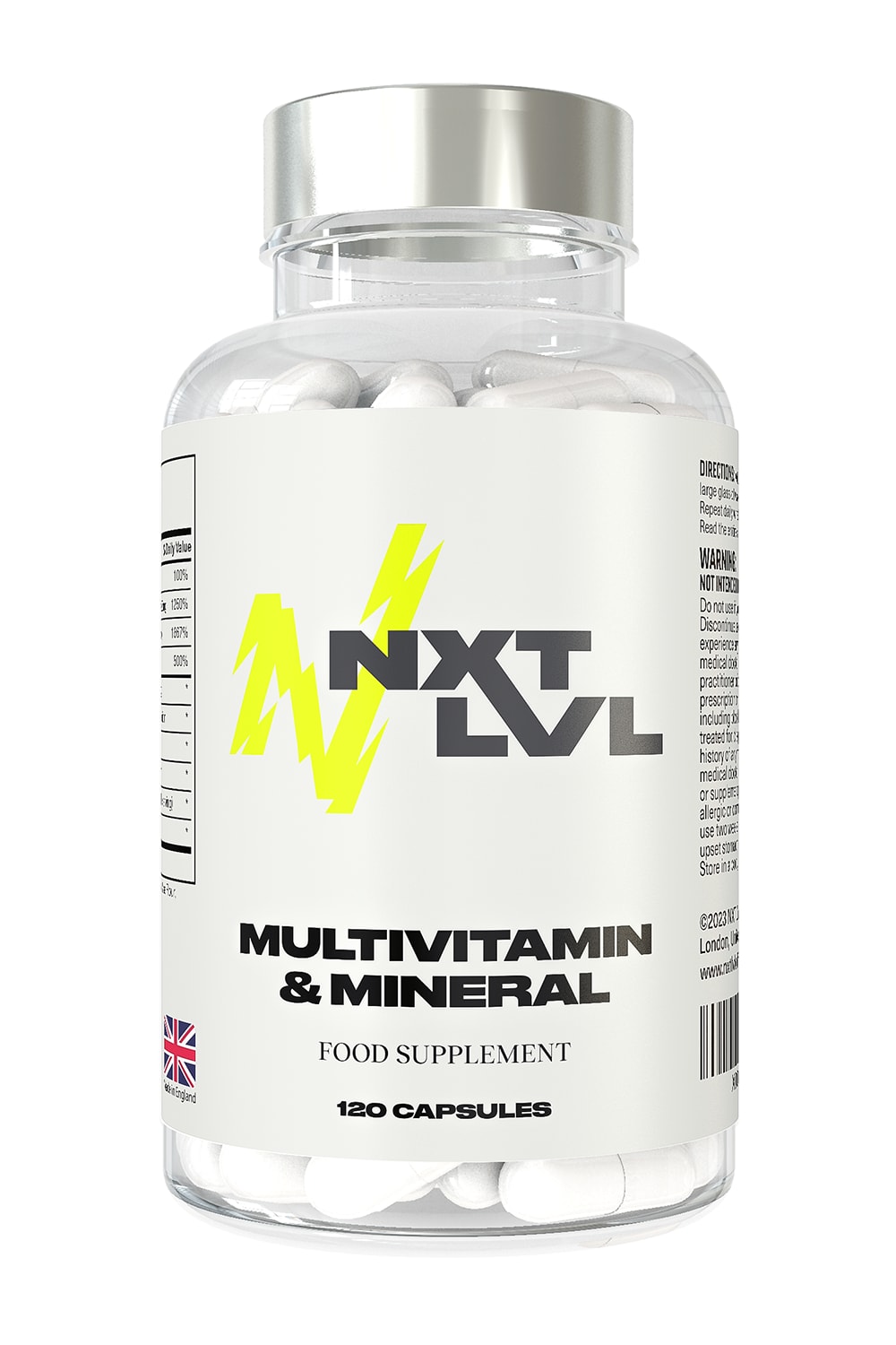
5 Responses to Option C
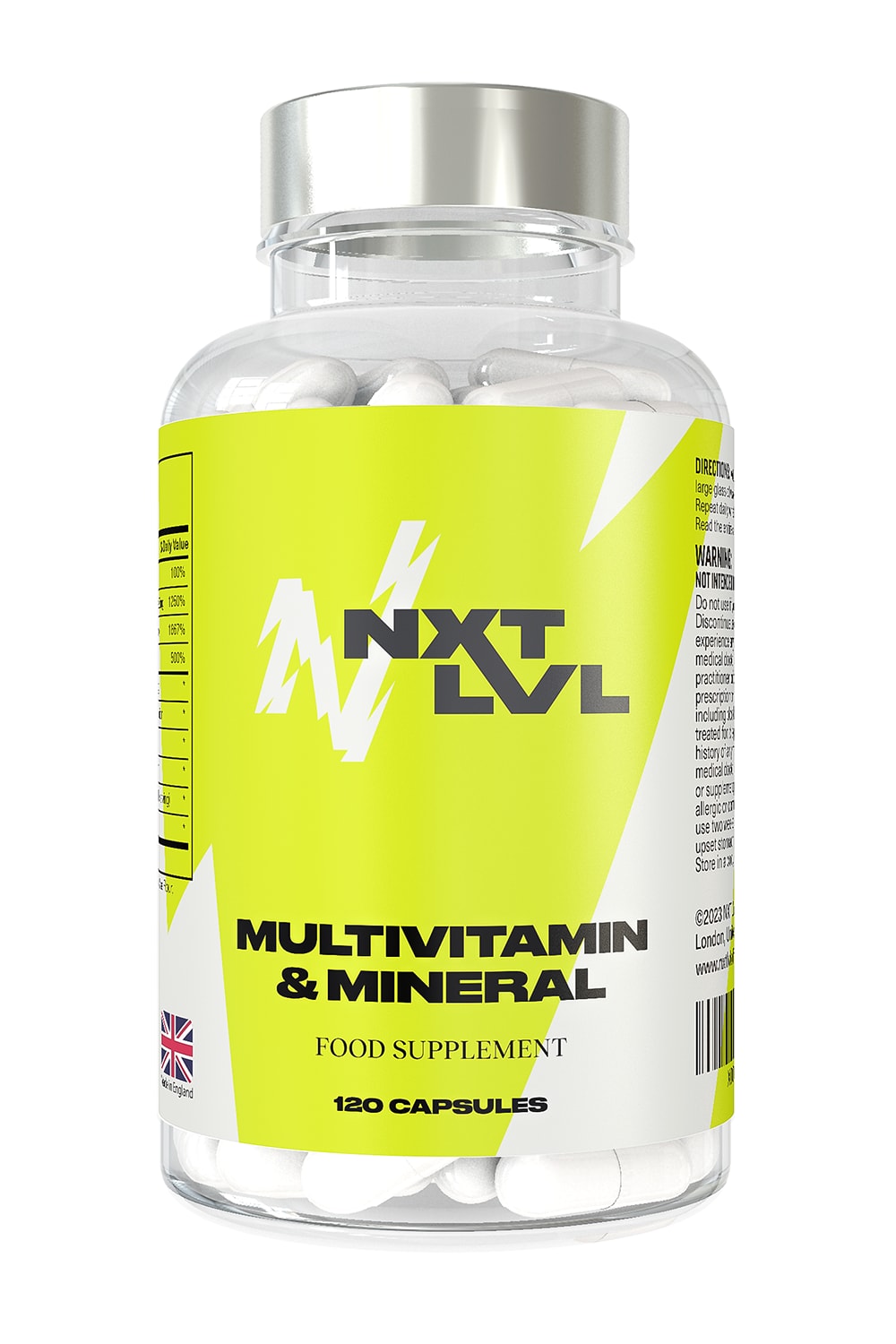
the more white on the label the better. i don't care for that greenish color.
This was an extremely hard choice to make. All the labels looked great. I ultimately went with Option C because I really like the all white label with the yellow N. I think it really pops.
I prefer the all white label
I like the white label with the highlighted n. Stands out better.
The less yellow the better, as far as I am concerned. I think C and D, having almost an entirely white background, are the easiest on the eyes and easiest to read.
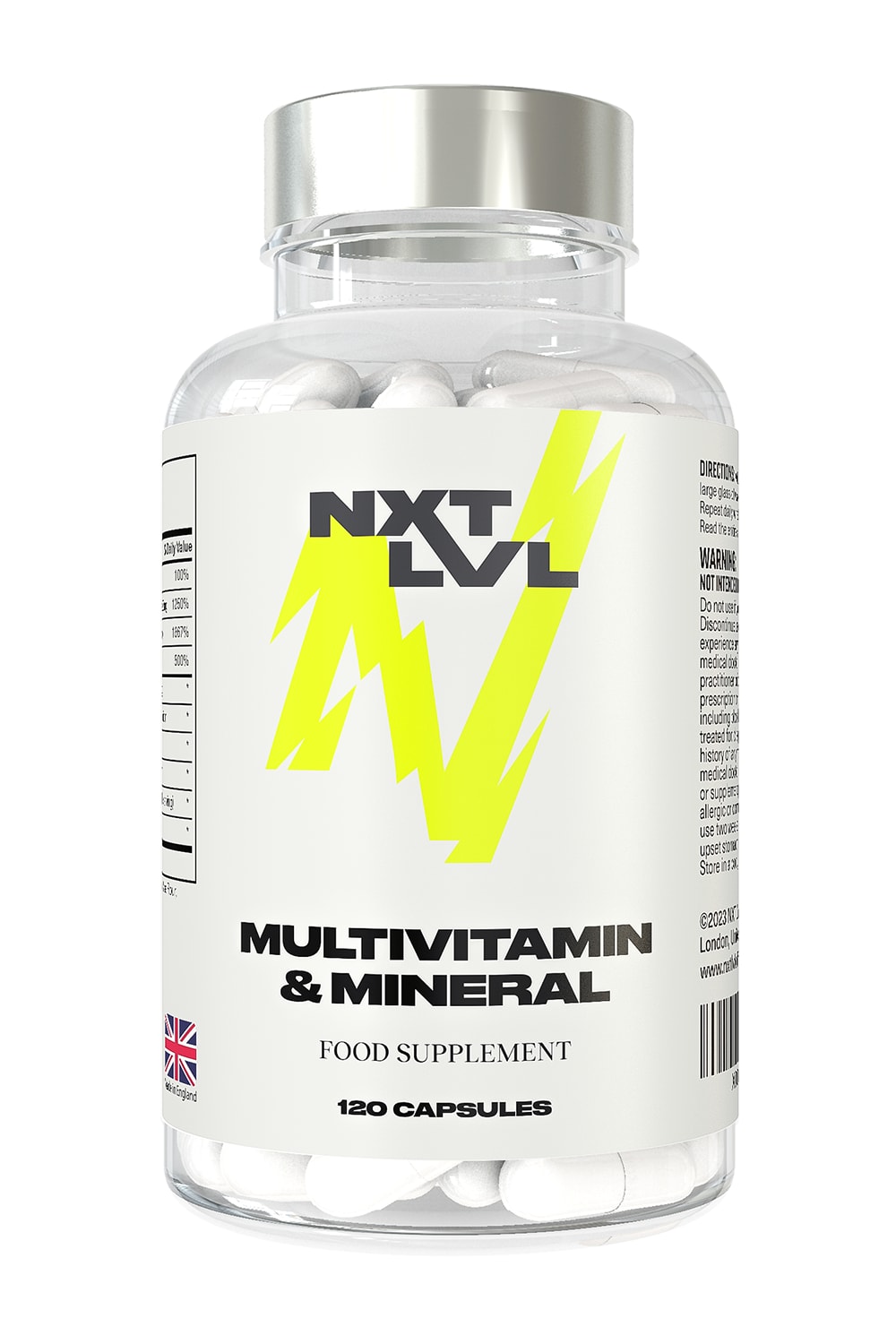
1 Responses to Option D
I prefer the images where the white is more prominent in the background with a neat logo of the N next to nxt lvl. It is more pronounced to me and so much easier and more pleasant to look at and read. The options like G, A, F, and H have too much of the yellow/green color and it is overpowering.
4 Responses to Option E
Option E's pattern is the most subtle and yet it attracts my attention more than the other options given
I like the first few with the clear style design first and I generally like the smaller letter n. I also like the fact that you can see made in USA I think they should be obvious a little bit more prevalent as that's important to me for Purity standards
I choose E first because I like the smaller N and less green.
That's a very specific, bold yellow. It doesn't scream high quality for me. It looks almost like mountain dew or an energy drink. Light accents of it are best
12 Responses to Option F
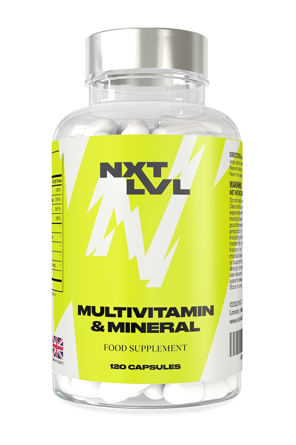
I chose option F, I think the all yellow label lets the other elements pop out more and is easy to read.
I would choose Option F as highest preference. The product label design looks unique and attractive and it enhance the product look and intend users attention.
Option f is the most eye catching and easiest to read the label.
I like the bottles with more green on it. I think they draw attention to the bottles and logos.
The more yellow the better. The choices with more white make the product look less visually appealing.
The more green the better. The less white the better. I like the large white N on the green background in F with no other white. I think that is simple enough and it looks appealing
I prefer this option. I like the green background which makes the N really pop. The white N is the focal point and my eye goes to the white/bright area naturally.
The yellow color of the bottle with proper explanation in the option F,A and is more attractive while seeing at the 1st sight.
I have chosen option F as the best option for me. In my opinion in this case Option F is the brightest and of course the most eye catching. This yellow color makes vitamins look so cool. My next choices H and A are also bright and appealing packaging.
I like the darker font on the yellow/gold background better as it's easier to read and more eye catching.
I picked f because this bottle stood out the most from the others. The yellow on this was the most significant.
The stronger the color the better. My choice stands out from the rest and would get me to take notice. White makes the product look kind of bland. The greenish yellow is better the more it stands out on the label.
5 Responses to Option G
The ones without a majoritatively white background were my first ranking criteria, and then out of those, the ones with the most appealing and eye-catching art designs. Ultimately G won out as the one I like the best and which I think would look the best on a shelf or in an Amazon list.
Choice G is pretty simple and to the point without much frills and stands out
I picked G because it represent the perfect balance of color and logo.
Option G looks the most natural, and appealing among the choices. The background colors flows together naturally, and make the contents easy to read.
G Middle level placement, with mostly green is the most visually appealing / F all green looks nice / A and H I prefer the green and and the placement A looks a bit better on it than H / B and E the little bit of green looks ok and the placement on B is a bit better / C plain but good placement on this bottle / D doesn't look bad but it's the worst of them all
10 Responses to Option H
I like containers with a big N logo and green background.
I like the combination of the yellow and the white combination on the label, it makes the lettering stand out more. In my opinion.
H and F would be my first choice they look identical and are bright in color and clear to read what it is, also shows where it was made.
The yellow label is the most attractive. Combine that, with the biggest N that you can make, and it is the most flashy out of the bunch
I love option H the most because it has the perfect amount of yellow in it and it has the most energetic vibe.
Options H and F had the boldest designs that would stand out more on a store shelf. Options A and G were colorful, but not quite as bold in design with the larger accent designs. Options E, C, B, and D were a bit too plain and needed more of the bright yellow color.
I feel like other than the fully green look, the designs are more or less the same. That being said, I felt Option H was the best option for me, since it is the most colorful. Although, green is far from my favorite color, it is a bit better than an all white.
I like the large N in option H and the coloring of the label as well helps to standout out more.
I like "H". It has more graphical power than the others.
I definitely like the yellow background. It is more eye catching. I like that H has the white designs on the side. It is nice extra added detail. I also like the bigger white letter in the middle which is easy to see and looks good
Explore who answered your poll
Analyze your results with demographic reports.


