Poll results
Save to favorites
Add this poll to your saved list for easy reference.
Which Gold Frame Design do you think is the most attractive and unique ? And which design you'll like to buy for decorating your home or putting you and your loved one pictures.

Option D won this Ranked poll with a final tally of 111 votes after 4 rounds of votes counting.
In a Ranked poll, respondents rank every option in order of preference. For example, when you test 6 options, each respondent orders their choices from first to sixth place.
PickFu requires a majority to win a Ranked poll. A majority winner differs from a plurality winner. A majority winner earns over 50% of the votes, whereas a plurality winner earns the most votes, regardless of winning percentage.
If an option does not earn a majority of votes, PickFu eliminates the option with the lowest number of votes. The votes from the eliminated option are reassigned based on each respondent’s next choice. This process continues in rounds until a majority winner emerges.
Scores reflect the percentage of total votes an option receives during the vote counting and indicate the relative preference of the respondents. If there is no majority winner, look to the scores to see how the options fared relative to one another.
| Option | Round 1 | Round 2 | Round 3 | Round 4 |
|---|---|---|---|---|
| D | 33% 66 votes | 40% 80 votes +14 | 43.5% 87 votes +7 | 55.5% 111 votes +24 |
| C | 18% 36 votes | 21.5% 43 votes +7 | 32.5% 65 votes +22 | 44.5% 89 votes +24 |
| E | 20.5% 41 votes | 22% 44 votes +3 | 24% 48 votes +4 | Eliminated 48 votes reassigned |
| B | 14.5% 29 votes | 16.5% 33 votes +4 | Eliminated 33 votes reassigned | |
| A | 14% 28 votes | Eliminated 28 votes reassigned |
Age range
Amazon Prime member
Education level
Gender identity
Interest in art
Online shopping marketplaces
Options
Personal income range
Racial or ethnic identity
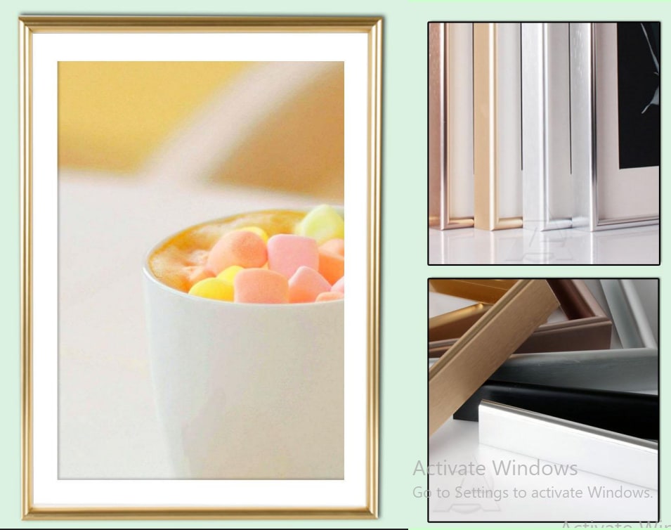
28 Responses to Option A
I much prefer Option A to the other four choices. I think Option A's frame has an excellent size to it compared to the others. I think most of the other frames are too thin and don't really showcase the gold color.
I am not big on gold frames as I think they look tacky but I did pick which ones I would prefer if I did look to buy one.
Most interesting look and design as well as color seeming most gold.
Most vibrant option to least.
Definitely A, the trim is simple and elegant
B is a bit plain. E has the same problem but i like the added texture. C Stands out and has the same plus of E. A and D i really liked and think they look elegant and pleasant. A i think stood out a bit more.
I like this one most because of how thick the frame is overall - its not too overwhelming in relation to the ratio of color and picture.
Out of all of these options, I think A and D are the most unique because of how they look.
It looks more elegant and attractive
Option A is a great look with the frame that seems perfect for me. I like the glossiness of it there. Options C and D are not bad here with the frame there. Options D and E are too thick on the outside to be useful. I'd avoid those.
I like the layouts that are brighter and looks less cluttered. So, even though it shouldn't matter, the picture in the frame makes the product image look more attractive to me.
The additional designs/layers in my top 2 choices really stick out. They make the product look higher in quality and nicer in general.
I ranked option A as 1st because it has the most elegant frame out of all of the pictured frames. It also isn't too wide and compliments the picture well. I ranked D and C 2nd and 3rd because although they are nice frames, they are not quite as elegant as frame A. I ranked options B and E last because out of all of the frames, I would not consider purchasing these. Option B is to wide and would stick out on the wall and option E is a color that I do not like.
I prefer option A because I like this shade of gold the most, also, there is a double ridged sides and this make it look more sophisticated.
Option A and I like it with it looks like the picture that's an option D.
E and d seem to be a little bit too thick. I think it's better to have a slightly thin and minimal look for the picture frame
Option A looks very professional and high quality because of the gold frame.
I prefer option A because I think it looks the most stylish and classy. Option D and B also look quite artsy. Option C and E feel bland to me.
A and E would fit most decor styles, I think. D looks nice, but might clash with some aesthetics. C and B look pretty much the same, and I'd prefer a wider frame.
I think this design is the most unique and attractive. I resonate with it more and it's more enticing
I really liked A the best, it didn't take away from the art in the frame but it helped draw your attention to it.
I went with most attractive because I don't find any of them unique. A is number one because it has an interesting texture and a rich gold color. I chose D last because I really don't like the rose gold color.
A I like the finishing and a little touch of raw pattern on it which makes it look attractive.
I prefer styles like A and D, but they are all very nice. I ranked on which I feel would not distract too much from the picture in it, and looks sturdy.
I like the thinner frames, gold is not a favorite of mine and I wouldn't want to see a lot of it. I think option D looks like any other frame and is not unique at all.
Option A has the shape and finish I prefer and can most picture in my own home. I'd be most apt to purchase one or more of these frames if I was in the market for any.
Option A has a small thickness, bold sleek shape, orientation, and design that adds aesthetics to the picture and makes it lovely while fitted on it.
Option A gold frame seems to stands out more than the others. It seems very pronounced and the coloring is very clear. I would personally use this one in my own home.
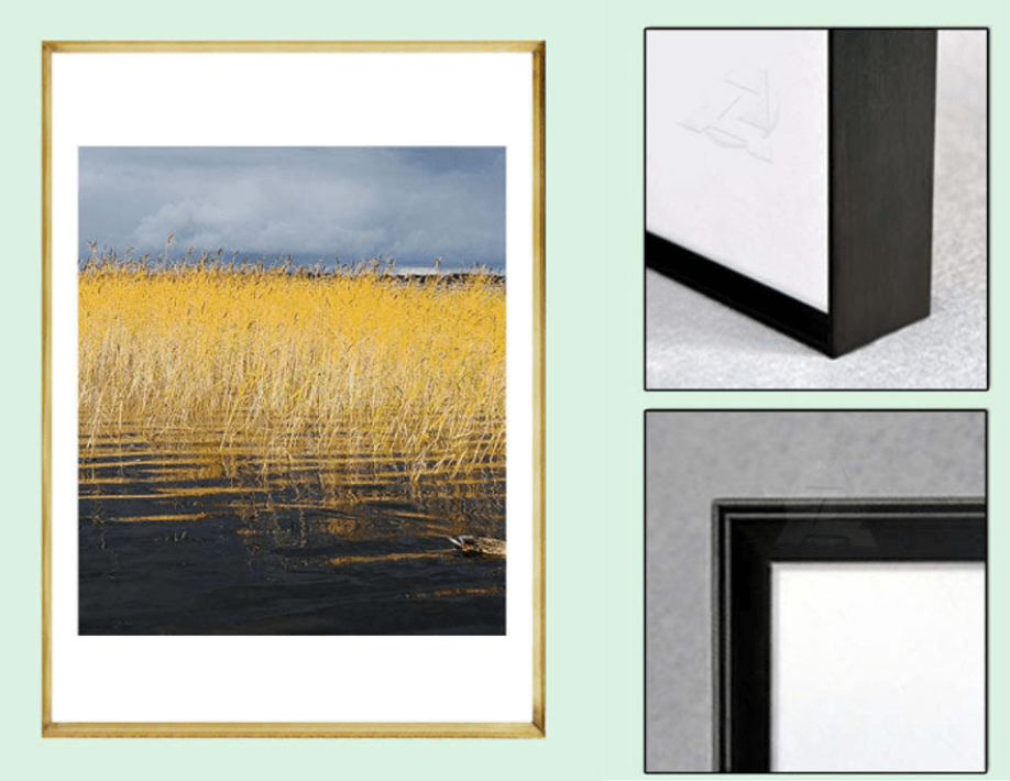
29 Responses to Option B
I like the smaller and more flat designs of B, C, and E. D and A have a lot of design to them which I don't really care for.
I like the more thin designs. I want the focus to be on the picture. I thinkb does the best job showing that and I like the shade of gold. The depth of it looks nice as well
I really like the minimalist gold frame, it is very appealing and makes me feel very interested in it because it allows me to show off the image very well with a slight accent. I would also be very interested in the design because it is pleasant and intriguing.
Options B and C, in that order, are most appealing in design because they are simple and have clean lines.
First pick is B because it makes the product look the most professionally built. Second pick is C because I liked the design in the frame. Third pick is A because the design and color is nice including the color and thin frame. Fourth pick is E because I liked the basic metal frame looks nice but also looks cheaper. Fifth pick is D because this older casual design just doesn't look right.
I really like option B as the black outline or border makes the frame look really modern and helps match the rest of the decor in my house.
I like how skinny the frame is in option B and C. I do not want the frame to be the focal point.
I prefer option B design looks clean. I choose this because it stands out well.
The outdoorsy sets looks best to me, the only thing that would make it look better is if they all had a black frame.
Really like the corner edges and their design here. Professional feel to this. 5 stars from me. Would purchase in this exact order B,D,E,A,C but I prioritize B and D above the group :) so much nicer!
I prefer the frames that appear to be thicker. They create a nice shadow effect on the wall they’re hung from.
Option B is far more of my style, as it has a warm and soft color to it.
I like the thinner border option because I think it allows the focus to be on the image inside. I think the focus in a frame needs to be on the image and not on the frame so the frame needs to be the background.
I like the super thin frame the most so B and C are the ones I would go with. I don't really want to know there's a frame there, even.
I ranked the frames by how much they actually appeared gold - vs. being obviously off colored (E is brown, not gold, it looks like balsa wood)
Options B and C of thinner frames put more emphasis on the picture contents and not the frame itself.
I would be most likely to purchase option B because I think that it is the cleanest and most visually appealing gold frame design out of the five options.
B and C are the most simple and elegant designs, which I like the best.
D isn't really my style, I really like B, C, and A the most. I think they stand out the most and I like the more thin border.
I prefer the thin line facade of options B and C. It matches the contemporary aesthetic of my home.
The thinner gold frame is more modern in my opinion, the thicker ones remind me of ones my mom and grandma would have, and I could easily get that at a thrift store or something for less money.
Option B is the best because it is slim and not intrusive, while still giving off a nice gold look and feeling.
Options B,A,E and D are fantastic designs that look amazing and they would look great on my walls.
I like B and C equally because they allow for most of the picture to take center stage since they have a thin bezzl
I like the ones with the thin gold frame the best since I think its fits the frame the best and shows off the picture perfectly.
I ranked my choices based off what brought me a sense of peace.
I like the simpler designs and the normal look. I don't care that much what the frame looks like. I want the photo inside of it to stand out the most.
I like frames with with less of a border and simpler.
I like the thinner border frame as I feel with the thinner boarder it would not take away from the picture that I put in the frame
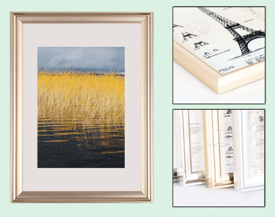
36 Responses to Option C
I choose C, Because this one is more unique for me and interest me more than any of the option.
I like C because I like the thinner frame. I think it looks classy and would really fit more seamlessly with my other décor in my home.
This design is very modern and trendy and I love the details of the finish the most
I thought Option C was both more unique and attractive. I like the deep inset of the glass.
I like the depth of the frame in choice C. I feel like it looks high quality
The frame looks very attractive with the leaves inside.
I like C and B because of the dark gold and sleek frame. Follwed by A and E its color and thickness of the frame. Lastely D
C is my favorite. It's a nice, thin border - my preference - yet also looks somehow organic despite being gold-ish. It's a nice balance all around.
I picked options C and A because I prefer less of a white border and more of the original picture showing.
I like the wood look of C. It is thin and will make the picture the focus, but still look nice. E and A are both nice and would compliment most pictures. B looks like it would break easilyD it too big and chunky. It reminds me of frames I see at my grandma's house.
C and B are my favorite choices because I just love the thin frame the most when it comes to gold. E would be next because it’s the second most simplest and design. A would be second to last because it’s starting to get a little bit to gaudy for my taste and then D is my least favorite because it’s just a little too ornate.
I think with gold, less is more and then thin ones are more attractive and less intrusive of the pictures themselves than the thicker gold frames. The thin ones are modern looking to me, I can see a white clean office with them in it.
I like the simplicity of C the most, the smaller frame looks really nice. I don't want too large of a frame.
I thought the first three were the most unique the las two looked basic to me
I prefer minimalistic designs for gold framing, so C and B appealed to me the most.
Option C seems the best, it is slim and stylish. It offers a good amount of color while not over shadowing the picture. The frame is elegant yet still stands out.
I like option C the most as the frame is very deep and it looks like it could go in modern and traditional settings. Option B is similar to option C but I like the ability to have different colors of frames. Option E is ok - the pictures are clear but I personally prefer a thinner border for the frame. Option D is fine, but it would really suit only a traditional-styled house. Option A is similar to Option D in that it would only suit a traditional house, but the images used to sell the product have too much in them, and make it hard to fully grasp what I'm looking at - e.g. I thought the top right image were window blinds, not picture frames.
Minimalistic frames beat beveled things
I like option C because it looks more sleek, minimalistic, and modern.
I prefer a thinner understated border. Options C and B have that while still maintaining the bright and visible gold color.
I'm a fan of simplistic. minimalistic design, so that influenced my choices. Option C was the top choice as it was simple but I also like the leaf print in the picture so that was a slight influence. Options B and E are close seconds but just not my favorite. And options A and D are my last choices as the frames have some beveling and extra design on them which is not so much my taste, if I had to choose though option A wins out here as it is slightly more simple versus option D.
I like option C the most because it is the classiest option.
I personally like a frame that is flat without any beveling, or if it does, a thin frame. I like the gold accent on the wall, but not too much to overpower the photo.
I like the thinner bezels on Option C compared to the rest. I also think the art on the frame is nicer than the rest of them.
I like the thicker frames they seem to give the picture more depth. After that I ranked them by the gold coloring that I thought looked best.
I like the deep frame and lip of option C a little bit better than the more traditional frame in option D. Option B has the deep frame but without the deep lip it doesnt look as good. i don't like a or e
I like the simpleness and thinness of C and B (they look more modern) followed by E. D and A just look to traditional. I don't like frames to have bevels.
i like choice c the best. it looks natural and would blend in with any home decor. it looks lovely
Options C, E, B seem more interesting and modern as compared to Options D and A, which seem to be more generic and like what you'd find at Target.
I liked the more thin metal look of the frame for option C the most. Option B and D, looked good too. Option A I liked the more metal look of the frame over option E.
I think that all of these options I have seen before I asked for the one that is the most unique it would be C
I prefer the thin profile of the first few and the darker luster. The bigger ones I liked the ribbed texture better.
I like C and B. I would actually buy those design. I wouldn't pick E or A, and I would skip over those. I like the skinny widths of C and B.
I like C the best as it is the most unique and prettiest. B is a close second. E is a thicker frame, but is still pretty. A is thin enough not ot take over the whole picture. Option D is too thick of a frame edge.
I picked C because I love the spacing in between the photos and the gold frame is thin.
I think the least white background I can find on the fram the better, it just seems to pop more and the gold trim really makes a difference in that situation.
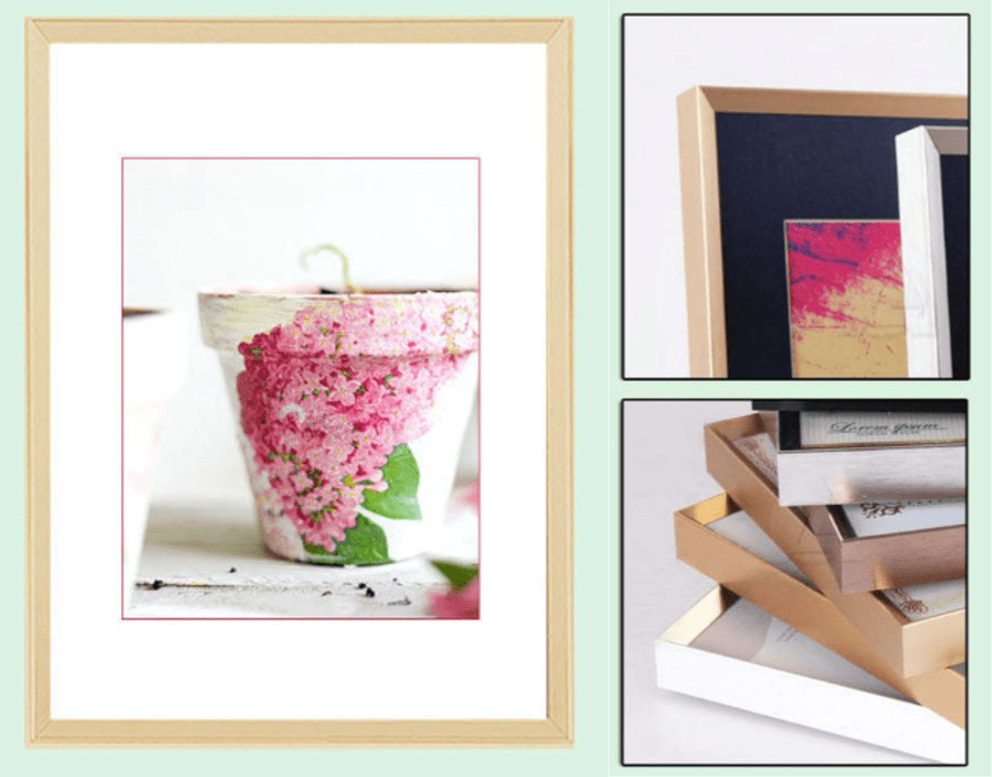
66 Responses to Option D
I really like the softer gold color. Other than that I try to select the thinner frames.
I suppose I like the less modern looking ones
D it looks richer and luxurious.
I picked D as the favorite because the frame looks the most traditional out of all of the options.
This one looks like it has the most gold around it. Due to that, it looks like something that would accent my pictures better
i strongly prefer the first one over the others. i like it because i love the double step to it, it makes it look more luxuroius.
Thinner and less bright is better than thicker and too gold which is tacky
D and A are very attractive. They look high quality and have a nice design to it
I like d best. Nice sturdy classy looking frame.
I like option D the best because I like the wider face of the frame, which features a more intricate design compared to the other options.
D looks the thickest and most durable
I like the color on option D. There is also enough frame to picture ration to make it look good to me.
I like the options that make it look like a double line around the image.
Option D has a beautiful frame. The bezel is really unique when compared to the other options. The frame has a nice wide thick bezel.
This one is beautiful. The ridges make it stand out.
I don't think there are significant differences, but I chose those that felt the most high-quality and timeless in terms of style.
i like the design in option D because the gold frame has a shine to it and looks to be high quality to me
The first 2 have a level of elegance to them. Nice detail and attempt at looking nice. The last 2 are just cheap strips, likely plastic.
I really like the border of the frame seen in D and B. It is the most stylish
Option D looks the most classy and dignified; it looks very professional and visually pleasing, far above the rest. Options E and A look okay, but they don't stand out to me as much. Options C and B look pretty cheap and flimsy when compared to the others.
Option D is the widest and has the detail I look for. Its not overly fancy which is a positive and the overall will look nice on the wall.
I prefer Options D and A since the raised border looks classy and the most dignified for pictures I want to frame.
I personally like the widest frame design; the frame on which yo can clearly see the edges around the picture.
Really like D more than the others. D has both quality and looks going for it.
I liked the thickness of d, I would buy that one
I prefer the boxed pictures in the frames. I think they have a much cleaner and better look in my opinion.
a bigger stronger frame looks more luxurious and fancy and elegant
I like the elegant, traditional look of D. I'd buy that one.
D with a thick frame and thick border or c with a thin frame and no border are both optimal. Es border looks off. As frame is too thin. And bs border looks so off I’d be embarrassed to display it
a bigger outline makes the picture itself feel more framed and it also looks stronger and high end
D looks the best since it has a noticeable bevel. I like C because it is thin and modern, E looks rustic, A and B look oddly shaped or colored to me.
I like the first two the most, they’re thick o you can see the gold nicely, and they have a slight bevel to them that makes them unique compared to the flat surfaces of the others. The third one is ok but it’s missing that bevel and the last two are too thin, if I were going to pick something as brilliant as a gold frame I would want it to be noticable.
I would buy options D and E. Option D I use for pictures of my ancestors. I like more of the classic look for their pictures. Option E gives me a simple look for modern pictures or artwork.
Option D. I like how the frame is thicker and has more detail and depth to it. It makes it more appealing and stands out more as unique making it the likely choice to purchase.
The simple design of D is more attractive. The other ones show too many or the wrong options in the smaller pictures creating an inconsistent view of what the product actually is. So basically the smaller pictures are what effected my opinion.
E looks very plain and boring. D has the best color of frame and is the most unique, A is a close second.
I like the depth of the frames in D and A. Even if they don't actually have depth, it looks like they do, which is a plus. I like the colors of C and B, they have the darker bits on the gold which looks nice. I do not like E, it's too flat and bright.
I like the design of the frame best in option D the best and then B, C, A and E next.
I think 'D' looks the best and is the most attractive. It does a better job making the pictures stand out.
I like D the best of the frames because I love its rose-gold color. A is second because it's shiny and a bright yellow gold. E is third, because it's all right but not really a standout in any way. C and B are last because they're too thin and don't look well made.
I ranked my choices based on which options looked the most traditional to me.
I chose D because i like this shade of gold, also the Design of the frame is very pretty and unique. I would love to use this frame to decorate my house with.
The thick edge frames are always a good choice for any family photo so D and A fit
I like frames that are a little thicker because the thin ones look cheap and breakable. I also like when the gold is not so shiny.
I like frame designs that stick out spatially, and D looks like a very nice one in that style.
I like the brushed gold the best and the beveled edge of Choice D
D is the best. The others don't even compare. The other look very cheap and old, like something from the 90s. The color is a nice soft gold and thick and looks good quality.
I felt like option D gave the most unique impression and eye-catching. I think it would fit my style the most out of the options.
I like D the most as it has the slightest hint of rose shade which is really pretty and definitely unique. I'd want to decorate with this in my own home.
I would choose option D because it is a rose gold color . I love rose gold and I think it looks beautiful and elegant. I would be happy putting all my photographs into a rose gold frame
B was too flimsy and E’s gold color was too dull. I liked that D and A featured a bolder gold color.
choices d,a,e are thicker and more classic types of frame designs
I like options d e and a the most out of all these options available. I would be most likely to buy one of these three options because I like the framing more on these. I like the framing on these the gold frame because they are a mixture of a little bit wider they have a little bit of an older look to the frame you can actually see the frame. The frame on these three options has a more retro old school feel which is what it's something I would like to hang in my wall area I think it makes it look more classic and better looking when you're hanging pictures family. I do not like options B and C because I do not like how thin the frames are on these options some of the frames are even so thin you can barely see them so it doesn't really matter what color it is. I like the ones with thicker more noticeable framed edges.
I would be the most likely to purchase this option because it has a nice design and the right thickness.
When I see these images I'm trying to imagine how they would look hanging on the walls in my house, and in that case I'm able to Envision options d and a the most and really think about how that would look with my photos in there and in my home and that makes me want to purchase those the most
I like option D because the frame has some shape and curve rather than being complete flat.
I prefer the wide and deep frame design in option D. I like the way the frame looks with an image in it. I would buy this gold frame.
I really like the more classic look of the frame shown in D. A looks nice too, but I like the width of the frame in D the most.
Option D is really the only one I would buy. It is a more elegant shade of gold. The others look like the cheap dollar store frames
I like D the most, by a lot. The others are more simple and plain. The image in the frame in option A seems kind of washed out, a higher contrast image may be more eye-catching.
Option D is a classic design that I like and would look great in my home. Option C feels more modern and is a close second for me.
I would likely buy and use the frames with a little more detail and depth to the frame design, not the simple flat frames
D and A are bold, durable, luxurious and appealing. C, B and E are too ornate.
All these gold frames are pretty similar and are similarly ranked, at least 1-4 are. B is ranked last though because the two pictures next to the frame show a black frame which is confusing.
I like the frame of option D and A better, it also looks more elegant and decorative in my opinion.
d is first because i like the thickness of the frame as well as the shine, a is 2nd because the thickness of the frame is still pretty thick and the shine is great, b is 3rd because the frame is starting to get way to thin, c is 4th because the frame is far to thin i like a chunkier frame, e is last because of the matte look.
41 Responses to Option E
Unlike the large mat for option E. It looks classy.
I would choose choices E, A and D first because they have a more attractive visual display for me as compared to choices B and C which are less attractive to me.
E- I liked the size of the mat that is included with this picture frame and the thickness of the frame looked ideal. D- was my 2nd choice as once again the mat that is included is nice and the colors that it comes in are great. C- I disliked the most as I feel that actual frame is too thick
I like E the best because the gold seems the most muted/dull and not as shiny in this one. I think the shiny gold looks very outdated. I like the gold tone and the thinner frame.
My most preferred frames are the ones in Option E and D.
I like the thicker frame on E. I don't like A or D because I find beveled edges like that dated
color preferences for me personally ranked in order. Also prefer medium width to large or small width
I love the colors that you get with this frame as well as the art itself.
I think option e is the best because it has a matte finish to it which makes it look current and not dated to the 80s and 90s which went with glossy gold.
I choose B because I can see all the angles and aspect of the frames making the product look visually attractive, compared to other options
The Gold Frame Design that I find the most attractive and unique would be option E. I would also consider decorating my home with option C. I like these because the frames are beautiful yet subtle and are very different than what you might see in stores.
I prefer one solid color border, rather than gradients or shades of color. It's consistent and more appealing to the eye.
I like that this one looks natural and bold at the same time
I like the simple yet elegant look of the top choice. I would buy several
I selected option E as my first choice because I like the color of gold and I like the thickness of the frame. I think that it is not too thin or too thick. I selected option D because I also like the size of the frame and also the design. I like option A because it looks interesting and also is a good size. I do not like the rest because the frames are too thin for my taste.
offers me the most detail of the product and it seems to be the best quality for me
I ranked based on my personal preference. I prefer the first one over others because if the texture of the surface of the outer edges looks more luxurious then the other options and looks like it would cost more. I choose others based off ones I could likely buy in real life.
I like the minimalist look of E and C the most. I would be happy to use these because the frame looks more simple in design than the other choices.
I really like the thickness of the gold part of the frame in option E, and I also like how bright the gold color is, makes it stand out more and really make the picture look even nicer
I think Option E is the most attractive. The flat edges make the frame look a little more modern and the color of the gold on Option E looks more high quality than the others.
i like the more simple designs and frames better so i picked choice E and C as my first two choices. i like that they are simple and i dont think they would take away from the photo in the frame at all.
I chose E because its a simpler look and the gold isn't as bold
I like the thicker and flatter option rather than the one that has a lot of ridges. I think it is a more classic look
I personally would buy my top choice as it has a nice golden thickness to it without being overbearing
I like the medium thickness of E & A, as well as the color options. The skinnier C & B options are also nice.
Option E has the best design and unique style for decorating my home or putting me and my loved one pictures. It's style fits with my current personality and tastes. It would look good in my office or home.
Option E is the most visually appealing and grabs your attention more right off the bat. It has a more modern and unique look to it that would make it more desirable for people. I think the color is more neutral and would make it easier to match up with other decor in the home, as well as whatever image you chose to put in it. I like the design and shape of it as well and think it would make it more attractive to people. Option E would appeal to a wider audience of people and would make them more likely to check deeper into what it has to offer.
My loves ones love flowers so this design on this option would be perfect for their living room.
This would be my choice order but I like the more simple basic look of E, and C, (in that order)
I prefer the designs that give a slightly thicker appearance of the frame from the front.
i prefer to have a simple look in out home. kind of back to the basics. so i prefer a frame that isn't very intricate or heavily detailed.
I REALLY LIKE THE MORE MODERN SLEEKER LOOK IN OPTION E BETTER THAN THE OTHERS
I liked choice E and the simplicity of the design. Choice E has a nice modern feel to it and doesn't distract me from the image. Choice D looks complex and wants to take my attention away.
I like the matte finish and the matting around the picture best in E. Option C looks really cheap and low quality.
I chose option E because I like that the gold in the frame in this picture is matte and not shiny. I think the frame is a nice classic design and will not go out of style.
I would pick option E because the shade of gold is just right and it looks like it would be easy to clean. I also feel like pictures would look nicer in it.
I think this looks the most different from what I've seen before.
I personally don't like gold. I wouldn't buy a gold frame. If I were to purchase one for a friend, I would lean more towards something matte and not shiny. I also like a flatter frame - not rounded and curved.
Simple, clean lines and classic designs are best. Design that are too modern or different don't look great.
B and C look cheap, and if I was a college student needing something fancy in a dorm then that would be for me. I like the non glossy look for E and A has a good look. D doesn't look gold but it's not bad
I chose this option because I liked the simplicity of the design and felt it was not too busy
Explore who answered your poll
Analyze your results with demographic reports.
Demographics
Sorry, AI highlights are currently only available for polls created after February 28th.
We're working hard to bring AI to more polls, please check back soon.


