Poll results
Save to favorites
Add this poll to your saved list for easy reference.
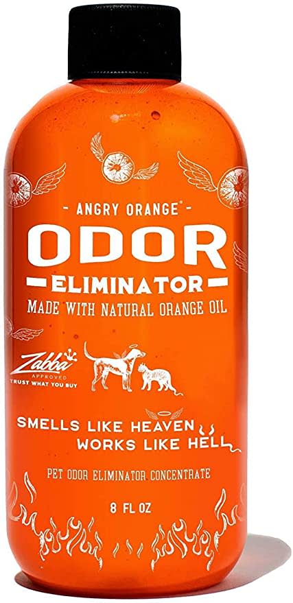
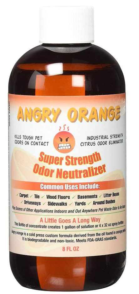
Which product packaging do you prefer for this line of pet deodorizers?
Age range
Dog owner
Education level
Gender identity
Household income range
Options
Personal income range
Racial or ethnic identity
29 Responses to Option A
The packaging is a lot more attractive and appealing in A. I also like the illustrations on the bottle.
I like A it looks more professional.
The look of the orange here is nice with the flames and I like the contrast for this odor eliminator
I like the color of the bottle. I think the name of it is really good. I like that it has a dog and a cat on it.
Just based on the label alone, A looks like it would be the better quality.
I like the orange color of this one. It is very eye catching and is more inviting than the other one.
I love that the entire bottle is orange as it’s in your face bright.
I like the artwork and slogan on A over B. The colors/art make it stand out.
I choose option A because the design and the font attracts the customer more
A is much more eye popping and high quality. B looks cheap and dull. It reminds me of something I'd find in the dollar store.
i prefer the packaging in option A because it looks less obnoxious and more professional
I chose A because I like that it has a dog and cat on the label and the overall look of it.
The font and graphics for option B look way too cheap and low quality.
After carefully studying and comparing both images of odor eliminator products displayed above, I selected Option A over Option B as my first preference and the one that I would more likely click on to purchase for my own personal use. I feel that this image has more eye catching appeal and I was also attracted to the clever phrase "SMELLS LIKE HEAVEN WORKS LIKE HELL" which has a unique ring to it.
I think this option is more aesthetically pleasing
I prefer Option A because it looks like it would not let any light in, and that way the liquid would last longer.
A looks gentle, but also effective. B looks scary, and even though it may be safe for pets, it doesn't look like it.
I love the bright orange and the flame details
The packaging looks more legit here. I like how it's kind of funny too.
This is a much more attractive looking bottle. It's clever and cute as well.
In above the package of the product I choose the option A in the first position because it had a good looks o I choose this option. then the other product is consume to be a valuable so I choose this option.
I would go with option A because it looks the most compelling and potent to me. Option B feels too basic and boring to me overall.
Option B does not look high quality in terms of packaging design. This would make me not trust the product, and therefore I would not purchase it. I like the design of A best. It looks unique, nicely branded, and trustworthy. I would look over option B.
the product package advert design is more and fits well for odor elimination purpose.
Don't like the emoji in choice B. On the positive side, I love the clear bottle on choice A and being a dog person, thinks that the drawing of the dog with the halo is a very cute touch....as is the tag, "smells like heaven, works like hell"
The design of the bottle of option A looks more professional in my opinion.
Option A is the best logo and label because the colors and design are simple and detailed
I find this product label to be more vibrant, and eye catching. I would be drawn to this product first.
I like the bright orange because it gets my attention and it is easy to tell apart from other products.
21 Responses to Option B
I disliked the brightness of the orange color on A since that seemed sort of tacky to me.
Because it offers more information about where it can be used, and the applications.
The brand name "angry orange" goes well with the angry orange face
I like the orange face on bottle catches my attention more
The orange actually looks angry on this bottle and would be more likely to cause me to look at the bottle and brand name again.
I chose option B because I like the description much better then option A. I don't like the wording in option A such as it works like Hell.
I like the semi transparent look of the bottle in B
Choice B looks like it would attract more customers and they would be curious about what it does. I love the design of the angry emoji
That angry face really gets me; grabbed my attention like crazy
I would choose B because I like that it has the safety information right on the front.
I don't care for the primarily orange bottle.
Option B conveys far more information about the product - its uses, how it's made, etc., than option A. And I prefer its overall design.
I think option B has more useful information on the label. It states that the product is an "odor neutralizer", which is somewhat believable. In my experience, nothing is an "odor eliminator" unless you thoroughly clean with disinfectants. I also don't really care for the swear word on the other label. It is catchy phrase, but I think some people might be put off by it too.
I like the cartoony packaging, it is fun and makes the pet deodorizer seem less serious and not as unpleasant to use
I like B better because I think that it is better when you can see into the bottle to see how much is left
I know A got my attention first, but for all of the wrong reasons. I would never spend money on A because I am unable to take it seriously. I would buy B and research them.
I enjoyed this option giving you more information about the product on the front. Common areas to use really helps
I love this product and I have used it for many years. I l usually look for the orange bottle, but I like B as it has so many uses listed that I never even thought of using.
I really like them both, but I like all the information on the one bottle of what can be used on and how it states "a little goes a long way"
Choice A because it is more OCD and sensory friendly. As someone who has OCD diagnosis I prefer to pick products that are more visually appealing. The reason the choice A is more visually appealing to me is because the simple orange and white colors. The choice B has too much going on on the label seems like.
I like the more light and mellow packaging of B. The facial expression is goofy and it really stands out immediately.
Explore who answered your poll
Analyze your results with demographic reports.
Demographics
Sorry, AI highlights are currently only available for polls created after February 28th.
We're working hard to bring AI to more polls, please check back soon.


