Poll results
Save to favorites
Add this poll to your saved list for easy reference.
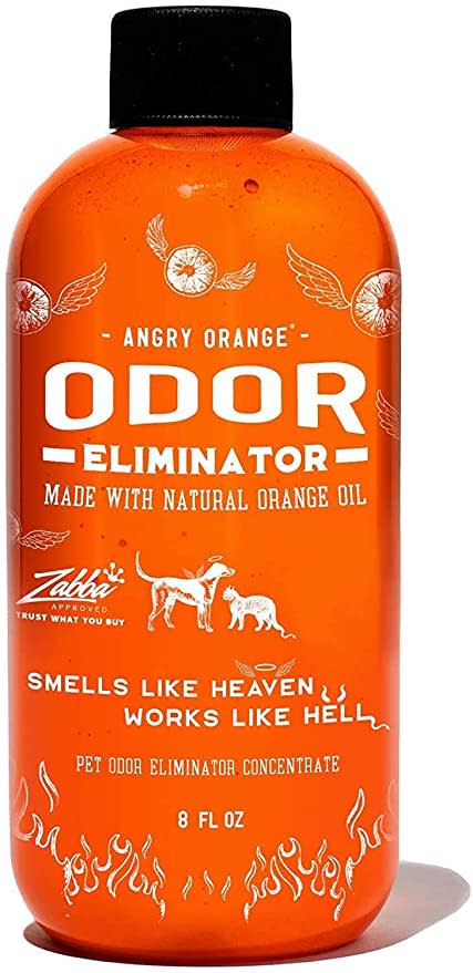
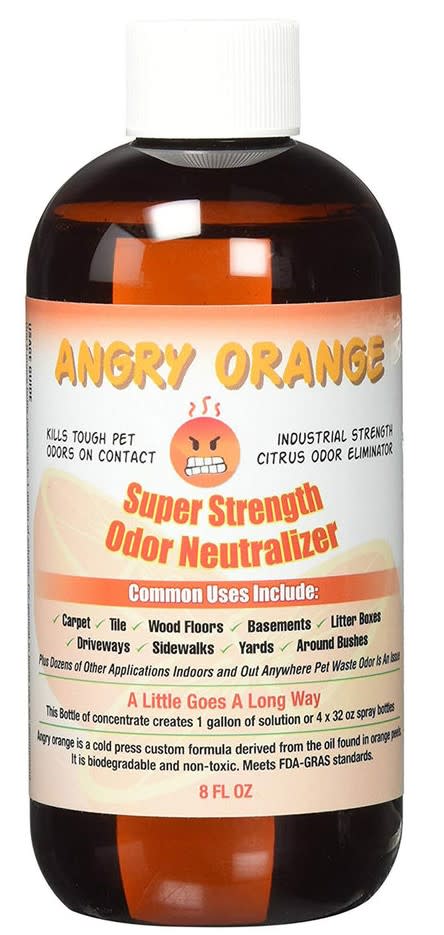
Which product packaging do you prefer for this pet deodorizer?
Age range
Dog owner
Education level
Gender identity
Household income range
Options
Personal income range
Racial or ethnic identity
37 Responses to Option A
I much more prefer the design concept of option A. The labeling looks great and overall looks like a higher quality product.
I love the all orange bottle with the flames at the bottom
I like the white color of the font on this one and also like the dogs.
This arrangement is more relevant to this order and it is more attractive and very reliable
I prefer A because the packaging is very vibrant, eye-catching, and whimsical. I think B looks uninspired, dated, and like cough medicine.
I love the all orange bottle as it’s unique and bright. Not something you see often.
This arrangement is more relevant to this order and it is more attractive and very reliable
I like seeing pets on the container and I really like the tag line.
I prefer option A. I like the orange and white label. It is colorful and easy to recognize. I just equate it with a pleasant smell.
I like option A the best because the orange colored label bottlre really jumps out and the white colored graphics and text really stand out due to that orange colored background. I also love the saying on there "Smells ike heaven...works like hell".
I prefer the design of the pet odor eliminator of option A’s product. It looks better in my opinion.
I like how there are animals on option A “smells like heaven works like hell” is a catchy phrase too! I like that
The look of the orange bottle is really neat to me with the white flames here, it stands out
I liked that this option featured a more vibrant and refreshing orange color.
I prefer A because it looks like it would work well.
Option A, because option B looks like a child's design. The "odor eliminator" for pets, should look a little professional. Add on, the wording and lettering on option A was clearer and accurately placed.
I like the design and color of this one. Just looking at it and I can smell oranges.
i prefer the packaging in option A for the pet deodorizer because it looks more exciting
I like option a better. The orange bottle makes more sense, because this product smells just like an orange. I have used this, and it is awesome.
I always like bright colors in my products because it matches my personality and A was very bright and cheery!
My choice is option A because of the product design and the product quality is very attractive i think. So i choose this. And i also have pet in my house so i want to buy this type of product.
The packaging here looks a lot more professional. Less amateur.
I do not like option B much at all. The angry face and the cluttered information make me prefer choice A which has a more modern and effective look.
Looks way more professional, less like it was made in a garage.
I like the brighter orange colors - I like seeing the dog and cat on the front.
I like this better because how good of a color shade of orange that it is. I really like it and I like how it takes up the whole bottle. The other just looks too basic and I don't like the brown color
I like the old-fashioned style of Option A better.
I love this one. The slogan is very catchy. It’s hard to forget it and definitely sparks conversation.
This label and bottle design has the best color and information.
At first glance option A tells me exactly what's in the bottle, and what it's for. I see an orange, I see a dog and a cat, and instantly am drawn to it. With option B, there are just a bunch of tiny words with an angry face. Brains process so much at first glance, and pictures work better for instant attention!
I prefer Option A because the bottle looks like it would better protect the oil from light.
I prefer option 'A' as I like a more subtle approach and not a label that has the word 'angry'. I also like option 'A' for the heavenly scent!!
Just based on the label alone A looks like it is the higher quality product.
Honestly I don't feel any of the options appealing , I'm 50years old maybe it's more appealing for a young person.A - is the one that I prefer because focus more on pet odor and I have 2 dogs and I really like the whole orange bottle. I think you should improve the cat's tail :) lol .My first impression of the other option was poison .
not a fan of the angry emoji. much more in favor of the large text that says odor eliminator, this is what would draw me in to this product if my dog smells
I think the more colorful packaging looks better
I prefer the packaging and the label of the product shown in option A because it looks more professional and more classic, that often resumes in quality and good service, making this product the best one.
13 Responses to Option B
I most prefer option B personally because the label is more fun to look at in my personal opinion.
I chose option B because I like the description on the bottle better than option A.
I like option B. It's fun but also gives a ton of information that makes it more relatable to the consumer. Consumers like information so product B is my choice.
I prefer the look and all the information on this bottle. I like seeing all the details about the product.
I like the angry orange face on the bottle
Although the other one gets my attention right away the list of surfaces it can be used on that is listed on this one would give me confidence in the product.
Because it mentions all of the different things that it can be used on.
I prefer option B because I think that it is a more interesting, eye-catching, and visually appealing product packaging design.
I like b with all the extra details it has.
I like the angry face, it’s funny and gets my attention
I feel like things in dark brown bottles are more serious and therefore more likely to work then other colored bottles. I know this is just a feeling and not true, but it doesnt change that i would likely buy the darker bottle of B over the more fun orange bottle of A.
I think that this labeling looks more professional and I like the label layout more. Option A looks a bit more cluttered and everything looks disorganized.
Although I like the orange label of A I like seeing all the information on B like the common uses included, that it goes a long way, and where it is derived from.
Explore who answered your poll
Analyze your results with demographic reports.
Demographics
Sorry, AI highlights are currently only available for polls created after February 28th.
We're working hard to bring AI to more polls, please check back soon.


