Poll results
Save to favorites
Add this poll to your saved list for easy reference.
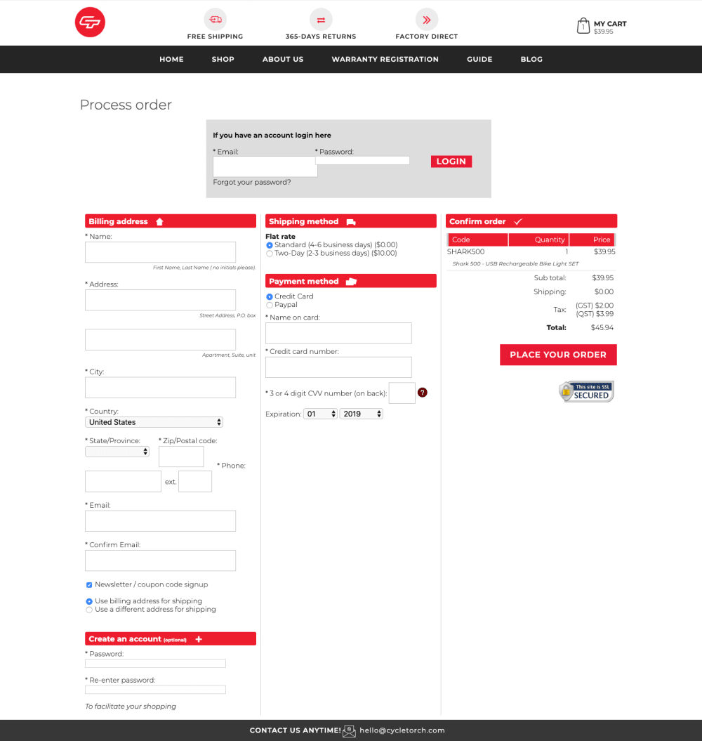
Rate our Checkout Page experience, whats wrong, whats bothering you, what would you change?
50 Responses
I think it is clear and concise. It looks as good as any checkout on any major website that I have used in the past.
It's too cluttered and not intuitive enough
The checkout page seems easy to use and very interactive.
It looks very user friendly and that is the most important part of the check out.
The boxes look like something from the 90s, the overall look is extremely dated and just feels kind of scammy looking at it. Maybe just have the different sections as frames so that the user only needs to focus on one thing at a time.
Seems like a standard checkout page, nothing fishy.
Does a good job of asking for right information and not too much private info. It's also nice to know that the site is secured.
too cluttered and too many fields to fill, not mobile friendly
Nothing bothers me. This page is direct and straightforward.
The "secured" icon should go near the top.
The mismatched boxes up top are really bothering me.
I honestly like this checkout. I like that you can see everything you would want to see. I can find all important information regarding shipping, and discounts, and everything. I like that it's simple and easy to follow.
i like it if it is all on one page. if its a three serrate i dont like it
very nice and good one
It looks good and I like the red accents. Only thing I'd change it the layout of the bottom section a little bit, make it spread across the page instead of stretching so far down. Maybe put the email and confirm email on the right side.
Needs more color or a logo / header of sorts other than that the checkout process looks simple enough to understand!
I don't think you should reveal all three portions of the checkout process at once. I think that it should be revealed to them via having a next button or a click here button as they complete each step of the process.
I like it overall. It's quite straightforward and is definitely something I've seen on another website before. I would like to see the "create an account" tab to be on the top where you can either login or create an account so that it looks less cluttered on that particular column.
pretty straight forward, easy to use
I like the 3 columns. I do like seeing all the steps on one page instead of having to type something, then click next, etc. That’s frustrating on order pages. The red coloring is effective too.
I think the red is distracting and makes it hard to focus on the factual information. I also think the free shipping should be highlighted more because it would make me want to purchase.
it looks like any other check out site, nothing new, i would remove the newsletter option, it's just extra noise that would bother me
Overall, the page is good. The password box is a bit small though. In addition, I don't really like radio buttons for selection; I would want something bigger and easier to click. The box for phone is not well aligned to the title. I would also put the Create an account boxes closer to the center.
I would not change anything! This is one of the most organized check out pages I have ever saw. Most of the time checking out comes in different steps and they are all on different pages which I hate. I wish all checkout pages online were like this one!
I like that all the ordering options/data are available on one page. Seems to be a good format/layout. I like color red
it is a good and almost calming layout so i appreciate it
There doesn't appear anything wrong, it all appears to be quite straight forward
I feel the checkout page is quite normal in my experiences with online shopping. However, the red color appears as if information was entered incorrectly opposed to simply entering it to complete the order.
Seems to be straight forward on what you need.
Boxes seem to be a little bit crowded. The login box and password box are overlapping then all of the other stuff such as billing address, shipping info, and payment seem to be right on top of each other. There is nothing wrong with having this stuff on separate pages. It makes for a better user experience vs having it all on one scree
I'd say it's a pretty well organized, I might have the account login on a separate page before the Checkout Page.
Nothing bothers me, this looks very standard for a page of this function. Maybe the design doesn't look "great" but it doesn't need to be great it needs to just work
Too many things at once.
It seems all jammed together and clustered. Perhaps they should be separated by spaces or on different pages.
I love it. It is very clean. I love the layout and the color scheme is nice as well.
it is good
It is fine just the way it is. I don't see anything wrong.
The checkout page looked very straight forward and standard. I appreciate that Paypal is available because that is commonly what I would use.For some reason the Email and Password fields at the top overlapped slightly.
I think it looks fine actually. All the necessary information is there: billing, shipping, discount code, confirmation of the order, etc.
Don't like the colors very much, is all over the place, organized it bit better so that it doesn't distract the eye.
I think its a great checkout page. Everything is easy to understand so very user friendly also like that you can use paypal as a payment method.
There is definitely no frills about this website. However, the text hierarchy is very much on point and easily guides the users eyes throughout. It take's a moment to fully understand the layout, but it's clearly defined. I think the color palette of white, red, grey, and black work well and that usage is consistent throughout the site. There is a lot of content for one page, though. I would recommend putting a link to the "create an account" option below the logon section (or the reverse). This would free up space and improve the layout design.
I would rather see the create account at the top not the bottom. Also the contact information should be at the top to find easily! Using red for the headliner color is distracting. Using a black or blue would be better.
I am not a fan of the red color; it hurts my eyes. Maybe a light blue...The Red also makes it look like there are 'mistakes' or errors on the page.
An option for overnight shipping. An option to save your credit information
I like the way that it looks. I like the wording and how that the billing is layed out.
I like it the way it is for the most part. It has everything that I'd look for on a checkout page. Sometimes, websites don't include the shipping information along with the shipping/billing information and the payment information. This page, however, has everything on one page which I really appreciate. It looks like it'll even update the order total on that page when different shipping is selected, which I really like also. In the effort of being helpful, I'm trying to come up with something that can be improved and I only have one little thing: the color red on all the text boxes. Typically, red carries negative connotations (errors, negative money, etc). Aside from that one nit-picky thing, I think it's pretty perfect.
process was smooth, no issues
The colors are interactive and attract me to the page
The color scheme is alerting but still subtle. It is clean and informative. I like the layout
Explore who answered your poll
Analyze your results with demographic reports.
Demographics
Sorry, AI highlights are currently only available for polls created after February 28th.
We're working hard to bring AI to more polls, please check back soon.

