Poll results
Save to favorites
Add this poll to your saved list for easy reference.
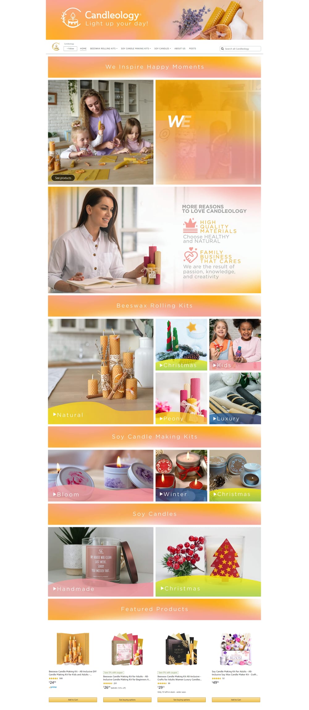
What Amazon Brand Store appearance do you prefer more and why? Which Store is more understandable for you and from which Store would you rather buy a product?
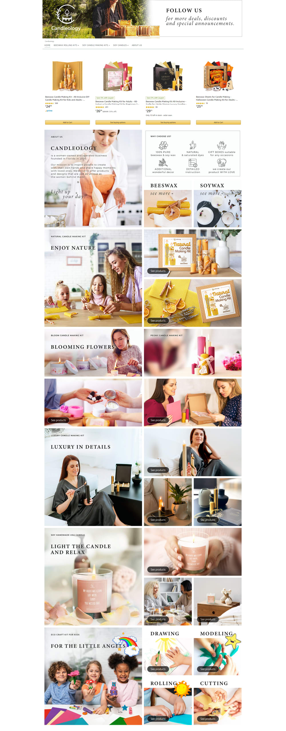
20 Responses to Option A
The text in A is much easier to read. B looks amateurish and uses too much color and not enough white space.
I chose option A because the focus is more about the product and not the models. The white background is less distracting and make me want to look at the candles more.
I think Option A looks like there are logical things to click on, where Option B looks like a giant advertisement.
I prefer the layout and colors of this one. My eyes find it easier to read.
A has better description than B, also the narration of each segment of it process is described in a clear and colorful manner. A is very creative than B so I prefer A
Darker lettering is easier to read without squinting.
While I liked the colors and the aesthetic of option B better, I liked option A more because it has a few of the listed items featured at the top of the page, not the bottom. I like the idea of seeing examples of products and pricing immediately rather than needing to scroll through first.
I chose A because this is a much more streamlined, basic, and modern design. I also like that it is very easy to see the products without distraction.
It has more descriptive information and better design arrangements. The website is more attractive.
I would choose option A because1> pictorial representation on the web page is good2> Listing of the product is very clear3>font used and style is more catchy
Although I prefer the banner for option B, I like option A overall better. I think that option A is more clear with the different categories it has. I better understand what I am looking at and can find what I might like easier.
I loathe pink. So, I would never buy from the B store. The fuzzy colors are also unattractive. I like the details in A. I like the white borders around images that don't have any fuzzy colors.
Option A feels more natural and holistic, as I would expect a candle store to feel. The bright colors in option B feel gaudy. I like the orange color in general but option B has too much of it for my taste, and I'd be more inclined to go with a more natural looking storefront!
I need text to give me the proper context of the pictures to understand what is going on.
I would prefer Option A Amazon brand store appearance because the layout design is interesting.Option A store is more understandable than the other options.I would buy product from Option A Amazon brand store.
A does so much better at explaining the products. It also looks more professional too.
Choice A is set up as a great website with lots of images for the different products and easy to understand links to find out more. The website is easy to understand and very family oriented. Choice B is colorful but some of the images do not seem to say much about the products along with a feeling that the website is more about colorful banners and backgrounds than the products themselves. This website is slower paced as there is only one product that is being sold but seems to be a waste of space in spots.
I can read A pretty well. I like the colors better in the other choice, but can't easily read the words.
I don't love either of these. I don't care for the bands of color between images on B, but I think there are too many images on A. However, I prefer the variety of images on A to fewer images and the pink and orange bands that are distracting and it's hard to read the white lettering reversing out of it.
I picked option A because the images are more realistic, while B uses a lot of bright pastel looking colors and accents.
30 Responses to Option B
option B i prefer for appearance because its visually more appealing with the color scheme and then i like option A for the more understandable
I like option B. It has more color and looks just a little more sophisticated for the product than option A.
too many people figure in A, too messy and disturbing. A is more concentrated on the product
I picked B because all the images in A are much too similar to one another, with limited information.
Option B looks more personable and less corporate it also looks very inviting with the color choice
I prefer option B, I think it looks nice, option A has lots of small images and it looks a little cluttered to me. That one is also more understandable because I like how it's organized, so I'd rather buy from that one.
One of the reasons I chose option B is because I like that blocks of colors with category labels are used to separate the images. The images used clearly depict what items are sold in the store . I also like the store name at the top of the store page as it stands out and catches my attention.
This option features more lush and feminine colors throughout.
I think B looks better. The store front is much more organized and easy to follow. This would encourage me to buy something from this store.
B because image was less busy, and was more organized and every image was labeled and easy to understand and read.
B is much more organized. The photos aren't as cluttered as A. The flow is much easier to follow. There is a separation between the main idea groups. Trying to follow A reminds me when my triplets had learned to walk and all went in different directions. Fun but exhausting.
I chose B, because just looking it over, I notice more of the candles, and I like the way the warm pinks and yellows mimic the glow of a candle.
This is straight to the point. It is not as cluttered.
There is less to process here. It is less cluttered. It is more clear cut overall.
I like the more simplistic style where all pictures are similar and have a common theme. The one that I did not choose was too busy, chaotic, and the multiple texts were distracting.
I chose B because they state that they sell bees wax rolling kits, soy candle kits and soy candles all of which have pictures on the page. They are grouped with just the titles and background layout which you can see each individual section to click on. Its visually appealing and easier on your eyes to figure out what to click on.
The colors of B provide division between the different pictures and information, but the use of colors also keeps them visually United and cohesive. The amount of white background in A makes the information and photography seem jumbled and less cohesive; b is far easier to peruse and understand and also more beautiful.
The Amazon B store because it was laid out nicer and neater and it was more eye-catching
B is easier to review and see. The other choice A is too busy - I didn't know where to look first.
Definitely Option B because it's much easier to read and understand, not as confusing as Option A. Thank you.
There is less photos and a more simple design which gives me a more clear look at the products
Option B presents the information in a way that is easier to understand
I think A has a little to much on going, there are to many pics and words and I don't think people are gonna take time to read all that. B is straight, clear and concise and just looks a lot cleaner.
the arrangement and design for option B is clear and looks more attractive, I would rather buy from store B.
This one looks more organized and has warmer colors, which made the site feel easier to navigating and more welcoming.
It's more focused on the categories.
Option b catches my attention and I would be more inclined to see what products they have
My first choice has a more simplified and modern look and feel.
The colors on this page are more appealing, also there are less words on the page that are distracting to the images.
Option B is the listing that would be more likely to get me to click on it and buy from the store. The colors in Option B are attractive and eye-catching and it feels like a good balance of color, images, and text. Option A just feels too overwhelming with just image after image and nothing breaking them up. I would be much more likely to just skim over it because no one thing grabs my attention. Option B is more colorful and also feels as though it flows better.
Explore who answered your poll
Analyze your results with demographic reports.
Demographics
Sorry, AI highlights are currently only available for polls created after February 28th.
We're working hard to bring AI to more polls, please check back soon.

