Poll results
Save to favorites
Add this poll to your saved list for easy reference.
Choose which painting to use for a room that needs new decoration on the wall.

48 Responses to Option A
Painting A adds more color to a room than B does and is more visually interesting and stimulating. But it depends upon the room - an office versus a house.
I like the colors and think it would brighten up a room.
A looks more like a painting rather than photograph. I also like how bright it is, it really draws your eyes in.
I love the colors and design in Option A. It will brighten up any room and seems more unique.
I love the pop of color it gives. It’s fresh and fun and inviting.
I prefer the option A painting because I like how this painting is much more colorful and pretty and much more brighter than the darker option B painting image. The option A painting would do much more to liven up a room that needs some decoration.
Option B is a nice photo but not something I want in a room. Option A is great because it brings color and life into the room.
First it actually looks like a painting. I like all the bright colors. I like the actual flowers that are on there. I think it stands out I think it would look great on a wall in your house
This option felt more cheery with its bolder brushstrokes and bright patterns.
I think the bright colors and contrasts are really pretty and attention getting. A would definitely make more of a statement.
Option A is so bright and colorful.it will be perfect for all light color painted wall
After carefully studying and comparing both images of paintings displayed above, I selected Option A over Option B as my first preference and the one that I would definitely click on to purchase for a room that needs new decoration on the wall. I was awed by the bright colors and spirit that this painting would bring to a room in my own home.
I like the more colorful artwork. I find it much more vibrant and interesting.
I would select this piece because it is bold and colorful and would add a real pop of color to a room
I would pick option A because this painting looks more positive and attention grabbing, it would brighten up any room and make it nicer, B is somewhat depressing.
Usually i would prefer a landscape painting or photograph but in this case the painting is a little boring since it is largely just sky and water. This works for a small image but not something large you are going to blow up and put on a wall. For this I like something more bold and colorful like this flower.
I like the bright bold colors
This is bright and has colors that can likely match any furniture
A would be the one for me because of the bright colors and original design. It would look great on my wall.
Love the colors and design. Would sit a better mood for a room.
I like to use painting for a pop of color. A fits this description.
I prefer A because it is very colorful and artistic. Finding photos is not too hard, but finding handpainted art that suits your decor is much harder. A would really brighten up a room.
this is a question that would greatly depend on what the theme of the room is and if the colors would match. Personally I enjoy loud and vibrant art.
I love all the colors. It would be uplifting!
The color will go with many things and at once brighten the room. I like it's style, it's not overly precise and gives flair, which is good.
A is prettier, IMO, but honestly it would depend on what the room is for. I wouldn't want A in a bedroom, I'd want B. But in a living room, A, absolutely.
I like the colorful design and color of this one. I like the cheerfulness of it.
I always prefer lots of color so like this.
I like the bright red, yellow, and blue colors in this option, which is fun and caught my eye. Very cool design for sure!
This painting would be great to complete a room. The amazing colors in this painting quickly capture the eyes attention and it just feels happy and exciting.
This piece of art is a lot more unique than a random picture of a sunset
I thought this was make the room feel livelier and more exciting and vibrant.
This was a tough call as I'm "meh" on both of these. However, if I had to pick, I'd pick A because it's a bit more cheery and colorful. Flowers bring a sense of nature to a space...even painted ones. I think B is too dark and too vague (is that clouds? It kind of resembles a city line for some reason to me.)
I'd go for the painting with the brilliant colors!! It really would help brighten up the room.
The flowers look really cool and the water coloring is very interesting to look at
Hands down this painting is gorgeous and I would love to have it on my own wall.
I like how A is abstract and the colors would match my home decor.
My choice A is beautiful and colorful easy to decorate with.
I love florals and love these colors.
I do not like landscapes and I love bursts of color, so A was the obvious choice. I prefer how A is more impressionistic and abstract while B is a bit overly realistic.
I prefer the colors in A. B is too boring.
I think it looks more colorful and like it would be more entertaining to people who would come in and out of the room
A is brighter and more cheerful and seems like better art quality.
The other one looks like a picture. I prefer the artwork and colors of this version as it just fits my style better.
It really depends on the decor in the rest of the room, but option A is a lot more unique. Sure, the sunrise is beautiful, but I can't imagine it being a conversation piece as much as option A.
I love the coloring of the painting. The other just appears more of a photograph, not really art work.
The colors used in choice A really help bring life to the wall here
Option A has a lot of color that would make it nicer to match with existing furniture and pull in a lot of colors from other items.
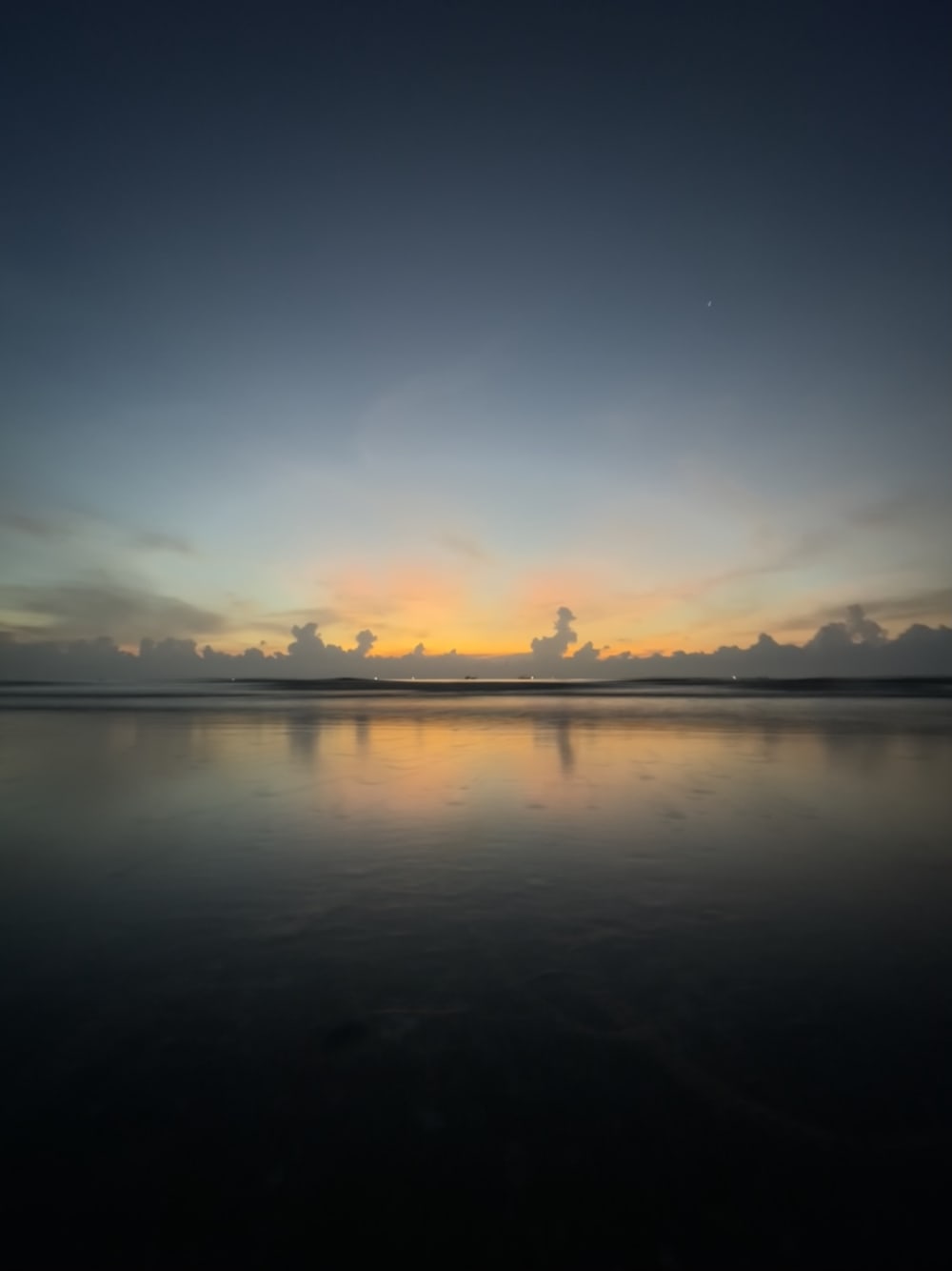
52 Responses to Option B
This is better and would make any room look elegant and high class. Whereas the other looks to bright and seems more feminine than most.
I think both are nice, but I'd personally go with B, as it is the more subtle piece of artwork. I would put this in a living room or a guest room where I do not want the wall art to be too distracting.
It looks like something I would put in my house.
I find the sunrise/sunset is very beautiful and it makes me feel very pleasant emotions that make me really interested in the picture and how it would complement a new room.
I like the realistic looking landscape picture. I think its nicer to look at and would fit in a lot more rooms. I like the look of the clouds and the sun behind them shining a nice cool orange color.
I would definitely choose this one. I love a nice sunset and it is a beautiful picture. I don’t like the other one
I like realistic paintings the most and option B is a gorgeous representation of a sunset.
I LIKE MORE NATURE SCENES ESPECIALLY BEACHES SO THIS WOULD BE MY CHOICE. I DO NOT LIKE THE FLOWER PICTURE AT ALL
I think that this painting, while not as flashy as the other, would be able to fit on any wall. The other one is specific to me for certain homes. This one, is neutral enough that it gives you more variety in choosing where to put it.
I don't dislike the picture, and a semi-dark water scene in photo form would work with my decor.
I like to choose option B, because this looks beautiful and peace.when we see this painting we feel refreshing.
i would use the painting in option B because it has a better colors to it
This option is quite soothing to me.
The other is a little too chaotic and I want to see something that’s more serene
This one is good for me. It presents a natural scene. I need more nature in my life.
I chose B because it is more realistic and I like art that has realism to it and is not as abstract as some other art.
I like these colors more, I prefer a darker style, this has a more pleasant and calming look to me
I love how realistic and soothing that artwork is to look at.
I would go with choice B because I like paintings that are scenes or views as opposed to abstract or objects.
A terrific looking painting. Love the darkness and the background.
B is calming and inspires reflection, reminding us of nature.
Although not as colorful as A. The photo is very neat and mysterious and rather thought provoking. A is something that I think is more common.
I love this one more because it is a picture of a sunset and I love sunsets as I find them incredibly calming.
I like how calm and simple it is.
Option B looks like it would suit more types of wall aesthetics than Option A since it's more "neutral".
I like Option B. I feel like I could get lost in it. This would help me relax by getting my mind off everything.
I picked option B because I strongly dislike option A. I can't image myself in a room with any wall like this.
Usually, I would choose something colorful and bright like A. Today, however, upon viewing both of these images/paintings I liked the feeling image B immediately evoked far more than that of A. I clicked on them both and viewed them large. When viewing B, I felt content, a feeling of "homesickness" - only for a place I've never been, if that makes sense. I like that it is not a cityscape in the far distance, on the other side of the large, calm body of water. It is almost a blank landscape against a setting sky (or a rising sun against the sky, I'm not sure which) and it brought this thought to my mind: "it isn't a city... it is a faraway land, it is whatever you want it to be." and that is why I choose B. :) I would actually really like this in my home. I wish someone could tell me who painted it.
I really love the water and the ocean so I think that if I were to choose a painting or wall art I would go with something like this, osmething of water, something natural.
I prefer the photo of the sunrise of option B compared to the painting of option A.
I picked option B because it is more calming and relaxing.
I have black leather furniture throughout my house so the sunset scene woud accent that.
I like the realism in the painting band I think it could go with just about anything.
I prefer B. The image is very calm and serene and would add that element to any room.
B is modern and classy looking and would tie a room together.
I always like more realistic artwork so B would fit in the best for my style.
I like the realness of B. I also like the lake and how it looks.
Because I think it would look better, more modern, and not too loud in color.
I like the outdoor scenery look. Very pretty and restful.
I chose B because I like this look. It's easy to look at.
The design is inclusive and creative. The design is likeable and fresh.
I generally prefer seascapes.
I like b with the more realistic look. It is a deep painting that will make the room feel bigger
I am very much a nature lover and enjoy painting that reflect the true beauty of the earth and God's creations. I never really understood art like A, no offense to the artist but it just seems like something anyone can do, if I am spending money on art it should be something beautiful that I know I don't have the talent to create.
I think this one is very serene and calm and would give me good vibes overall
I feel like B would fit my decor in any room
I think Option B looks like an image I could have taken and like a place I could dream about traveling if it was on my wall.
I prefer option B. It is relaxing and calming.
I love B. It makes me happy with the clouds and the water. I like dark things, so it draws me in.
Choice B is a natural real looking image that would go with most themes of a room. Choice A is an almost abstract painting of flowers that might be too busy for some room themes.
The painting is more relaxing and calms the area around it.
I like option B the best because the water scene stands out more to me and grabs my attention.
Explore who answered your poll
Analyze your results with demographic reports.
Demographics
Sorry, AI highlights are currently only available for polls created after February 28th.
We're working hard to bring AI to more polls, please check back soon.

