Poll results
Save to favorites
Add this poll to your saved list for easy reference.
Which image is more eye catching & more clickable?
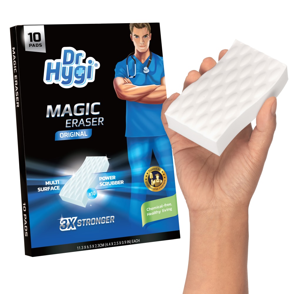
34 Responses to Option A
It shows the size of the product relative to a person.
The hand caught my attention
one simple picture of this thing is enough
Gives a closer, more detailed look at the product than the other picture.
the hand is more eye catching than a stack of sponges
It's helpful to see how the product looks in someone's hand
Seeing one magic eraser is enough and think that is the best option here. I would go with that as the first image. No need to see multiple of the same product. It is listed that there is 10 pads on the box and that is the best way to show that, instead of replicating the erasers.
I would absolutely prefer this image. I think seeing a hand holding the product gives it a perspective to me that would be appealing.
I like the use and packaging look. The product looks great in this image.
I like A because it shows the size in the hand. It helps to see it in proportion. I think that saying there are 10 is good enough. I don't need see them all lined up out of the packaging.
the choice A is more attractive as it shows a human hand which can practically serve more eyes
it has a better model
"A" seems to have a better visual appeal.
I honestly didn't even initially notice that the scrubbers were in the picture for Option B. The hand in the photo is not only helpful, but it's more eye catching and shows the scale of the product.
The image looks less cluttered and the hand gives it a "scale" that helps you estimate the size.
Option A is a lot more clickable as it shows the product whereas B just looks hard to determine what I am looking at on the side.
This image with the hand seems like a better reference image and displays the product well.
I think the hand in the image gives me a better idea of the size and look of the products
the other is too busy there is no reason to show the same image that many times
The hand makes the product more visable
I think that in A I can see the surface of the product more which seems to be the prominent feature and benefit of the product - the power scrubber. I think if the hand holding the scrubber was positioned differently it would make the part of the box where it says 10 Pads more eye catching so that the idea in B of how many you get in a box would not be lost.
I like the one with a grip. It shows you how to use it. The other looks a little like toilet paper rolls.
The hand with the sponge is more attractive as that is what most people will do with it.
it shows the size of the item in scale to an actual hand
I chose A because I can easily make out all aspects of the photo. It took me a few seconds to realize that choice B had sponges in the right lower corner of the photo.
A is more clickable because you see exactly what you are getting
choice A because there's an actual users and showing the size ratio of the product.
The eraser on the white background is too hard to see
I do like both photos, however the one with the hand shows the rough size of each eraser better and I appreciate that. A seems more clickable to me.
You get a better close up picture of the product.
You can see the detail better.
this one shows the size better
option A showing the image of the product in hands so we can estimate how big or small the size is
I prefer it with the hand holding the pad
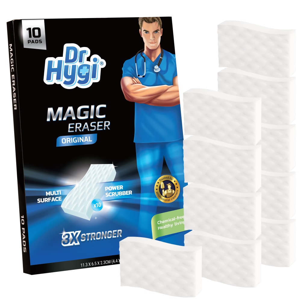
16 Responses to Option B
I can see the exact amount included in the package.
I like seeing how many pieces come in the package.
Has more product for ur money
I like how option B shows off all 10 items included
It's easier to tell that you get 10 cleaning pads in option B than it is in option A.
It is more clickable to me because it shows more than one eraser on the right.
The hand is not necessary.
I like Option B the best because it shows several of the scrubbers which makes it more appealing.
The realistic hand of A looks weird compared to the cartoon on the package
Give me quantity. I love seeing all these pieces.
I like it without the hand. The hand seems too distracting form the product. I would try to make the extra sponges pop out more though
I would click on option B, it shows more of the erasers.
I don’t need to see the hand in the other one.
The hand is distracting
this is more informative
The stack of erasers catches my eye more and doesn't make me feel like they are copying right from mr. clean's ads that have a hand holding the eraser a lot of the time.
Explore who answered your poll
Analyze your results with demographic reports.
Demographics
Sorry, AI highlights are currently only available for polls created after February 28th.
We're working hard to bring AI to more polls, please check back soon.

