Poll results
Save to favorites
Add this poll to your saved list for easy reference.
Which of these designs do you prefer and why?
Option B won this Ranked poll with a final tally of 27 votes after 3 rounds of votes counting.
In a Ranked poll, respondents rank every option in order of preference. For example, when you test 6 options, each respondent orders their choices from first to sixth place.
PickFu requires a majority to win a Ranked poll. A majority winner differs from a plurality winner. A majority winner earns over 50% of the votes, whereas a plurality winner earns the most votes, regardless of winning percentage.
If an option does not earn a majority of votes, PickFu eliminates the option with the lowest number of votes. The votes from the eliminated option are reassigned based on each respondent’s next choice. This process continues in rounds until a majority winner emerges.
Scores reflect the percentage of total votes an option receives during the vote counting and indicate the relative preference of the respondents. If there is no majority winner, look to the scores to see how the options fared relative to one another.
| Option | Round 1 | Round 2 | Round 3 |
|---|---|---|---|
| B | 38% 19 votes | 42% 21 votes +2 | 54% 27 votes +6 |
| D | 38% 19 votes | 40% 20 votes +1 | 46% 23 votes +3 |
| C | 16% 8 votes | 18% 9 votes +1 | Eliminated 9 votes reassigned |
| A | 8% 4 votes | Eliminated 4 votes reassigned |
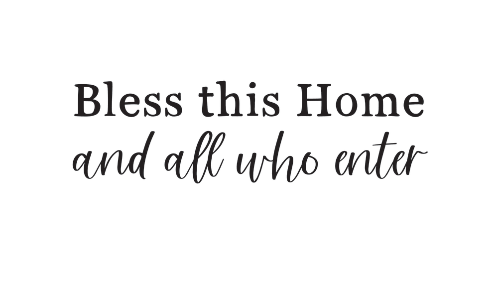
4 Responses to Option A
Really like option A. The logo seems more balanced and has a more pleasant look to it in my opinion.
I like the font at the top and bottom of A together and how the fonts are the same length. I like both B and D having accent art to them as well. I think the font in C looks too thin and doesn't stand out.
A and B are elegant. The mix of text and script in A look stellar. Option B has the nice leave decoration. Option C is simple and appealing. Only option D is out of place because the leaf design is too out of place and distracting. It should have been a solid piece instead of having the leaves on both sides of the text.
the shapes and structure of each themes design were ranked by their enticing nature and look.
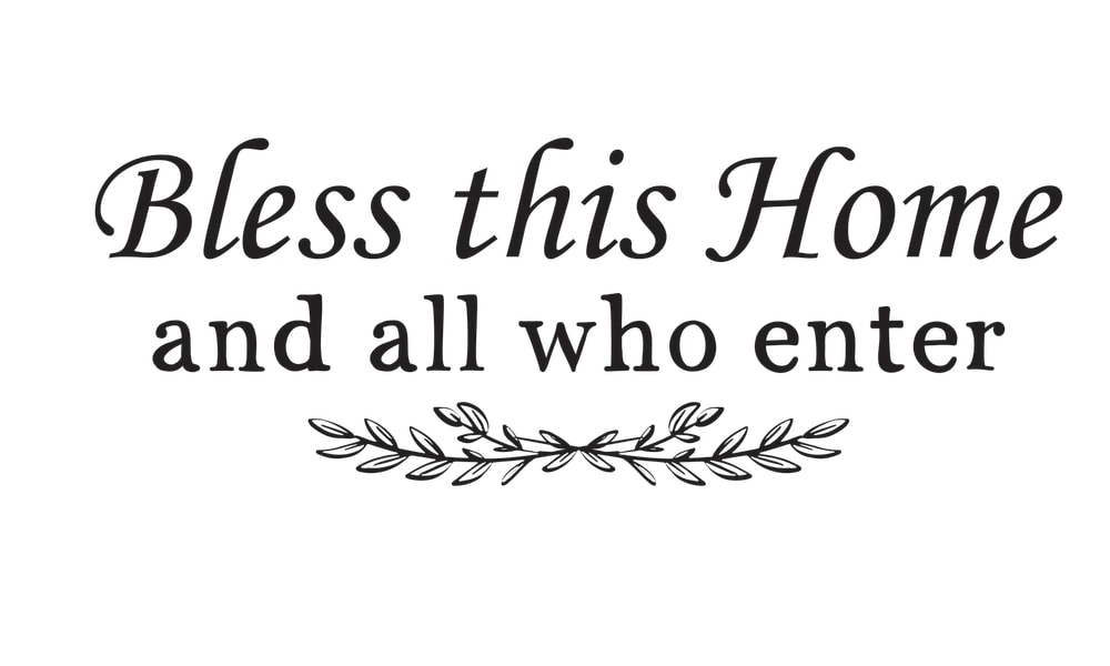
19 Responses to Option B
B and D look more formal and thoughtful. The second font in A is a painfully overdone style.
I chose B because I really like the font and the way the leaves are fixated.
The font used in B and A is easier to read than the other options
I think it looks better with less cursive and a more bold font, like my top 2 picks.
it's cute and kitschy but still easy to read
The text in B is very pretty but also easy to read.
I really like the floral designs that were added in options B and D I think they make it look much neater and give the words more style and character. I do not care much for the font in option A I think it looks too cartoony and not fitting the phrase.
Aw, B is gorgeous. I love the sentiment and the font.
I prefer the option B text design because I like the wreath beneath the text and the easy to read cursive writing on the first line the most. I chose option D second because I like the wreaths on the left and right sides of the text but the font size is smaller and the cursive writing slightly more difficult to read. I chose option C third because I like the emphasis on the first line but the cursive writing is more difficult to read and there are no illustrations in this image. I chose option A last because the emphasis on the last line does not seem as relevant to emphasizing the first line to me.
B has a nice clean style that has a natural look and it's a good balance between bold and thin, it's a nice medium looking option
I think Option B is the best. it has the best overall readability and would still be easy to read even at a distance. I also like Option B because it has some extra design aspects below it which some of the others do not have. I think it is better than option D that also has those extra design aspects because I like the centered nature of option B while Option D has parts of it that are off-center. Therefore all things considered I think Option B is the best.
I like the plant imagery on B and D best. I like that B doesn't mix cursive and writing.
This home is best in this color ful life in this product and the very beautiful and nice in this like in design and the most beautiful letters
I like option B the best because I like the leaf design under the message.
B and D are most attractive and have the best fonts, C and A are more boring and generic
Option B is simply easier to read compared to all the other options, making it my top choice as I would want this to be legible on anything it is on.
Option B is the easiest to read and is centered well. I like the fonts of each word the best. Option C is also centered well. Option D is too scattered and not centered. It makes it hard to read. Option A looks very strange. The first line is a calm font but then the second is very messy.
I hate the way multiple fonts look next to each other. I want the fonts to look as similar to one another as possible, thus B is the clear winner.
i prefer the design in option B the most because the font is the most pleasant to me
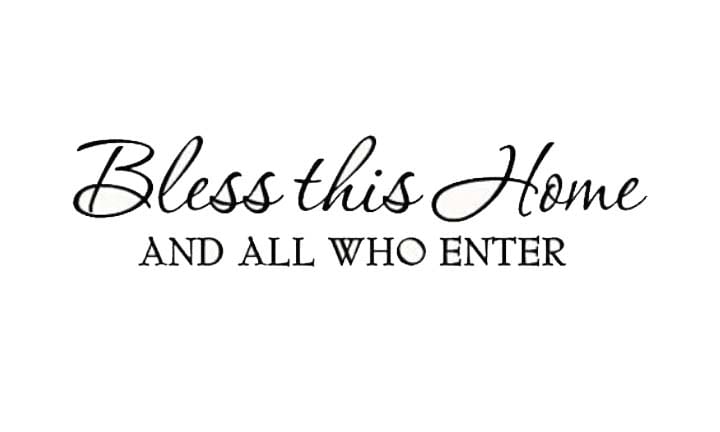
8 Responses to Option C
C I feel has the best font and design that looks good and flows the best.
I like this combination of fonts the best, good simplicity in design.
The font for B and D felt increasingly bold and thus seemed a bit too aggressive; I liked that C and A were more subtle and relaxed.
My choices c why because more attractive...
I really enjoy the switch between cursive and print in this choice
I really like design option C the best. It's so pretty! I like the font bigger on the top and smaller o n the bottom.
I like option C because the font is powerful and it gives off a sense of maturity.
This color in this beautiful in this letter and the most useful and important and the home life and the like this person happy to enjoying thehome
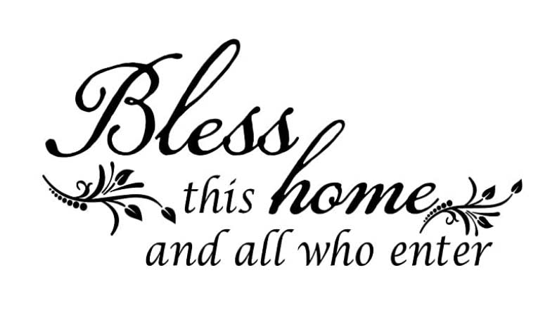
19 Responses to Option D
I liked option D the most since it has a better design on the overall phrase
The top choice is far better than the rest. The font is gorgeous as are the details. It looks sweet and eloquent.
Option D looks like a design that had the most work put into it and stands out from the rest. I like the font and the way it's laid out. B is also nice with a little graphic. I don't like C and A at all.
I like the overall aesthetics of these designs in terms of their appearance
The first one is the most aesthetically pleasing. I like the offset font along with the italics and the graphics. C is the most similar. B is a close third - the font is plainer, but the graphic adds some flair. A looks awkward and I don't really like it. It doesn't feel right and isn't that pleasant to look at.
Option D has a nice balance to it. Option B and C are meh. Option A doesn't look professional in the layout.
i like when it has the little leaves or plants to the image giving it more life and meaning
I prefer choice D then B among the others because the design is more floral and appealing to me. The continuous design of floral and cursive writing looks very good for both option D and B, but a slightly prefer option D better so I would choose that instead. The other options are too dull or too inconsistent with relative design and font choice.
I like that D is most uniform, the font blends well. B is sort of close font wise, too, but contains contrast, C and D are too disparate, I don't like the contrast there, it's jarring.
I prefer option D because I think that it is the most interesting and visually appealing design/font out of the four options.
This choice looks the most cohesive. There's a variety without looking too disjointed. The cursive font gives it a touch of class and elegance. The ornate element added is simple and not too much where it distracts from the text. Looks very organic and inviting.
They all had good messages so I went with the larger and darker text with D, B was the next largest and so on.
I like the design of option D the best as the design of the text looks elegant. I like how the text emphasizes the word "Bless".
Option D is pretty nice. It's a style that will look good with almost any décor.
This design is the most fancy to me. I really like the font style and the leaf design as well. It looks the most sophisticated and appealing to me, so I would choose this one.
I definitely prefer the versions with the floral designs, rather than just text on its own. I also prefer the ones that have the first part in cursive rather than the end. Overall, thus, D is my favorite. I like the art the best, the bolded cursive the best, and the font size the best out of the four.
This has a very beautiful font and decorations around it that make it stand out for me
I like the lettering and how the words are arranged. I find it more visually appealing and pleasing.
The text entries that feature traditional scripts and desirable font selections are mostly suitable. I like the fancy versions with cursive writing along with small added features like flowers or leafy vines.
Explore who answered your poll
Analyze your results with demographic reports.
Demographics
Sorry, AI highlights are currently only available for polls created after February 28th.
We're working hard to bring AI to more polls, please check back soon.

