Poll results
Save to favorites
Add this poll to your saved list for easy reference.
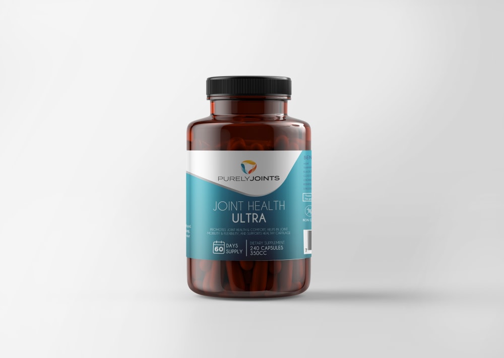
Based on the design, which product would you be more likely to buy, and why?
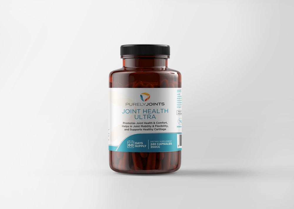
30 Responses to Option A
I would be more likely to buy Choice A. It may not look as good as B, but it's a lot more readable. I can barely read the text telling me what this does in B, the contrast between white text and the teal background muddles it too much. It's perfectly clear on A though. Something looking nice won't sell me if I can't quickly grasp what it does or is before a competitor does.
It is easier to read upon a quick glance
I voted option A because it is easier to read the label with the blue lettering against the white background.
I chose A, because I find that label easier to read and think it looks more professional, which would get my attention more.
My choice looks more professional
choice a's product has better lighting allow us to see the information on the bottle better
I think the white label with blue writing is easier to read than the blue label with white writing.
I like Option A because the label is easier to read. I think I would have to pick Option B up off the shelf to give it a closer look.
It's easier for me to read the label in A and figure out what the product is.
I liked choice A and how simple and direct the design is on the label looks more trustworthy and appealing.
I chose this one because you can read the supposed healthy benefits it proivides
More white is easier to read and just provides a more pleasant feeling.
The font sizes and colors on option A is much easier to read.
While I do like the color pattern in Option B, I would choose Option A because by it's easier to see the information on the label by having the majority of words with a white background.
I would pick option A since the label is very pleasing and easy to read.
The white label looks a little more professional I think
A seems easier to read and looks like a nice modern design on the label
it is so much easier to read the benefits of the product on the label on A. the black text on white background is easy to read. the white on blue on b, not so easy to read. if they've thought about the design of the label, they have probably also thought about the product inside.
The white background in A makes is seem more professional and like a healthier product.
I would choose A. I prefer the shape of the white part of the label over option B. It has better contrast overall.
I prefer option A because this packaging design provides more relatable and relevant information, looks higher in quality.
I think option "A" has a label that is clearer and more easily describes the product in comparison to option "B". Also I do not like the expression of the dosage in CC for either.
I would choose A because there is more contrast with black lettering on a white background.
I like the clear white type background here, making the label really pop, and making the detail on it even more readable and clear.
I find this one is easier to read and the logo appears to take up a lot of space on the other bottle.
The separate colors make it easier to read the benefits.
Option a with lighter colors makes the bottle easier to read if you forgot glasses and is just plain more attractive.
A bottle of option A has more valuable information, I like this and vote for option A.
I would definitely be more interested in purchasing item A, the font on the label is much easier to read then on option B. Having a white background with black lettering as much easier on the eyesthen trying to read font that is written on a colored label,It's also less distracting
The packaging is easier to read on the white background and the overall layout looks more medical and higher quality in its design.
20 Responses to Option B
B's label stands out a lot more to me, and is more interesting.
I prefer the aesthetic of option B. It feels more streamlined and modern, and less aimed at fitness people, if that makes sense.
there is no doubt about it, "B" is far superior; it is very attractive compared to the ultra bland "A."
Option B is my choice. The majority blue on the label makes this product look more professional and effective. I'm not sure why, but it could be because majority white is usually associated with 'generic' or 'store' brands. Maybe if a company spends more ink on their label that means they spend more money on their product and that equals better?
The blue is cool and wavy and grabs one’s attention in Option B more so than the more traditional use of color in Option A.
I love this one because I love the artistic shape of this. It feels sleek to me and modern to me which I personally love
I like that B separates the logo from the product description.
The version with more solid blue on the label looks less generic.
I think B looks a little more sophisticated and ultra sounds prestigious.
I prefer Option B as my first choice. It's more vibrant looking with the aquamarine color on the label. It's simple but elegant and pleasing. The remaining option are perfectly fine but not as eye catching and seems to be a little ordinary.
I like the additional color in option B which makes it more attention grabbing which makes me the most likely to buy
The larger amount of blue on the label of B is more attractive for the same product.
I'd be more drawn to the labeling design in B. It comes across as very professional and contemporary, and gives off a sense of confidence.
The more extensive use of blue color in this option is calming and inviting, which is appealing for sure!
I like the bright blue on my shelf better, it would be an easier bottle to find in my medicine cabinet.
I find the darker label more striking. The print is easier to read as well.
I like the darker background on the graphics. the words are easier to read and catch your eye a bit more than the white. It also highlights the brand which if you're searching for a certain brand will help you recognize it easier.
People will more likely buy this one because of the design which is more appealing. and pleasing.
B is more vibrant and stands out. If both bottles were sitting next to each other on a shelf, I'd choose B.
I prefer option B because the label looks more professional.
Explore who answered your poll
Analyze your results with demographic reports.

