Poll results
Save to favorites
Add this poll to your saved list for easy reference.
If you were shopping for a professional development book to read, which book cover design would make you want to buy?
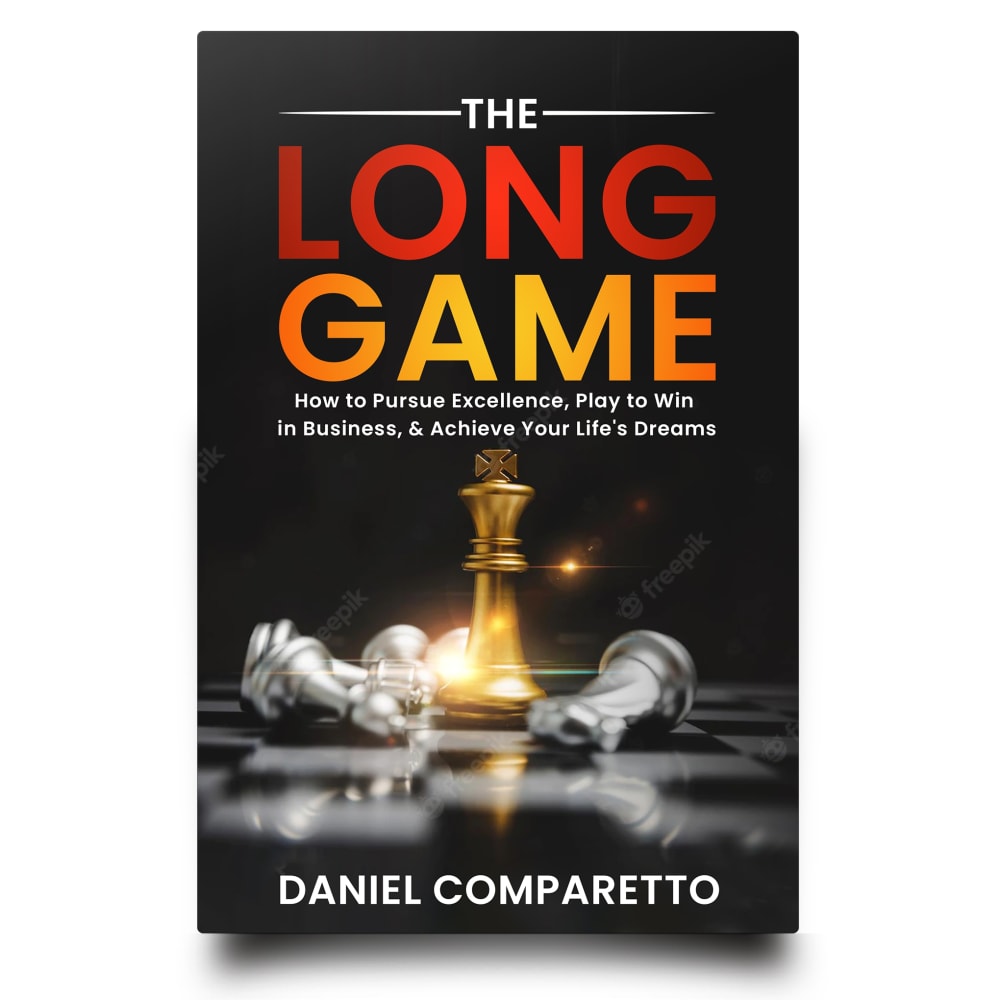
Option C won this Ranked poll with a final tally of 57 votes after 7 rounds of votes counting.
In a Ranked poll, respondents rank every option in order of preference. For example, when you test 6 options, each respondent orders their choices from first to sixth place.
PickFu requires a majority to win a Ranked poll. A majority winner differs from a plurality winner. A majority winner earns over 50% of the votes, whereas a plurality winner earns the most votes, regardless of winning percentage.
If an option does not earn a majority of votes, PickFu eliminates the option with the lowest number of votes. The votes from the eliminated option are reassigned based on each respondent’s next choice. This process continues in rounds until a majority winner emerges.
Scores reflect the percentage of total votes an option receives during the vote counting and indicate the relative preference of the respondents. If there is no majority winner, look to the scores to see how the options fared relative to one another.
| Option | Round 1 | Round 2 | Round 3 | Round 4 | Round 5 | Round 6 | Round 7 |
|---|---|---|---|---|---|---|---|
| C | 27% 27 votes | 28% 28 votes +1 | 28% 28 votes | 29% 29 votes +1 | 33.33% 33 votes +4 | 40.82% 40 votes +7 | 58.16% 57 votes +17 |
| A | 14% 14 votes | 15% 15 votes +1 | 15% 15 votes | 18% 18 votes +3 | 22.22% 22 votes +4 | 29.59% 29 votes +7 | 41.84% 41 votes +12 |
| B | 19% 19 votes | 20% 20 votes +1 | 22% 22 votes +2 | 23% 23 votes +1 | 25.25% 25 votes +2 | 29.59% 29 votes +4 | Eliminated 29 votes reassigned |
| G | 11% 11 votes | 13% 13 votes +2 | 15% 15 votes +2 | 18% 18 votes +3 | 19.19% 19 votes +1 | Eliminated 19 votes reassigned | |
| D | 9% 9 votes | 9% 9 votes | 11% 11 votes +2 | 12% 12 votes +1 | Eliminated 12 votes reassigned | ||
| H | 7% 7 votes | 8% 8 votes +1 | 9% 9 votes +1 | Eliminated 9 votes reassigned | |||
| E | 7% 7 votes | 7% 7 votes | Eliminated 7 votes reassigned | ||||
| F | 6% 6 votes | Eliminated 6 votes reassigned |
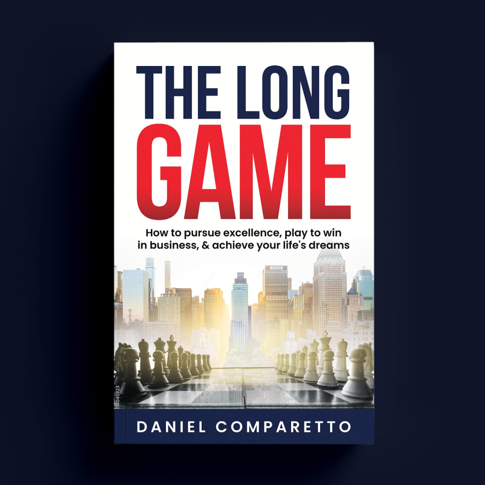
14 Responses to Option A
I like A better because of the colors and the photo on the cover. C, D and B also have nice photos that are the best options. The other choices are ok, but not as desired.
This cover design is very stark, bold, readable and its simplicity makes it stand out the most for me.
I like seeing the chess pieces because they seem to represent people who are deeper thinkers
I liked A, G, H, and F the best, in that order, because the brighter color stands out. I think they look the most unique in that order. Than C, E, B, and D are the worse with D being the most generic by far. The darker ones make it harder to see with each being more generic than the last. So A, G, H, F, C, E, B, D.
I thought the options with lighter and brighter colored covers looked more inspiring than the options with heavy dull and dark covers.
I would prefer the book cover designs that remind me of strategy making
Option A shows more of the chess pieces than the other covers, and it is all about making the right moves.. I think Chess is a great idea regaring a book about such subject matter.. Option A also has pleasing colors and is balance out well.. It's the one which caught and kept my eye..
I prefer the option A book cover because I like the long game of chess analogy and imagery shown here the most. I chose options B, C and D second, third and fourth because I like the golden king chess piece book cover more than the triangulated hand picking up the chess piece more than the running rocket book cover. I chose options H, G and E fifth, sixth and seventh because I like the light bulb and winning in business book cover more than the ladder themed long game book cover more than the light through the tunnel book cover because the light is too bright. I chose option F last because I do not like the image of the author as much as the other more metaphorical images given on the other book covers here.
Option A combined a city photo and a chessboard very well to create a captivating book cover. Option C had intriguing colors that gave the book an advanced feel. Option B also made use of a chessboard to illustrate the book's title and made me think of progress over time. Option G had a cool bullseye and ladders to give the feeling of growth and advancement. Option H had a retro feel that caught my attention, but wasn't as creative as the previous options. Option D seemed a bit too typical and common for a lot of modern books. Option F was a bit too customary and the author photo is really best for the dust jacket or back cover. Option E was too dark in color and tone.
If H didn't have pink text on the cover, I might have picked it first. I like the chess set against the cityscape in A. It speaks loudly and clearly the purpose of the book. B does to a lesser degree. H does an excellent job as well and it's an interesting design, but I loath that pink text.
Personally, I love books that tell stories and that is what the first covers full of color and life represent, on the other hand, the last ones seem recycled and one or the other seems to be from a politician
I prefer option A because the chess board depicts a game which fits within the title of the book.
I liked A because I liked color scheme and the chess game component of the cover. It was crisp and sharp and just the right amount of image on the cover.
A makes the most sense because it goes with the title and the subject matter. B shows some action and strategy to win, but not necessarily an exact fit to the title. C is visually appealing and shows a game being played to win, so it is still relevant to the title and subject but not as action packed as the first two choices. G isnt really featuring a game unless it is referring to Chutes and Ladders, but it is simply a lighthearted and practically dead on approach to the name of the book. D is somewhat confusing as far as what the person is doing or the shape in front of them; it seems like a marathon runner about to go through a jet shaped hole in the wall which in itself is unusual but the whole image still implies a competition about to happen. E looks like a moment of reflection for someone who has attained their goals, but it is not particularly direct about this. F is a nice, professional looking image of the author and is welcoming but it doesn't grab me for the concept of the book or what I will be learning. H is too busy and wordy with the many fonts and phrases, and the image is small and generic.
19 Responses to Option B
I like B the most because the chess-theme is very clear and engaging with how it's displayed and makes for a very aesthetic touch to the idea of professional-development.
I find using the chess pieces attracted my attention to the book, the overall design is clean and represents the point of the book.
I think B stands out the most to me. I like the colors and the use of the chess pieces.
Chess achieves a better look
I really like the image here of the chess pieces. I would go with that compared to the others
I feel that this cover ties in the element of a 'long game' most nicely given the imagery.
I absolutely love the chess piece design. To me it conveys what the author is trying to say. I think it says the most with being too busy. I like the golden chess piece in the middle of the board. This one is very eye catching and would entice me to read it.
B, C, E, A H all seem like they would tell you life secrets and tips, and it looks more interesting. F, G, D aren't interesting and I am not sure what all the title or picture is trying to convey.
I really like the way the chess piece stands out in option B
I prefer the more stand out detailed covers first over the white worded bland ones
option B I really like that black with the Orange and that chessboard on the cover looks 3-D is it looks sharp and professional
I like the book cover depicting the chess pieces. Career success can be a lot like a game of chess so I appreciate the metaphor
E and F felt the most generic and least professional or high quality to me. I think B felt the most thoughtfully designed without reading too much like a chess book on first glance.
its the most appealing and one that stands out as the best value and one i would be most interested in
B seems to fit the title and concept of the book the best.
Option B, looked the most appealing cover wise. It just stood out to me more and I liked the chess theme it relates the title of the book well. Option C and A, I thought looked nice and I liked the chess theme. Option G and H was good but not as eye-catching. Option H, text style was cool but the text size was a bit more small. Option D and F looked okay. Option E, looked the most dull of the covers. It just didn't fit that well which is why I ranked it last.
I like the one with the chess board the best. Then I like the one with the guy standing there with the light behind him.
i really like the ones more with the black covers. i think that this draws the reader in much more, with the fire and ice type effects of the colors. also the one with the picture looks more like a self help book, which i think is what you are going for.
choices b,a,c seems like more modern book cover styles
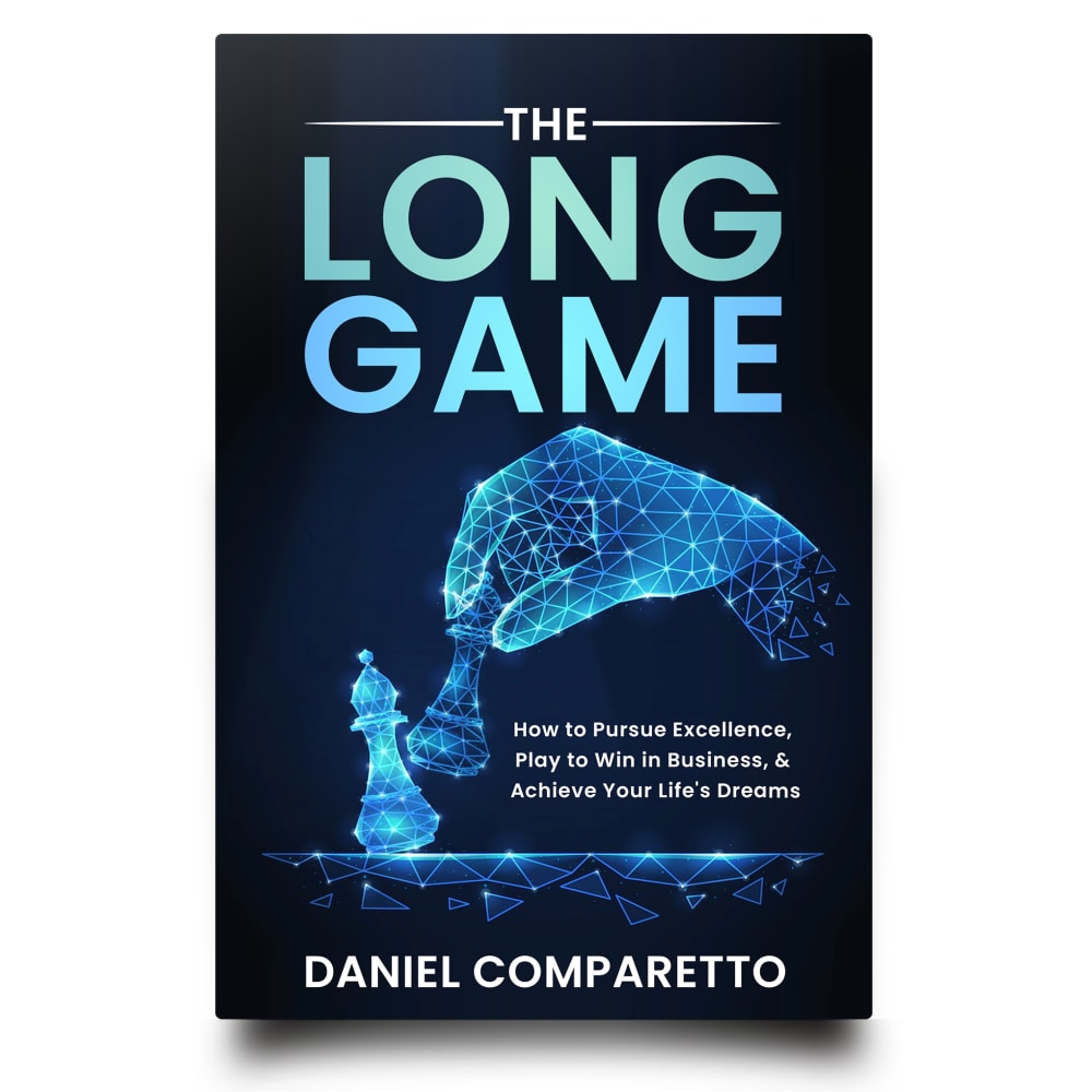
27 Responses to Option C
I find the all blue colors of option C just super aesthetically pleasing and attention grabbing. I like the chess piece for long game, and just love the whole coloring.
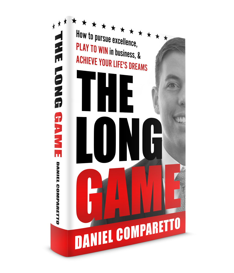
The darker covers stick out and look more professional. The only one I don't like is my last choice. I don't care to see the author's face on the cover.
C has a more modern and intriguing style and this stands out more to me.
I chose C as my choice because I like the graphics, the colors, and the look.
A chess board feels the most accurate for a display of a long game and trying different moves for success.
Options C,B,A and D are interesting covers that look good and original. Options H,G,F and E are ok at best, but they're a bit boring.
I like Option C because I thought the cover looked unique and drew me into book.
I like option C the best because I like the image of the hand moving the chess piece because I think that visual makes me think of life and business is playing a game to win.
Option C is the one I like the mostOptions G, A, F are probably what most people would choose because it fits the possible topicOptions b, E, D, and H are all kind of odd looking and don't match the topic
Option C because chess games usually last a long time and require a lot of focus, which can also apply to development. The illustration on the cover was attractive as well
The exciting layouts and design featuring realistic backgrounds are mostly appealing. I prefer the title font to be somewhat large and easy to read. These are mostly suitable options and I think most of them are appropriate given the subject matter of the book.
I like this because it stands out the most. It also shows the progression of a game, like in life. It is the most attractive in appearance.
chess is strategy long game, makes it seem smarter and achievable
I ranked my choices based on visually appeal.
I prefer the options that look more like movie posters and are more dramatic versus the ones that look like self help books. They are more eyecatching and I am not a fan of self help books
I like the covers that have chess pieces and also have blue or dark colors. I also like H because it looks simple which makes you want to read it.
I put the images in C, E, H, A, G, F, D and B. I really like C. I love the picture. I think it's fitting for the image and idea. I would buy C.
C wins easily. The digital chess game on the cover is very salient and stands out to me immediately. It makes me curious at once.
I chose option C because I like the contrast of the bright blue in front of the dark background. I also like the chess symbols.
This has such vivid colors and a unique aesthetic
(C) This is the first one my eye goes to. I really like the color and the design. I think the type "How to pursue excellence, etc.." should be zhuzhed up a bit because it doesn't stand out like it does in F.(F) This is a solid option. I read the words on the cover and I believe it. It's just that the author looks like a frat boy. Big turn off. There's gotta be a better way to photograph him.(G) Another solid option. Great visual(A) Super CHEESY. A, B, D, and E look like cheezy novel covers. I wouldn't look twice.(B) (see A)(D) (see A)(E) (see A)(H) It looks like somebody created this on an Apple II computer in the 80s. Terrible.
C this looks cool and chill.
I like the chess images best - they're the most appealing to me as covers and images in general, AND they match the title of the book. They're all ok, but the dark colors and font of C and B looks more intriguing, and I like the blue color of C best. The lightbulb (H) is a really cute image and feel, and it could work to stand out from other similar books. It's just very different, so it's more of a gamble. D and E feel cliche and irritating, and F just isn't appealing or creative at all.
I like the one I ranked first because chess makes me think of strategy, which is essential to succeed. The electric blue stands out and is aesthetically pleasing.
This is a stunning image. The others are generic and boring in comparison. This one literally blows my mind
I like C because I like the blue shades and the hand moving the chess piece. I think it stands out and it gets my attention over the other ones.
i picked the coolest looking covers that seemed like the book has depth
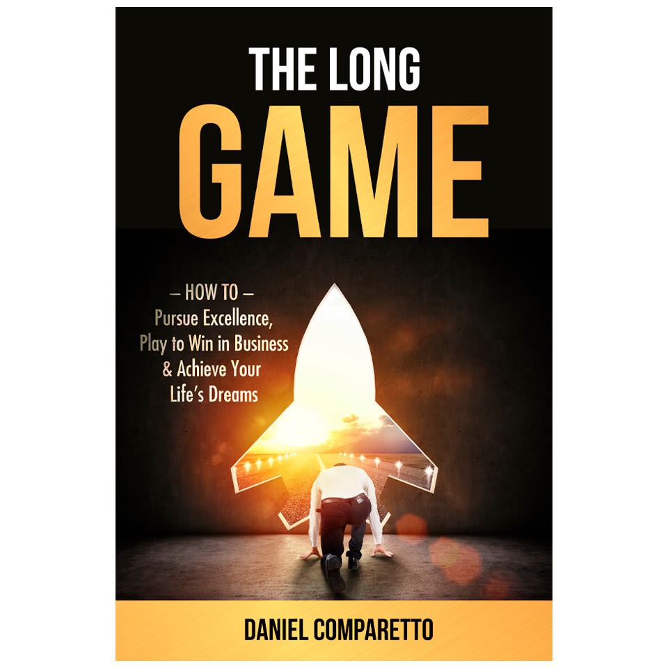
9 Responses to Option D
I like the bright color of the cover in option D. I also like that it shows a rocket and references the long game, like a rocket to mars would be.
I'll start by saying I don't like the open book that shows both the front and the back of the book at the same time I'd rather just see one side of it in this case we want to see the book cover so just show us the cover and it's better if it has like a pops of color or interesting elements like the light being shown in the darkness and and that sense it's a little interesting and catches your eye
I choose option D, the cover gives me a sense of motivation and potential, much like a rocket ship waiting to launch.
After carefully studying and comparing all eight images of book cover designs displayed above, I selectged Option D as my first preference and the one that I would definitely click on to purchase for my own reading enjoyment. I felt that this book cover image just jumped right out at me as having the most eye catching appeal based on its overall design and attractive selection of colors. Option A was my second choice followed by Option C, Option F, Option B, Option H, Option G and finally Option E with all eight rankings based on my own personal opinion of the relative attractiveness of each book cover image.
I ranked my choices based on how catchy i felt the cover was
Option D was immediately my first choice due to how eye catching it was. I love the outline of a spaceship which to me signifies reaching your dreams. G was good too with the red target and ladder. I think I’d choose either of these books. The chess board options were interesting as well but as a person who isn’t interested in chess I would be likely to skip over these while browsing options in a store. H and F were far too plain and boring. H also has an off centered word pattern that would bother me to look at for long periods of time.
D makes me think of Elon who is super successful and a brilliant mind and strategist. C is futuristic yet down to earth with the chess reference. I like the chess ones after that. H looks like a kids book; I don't like it much.
The rocket with the bright light just gets my attention right away and makes me ready to read about the subject.
Option D makes me think of success just from the design. It is more inspirational while still being strategic. The chess pieces in option C is ok but it is a little too cliché
7 Responses to Option E
I just went with my gut and what I found attractive and thought provoking.
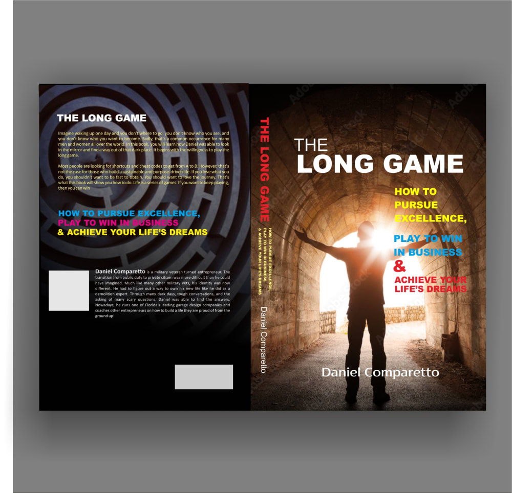
The 'light at the end of the tunnel' of E is inspiring. The bricks of Masonry and the occultic swirls on the back cover tick all the boxes of power and intrigue. Symbolism galore.
The two designs in E and D use real life scenes as the main images in the cover. As a reader, I can put myself in the character's shoe and take the same life journey. Thus, E and D are my most favorite designs. I put E in front of D because I think both "long" and "game" are important for the book which should be highlighted together using special fonts. The designs in A, B, and C treat the topic as a game and use chess as the main images in the cover. They may not be attractive to some readers who have limited knowledge about chess. The designs in A and B are better than the one in C since the images in A and B reveal touch competitions in the chess game vividly. The designs in G and H are less attractive than the previous ones since they do not use real life scenes or chess game in the cover. Readers may find it hard to follow the author's life journey. The design in H is somewhat boring. I dislike the design in F which shows an image of the author in the cover.
I like E and G as you get to see both the front and back cover. E is my favorite as I like the colorful look of the covers.
The first option is mysterious, challenging and educating.
I like E because the man is standing in the like and I feel that is positive energy to succeeding in the long game
I ranked the covers based on how intriguing and inspirational they were when I looked at them. Option E and G captured my interest the most.
6 Responses to Option F
It's really important not to overwhelm the person with too many colors, as it creates something that's not harmonious. D, B and E are prime examples. F and C are my favorites. C has good colors and good fonts, good text placement. F looks like a lot of books but that kind of gives it an established feel to it, and it works.
I liked the option that showed the author to the reader. I think that will help people accept the advice.
There are some great covers here, but a business book really benefits from putting the writer in the cover and in creative way. Option F certainly does just that.
F and H, because they both look like business books, with the face and large script description in F and the large text in H. B, A, G,NdC are all about equal, with the smaller text all mentioning business. The graphic in E, with the maze, looks more like a horror story, and D with the rocket looks more like a sci-fi story.
F wins by a long shot with the way the cover is laid out, and having the author in the background.
"F" is the best cover. I would pick this.
11 Responses to Option G
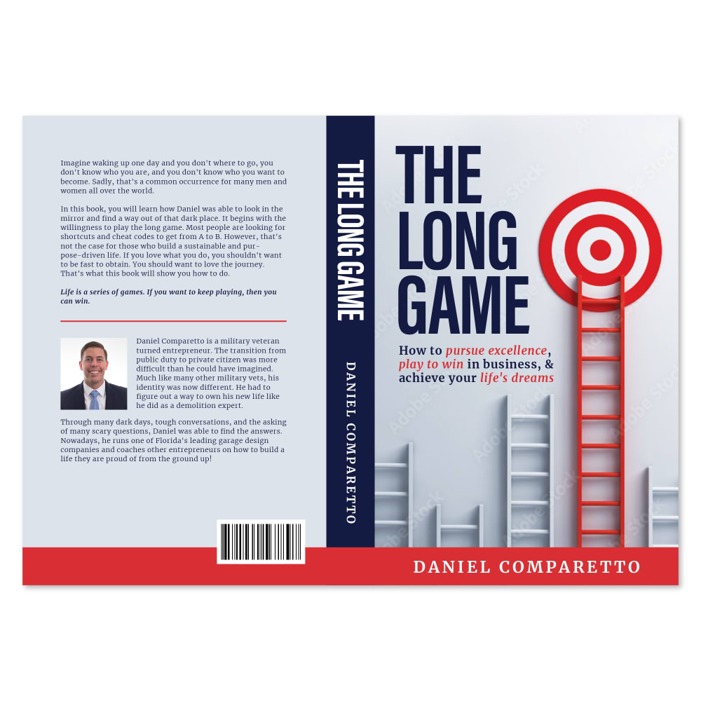
G is the best to me because the target and ladder really speak to the idea that a game is being played, but it's on a massive scale. D is intense just because of the colors, which is cool.
There are several good options but I’m going with option G just because I think the graphics are most appealing
Think of what's professional above all, then interesting. Don't go for quirky and don't use too many colors - E and H look like patchwork quilts.
Option G looks more professional and more relatable to the topics and seeks my attention more
I thought G conveyed the greatest feeling of credibility and utility. However, I also did like the chess connection displayed in B and A and found them to be the more engaging and intriguing covers.
I like the option with the ladder, the most as most people with associated with ladder, climbing
I choice G as my top choice as it has a light colored front cover and also info on the author is provided.
I would go with option G because to me it looks the most realistic and engaging. Option C, H, F, and A look quite fundamentally interesting too! Option B, D, and E feel rather bland to me.
Option g with the highest ladder reaching a bullseye hits an emotional chord. I can relate to the imagery.
Option G is my first choice because it looks like a career success book with the classic ladder of success very visible and it has an attractive design. The majority of the other choices look more like the cover for a novel. Options H and F are the only other two that don't look like a novel, but Option G is more appealing than H and F.
i actually can judge a book by its cover because the cover is what sells me , the more info a cover gives to me at a glance concerning its content , especially when im intent on a particular subject matter, the chances of me buying it are greater, pretty pictures dont do it for me, unless accompanied with more text description so my choices are in the order of most descriptive to least
7 Responses to Option H
H's cover has the best design to it that is able to draw my interest the most, and has a very pleasing design to it.
I would choose option H because the cover is simple and straightforward.
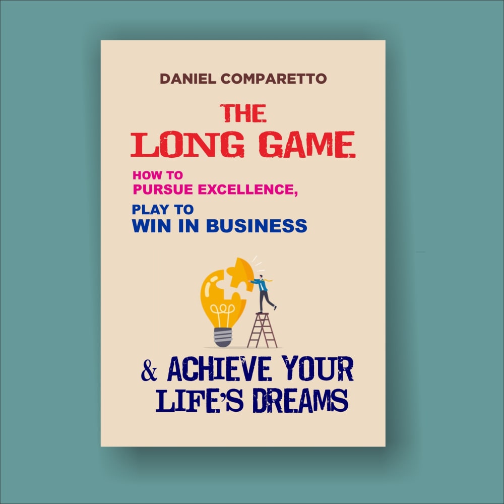
Well first, I don't like the title....Long is not an inviting word when you are working on improving. I like the graphics of H best because it looks fun and inviting which I like to think is possible when working on one's self. I like the analogy of ladders in G, climbing higher is what most of us want to achieve. D and E are inviting with the bright light when referencing life's dreams!A is nice with the cityscape, but may be intimidating for your average person who isn't in the big city. F has a personal touch with the man's face, but not really inviting. B and C I don't care for at all because I find chess stressful and just looking at those covers implies hard,stressful work to me. I want to go into a book thinking, "I can do this!" and H is what does it for me. The words on all of them are good, but it is the attractiveness of the picture that works.
A professional developement text should look professional and not like a science fiction book.
I voted based on which ones appealed to me. H was my favorite because it had a more modern look. I didn't really like the other ones. I like the ones with people on them the least, so I didn't prefer E or F.
I prefer option H. I like the positive message that is uplifting. It makes me feel this book could be a positive one to read.
Pursuing excellence and winning in Business you have to sometime think of new ways or things and is the reason I really liked the cover for option H, I think it was the best. Option E is next best, the image made me feel the power of patience, and the feeling of accomplishment and finally reaching the moment when you are at the place you been perusing. Option G was my third choice , I liked the target at the top of the ladder, as in one has to climb the ladder to reach the top. Option F was the last one I liked, it was clean and undistracted, gave the feel of Genuine truth was written in the interior. Options C,B,A, and D, I did not like the covers at all. Just gave me wrong vibes on book, kind of annoying to look at.
Explore who answered your poll
Analyze your results with demographic reports.
Demographics
Sorry, AI highlights are currently only available for polls created after February 28th.
We're working hard to bring AI to more polls, please check back soon.


