Poll results
Save to favorites
Add this poll to your saved list for easy reference.
If you were shopping for a professional development book to read, which book cover design would make you want to buy?

Option H won this Ranked poll with a final tally of 51 votes after 7 rounds of votes counting.
In a Ranked poll, respondents rank every option in order of preference. For example, when you test 6 options, each respondent orders their choices from first to sixth place.
PickFu requires a majority to win a Ranked poll. A majority winner differs from a plurality winner. A majority winner earns over 50% of the votes, whereas a plurality winner earns the most votes, regardless of winning percentage.
If an option does not earn a majority of votes, PickFu eliminates the option with the lowest number of votes. The votes from the eliminated option are reassigned based on each respondent’s next choice. This process continues in rounds until a majority winner emerges.
Scores reflect the percentage of total votes an option receives during the vote counting and indicate the relative preference of the respondents. If there is no majority winner, look to the scores to see how the options fared relative to one another.
| Option | Round 1 | Round 2 | Round 3 | Round 4 | Round 5 | Round 6 | Round 7 |
|---|---|---|---|---|---|---|---|
| H | 23% 23 votes | 23% 23 votes | 24% 24 votes +1 | 26% 26 votes +2 | 32% 32 votes +6 | 39% 39 votes +7 | 51.52% 51 votes +12 |
| E | 24% 24 votes | 24% 24 votes | 25% 25 votes +1 | 26% 26 votes +1 | 31% 31 votes +5 | 34% 34 votes +3 | 48.48% 48 votes +14 |
| A | 13% 13 votes | 15% 15 votes +2 | 15% 15 votes | 16% 16 votes +1 | 19% 19 votes +3 | 27% 27 votes +8 | Eliminated 27 votes reassigned |
| F | 16% 16 votes | 16% 16 votes | 17% 17 votes +1 | 17% 17 votes | 18% 18 votes +1 | Eliminated 18 votes reassigned | |
| C | 10% 10 votes | 10% 10 votes | 12% 12 votes +2 | 15% 15 votes +3 | Eliminated 15 votes reassigned | ||
| D | 6% 6 votes | 6% 6 votes | 7% 7 votes +1 | Eliminated 7 votes reassigned | |||
| G | 6% 6 votes | 6% 6 votes | Eliminated 6 votes reassigned | ||||
| B | 2% 2 votes | Eliminated 2 votes reassigned |
13 Responses to Option A
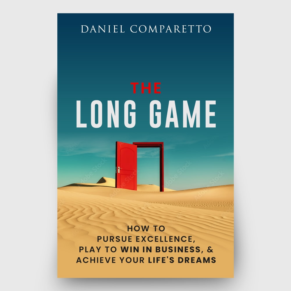
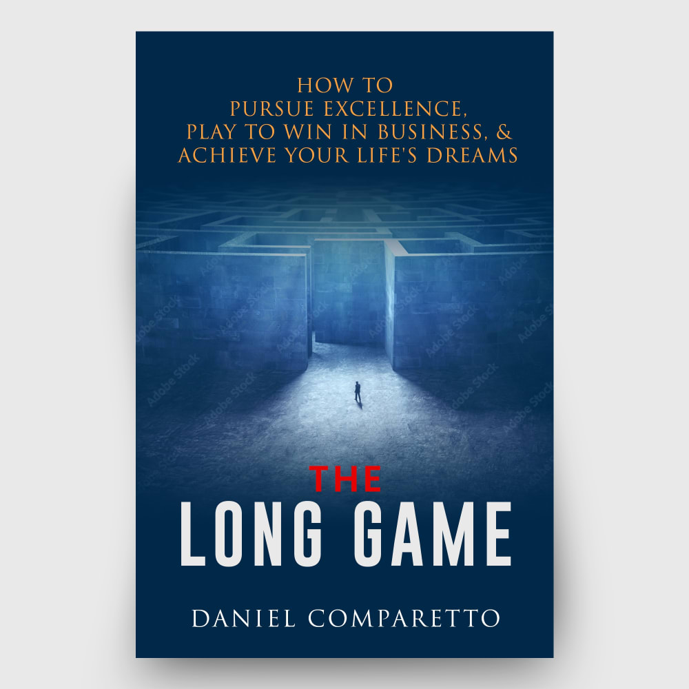
Option A's colors and just interesting design catches my attention right away and makes me HAVE to know more, I need to understand what the picture is referencing and makes me super interested to at least pick it up and find out more.
A has a more distinctive and unique style that stands out more to me from these options.
I like Option A because there is distance in the image, making me think it'll take awhile to get to my destination in the game.
Option A would catch my attention immediately, it's unique, doesn’t appear generic as the others.
A looks like a thumbnail photo for a feature length film, it really draws me in so I want to stay for a while. The red of D is very striking and focuses the eye so I'm not distracted looking all over the place at random inputs.
The lighter shades of color are bright and lively, so those are preferred. Also, having realistic backgrounds are preferable over more mundane shades of blue or red. These designs are mostly appropriate given the subject matter of the book and its potential audience of readers.
I chose A as first because I like the words under the title, "Achieve Your Life's Dream". F is second because at the top of the cover, before the book title are the words, "How to Pursue Excellence". G is next just because the cover makes me think - Be on the ball. B is next as it appears that this man is successful because of all the money. E is next because it appears to be a game winner on the cover. D will be has to be next because it also appears to be a game winner. H will be next as it is another game winner. Sorry C, but you have to be last but not least.
I chose this because there is a lot that can be interpreted by an empty desert. It leaves more to the imagination and makes the cover interesting.
I like the visual look of A and how simple it looks and I like D and G for their simplistic covers too. I feel like F looks too much like a fiction book.
There is just something to be said about the beachy type of feel that this choice has that makes me very excited to open up the pages to the book.
This is about which ones I hate the least, unfortunately. But there's one exception. I Love (A)A-- I absolutely Love this. The image is top notch and it will stand out in a crowd. The gfx just needs to be finessed. H-- I don't Love this but if you must use the chess theme, this isn't the worst.G-- I don't mind this because it's curious.F-- Interesting, like you don't know where to go but the answer is here. Some folks will respond to this.B-- These stock images with the light fx are so cheesy. I'm walking away right now.E-- I saw this at the 99 cent store, didn't I? See BD-- How original! A chess piece! I'm being sarcastic. I hate it.C-- Again with the chess board and light fx. NO
There is a Mandela Effect about an album cover with a door in the middle of a desert. Since this fascinates me, I would consider this cover a spiritual sign.
The books with professional looking covers with some vivid colors draw my attention the most.
2 Responses to Option B
I ranked in the order that the covers would catch my attention sitting on a store shelf.
A professional development book I chose option B followed by A, I could see so many things in these two covers that could fit the title, strength, preservice, patience, learning,. said so much with no other info than just the image. My next choice was F, because it showed the maize and sometimes life feels that way, specially when learning to be patient with oneself, but if one keeps going with patience the maize becomes clear and so does our confidence of learning professional development skills. All others didn't like for same reason stated , I really did not get or understand the image in relation to the book, and both the chess game, and the spere gave me impressions of a generic feel to the cover.
10 Responses to Option C
I ranked my selections based on how catchy I felt the covers were
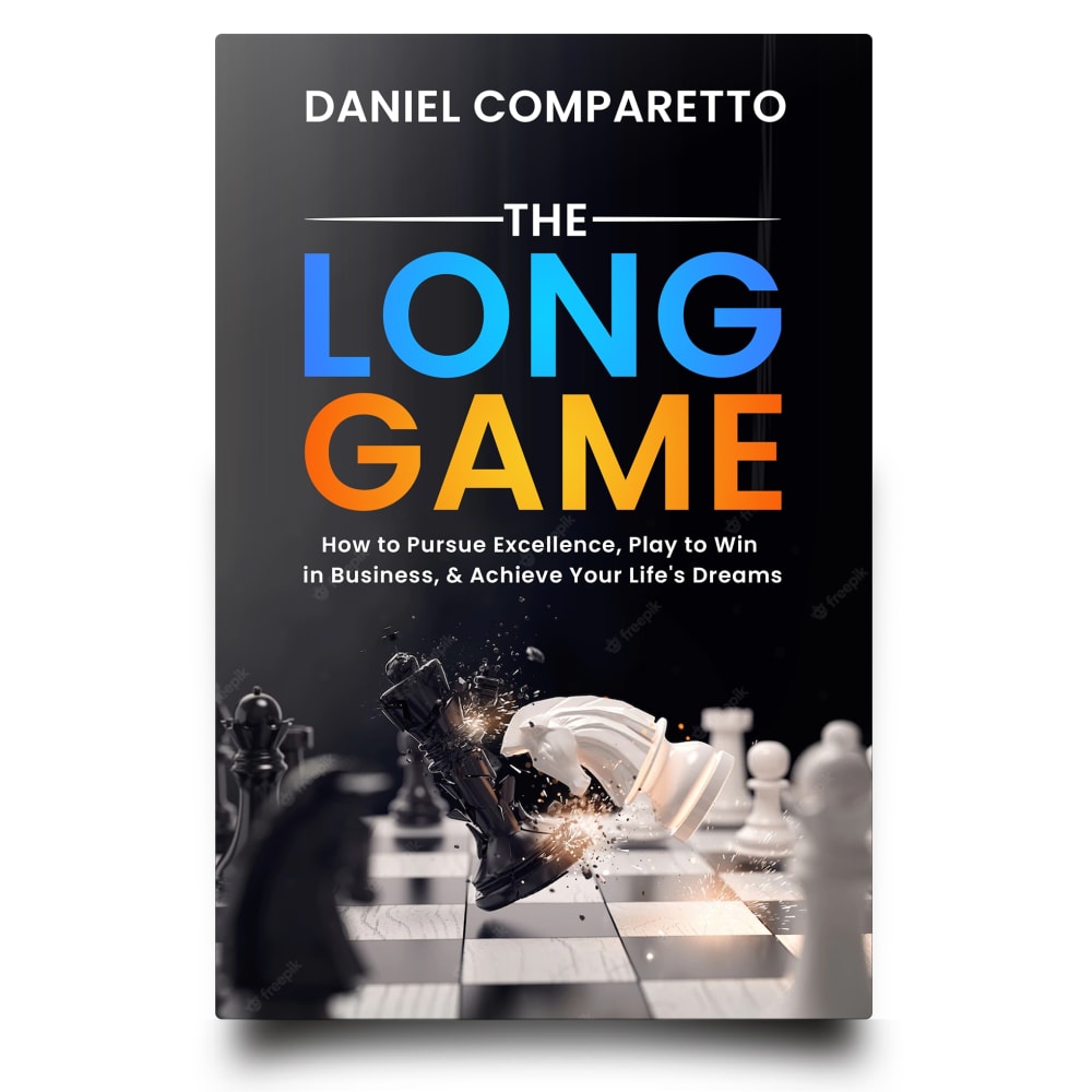
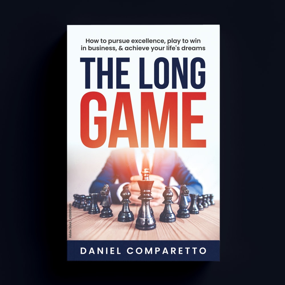
I really liked the Chess game comparisons and I think that the idea is correct. Chess is strategy and skill, like learning things from this book.
I like option C because of the graphics used on this book. They make it much more appealing to me
I really like the way the chess piece stands out in option C
I liked the chess angle given the title and focus, and I felt the colors and general style of C had the right balance of professionalism and modern aesthetics.
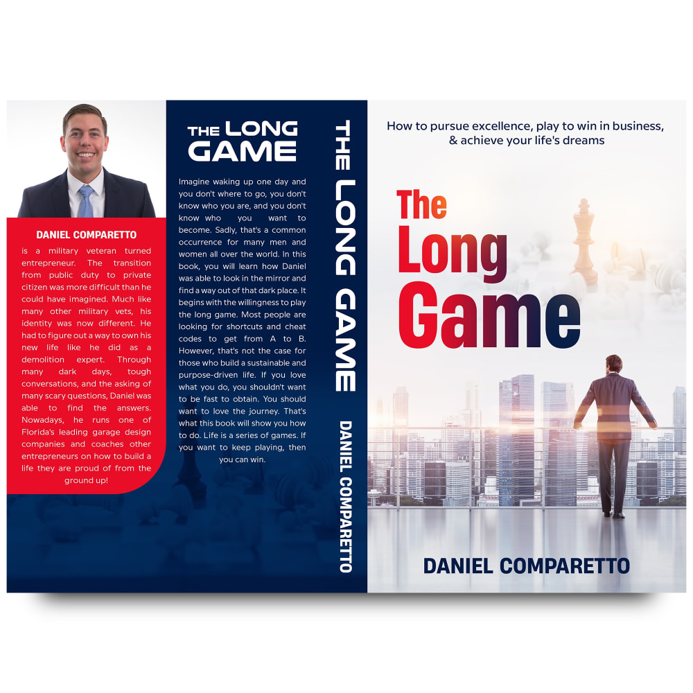
I like seeing both front and back cover so I had C D B at top. C gets top as I like the gold looking tint on the chess piece.
C I like the chess themed ones.
C is definitely my favorite, with the nice photo of the author and the simple yet intriguing cover.
I liked C the best, because I liked the chess game component but liked without the person behind. I liked the coloring and how the other pieces were knocked over.
C- I really like the covers with chess, Its perfect for the title. The one with all of them down and the red standing has a meaning of defeat.E- also a very good meaning of defeat and standing aloneH and D- I like the chess pieces on the cover the bestF- The maze is a great meaning of a long gameA- The open door to know where symbolizes a long road aheadB and G are my least favorite.
6 Responses to Option D
I liked the options that featured lighter covers since the options with the heavier and darker colors felt a bit depressing.
I like D the best because I like the chess piece on the front and I like the look of the back cover. It's got an allover cohesive look to it that I like. I think the rest are okay but this one stands out for me.
I absolutely love the simplicity of this one. With the king being the only piece on the chessboard it definitely denotes a sense of power. I think it would accurately depict what the author is trying to convey. I think the colors are minimal which makes it not so busy. This is the one that would catch my eye on a book shelf.
It’s about chess not checkers, so those images would be my top choice especially for something with the name long game
I chose D as my top choice as I want a chess board image and also I want a light or white color on the cover. I also want info provided on the author.
The covers with the chess pieces stand out visually and represent the theme of the book well.
24 Responses to Option E
I like the chess pieces that represent the title of the book, since it's "the long game"
I like E the most because the image of chess-pieces engaged in a brutal battle shows the hunger and drive professionals have in their career.
I liked the covers that had darker colors on them. The ones that were white backrounds looked kind of cheap and outdated.
Chess relays an idea of professionalism and strategy
I chose E as my choice because I like the colors, the graphics, and the overall look.
I like E and H the most. I think E is a bit better as the black background makes it stand out more.
I love the image on this book of the chessboard and the way the pieces are clashing
I'll start by saying I do not like the displays of this with the open book that shows the back and the cover at the same time I'd rather just see the cover and what I'm looking at these covers I want to see interesting covers that catch my attention have some red in there have some imagery in there show me the story and give me an illustration of what I can expect to read
Options E,H,A and F are interesting covers that look good and they also got a nice color schemes. Options G,C,D and B are ok at best, but they're a bit boring.
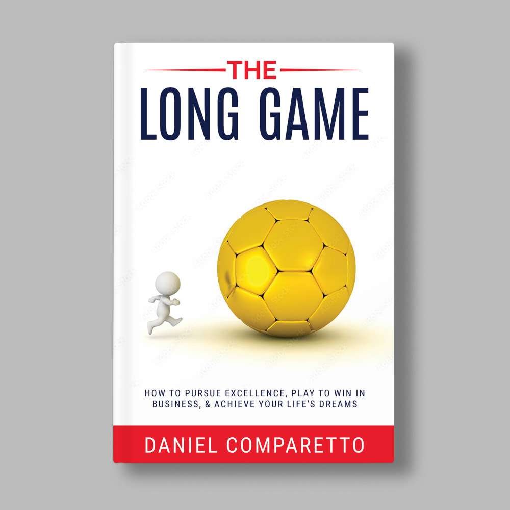
I definitely think like is like Chess so I prefer the chess cover ones and ranked those by visual preference. The yellow ball looks too juvenile to take seriously so I put that one last.
As before, I chose the covers with the chess pieces as it is all about making moves, the right moves, at the right times.. Option E has a lot of movement in the image and the colors are balanced out well.. Like the other main choice I made in a different task, it caught my eye and kept it.. The following choices again are due to the chess pieces, but E is the best of the lot.. The maze in Option F is a nice idea, but a well thought out business plan would not be represented by a maze, more like chess moves.. The rest of the covers I am not a fan of..
I would purchase option E. I think the picture looks most professional. I like the black background and the blue letters. I think it makes it look most professional and would make me want to buy it.
Really like the crashing chess pieces on E, followed by the other chess piece variations I liked. I don't like the city one with the man as it reminds me of the "rat race." The yellow ball is confusing and a door in a desert opening to nothing is not my idea of success.
Option E had vivid colors and a bold design that was creative and eye-catching; I also liked the chess theme. Option D also made good use of the chess theme and had an intriguing mix of colors. Option H was a bit more standard, but had the chess theme that I like so well with the book's title. Option G was unique and cute. Option C had the chess theme, but the colors were not bold enough. Option A was too stark and didn't do a good enough job of making the title stand out. Option B lacked color and was too bland. Option F was too ominous and dark in tone.
Option E. I think that the black with the blue and the orange really stand out nicely it looks professional and classy
stands out to me as most interesting and one that i can trust based off the imagery and know what to expect based off of it
The first 3 options are quite creative and original, but the last ones seem to be taken from a book that tries to sell you dreams and not realities.
Option E, looked the most appealing cover wise. It just stood out to me more and I liked the chess theme it relates the title of the book well. Option C, H and D, I thought looked nice and I liked the chess theme. Option G and A was good but not as eye-catching. Option G did match the title a bit better than option A. Option H, text style was cool but the text size was a bit more small. Option F looked okay. Option F, did have a more dramatic look to it which is why I ranked it higher than option B. Option B, looked the most dull of the covers. It just didn't fit that well which is why I ranked it last.
Option E seems like the only option that's image is geared towards displaying a dynamic struggle like the title of the book fixates on
I like the concentration of the image on a chess board.
I liked the covers with the chess pieces the most and then the tunnel and doorway.
the ones that i like most have the fire and ice color scheme with the chess board and the black background. for the ones with the picture of you on them, these ring as a self help type book. i'm not a huge fan of the dark blue one, not really sure why though, because i do like the idea of the maze, but i think that i prefer the chess game to the maze. 8 is a bit more novel like rather than a self help book though.
I like the ones with the chess games on the cover, the black and white one, mostly, is the nicest one.
i’m a fan of chess and like the covers that have chess at the forefront
16 Responses to Option F
I feel that F's cover is able to mesh well with the title, and stands out the most to me compared to the rest.
I think that the chess theme fits the book well. The darker covers also stick out to me and look more professional.
Professional development is all about strategy. I would prefer the book cover that reminds me of making strategies like as in a game of chess
Options F and A I like the best out of the choicesOptions E, C, D are also pretty nice covers and seem relevantOptions G, H, B also nice and seem relevant
This was really hard. I loved all of them. I put them in the F, B, C, G, H, A, D and E order. I really like F. I would be happy with F or any of them. I honestly would buy all of them.
F is really intriguing. The maze that is cleverly blended into the background looks like life in a nutshell, and the way it's blended on the screen is very professional.
F makes me think of Maze Runner and that definitely speaks to a long game. G does as well, but the imagery in it and the rest of the book aren't nearly strong enough. B would be, but it focuses on a man. Question: Can't the long game help women too?
G felt a little too silly or cartoonish for the category. I worry E or B might feel too generic or like stock images. F and A felt bold and ambitious, while best communicating through a relevant and deeper analogy.
I chose F as my first choice because of the maze imagery.
I prefer option F. I find it the cover that makes this book the most intriguing to pick up and read.
I lean towards option F because to me it looks the most engaging and educational. Option B, A, E, C, and G feel inspiring and compelling too. Option D and H feel too lackluster for me.
F reminds me of Time Bandits. A is a classic object of potential. D has a classical business book cover look. C is close to D but the back isn't great. H has an old scifi structure to its objects. E isn't great but it is interesting. B is boring. G has a soccer ball which I dislike.
I like the chess references best, but I'm going with F as my top pick in this selection - I like the colors, and the ominous and oppressive feeling of the maze is an interesting analogy to what it takes to succeed. It looks like the cover of a novel. The best chess one is D - again, the king and pawns is a good analogy. The look of the soccer cover is ok, but I prefer chess. B feels cliche with the sun and the cityscape and businessman - I wouldn't go that route.
Option F seems the most professional, trustworthy, attention grabbing, and the most unique which makes me the most likely to read and buy
I like all of these actually, but ranked based on what caught my eye.
The maze does the best job of giving a visual representation of the title
6 Responses to Option G
This design is very modern looking with a great bold font choice and simple colors but this combination really makes it jump out at you.
They all look like real books and like what you would expect. I do like the first two a good bit better than the other ones.
G, H, B, E, A all look professional and like it would tell you how to get from one point in life to another. D, F, C don't seem that appealing or interesting.
My first choice has enough ambiguity to make me see what the contents are.
These use very interesting visual styles
Option g and irs soccer ball graphic strikes an emotional chord within me.i can relate to this imagery.
23 Responses to Option H
H, F, and A are the only ones I really would consider. A reminds me of a certain Stephen King book, so it gets points for that. H and F both have the best font and color choice. The other ones, especially B and C, have a low quality, rough draft feel to them. I dislike the fonts as well.
I would choose option H because of the design of the cover with evokes success such as playing chess.
Chess always seems like a smart man's game and makes you think deeply, which I like
I like the look of H better. B and C are close together, just a change of the figure in the picture. F and E are ok and can see the depth that is showing .
The business chess cover in H is really intriguing so people would be drawn to it. Likewise, the labyrinth cover in F is intriguing and draws in the eye.
I like the brightness of the cover in option H but I also like the reference to chess, this certainly makes me think of the long game.
After carefully studying and comparing all eight images of book covers displayed above, I selected Option H as my first preference and the one that I would definitely click on to learn more about before purchasing for my own reading enjoyment and professional development. I felt that this book cover just jumped right out at me as having the most eye catching appeal to me based on its graphics and coloring. Option A was my second choice followed by Option F, Option E, Option G, Option C, Option B and finally Option D with all eight rankings based on my own personal opinion of the relative attractiveness of each book cover image.
A chessboard best shows the long game and how to capture the elements that you want in your book by planning long term, chess fits that.
I like option H the best because I like the image showing the person in the suit playing a game of chess, which I think perfectly represents the title of the book.
Option H because chess games usually last a long time and require a lot of focus, which can also apply to development
I rather prefer the option H book cover because I like the long game of chess analogy with the business suit shown here the most. I chose options E, D and C second, third and fourth because I like the fighting chess pieces book cover more than the red king chess piece book cover with standing pawns more than the red king book cover with pawns fallen over by its side. I chose options G, B and A fifth, sixth and seventh because I like the soccer ball analogy book cover more than the city with chess background book cover more than the desert book cover because the light because it seems too dry. I chose option F last because I do not like the labyrinth or maze imagery shown here on this book cover as much.
In general, I like the chess metaphor, though A wins points for having an intriguing image.
I like this option most because I feel it ties the title, professionalism and the challenge of growth into the images using the elements used.
I like the chess piece images the best, H looks the best and classic. the other chess piece is good but not great. Then I like the images of the person and B looks clean and good. I don't get the maze (F), the ball (G) and the desert (A). with the desert being the worst
I like how H and D has the center as the focal point and also its color scheme. I thought B and F didn't catch the eye as well.
I like option H the best. It depicts that you are you own master when it comes to professional development
I like the metaphor of a chess game for the title.
I like H the best because of the guy behind the chest pieces
Chess takes strategy and calculations, so I liked the ones with chess pieces on the cover the best. I like the one showing the torso of a man in a business suit, because I associate business suits with business and success.
H has the chess pieces lined up in a way that implies it is a long board or reach, and the businessman behind it either represents the opponent or the objective to attain. D has the same lined up pieces but without the man behind it so it is open to more interpretations. E features a fun action scene between the opposing sides like a "head on" approach, but not necessarily tying in with the title. F features a different type of game and is another way to interpret the title, but is a little bit of an intimidating approach since it reminds of life and its twists and turns and may be a scary reminder. G is a fun and cute way to explain that the "game" gets a little tough at times because of some obstacles. I don't think it quite suits the title so much since it's just more effort than it is just a long process. C goes back to the chess pieces but shows one remaining as if to say it is the winner or came out on top. I prefer the action shots or the ones in progress so it shows the journey or the effort put into the goal. A doesn't really seem to make any sense at all because I don't see how it is a game and looks more like a reflection on life. B also does not really match the title to me and does not show me any sort of actions towards success or progress.
choices h,a,e are more modern styles of book covers
Options H is my first choice for the book cover design for a professional development book because it clearly indicates the subject at first sight.2. Option C because it has lots of information and the subject is easy to see on the cover.3. Option D because it has lots of clear information4. Option E because it has a clear picture of the subject5. Option B because it has lots of information but has a person guessing about the subject6. Option G because it seems more like a sport type of book7. Option A because it seems a mystery on the subject8. Option F because it leaves a person guessing about the subject of the book
the arrow shape of the chess pieces, with the image of the person, indicates that there is an adversary in this LONG GAME, this cover motivates me.Do not discard the one voted in second place, option F, visually it has a lot of impact.
Explore who answered your poll
Analyze your results with demographic reports.
Demographics
Sorry, AI highlights are currently only available for polls created after February 28th.
We're working hard to bring AI to more polls, please check back soon.


