Poll results
Save to favorites
Add this poll to your saved list for easy reference.
Which book cover do you prefer (and why)? Background: The Reincarnationist Papers book series is about discovered manuscripts that tell the story of a small group of people who have total recall of their past lives and drive history toward their goals.
23 Responses to Option A
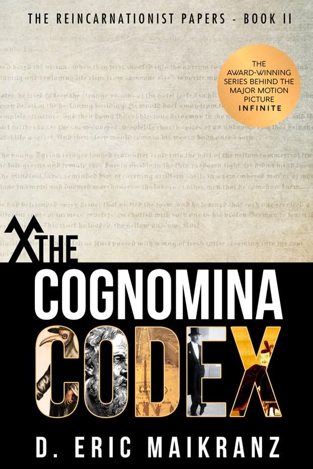
The imagery matches the title better in A, B is a little generic.
I like the design of the title in A plus the background looks like old paper.
B just looks very generic and doesn't appeal to me. A looks more professionally done and catches my eye more
Chose A because B looks like some kind of medical book.
I like option A because I think the pictures in the letters on the cover give a better idea of what the novel entails. I also like how big the lettering is and it grabs my attention the quickest.
I prefer this design because it has an almost historical feel to it. It's an intriguing mix of old and new. I like the very large and bold text too. Caught my eye.
At first, the other book cover caught my attention with it dark and foreboding colors of red and black, but Option A's book cover states that it is a award-winning series based on a major motion picture called Infinite. Books are always so much better than a movie, so if the movie was good then the book must be worth checking out, too.
Option A is a great looking cover. It's certainly eye-catching. It's stand out well, on the shelf, or on a store page. Either way, it's a cool cover. I like option A. I'd buy it.
I would choose A because I like the fact that it has a label mentioning its award-winning aspects and I also find the graphics on the cover tto be easy to read and visually appealing.
I think A is the better cover, as it lets readers know the connection to a popular major motion picture. I actually find the artistic direction in B to be preferable, but when it comes to persuasion, I find the film connection in A to be a stronger pitch.
I think that red is an intense color and i like the calm tan better. It is not as intimidating.
I like this one better because of all of the designs that are in the letters for codex. They seem like puzzle pieces and like places you will have to go to solve the mystery. The color scheme makes it look nice
I think Option A fits the description more. I think that the red in Option B is a bit too intimidating for the book, including the silhouette- makes it weird.
A because it mentions the past recognition and the cover is overall more attractive. The unfamiliar text on the top half is intriguing.
I like how the top half is like a faded manuscript. It really matches the summary given of the book.
My first choice is most intriguing and it is also easier to review and look at.
I like opts better. I didn’t know they made this into a movie. It must be good.
The individual/person on the cover doesn't really add anything. I like the colors and font used in this version better, it makes the book seem more professional.
A's cover makes me think of the manuscripts and the history that they contain. It makes me want to learn about it and spend time thinking about how the plot might work. The letters at the bottom help tie in different ideas or aspects through history of how they might operate, which is also interesting to think about.
I like A because the word 'codex,' is prominent. I like that there is an old looking manuscript paper on the cover. And the coloring is more attractive than B.
I think the cover best reflects a book about manuscripts.
I chose A since it has the reference to "The Award Winning Series Behind the Major Motion Picture Infinite" ... this gives me more info about the book and increases my interest in it
The historical figures and pictures makes me intrigued because I love fiction based on history
27 Responses to Option B
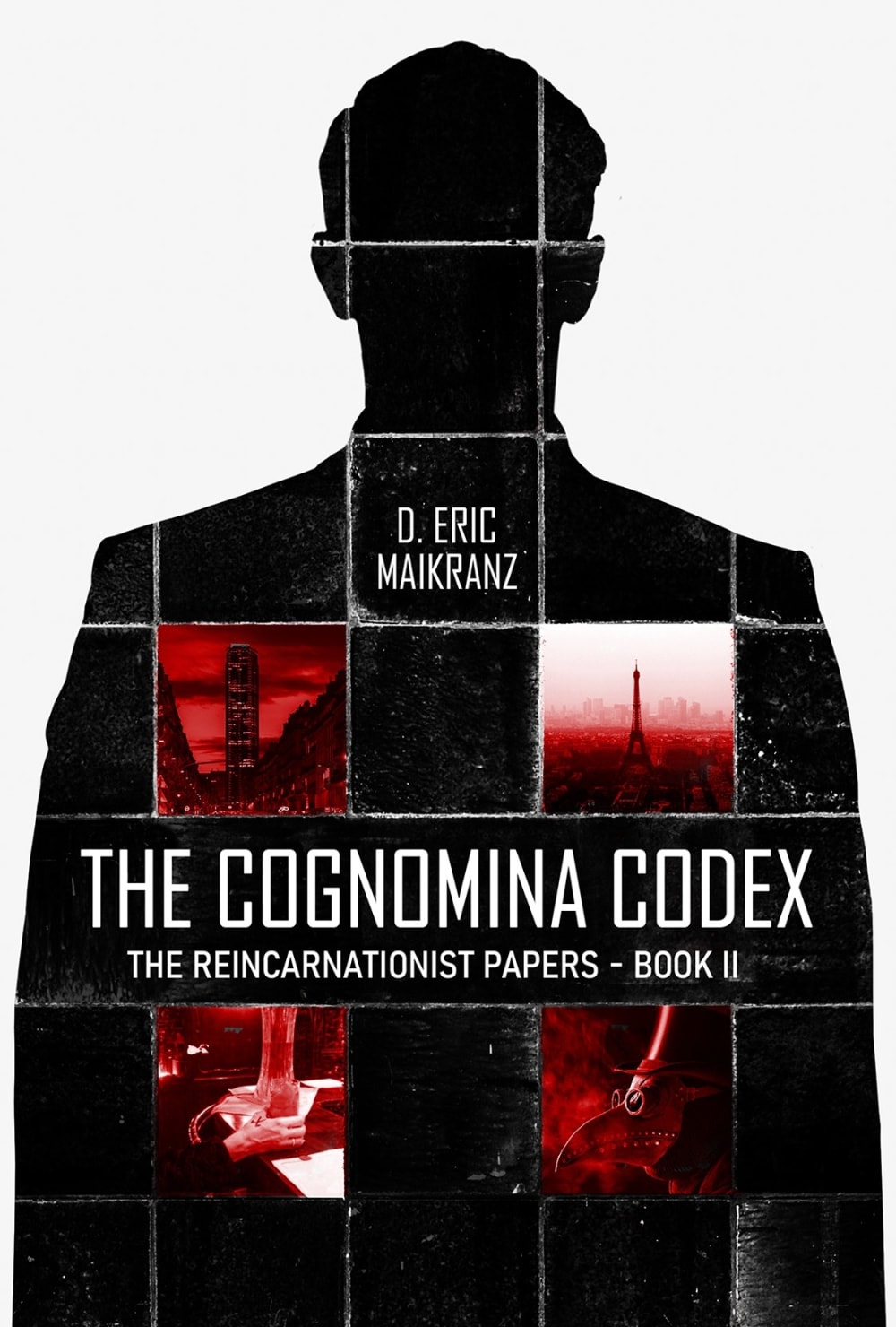
i think a black backdrop of a man in reincarnation is a more interesting and drawing presentation of the book.
I prefer option B because I think that it is a more interesting, eye-catching, and overall a more visually appealing book cover design than option A.
The image on the front of option B looks very mysterious and enigmatic and it makes me want to read it.
I prefer option B because the cover feels more surreal and intriguing to me. Option A feels quite boring to me.
This one looks mysterious and piques my interest and curiosity.
I like B best because the book cover looks more thrilling and gives me the impression that this book will be suspenseful.
I voted for B because it is simply more eye catching. Half of book A is unappealing and B uses red in a way that lures you in.
The cover in B is more attention grabbing and would stand out to me on a shelf
I like the cover of 'B' the most. I think it's the most descriptive and the images do a much better job of explaining and showing what the book is about. The art is much more thought provoking as well.
I like the silhouette for B. I think it is the most compelling
Option B has a dynamic visual for a book cover compared to option A which is more appealing.
I thought option B stood out more.
I like this one more as it gives the feel of the narrative better. That there is several lives existing/existed in this particular person and frames the idea quite well. The only thing I would suggest is that if there was some sort of "melding" of joint effect of all the images like they are also being tied together.
The artwork on the book cover gives it a sense of drama and actually being within the story itself.
I like the various images placed within the man's body - especially given that the story involves knowing our past lives. I like that we don't see his face so it adds mystery and intrigue to it. I'm curious about it. Option A was okay but I kept getting hung up on the X next to THE and thinking how it really looks too much like a swastika.
I picked option B because I like the mysterious silhouette of a person.
Option B looks the best to me in my opinion. Having the ominous figure silhouette it in the background ties in well with the rest of the design for the cover and grabs your attention.
Option B's cover looks a little more mysterious. this helps to wonder what this group did/does.
This option looks more interesting honestly. Both are good but this is just a little bit better I think. I would read this book seriously.
I chose B because I Feel that it is more complex and allows me to feel more of a curiosity and wanting to know more about this world and characters.
This one has more of a wow factor and it catches your eye right away. The other option feels lacking and boring.
The person in black in Option B reminds me of identity crisis. Since a person's identity is the spirit of what the series is about, I would prefer Option B
The squares make it look more like a puzzle than the other. DUe to this, this is my top pic
Option b is more attention grabbing end it kind of fits with the description more with total recall of a person and their memory being that it's an image of a person on it but its more of an attention grabber with the red on the center of the persons image
B gives a really good vibe off when you look at it, I would be inclined to pick that up over A.
The cover with the squares and the man brings intrigue to their story.
I think the image of the person as the background is more interesting and eye catching.
Explore who answered your poll
Analyze your results with demographic reports.
Demographics
Sorry, AI highlights are currently only available for polls created after February 28th.
We're working hard to bring AI to more polls, please check back soon.


